Drill-Down Analytics
Drill-down analytics dashboard. Ideal for landing pages, modern websites. AI-ready template.
Use case: Landing pages, Modern websites
Historical Context
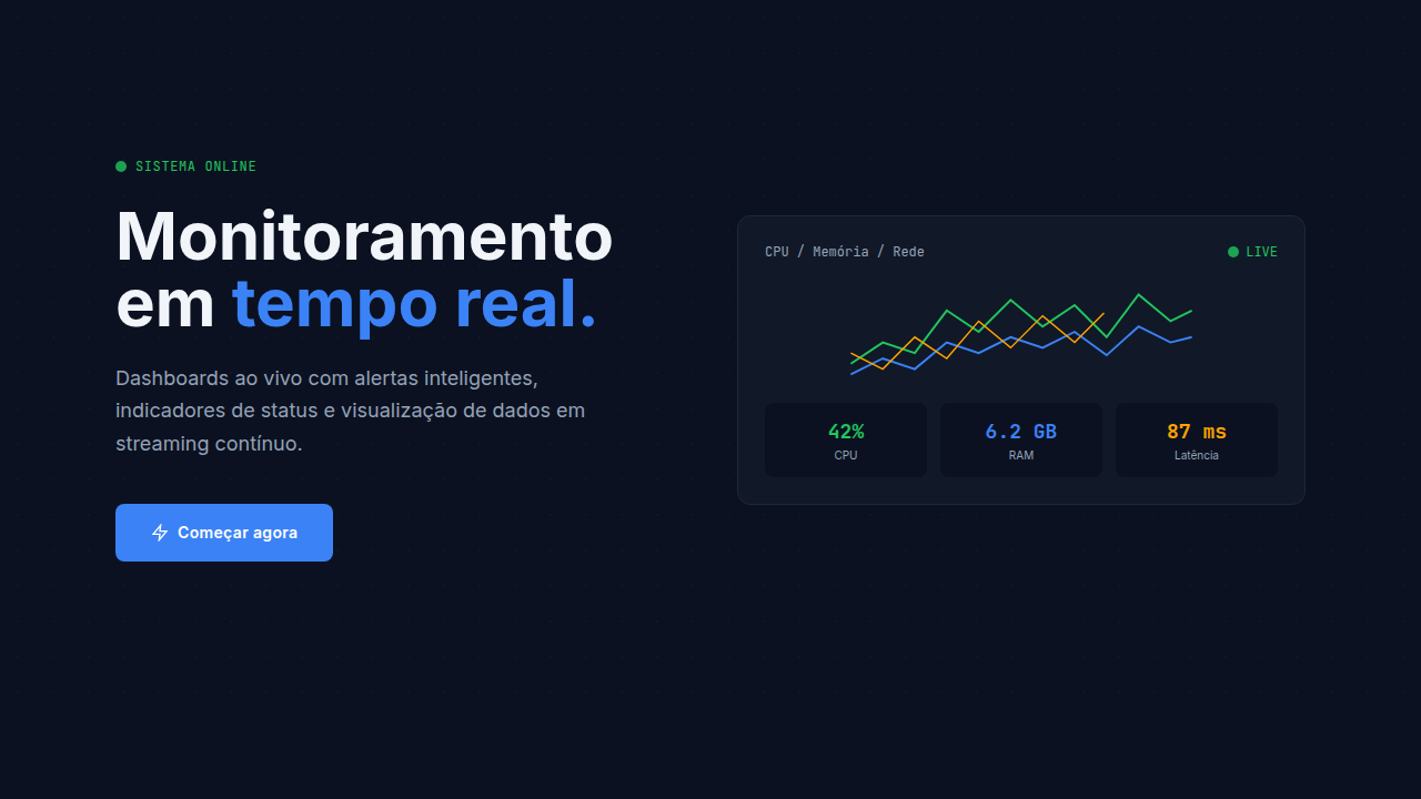
Before drill-down became a UX pattern, it was a database concept. OLAP cubes in the 90s let analysts slice multidimensional data — revenue by region, then by quarter, then by product line. The interaction was powerful but buried in enterprise tooling nobody outside of IT ever touched. The genius of modern drill-down is that it took that same hierarchical traversal and made it feel like browsing. Tableau changed the game around 2013 by making this exploration visual and immediate. Click a bar, the chart redraws. Click again, deeper. Power BI followed suit. Suddenly, progressive disclosure wasn't just a UI trick for hiding complexity — it became the primary navigation model for data itself. The hierarchy IS the interface. What we're designing now inherits all of that. Expandable rows, nested charts, breadcrumb trails back to the top level. The pattern works because it respects attention: show the summary first, let curiosity drive the depth. Not every user needs the granular view. Most don't. But the ones who do should never hit a wall.
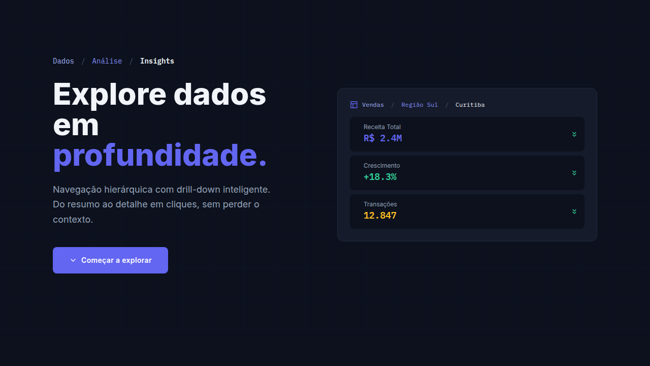
When to Use
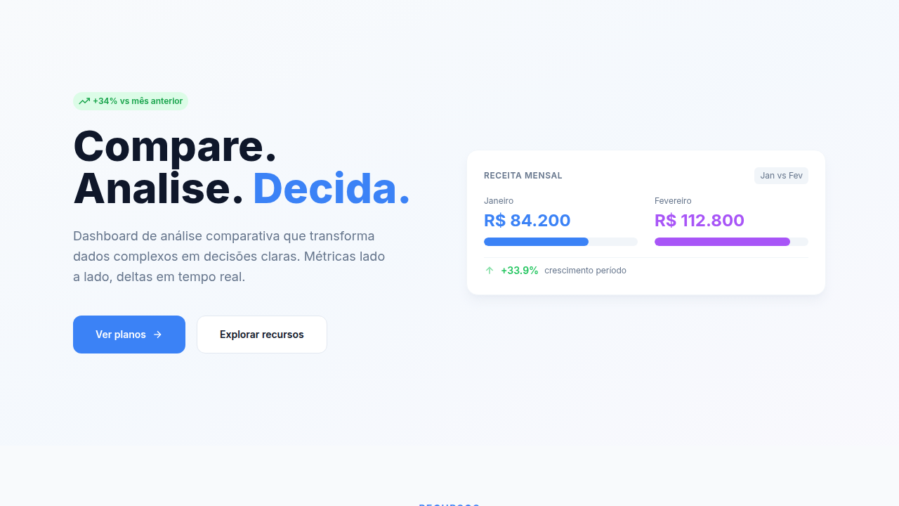
Reach for drill-down when your data has natural parent-child relationships and users arrive with different depth needs. Dashboards where executives want the headline number but analysts need the transaction-level detail. Reporting tools where a single flat table would be overwhelming. Anywhere you'd otherwise build five separate views that are really just zoom levels of the same dataset. Skip it if your hierarchy is shallow or artificial — two levels deep isn't drill-down, it's an accordion.
Design Principles
- Show the forest first — summary views should be genuinely useful on their own, not just a loading state for the real data
- Make depth reversible and obvious — breadcrumbs, back arrows, or animated transitions that preserve spatial memory of where you came from
- Maintain context during traversal — the parent metric should stay visible or accessible so users never lose the 'compared to what' frame
- Limit depth to what's meaningful — three to four levels max before you're just building a file explorer with extra steps
- Signal drillability affordances clearly — if something is expandable, it needs to look expandable before hover, not after
Technical Specs
Colors
Effects
Drill-down expand animations, breadcrumb click transitions, smooth detail reveal, level change smooth, data reload animation
Light/Dark
✓ Full / ✓ Full
Related
Last synced: 4/1/2026