Runway Cinematic Editorial
Runway-inspired cinematic editorial landing page. Ideal for ai criativa, geração de vídeo, plataformas de mídia, estúdios de produção. AI-ready template.
Use case: AI criativa, Geração de vídeo, Media platforms, Studios de produção
Historical Context
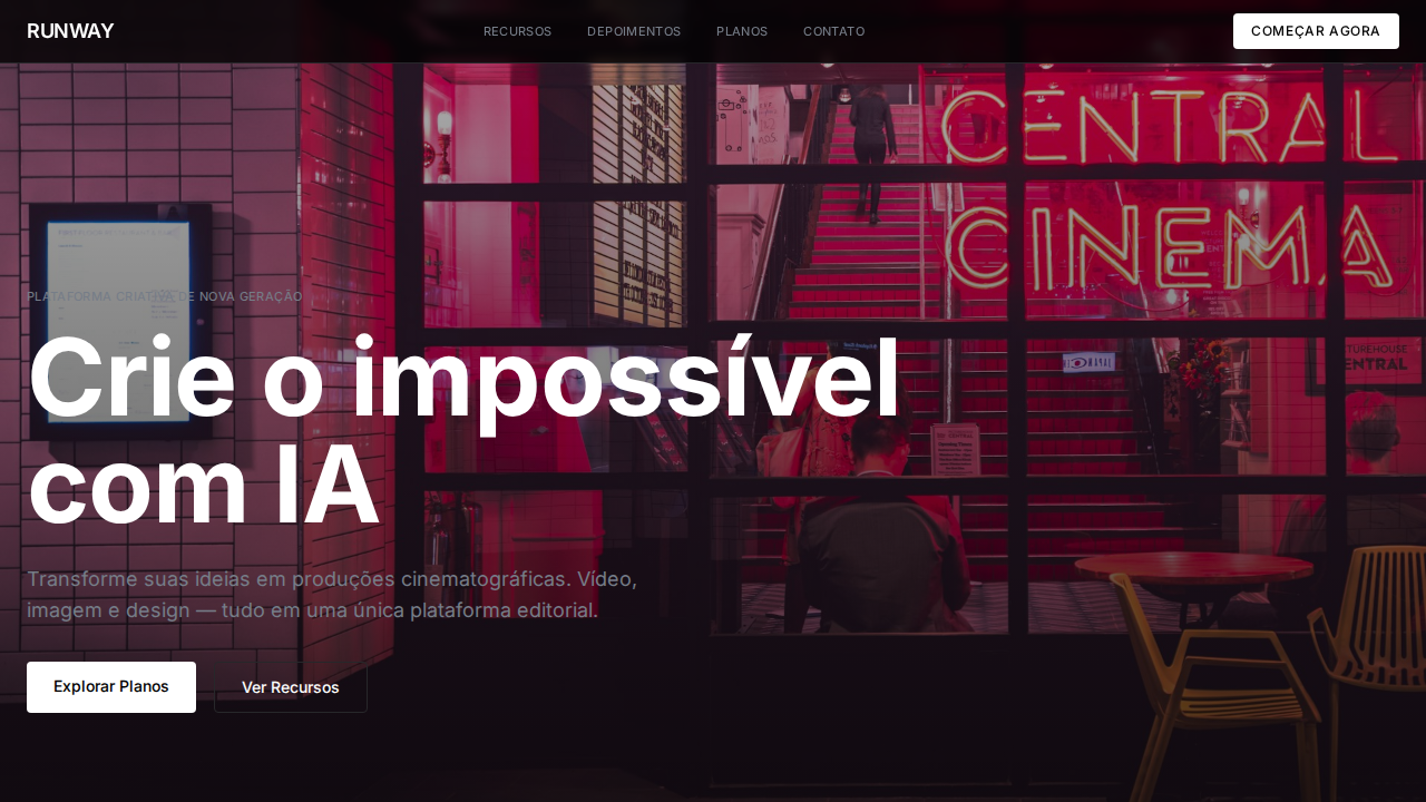
The cinematic editorial layout didn't emerge from web design — it was stolen from film title sequences and fashion photography spreads. Saul Bass understood that a single frame, held long enough, creates more tension than any animation. Magazine art directors at Harper's Bazaar and Vogue spent decades perfecting the full-bleed photograph as a statement of editorial authority. The image IS the layout. Runway's contribution to this lineage is giving individual creators access to the same visual grammar that previously required a production budget and a DP. When you pair AI-generated cinematic footage with editorial typography — tight tracking, extreme weight contrast, text that bleeds off the edge — you get something that feels like a film poster crossed with a gallery wall. The danger is obvious: without restraint, it becomes a screensaver. The discipline is knowing that one perfect frame communicates more than twelve mediocre ones. This pattern works because it respects the oldest rule in visual storytelling: give the image room to breathe, then anchor it with type that knows its place.
When to Use
Deploy this when the visual content is genuinely cinematic — not just 'nice photography' but imagery with intentional composition, dramatic lighting, and narrative weight. Ideal for AI video tool landing pages, creative production portfolios, film festival sites, and any context where the work itself should dominate the viewport. Kill it immediately if your imagery is generic stock or poorly generated AI output. This layout amplifies quality and exposes mediocrity with equal force.
Design Principles
- Full-bleed imagery owns the viewport — no padding, no apologies, no safe margins. The photograph extends to every edge as a declaration of confidence in the visual.
- Typography exists in service to the image. Ultra-condensed or extended faces, extreme size contrast, and precise optical placement — never floating aimlessly over the composition.
- Negative space is structural, not decorative. Let frames breathe between sections. The pause between images creates rhythm the same way silence works in film editing.
- Color grading consistency across all imagery — unified tone curves, matched black points, coherent mood. A cinematic layout with mismatched color science looks like a mood board, not a finished piece.
- Motion, when present, is slow and deliberate. Parallax at 0.02 speed, not 0.2. Fade transitions measured in seconds, not milliseconds. Everything references the pacing of cinema, never the urgency of advertising.
DESIGN.md
---
version: "alpha"
name: "Runway Cinematic Editorial"
description: "Runway-inspired cinematic editorial landing page. Ideal for ai criativa, geração de vídeo, plataformas de mídia, estúdios de produção. AI-ready template."
colors:
  primary: "#000000"
  secondary: "#ffffff"
  tertiary: "#1a1a1a"
  neutral: "#e9ecf2"
  surface: "#404040"
  accent: "#767d88"
typography:
  h1:
    fontFamily: system-ui
    fontSize: 2.25rem
    fontWeight: 700
  body-md:
    fontFamily: system-ui
    fontSize: 1rem
    fontWeight: 400
  label-caps:
    fontFamily: system-ui
    fontSize: 0.75rem
    fontWeight: 500
rounded:
  sm: 4px
  md: 8px
  lg: 12px
components:
  button-primary:
    backgroundColor: "{colors.primary}"
    textColor: "{colors.neutral}"
    rounded: "{rounded.sm}"
    padding: 12px
---

## Overview

Runway-inspired cinematic editorial landing page. Ideal for ai criativa, geração de vídeo, plataformas de mídia, estúdios de produção. AI-ready template. The cinematic editorial layout didn't emerge from web design — it was stolen from film title sequences and fashion photography spreads. Saul Bass understood that a single frame, held long enough, creates more tension than any animation. Magazine art directors at Harper's Bazaar and Vogue spent decades perfecting the full-bleed photograph as a statement of editorial authority. The image IS the layout.

Runway's contribution to this lineage is giving individual creators access to the same visual grammar that previously required a production budget and a DP. When you pair AI-generated cinematic footage with editorial typography — tight tracking, extreme weight contrast, text that bleeds off the edge — you get something that feels like a film poster crossed with a gallery wall. The danger is obvious: without restraint, it becomes a screensaver. The discipline is knowing that one perfect frame communicates more than twelve mediocre ones.

This pattern works because it respects the oldest rule in visual storytelling: give the image room to breathe, then anchor it with type that knows its place.

- Density: 5/10 — Balanced
- Variance: 4/10 — Moderate
- Motion: 8/10 — Cinematic

- **Style:** Cinematic, Full-Bleed Photography, Single Font, Zero Shadows, Film-Title Typography
- **Keywords:** runway, cinematic, full-bleed photography, single font, zero shadows, film titles, abcNormal, cool neutrals, editorial magazine, AI video
- **Era:** 2024-2026 AI Cinematic Creative
- **Light/Dark:** ✓ Full / ✓ Full

## Colors

- **Preto** (#000000) — Dark surface, primary background
- **Branco** (#ffffff) — Light surface, card backgrounds
- **Escuro** (#1a1a1a) — Dark surface, primary background
- **Cool Cloud** (#e9ecf2) — Supporting palette color
- **Charcoal** (#404040) — Deep contrast surface
- **Cool Slate** (#767d88) — Extended palette, decorative use
- **Mid Slate** (#7d848e) — Extended palette, decorative use
- **Borda** (#27272a) — Extended palette, decorative use


## Typography

- **Display / Hero:** system-ui — Weight 700, tight tracking, used for headline impact
- **Body:** system-ui — Weight 400, 16px/1.6 line-height, max 72ch per line
- **UI Labels / Captions:** system-ui — 0.875rem, weight 500, slight letter-spacing
- **Monospace:** JetBrains Mono — Used for code, metadata, and technical values

Scale:
- Hero: clamp(2.5rem, 5vw, 4rem)
- H1: 2.25rem
- H2: 1.5rem
- Body: 1rem / 1.6
- Small: 0.875rem


## Layout

- **Grid:** CSS Grid primary. Max-width containment: 1280px centered with 1.5rem side padding.
- **Spacing rhythm:** Balanced. Base unit: 0.5rem (8px).
- **Section vertical gaps:** clamp(4rem, 8vw, 8rem).
- **Hero layout:** Split-screen (text left, visual right).
- **Feature sections:** Zig-zag alternating text+image rows. No 3-equal-columns.
- **Mobile collapse:** All multi-column layouts collapse below 768px. No horizontal overflow.
- **z-index contract:** base (0) / sticky-nav (100) / overlay (200) / modal (300) / toast (500).


## Elevation & Depth

Fotografia e vídeo full-bleed cinematográfico como elementos UI primários. Fonte única (abcNormal) para tudo — display a micro labels. Headlines tight (line-height 1.0) com tracking negativo (-0.9px a -1.2px) como títulos de filme. Zero sombras, bordas mínimas — interface intencionalmente invisível. Neutrals cool-toned (#767d88, #7d848e). Labels uppercase com letter-spacing positivo (0.35px). Weight 450 incomum para labels — craft tipográfico de precisão. Layout editorial de revista com grids de imagem mixed-size.

- **Physics:** Spring — stiffness 120, damping 20. Confident, weighted transitions.
- **Entry animations:** Fade + translate-Y (16px → 0) over 540ms ease-out. Staggered cascades for lists: 120ms between items.
- **Hover states:** Scale(1.03) + shadow lift over 200ms.
- **Page transitions:** Fade + slide (300ms).
- **Performance:** Only transform and opacity animated. No layout-triggering properties.


## Shapes

Base corner radius: 4px. See rounded tokens in front matter for the full scale.


## Components

- **Primary Button:** Rounded (4px functional) shape. Accent color fill. Hover: 8% darken + subtle lift shadow. Active: -1px translate tactile press. Font weight 600. No outer glows.
- **Secondary / Ghost Button:** Outline variant. 1.5px border in muted color. Text in primary color. Hover: subtle background fill.
- **Cards:** Rounded (4px functional) corners. Surface background. Subtle shadow (0 2px 12px rgba(0,0,0,0.06)). 1px border stroke.
- **Inputs:** Label above input. 1px border stroke. Focus ring: 2px accent color offset 2px. Error text below in semantic red. No floating labels.
- **Navigation:** Primary surface background. Active item: accent color indicator. Font weight 500 when active.
- **Skeletons:** Shimmer animation matching component dimensions. No circular spinners.
- **Empty States:** Icon-based composition with descriptive text and action button.


## Do's and Don'ts

- No emojis in UI — use icon system only (Lucide, Heroicons)
- No pure black (#000000) — use off-black or charcoal variants
- No oversaturated accent colors (saturation cap: 80%)
- No 3-column equal-width feature layouts — use zig-zag or asymmetric grid
- No `h-screen` — use `min-h-[100dvh]`
- No AI copywriting clichés: "Elevate", "Seamless", "Unleash", "Next-Gen"
- No broken external image links — use picsum.photos or inline SVG
- No generic lorem ipsum in demos

- Do Fotografia full-bleed como UI
- Do Fonte única para tudo
- Do Headlines tight como títulos de filme
- Do Zero sombras
- Do Neutrals cool-toned
- Do Labels uppercase
- Do Layout editorial revista
- Do Responsivo


## Use Case

AI criativa, Geração de vídeo, Media platforms, Studios de produção
Technical Specs
CSS
background:#000000;color:#ffffff;border:1px solid #27272a;box-shadow:none;font-family:system-ui,sans-serif;line-height:1.0 headlines;letter-spacing:-1.2px at 48px;border-radius:4px functional,16px alerts
Variables
--bg:#000000;--bg-surface:#1a1a1a;--text:#ffffff;--text-secondary:#767d88;--text-tertiary:#7d848e;--border:#27272a;--cloud:#e9ecf2;--charcoal:#404040;--radius:4px
Checklist
☐ Fotografia full-bleed como UI, ☐ Fonte única para tudo, ☐ Headlines tight como títulos de filme, ☐ Zero sombras, ☐ Neutrals cool-toned, ☐ Labels uppercase, ☐ Layout editorial revista, ☐ Responsivo
Colors
Primary
Secondary
Effects
Fotografia e vídeo full-bleed cinematográfico como elementos UI primários. Fonte única (abcNormal) para tudo — display a micro labels. Headlines tight (line-height 1.0) com tracking negativo (-0.9px a -1.2px) como títulos de filme. Zero sombras, bordas mínimas — interface intencionalmente invisível. Neutrals cool-toned (#767d88, #7d848e). Labels uppercase com letter-spacing positivo (0.35px). Weight 450 incomum para labels — craft tipográfico de precisão. Layout editorial de revista com grids de imagem mixed-size.
Light/Dark
✓ Full / ✓ Full
AI Prompt
Act as a Senior Frontend Engineer and Expert UI Designer.
Your task is to code a complete Landing Page on the first attempt.
- Landing Page Theme: <INSERT THEME>
- Sections to add: <INSERT SECTIONS>

Generate the final code immediately following these definitions:

## Style

- **Name:** Runway Cinematic Editorial
- **Type:** Cinematic, Full-Bleed Photography, Single Font, Zero Shadows, Film-Title Typography
- **Keywords:** runway, cinematic, full-bleed photography, single font, zero shadows, film titles, abcNormal, cool neutrals, editorial magazine, AI video
- **Era:** 2024-2026 AI Cinematic Creative
- **Light/Dark:** ✓ Full / ✓ Full

## Color Palette

- **Primary:** Preto #000000, Branco #ffffff, Escuro #1a1a1a, Cool Cloud #e9ecf2
- **Secondary:** Charcoal #404040, Cool Slate #767d88, Mid Slate #7d848e, Borda #27272a

## Visual Effects

Fotografia e vídeo full-bleed cinematográfico como elementos UI primários. Fonte única (abcNormal) para tudo — display a micro labels. Headlines tight (line-height 1.0) com tracking negativo (-0.9px a -1.2px) como títulos de filme. Zero sombras, bordas mínimas — interface intencionalmente invisível. Neutrals cool-toned (#767d88, #7d848e). Labels uppercase com letter-spacing positivo (0.35px). Weight 450 incomum para labels — craft tipográfico de precisão. Layout editorial de revista com grids de imagem mixed-size.

## AI Visual Direction

Design a Runway-inspired cinematic editorial landing page. Full-bleed photography and video as primary UI elements. Single typeface for everything from 48px display to 11px labels. Tight headlines (line-height 1.0) with negative tracking (-0.9px to -1.2px) like film titles. Zero shadows, minimal borders — intentionally invisible interface. Cool-toned neutrals (#767d88, #7d848e). Uppercase labels with 0.35px letter-spacing. Editorial magazine layout with mixed-size image grids.

## CSS Technical

```css
background:#000000;color:#ffffff;border:1px solid #27272a;box-shadow:none;font-family:system-ui,sans-serif;line-height:1.0 headlines;letter-spacing:-1.2px at 48px;border-radius:4px functional,16px alerts
```

## Design System Variables

```css
--bg:#000000;--bg-surface:#1a1a1a;--text:#ffffff;--text-secondary:#767d88;--text-tertiary:#7d848e;--border:#27272a;--cloud:#e9ecf2;--charcoal:#404040;--radius:4px
```

## Implementation Checklist

- ☐ Fotografia full-bleed como UI
- ☐ Fonte única para tudo
- ☐ Headlines tight como títulos de filme
- ☐ Zero sombras
- ☐ Neutrals cool-toned
- ☐ Labels uppercase
- ☐ Layout editorial revista
- ☐ Responsivo

## Execution Rules

1. Strictly follow the defined visual style.
2. Use high-quality inline SVG icons (Heroicons or Lucide style) — NEVER use emojis as icons.
3. Add `cursor-pointer` and smooth `hover` states (transition-all) on all interactive elements.
4. Required Page Structure:
   - Navbar (Logo + Links + CTA)
   - Hero Section (Impactful Headline + Subtitle + 2 buttons + 3D/Abstract visual element via CSS)
   - Features (3 cards with icons)
   - Testimonials (3 cards)
   - Pricing (3 tiers, highlight the middle one)
   - Final CTA
   - Full Footer with social links, privacy policy, terms of use, contact and SEO links.
5. All text content must be in English.
6. The visual must be CLEARLY distinct — do not create a "default Bootstrap" design. Force the use of the provided design system variables.
7. Use `<style>` tags in the head for custom classes (especially for complex backdrop-filter effects and animations) that Tailwind CDN doesn't cover.
8. Full Responsiveness: Layout must adapt perfectly to Mobile, Tablet and Desktop (vertical stack on mobile).
9. Include basic SEO, Viewport and Open Graph meta tags in `<head>`.
10. Footer must contain: Copyright 2026, Secondary navigation links and Social media icons.
11. Make the creative decisions needed to deliver the complete, functional result now.
Related
Last synced: 4/1/2026