Risograph Zine Aesthetic
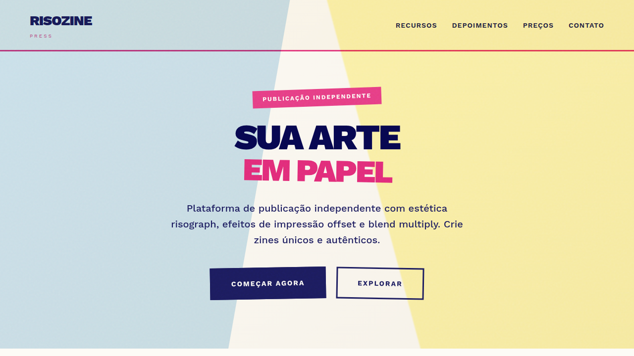
Risograph landing page, zine aesthetics, grainy texture, multiply blending mode, retro print style, bright pink and blue ink. Ideal for landing pages, modern websites. AI-ready template.
Use case: Landing pages, Modern websites
Historical Context
Zines never needed permission. From the punk photocopied pamphlets of the late '70s to the riot grrrl manifestos of the '90s, the zine was always the medium of people who couldn't wait for gatekeepers to let them in. Cheap, fast, imperfect on purpose. Then risograph entered the picture — or rather, re-entered it. Originally a Japanese office duplicator from the 1980s, the Riso machine found a second life in the 2010s among artists, illustrators, and small publishers who craved that specific look: soy-based inks with a grain you can almost feel through the page, misregistered layers that turn accidents into texture. Studios like Hato Press in London and Perfectly Acceptable in Minneapolis turned the machine into a creative tool, not just a reproduction one. What makes the risograph revival stick is economics meeting aesthetics. Short runs of 50–500 copies become viable. Each print carries slight variation — no two copies identical. That imperfection became the point. In a world of pixel-perfect screens, riso reminded people that print could breathe.
When to Use
Reach for this when the project needs to feel handmade without being precious. Indie record sleeves, poetry chapbooks, exhibition catalogs, event posters for venues that smell like beer and creativity. It works when your audience values authenticity over polish — when a slightly off-register cyan layer isn't a mistake, it's a statement. Terrible for corporate annual reports. Perfect for anything that should feel like it was made by humans who care more about the work than the margins.
Design Principles
- Embrace misregistration — offset your color layers by 1-3px intentionally. Perfect alignment kills the entire mood.
- Limit your palette to 2-3 spot colors. Riso inks are not CMYK. Think fluorescent pink, teal, yellow, and the beautiful muddy overlaps where they meet.
- Let paper texture show through. Backgrounds should never be fully opaque. The stock is part of the design, not something to cover up.
- Grain is structure, not decoration. Apply halftone dots and noise as compositional elements — they define hierarchy, not just surface.
- Design for the fold. Zines are physical objects with spines, staples, and pages that wrap. Even on screen, honor that physicality with asymmetric margins and bleed that suggests something beyond the viewport.
DESIGN.md
---
version: "alpha"
name: "Risograph Zine Aesthetic"
description: "Risograph landing page, zine aesthetics, grainy texture, multiply blending mode, retro print style, bright pink and blue ink. Ideal for landing pages, modern websites. AI-ready template."
colors:
  primary: "#FDFBF6"
  secondary: "#1C1C5E"
  tertiary: "#E63E85"
  neutral: "#0078BF"
  surface: "#FFE800"
  accent: "#00A95C"
typography:
  h1:
    fontFamily: Work Sans
    fontSize: 2.5rem
    fontWeight: 700
  body-md:
    fontFamily: Work Sans
    fontSize: 1rem
    fontWeight: 400
components:
  button-primary:
    backgroundColor: "{colors.primary}"
    textColor: "{colors.neutral}"
    padding: 12px
---

## Overview

Risograph landing page, zine aesthetics, grainy texture, multiply blending mode, retro print style, bright pink and blue ink. Ideal for landing pages, modern websites. AI-ready template. Zines never needed permission. From the punk photocopied pamphlets of the late '70s to the riot grrrl manifestos of the '90s, the zine was always the medium of people who couldn't wait for gatekeepers to let them in. Cheap, fast, imperfect on purpose.

Then risograph entered the picture — or rather, re-entered it. Originally a Japanese office duplicator from the 1980s, the Riso machine found a second life in the 2010s among artists, illustrators, and small publishers who craved that specific look: soy-based inks with a grain you can almost feel through the page, misregistered layers that turn accidents into texture. Studios like Hato Press in London and Perfectly Acceptable in Minneapolis turned the machine into a creative tool, not just a reproduction one.

What makes the risograph revival stick is economics meeting aesthetics. Short runs of 50–500 copies become viable. Each print carries slight variation — no two copies identical. That imperfection became the point. In a world of pixel-perfect screens, riso reminded people that print could breathe.

- Density: 5/10 — Balanced
- Variance: 7/10 — Dynamic
- Motion: 1/10 — Static

- **Style:** Tactile, Retro-Intellectual, Approachable
- **Keywords:** risograph, zine, print, overlay, texture, grain, multiply, ink
- **Era:** Indie Print
- **Light/Dark:** ✓ Full / ✗ No

## Colors

- **Background** (#FDFBF6) — Primary background surface
- **Text** (#1C1C5E) — Primary text color
- **Accent** (#E63E85) — Primary accent, CTAs and interactive elements
- **Riso Blue** (#0078BF) — Secondary accent
- **Riso Yellow** (#FFE800) — Warning states, attention indicators
- **Mint** (#00A95C) — Extended palette, decorative use


## Typography

- **Display / Hero:** Work Sans — Weight 700, tight tracking, used for headline impact
- **Body:** Work Sans — Weight 400, 16px/1.6 line-height, max 72ch per line
- **UI Labels / Captions:** Work Sans — 0.875rem, weight 500, slight letter-spacing
- **Monospace:** JetBrains Mono — Used for code, metadata, and technical values

Scale:
- Hero: clamp(2.5rem, 5vw, 4rem)
- H1: 2.25rem
- H2: 1.5rem
- Body: 1rem / 1.6
- Small: 0.875rem


## Layout

- **Grid:** CSS Grid primary. Max-width containment: 1280px centered with 1.5rem side padding.
- **Spacing rhythm:** Balanced. Base unit: 0.5rem (8px).
- **Section vertical gaps:** clamp(4rem, 8vw, 8rem).
- **Hero layout:** Asymmetric composition.
- **Feature sections:** Asymmetric grid with varied card sizes. No 3-equal-columns.
- **Mobile collapse:** All multi-column layouts collapse below 768px. No horizontal overflow.
- **z-index contract:** base (0) / sticky-nav (100) / overlay (200) / modal (300) / toast (500).


## Elevation & Depth

Simulated offset printing, varying opacity layers (multiply effect), coarse paper grain, ink bleed, rough stamp-like stroke edges.

- Minimal motion design. Hover states use color transitions only (150ms).
- No entry animations. No page transitions. Instant, utilitarian feedback.
- Performance: No animation overhead. Static-first approach.


## Shapes

Base corner radius: 8px. See rounded tokens in front matter for the full scale.


## Components

- **Primary Button:** Subtly rounded (0.5rem) shape. Accent color fill. Hover: 8% darken + subtle lift shadow. Active: -1px translate tactile press. Font weight 600. No outer glows.
- **Secondary / Ghost Button:** Outline variant. 1.5px border in muted color. Text in primary color. Hover: subtle background fill.
- **Cards:** Subtly rounded (0.5rem) corners. Surface background. Subtle shadow (0 2px 12px rgba(0,0,0,0.06)). 1px border stroke.
- **Inputs:** Label above input. 1px border stroke. Focus ring: 2px accent color offset 2px. Error text below in semantic red. No floating labels.
- **Navigation:** Primary surface background. Active item: accent color indicator. Font weight 500 when active.
- **Skeletons:** Shimmer animation matching component dimensions. No circular spinners.
- **Empty States:** Icon-based composition with descriptive text and action button.


## Do's and Don'ts

- No emojis in UI — use icon system only (Lucide, Heroicons)
- No pure black (#000000) — use off-black or charcoal variants
- No oversaturated accent colors (saturation cap: 80%)
- No 3-column equal-width feature layouts — use zig-zag or asymmetric grid
- No `h-screen` — use `min-h-[100dvh]`
- No AI copywriting clichés: "Elevate", "Seamless", "Unleash", "Next-Gen"
- No broken external image links — use picsum.photos or inline SVG
- No generic lorem ipsum in demos

- Do Off-white/Paper background
- Do Multiply blending modes on colors
- Do Grainy/Noise texture overlay
- Do Misaligned registration effects
- Do Limited color palette (CMYK-ish)


## Use Case

Landing pages, Modern websites
Technical Specs
CSS
background-color: #FDFBF6; color: #1C1C5E; font-family: 'Work Sans', sans-serif; mix-blend-mode: multiply; filter: contrast(120%) brightness(90%);
Variables
--paper-offwhite: #FDFBF6, --iso-pink: #E63E85, --iso-blue: #1C1C5E, --blend-mode: multiply, --font-sans: 'Work Sans', sans-serif
Checklist
☐ Off-white/Paper background, ☐ Multiply blending modes on colors, ☐ Grainy/Noise texture overlay, ☐ Misaligned registration effects, ☐ Limited color palette (CMYK-ish)
Colors
Primary
Secondary
Effects
Simulated offset printing, varying opacity layers (multiply effect), coarse paper grain, ink bleed, rough stamp-like stroke edges.
Light/Dark
✓ Full / ✗ No
AI Prompt
Act as a Senior Frontend Engineer and Expert UI Designer.
Your task is to code a complete Landing Page on the first attempt.
- Landing Page Theme: <INSERT THEME>
- Sections to add: <INSERT SECTIONS>

Generate the final code immediately following these definitions:

## Style

- **Name:** Risograph Zine Aesthetic
- **Type:** Tactile, Retro-Intellectual, Approachable
- **Keywords:** risograph, zine, print, overlay, texture, grain, multiply, ink
- **Era:** Indie Print
- **Light/Dark:** ✓ Full / ✗ No

## Color Palette

- **Primary:** Background #FDFBF6, Text #1C1C5E, Accent #E63E85
- **Secondary:** Riso Blue #0078BF, Riso Yellow #FFE800, Mint #00A95C

## Visual Effects

Simulated offset printing, varying opacity layers (multiply effect), coarse paper grain, ink bleed, rough stamp-like stroke edges.

## AI Visual Direction

risograph landing page, zine aesthetics, grainy texture, multiply blending mode, retro print style, bright pink and blue ink.

## CSS Technical

```css
background-color: #FDFBF6; color: #1C1C5E; font-family: 'Work Sans', sans-serif; mix-blend-mode: multiply; filter: contrast(120%) brightness(90%);
```

## Design System Variables

```css
--paper-offwhite: #FDFBF6, --iso-pink: #E63E85, --iso-blue: #1C1C5E, --blend-mode: multiply, --font-sans: 'Work Sans', sans-serif
```

## Implementation Checklist

- ☐ Off-white/Paper background
- ☐ Multiply blending modes on colors
- ☐ Grainy/Noise texture overlay
- ☐ Misaligned registration effects
- ☐ Limited color palette (CMYK-ish)

## Execution Rules

1. Strictly follow the defined visual style.
2. Use high-quality inline SVG icons (Heroicons or Lucide style) — NEVER use emojis as icons.
3. Add `cursor-pointer` and smooth `hover` states (transition-all) on all interactive elements.
4. Required Page Structure:
   - Navbar (Logo + Links + CTA)
   - Hero Section (Impactful Headline + Subtitle + 2 buttons + 3D/Abstract visual element via CSS)
   - Features (3 cards with icons)
   - Testimonials (3 cards)
   - Pricing (3 tiers, highlight the middle one)
   - Final CTA
   - Full Footer with social links, privacy policy, terms of use, contact and SEO links.
5. All text content must be in English.
6. The visual must be CLEARLY distinct — do not create a "default Bootstrap" design. Force the use of the provided design system variables.
7. Use `<style>` tags in the head for custom classes (especially for complex backdrop-filter effects and animations) that Tailwind CDN doesn't cover.
8. Full Responsiveness: Layout must adapt perfectly to Mobile, Tablet and Desktop (vertical stack on mobile).
9. Include basic SEO, Viewport and Open Graph meta tags in `<head>`.
10. Footer must contain: Copyright 2026, Secondary navigation links and Social media icons.
11. Make the creative decisions needed to deliver the complete, functional result now.
Related
Last synced: 4/1/2026