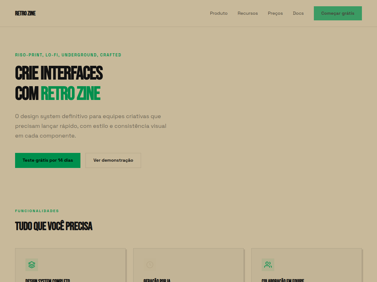
Retro Zine
Retro Zine — Beige paper with green accent and Bebas Neue + Caveat: a riso-printed zine in HTML form. Bebas Neue typography. warm beige / khaki paper with one saturated forest green. Best for indie zine / publication, music or arts brand, creator portfolio. AI-ready design system.
Use case: indie zine / publication, music or arts brand, creator portfolio, small-batch / craft launch, cultural / community deck
Historical Context
Risograph printing wasn't supposed to become an aesthetic. It was a Japanese office duplicator from the 1980s — Riso Kagaku's answer to expensive offset runs. Churches printed bulletins on it. Schools cranked out worksheets. The machine was fast, cheap, and imperfect in ways nobody cared about because the output was disposable. Then zine makers got their hands on it. By the mid-2000s, independent publishers realized that the soy-based inks, the slight misregistration between color passes, the grain of the drum — all of it produced something that felt alive in a way laser printers never could. The limitations became the language. Beige uncoated stock wasn't a budget compromise anymore; it was a deliberate canvas that let spot colors sing differently than they would on bright white. The green accent specifically traces back to the fluorescent ink cartridges Riso offered — colors you literally cannot reproduce in CMYK. That constraint bred a whole visual culture: limited palettes, overprint surprises, happy accidents elevated to design decisions. It's print culture's answer to lo-fi music production.
When to Use
When your project needs to feel made by hands, not committees. Retro Zine works for indie publishers who want their digital presence to carry the same tactile energy as their printed output. It's right for art collectives announcing shows, DIY brands that reject corporate polish, and anyone whose audience reads "rough" as "authentic" rather than "unfinished." Avoid it for anything requiring institutional trust — banks, healthcare, legal. The aesthetic signals counterculture on purpose.
Design Principles
- Embrace misregistration — offset elements by 1-3px intentionally. Perfect alignment kills the entire premise.
- Limit your palette brutally. Two spot colors plus the paper tone. If you need a third color, get it through overprint, not a new swatch.
- Paper texture is structural, not decorative. The beige ground should influence every color choice — nothing exists in isolation from the stock.
- Typography should reference mechanical reproduction: typewriter faces, hand-lettered headers, or tight grotesks that nod to paste-up layout. Never use geometric sans-serifs that scream digital-native.
- Let ink coverage be uneven. Grain, halftone dots, and density variation are features. The moment everything looks uniformly smooth, you've lost the plot.
Technical Specs
Colors
Primary
Secondary
Effects
display font Bebas Neue for hero headlines, smooth hover transitions (200-250ms), subtle lift shadows, riso-print grain texture, beige paper, green accent, Caveat handwriting
Light/Dark
✓ Full / ✗ None
Related
Last synced: 5/6/2026