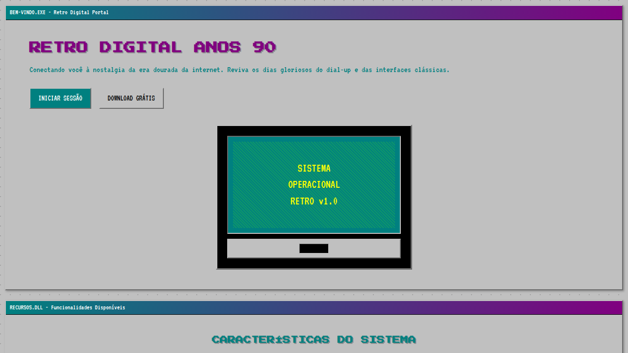
Retro Digital Anos 90
Nostalgic and playful retro landing page for a 90s-style digital marketing agency. Ideal for landing pages, modern websites. AI-ready template.
Use case: Landing pages, Modern websites
Historical Context
Before algorithms decided what you'd see, the internet was a mess — and it was glorious. GeoCities pages stacked animated GIFs on tiled backgrounds, visitor counters ticked upward like badges of honor, and "Under Construction" signs were everywhere because everything genuinely was. The early web had no gatekeepers. A twelve-year-old's Sailor Moon fansite sat next to a PhD's research page, both equally ugly, both equally valid. Marquee text scrolled endlessly. Frames broke navigation. It was chaos with a blinking cursor. That rawness is exactly what makes 90s digital aesthetics resonate now. For millennials, these visuals aren't just retro — they're emotional shorthand for a time when the internet felt like discovery, not consumption. The pixelated edges, the system fonts, the garish color clashes — they represent optimism about technology before tech became surveillance. Designers started pulling these elements back around 2018, first ironically, then sincerely. What began as vaporwave moodboards evolved into legitimate brand identities. The aesthetic works because it signals authenticity in an era of polished sameness. It says: we remember when things were weird, and we liked it better that way.
When to Use
Reach for this when your audience has dial-up in their bones. Millennial-targeted campaigns, nostalgia-driven product launches, retro tech brands, anything that needs to feel like it was built before venture capital ruined the internet. Works beautifully for limited drops, throwback collections, and brands that want personality over polish. Avoid it for anything requiring trust signals — healthcare, finance, enterprise SaaS. The aesthetic reads as playful and irreverent, never authoritative.
Design Principles
- Embrace the pixel — anti-alias nothing, let edges bite, use bitmap fonts and integer scaling to honor the low-resolution origins
- Color without committee — 90s web had no brand guidelines, so lean into clashing hues, web-safe palettes, and saturated backgrounds that would fail any modern accessibility audit (then fix contrast where it actually matters)
- Layer the artifacts — visitor counters, star dividers, tiled backgrounds, and "best viewed in Netscape" badges aren't decoration, they're worldbuilding that signals temporal specificity
- Motion means animation frames, not easing curves — think GIF loops, blinking text, and marquee scrolls rather than smooth 60fps transitions
- Structure through chaos — use visible tables, hard borders, and asymmetric layouts that feel hand-placed rather than grid-snapped, but maintain actual usability underneath the aesthetic layer
DESIGN.md
---
version: "alpha"
name: "Retro Digital Anos 90"
description: "Nostalgic and playful retro landing page for a 90s-style digital marketing agency. Ideal for landing pages, modern websites. AI-ready template."
colors:
  primary: "#008080"
  secondary: "#800080"
  tertiary: "#FFFF00"
  neutral: "#C0C0C0"
  surface: "#32CD32"
  accent: "#FF00CC"
typography:
  h1:
    fontFamily: Pixelade
    fontSize: 2.5rem
    fontWeight: 700
  body-md:
    fontFamily: Pixelade
    fontSize: 1rem
    fontWeight: 400
components:
  button-primary:
    backgroundColor: "{colors.primary}"
    textColor: "{colors.neutral}"
    padding: 12px
---

## Overview

Nostalgic and playful retro landing page for a 90s-style digital marketing agency. Ideal for landing pages, modern websites. AI-ready template. Before algorithms decided what you'd see, the internet was a mess — and it was glorious. GeoCities pages stacked animated GIFs on tiled backgrounds, visitor counters ticked upward like badges of honor, and "Under Construction" signs were everywhere because everything genuinely was. The early web had no gatekeepers. A twelve-year-old's Sailor Moon fansite sat next to a PhD's research page, both equally ugly, both equally valid. Marquee text scrolled endlessly. Frames broke navigation. It was chaos with a blinking cursor.

That rawness is exactly what makes 90s digital aesthetics resonate now. For millennials, these visuals aren't just retro — they're emotional shorthand for a time when the internet felt like discovery, not consumption. The pixelated edges, the system fonts, the garish color clashes — they represent optimism about technology before tech became surveillance.

Designers started pulling these elements back around 2018, first ironically, then sincerely. What began as vaporwave moodboards evolved into legitimate brand identities. The aesthetic works because it signals authenticity in an era of polished sameness. It says: we remember when things were weird, and we liked it better that way.

- Density: 5/10 — Balanced
- Variance: 7/10 — Dynamic
- Motion: 8/10 — Cinematic

- **Style:** Nostalgic, Playful, Digital
- **Keywords:** digital marketing, 90s retro, nostalgic, playful, pixelated, vibrant, quirky, authentic, internet, fun
- **Era:** 1990s Early Internet
- **Light/Dark:** ✓ Full / ✗ No

## Colors

- **Azul Teal** (#008080) — Accent highlight, links and focus states
- **Roxo** (#800080) — Accent color, emphasis elements
- **Amarelo Neon** (#FFFF00) — Warning states, attention indicators
- **Cinza Claro** (#C0C0C0) — Secondary text, borders, muted elements
- **Verde Limão** (#32CD32) — Success states, positive indicators
- **Rosa Choque** (#FF00CC) — Decorative accent, highlight elements
- **Laranja** (#FFA500) — Warm accent, call-to-action secondary
- **Preto** (#000000) — Deep contrast surface


## Typography

- **Display / Hero:** Pixelade — Weight 700, tight tracking, used for headline impact
- **Body:** Pixelade — Weight 400, 16px/1.6 line-height, max 72ch per line
- **UI Labels / Captions:** Pixelade — 0.875rem, weight 500, slight letter-spacing
- **Monospace:** JetBrains Mono — Used for code, metadata, and technical values

Scale:
- Hero: clamp(2.5rem, 5vw, 4rem)
- H1: 2.25rem
- H2: 1.5rem
- Body: 1rem / 1.6
- Small: 0.875rem


## Layout

- **Grid:** CSS Grid primary. Max-width containment: 1280px centered with 1.5rem side padding.
- **Spacing rhythm:** Balanced. Base unit: 0.5rem (8px).
- **Section vertical gaps:** clamp(4rem, 8vw, 8rem).
- **Hero layout:** Asymmetric composition.
- **Feature sections:** Asymmetric grid with varied card sizes. No 3-equal-columns.
- **Mobile collapse:** All multi-column layouts collapse below 768px. No horizontal overflow.
- **z-index contract:** base (0) / sticky-nav (100) / overlay (200) / modal (300) / toast (500).


## Elevation & Depth

Elementos de UI de sistemas operacionais antigos (janelas, botões 3D), tipografia pixelizada e "web-safe", fundos com padrões geométricos e texturas de "ruído", bordas com efeito de "bisel", micro-interações de clique com som de "dial-up", animações de transição de tela com efeito de "varredura" ou "pixelização".

- **Physics:** Spring — stiffness 120, damping 20. Confident, weighted transitions.
- **Entry animations:** Fade + translate-Y (16px → 0) over 540ms ease-out. Staggered cascades for lists: 120ms between items.
- **Hover states:** Scale(1.03) + shadow lift over 200ms.
- **Page transitions:** Fade + slide (300ms).
- **Performance:** Only transform and opacity animated. No layout-triggering properties.


## Shapes

Base corner radius: 8px. See rounded tokens in front matter for the full scale.


## Components

- **Primary Button:** Subtly rounded (0.5rem) shape. Accent color fill. Hover: 8% darken + subtle lift shadow. Active: -1px translate tactile press. Font weight 600. No outer glows.
- **Secondary / Ghost Button:** Outline variant. 1.5px border in muted color. Text in primary color. Hover: subtle background fill.
- **Cards:** Subtly rounded (0.5rem) corners. Surface background. Subtle shadow (0 2px 12px rgba(0,0,0,0.06)). 1px border stroke.
- **Inputs:** Label above input. 1px border stroke. Focus ring: 2px accent color offset 2px. Error text below in semantic red. No floating labels.
- **Navigation:** Primary surface background. Active item: accent color indicator. Font weight 500 when active.
- **Skeletons:** Shimmer animation matching component dimensions. No circular spinners.
- **Empty States:** Icon-based composition with descriptive text and action button.


## Do's and Don'ts

- No emojis in UI — use icon system only (Lucide, Heroicons)
- No pure black (#000000) — use off-black or charcoal variants
- No oversaturated accent colors (saturation cap: 80%)
- No 3-column equal-width feature layouts — use zig-zag or asymmetric grid
- No `h-screen` — use `min-h-[100dvh]`
- No AI copywriting clichés: "Elevate", "Seamless", "Unleash", "Next-Gen"
- No broken external image links — use picsum.photos or inline SVG
- No generic lorem ipsum in demos

- Do Elementos de UI antiga
- Do Tipografia pixelizada/web-safe
- Do Fundos com padrões/ruído
- Do Bordas com efeito de bisel
- Do Micro-interações com som de dial-up
- Do Animações de varredura/pixelização.


## Use Case

Landing pages, Modern websites
Technical Specs
CSS
background: #C0C0C0, color: #000000, border: 2px outset #FFFFFF, font-family: "Pixelade, monospace", text-shadow: 1px 1px #808080, .old-ui-element, .pixel-pattern-bg, .bevel-border.
Variables
--teal-blue: #008080, --purple-accent: #800080, --neon-yellow: #FFFF00, --light-grey-bg: #C0C0C0, --font-pixel: "Pixelade, monospace", --noise-texture-bg: url("noise.png"), --bevel-effect: inset 2px 2px 0px #FFFFFF, inset -2px -2px 0px #808080. Checklist
☐ Elementos de UI antiga, ☐ Tipografia pixelizada/web-safe, ☐ Fundos com padrões/ruído, ☐ Bordas com efeito de bisel, ☐ Micro-interações com som de dial-up, ☐ Animações de varredura/pixelização.
Colors
Primary
Secondary
Effects
Elementos de UI de sistemas operacionais antigos (janelas, botões 3D), tipografia pixelizada e "web-safe", fundos com padrões geométricos e texturas de "ruído", bordas com efeito de "bisel", micro-interações de clique com som de "dial-up", animações de transição de tela com efeito de "varredura" ou "pixelização".
Light/Dark
✓ Full / ✗ No
AI Prompt
Act as a Senior Frontend Engineer and Expert UI Designer.
Your task is to code a complete Landing Page on the first attempt.
- Landing Page Theme: <INSERT THEME>
- Sections to add: <INSERT SECTIONS>

Generate the final code immediately following these definitions:

## Style

- **Name:** Retro Digital Anos 90
- **Type:** Nostalgic, Playful, Digital
- **Keywords:** digital marketing, 90s retro, nostalgic, playful, pixelated, vibrant, quirky, authentic, internet, fun
- **Era:** 1990s Early Internet
- **Light/Dark:** ✓ Full / ✗ No

## Color Palette

- **Primary:** Azul Teal #008080, Roxo #800080, Amarelo Neon #FFFF00, Cinza Claro #C0C0C0
- **Secondary:** Verde Limão #32CD32, Rosa Choque #FF00CC, Laranja #FFA500, Preto #000000

## Visual Effects

Elementos de UI de sistemas operacionais antigos (janelas, botões 3D), tipografia pixelizada e "web-safe", fundos com padrões geométricos e texturas de "ruído", bordas com efeito de "bisel", micro-interações de clique com som de "dial-up", animações de transição de tela com efeito de "varredura" ou "pixelização".

## AI Visual Direction

Design a nostalgic and playful retro landing page for a 90s-style digital marketing agency. Use: old OS UI elements (windows, 3D buttons), pixelated/web-safe typography, geometric patterns and noise textures, bevel-effect borders, "dial-up" sound click micro-interactions, scanline/pixelation screen transition animations, teal and purple accents, quirky and fun feel.

## CSS Technical

```css
background: #C0C0C0, color: #000000, border: 2px outset #FFFFFF, font-family: "Pixelade, monospace", text-shadow: 1px 1px #808080, .old-ui-element, .pixel-pattern-bg, .bevel-border.
```

## Design System Variables

```css
--teal-blue: #008080, --purple-accent: #800080, --neon-yellow: #FFFF00, --light-grey-bg: #C0C0C0, --font-pixel: "Pixelade, monospace", --noise-texture-bg: url("noise.png"), --bevel-effect: inset 2px 2px 0px #FFFFFF, inset -2px -2px 0px #808080.
```

## Implementation Checklist

- ☐ Elementos de UI antiga
- ☐ Tipografia pixelizada/web-safe
- ☐ Fundos com padrões/ruído
- ☐ Bordas com efeito de bisel
- ☐ Micro-interações com som de dial-up
- ☐ Animações de varredura/pixelização.

## Execution Rules

1. Strictly follow the defined visual style.
2. Use high-quality inline SVG icons (Heroicons or Lucide style) — NEVER use emojis as icons.
3. Add `cursor-pointer` and smooth `hover` states (transition-all) on all interactive elements.
4. Required Page Structure:
   - Navbar (Logo + Links + CTA)
   - Hero Section (Impactful Headline + Subtitle + 2 buttons + 3D/Abstract visual element via CSS)
   - Features (3 cards with icons)
   - Testimonials (3 cards)
   - Pricing (3 tiers, highlight the middle one)
   - Final CTA
   - Full Footer with social links, privacy policy, terms of use, contact and SEO links.
5. All text content must be in English.
6. The visual must be CLEARLY distinct — do not create a "default Bootstrap" design. Force the use of the provided design system variables.
7. Use `<style>` tags in the head for custom classes (especially for complex backdrop-filter effects and animations) that Tailwind CDN doesn't cover.
8. Full Responsiveness: Layout must adapt perfectly to Mobile, Tablet and Desktop (vertical stack on mobile).
9. Include basic SEO, Viewport and Open Graph meta tags in `<head>`.
10. Footer must contain: Copyright 2026, Secondary navigation links and Social media icons.
11. Make the creative decisions needed to deliver the complete, functional result now. Related
Last synced: 4/1/2026