Retro-Comic Action Blueprint
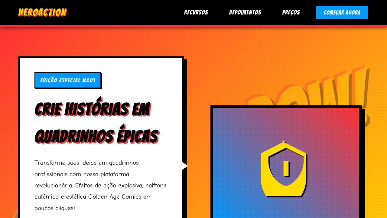
Retro comic landing page, superhero style, pop art, halftone dots, speech bubbles, bold black outlines, bright primary colors. Ideal for landing pages, modern websites. AI-ready template.
Use case: Landing pages, Modern websites
Historical Context
The retro-comic action blueprint draws from a lineage that most designers reference but few truly understand. It starts with Jack Kirby's explosive page compositions in the 1960s — those crackling energy fields, the forced perspective, the unapologetic dynamism that made static pages feel like they'd punch through the paper. Kirby didn't do subtlety. Neither does this system. But the real DNA here isn't just Golden or Silver Age comics. It's the collision point: Ben-Day dots meeting screenprint aesthetics, Lichtenstein's pop art appropriation feeding back into the source material it stole from. By the 1980s, comics themselves had absorbed their own parody. Bold outlines got bolder. Colors went flatter. Action lines multiplied. The visual language became self-aware without losing its punch. What makes this blueprint distinct from generic "comic book" theming is the structural rigor underneath the chaos. Every splash of halftone, every speed line, every knockout type treatment follows compositional rules borrowed from propaganda posters and pulp covers — media designed to grab attention at newsstand distance. That's not decoration. That's information hierarchy weaponized.
When to Use
Deploy this when your brand needs to hit hard and fast — zero ambiguity, maximum energy. Gaming launches, esports events, entertainment apps targeting 16-30 demographics, streetwear drops, energy drink campaigns. It works when your audience already speaks visual shorthand: they see a starburst and read "impact" without thinking. Terrible for anything requiring trust signals, financial services, or healthcare. This system assumes your user wants to feel something loud. If your brief says "sophisticated" or "minimal," walk away.
Design Principles
- Maximum contrast, minimum hesitation — every element either dominates or supports, nothing floats in limbo between roles
- Halftone and texture as structural elements, not decorative afterthoughts — dots define depth, grain defines hierarchy
- Typography must shout before it speaks — display type at action-figure scale, body copy tight and secondary
- Color palettes limited to 4-5 flat, saturated hues with black keyline containment — CMYK logic even in RGB execution
- Motion and implied kinetics in every static composition — if it doesn't feel like it's about to leap off the frame, push harder
DESIGN.md
---
version: "alpha"
name: "Retro-Comic Action Blueprint"
description: "Retro comic landing page, superhero style, pop art, halftone dots, speech bubbles, bold black outlines, bright primary colors. Ideal for landing pages, modern websites. AI-ready template."
colors:
  primary: "#FFDD00"
  secondary: "#000000"
  tertiary: "#FF3333"
  neutral: "#0099FF"
  surface: "#FFFFFF"
  accent: "#000000"
typography:
  h1:
    fontFamily: Bangers
    fontSize: 2.5rem
    fontWeight: 700
  body-md:
    fontFamily: Bangers
    fontSize: 1rem
    fontWeight: 400
components:
  button-primary:
    backgroundColor: "{colors.primary}"
    textColor: "{colors.neutral}"
    padding: 12px
---

## Overview

Retro comic landing page, superhero style, pop art, halftone dots, speech bubbles, bold black outlines, bright primary colors. Ideal for landing pages, modern websites. AI-ready template. The retro-comic action blueprint draws from a lineage that most designers reference but few truly understand. It starts with Jack Kirby's explosive page compositions in the 1960s — those crackling energy fields, the forced perspective, the unapologetic dynamism that made static pages feel like they'd punch through the paper. Kirby didn't do subtlety. Neither does this system.

But the real DNA here isn't just Golden or Silver Age comics. It's the collision point: Ben-Day dots meeting screenprint aesthetics, Lichtenstein's pop art appropriation feeding back into the source material it stole from. By the 1980s, comics themselves had absorbed their own parody. Bold outlines got bolder. Colors went flatter. Action lines multiplied. The visual language became self-aware without losing its punch.

What makes this blueprint distinct from generic "comic book" theming is the structural rigor underneath the chaos. Every splash of halftone, every speed line, every knockout type treatment follows compositional rules borrowed from propaganda posters and pulp covers — media designed to grab attention at newsstand distance. That's not decoration. That's information hierarchy weaponized.

- Density: 5/10 — Balanced
- Variance: 7/10 — Dynamic
- Motion: 1/10 — Static

- **Style:** Energetic, Heroic, Nostalgic
- **Keywords:** comic, superhero, retro, action, halftone, bold, boom, pow
- **Era:** Golden Age Comics
- **Light/Dark:** ✓ Full / ✗ No

## Colors

- **Background** (#FFDD00) — Primary background surface
- **Text** (#000000) — Primary text color
- **Accent** (#FF3333) — Primary accent, CTAs and interactive elements
- **Comic Blue** (#0099FF) — Secondary accent
- **White** (#FFFFFF) — Secondary surface
- **Black Ink** (#000000) — Deep contrast surface


## Typography

- **Display / Hero:** Bangers — Weight 700, tight tracking, used for headline impact
- **Body:** Bangers — Weight 400, 16px/1.6 line-height, max 72ch per line
- **UI Labels / Captions:** Bangers — 0.875rem, weight 500, slight letter-spacing
- **Monospace:** JetBrains Mono — Used for code, metadata, and technical values

Scale:
- Hero: clamp(2.5rem, 5vw, 4rem)
- H1: 2.25rem
- H2: 1.5rem
- Body: 1rem / 1.6
- Small: 0.875rem


## Layout

- **Grid:** CSS Grid primary. Max-width containment: 1280px centered with 1.5rem side padding.
- **Spacing rhythm:** Balanced. Base unit: 0.5rem (8px).
- **Section vertical gaps:** clamp(4rem, 8vw, 8rem).
- **Hero layout:** Asymmetric composition.
- **Feature sections:** Asymmetric grid with varied card sizes. No 3-equal-columns.
- **Mobile collapse:** All multi-column layouts collapse below 768px. No horizontal overflow.
- **z-index contract:** base (0) / sticky-nav (100) / overlay (200) / modal (300) / toast (500).


## Elevation & Depth

Thick black ink outlines, Ben-Day dot shading patterns, speech bubbles, explosive action bursts, vintage newsprint aesthetic.

- Minimal motion design. Hover states use color transitions only (150ms).
- No entry animations. No page transitions. Instant, utilitarian feedback.
- Performance: No animation overhead. Static-first approach.


## Shapes

Base corner radius: 8px. See rounded tokens in front matter for the full scale.


## Components

- **Primary Button:** Subtly rounded (0.5rem) shape. Accent color fill. Hover: 8% darken + subtle lift shadow. Active: -1px translate tactile press. Font weight 600. No outer glows.
- **Secondary / Ghost Button:** Outline variant. 1.5px border in muted color. Text in primary color. Hover: subtle background fill.
- **Cards:** Subtly rounded (0.5rem) corners. Surface background. Subtle shadow (0 2px 12px rgba(0,0,0,0.06)). 1px border stroke.
- **Inputs:** Label above input. 1px border stroke. Focus ring: 2px accent color offset 2px. Error text below in semantic red. No floating labels.
- **Navigation:** Primary surface background. Active item: accent color indicator. Font weight 500 when active.
- **Skeletons:** Shimmer animation matching component dimensions. No circular spinners.
- **Empty States:** Icon-based composition with descriptive text and action button.


## Do's and Don'ts

- No emojis in UI — use icon system only (Lucide, Heroicons)
- No pure black (#000000) — use off-black or charcoal variants
- No oversaturated accent colors (saturation cap: 80%)
- No 3-column equal-width feature layouts — use zig-zag or asymmetric grid
- No `h-screen` — use `min-h-[100dvh]`
- No AI copywriting clichés: "Elevate", "Seamless", "Unleash", "Next-Gen"
- No broken external image links — use picsum.photos or inline SVG
- No generic lorem ipsum in demos

- Do Bright Yellow/Red/Blue palette
- Do Thick black borders/outlines
- Do Halftone (dots) textures
- Do Comic book fonts
- Do Speech bubble containers


## Use Case

Landing pages, Modern websites
Technical Specs
CSS
background-color: #FFDD00; color: #000000; font-family: 'Bangers', cursive; border: 4px solid #000000; box-shadow: 5px 5px 0px #000000; background-image: radial-gradient(#000 15%, transparent 16%); background-size: 10px 10px;
Variables
--comic-yellow: #FFDD00, --comic-red: #FF3333, --comic-blue: #0099FF, --ink-black: #000000, --font-comic: 'Bangers', cursive
Checklist
☐ Bright Yellow/Red/Blue palette, ☐ Thick black borders/outlines, ☐ Halftone (dots) textures, ☐ Comic book fonts, ☐ Speech bubble containers
Colors
Primary
Secondary
Effects
Thick black ink outlines, Ben-Day dot shading patterns, speech bubbles, explosive action bursts, vintage newsprint aesthetic.
Light/Dark
✓ Full / ✗ No
AI Prompt
Act as a Senior Frontend Engineer and Expert UI Designer.
Your task is to code a complete Landing Page on the first attempt.
- Landing Page Theme: <INSERT THEME>
- Sections to add: <INSERT SECTIONS>

Generate the final code immediately following these definitions:

## Style

- **Name:** Retro-Comic Action Blueprint
- **Type:** Energetic, Heroic, Nostalgic
- **Keywords:** comic, superhero, retro, action, halftone, bold, boom, pow
- **Era:** Golden Age Comics
- **Light/Dark:** ✓ Full / ✗ No

## Color Palette

- **Primary:** Background #FFDD00, Text #000000, Accent #FF3333
- **Secondary:** Comic Blue #0099FF, White #FFFFFF, Black Ink #000000

## Visual Effects

Thick black ink outlines, Ben-Day dot shading patterns, speech bubbles, explosive action bursts, vintage newsprint aesthetic.

## AI Visual Direction

retro comic landing page, superhero style, pop art, halftone dots, speech bubbles, bold black outlines, bright primary colors.

## CSS Technical

```css
background-color: #FFDD00; color: #000000; font-family: 'Bangers', cursive; border: 4px solid #000000; box-shadow: 5px 5px 0px #000000; background-image: radial-gradient(#000 15%, transparent 16%); background-size: 10px 10px;
```

## Design System Variables

```css
--comic-yellow: #FFDD00, --comic-red: #FF3333, --comic-blue: #0099FF, --ink-black: #000000, --font-comic: 'Bangers', cursive
```

## Implementation Checklist

- ☐ Bright Yellow/Red/Blue palette
- ☐ Thick black borders/outlines
- ☐ Halftone (dots) textures
- ☐ Comic book fonts
- ☐ Speech bubble containers

## Execution Rules

1. Strictly follow the defined visual style.
2. Use high-quality inline SVG icons (Heroicons or Lucide style) — NEVER use emojis as icons.
3. Add `cursor-pointer` and smooth `hover` states (transition-all) on all interactive elements.
4. Required Page Structure:
   - Navbar (Logo + Links + CTA)
   - Hero Section (Impactful Headline + Subtitle + 2 buttons + 3D/Abstract visual element via CSS)
   - Features (3 cards with icons)
   - Testimonials (3 cards)
   - Pricing (3 tiers, highlight the middle one)
   - Final CTA
   - Full Footer with social links, privacy policy, terms of use, contact and SEO links.
5. All text content must be in English.
6. The visual must be CLEARLY distinct — do not create a "default Bootstrap" design. Force the use of the provided design system variables.
7. Use `<style>` tags in the head for custom classes (especially for complex backdrop-filter effects and animations) that Tailwind CDN doesn't cover.
8. Full Responsiveness: Layout must adapt perfectly to Mobile, Tablet and Desktop (vertical stack on mobile).
9. Include basic SEO, Viewport and Open Graph meta tags in `<head>`.
10. Footer must contain: Copyright 2026, Secondary navigation links and Social media icons.
11. Make the creative decisions needed to deliver the complete, functional result now.
Related
Last synced: 4/1/2026