Retro Boutique Vintage
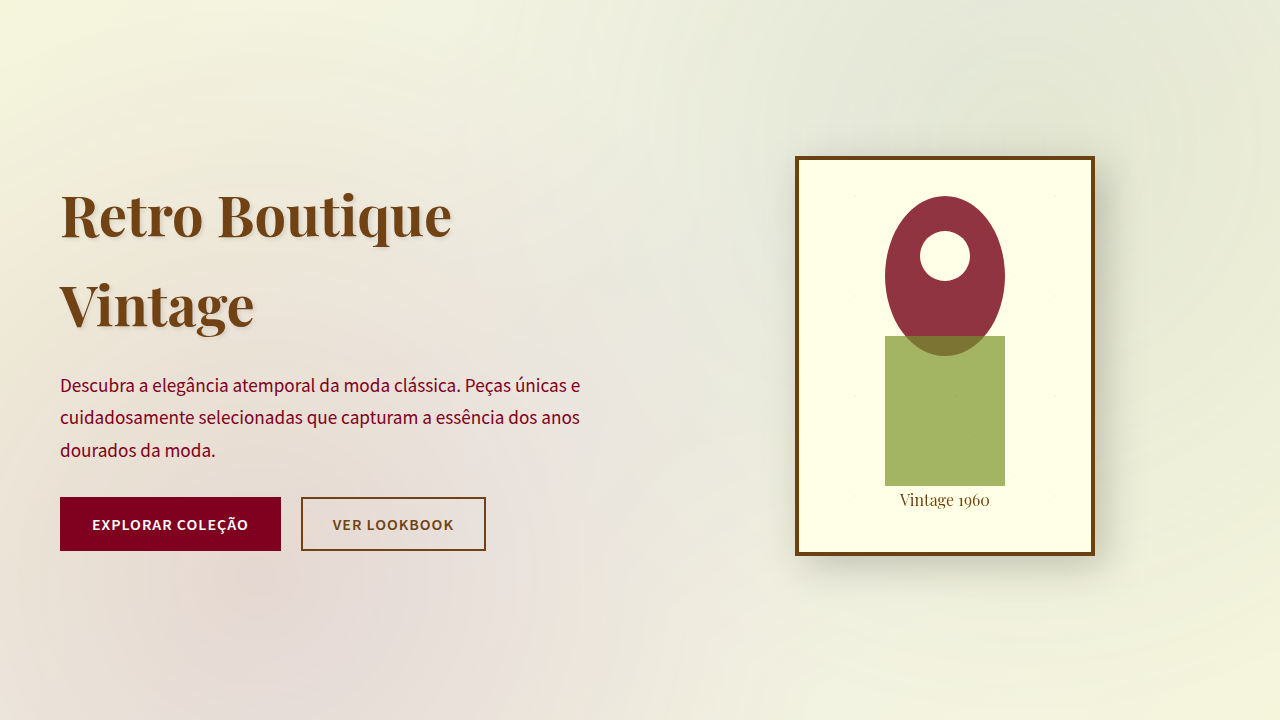
Nostalgic and elegant retro landing page for a vintage clothing store. Ideal for landing pages, modern websites. AI-ready template.
Use case: Landing pages, Modern websites
Historical Context
The vintage boutique aesthetic didn't emerge from design studios. It crawled out of Etsy shops, Depop listings, and Instagram accounts run by people who genuinely loved the hunt. Thrift culture — messy, personal, obsessive — needed a visual language that felt found rather than manufactured. Hand-lettered price tags. Polaroid textures. Color palettes pulled from faded concert tees and sun-bleached book covers. The web caught up around 2015 when sustainability became a selling point, not just a lifestyle choice. What makes this aesthetic stick is the tension between curation and chaos. A vintage shop owner arranges a rack with intention, but the magic is in the dig. Translating that to screen meant embracing imperfection — slightly off-grid layouts, warm grain overlays, typography that references decades without cosplaying them. The sustainability narrative gave it commercial legs. Secondhand became aspirational. The visual language followed: earthy, textured, deliberately un-polished. Today it reads as both countercultural and mainstream. That's the trick. It signals taste without trying too hard — which is, of course, trying very hard indeed.
When to Use
Deploy this when the brand identity lives in the space between curated and casual. Vintage clothing shops, thrift marketplaces, secondhand platforms, consignment stores — anywhere the product has a previous life and that history is the point. Works beautifully for sustainability-forward fashion brands that reject fast-fashion polish. Also fits record stores, vintage furniture dealers, and any commerce experience where provenance matters more than newness. Skip it if the product is actually new pretending to be old — customers smell that immediately.
Design Principles
- Texture over flatness — grain, paper stocks, subtle noise. Every surface should feel like it's been touched, folded, lived in. Digital shouldn't mean sterile.
- Typography with memory — pull from specific decades but don't parody them. A 70s serif next to a modern grotesque creates dialogue. Full period cosplay looks like a costume party.
- Warm, desaturated palettes — think sun-faded denim, aged paper, oxidized metals. High saturation kills the mood instantly. Let colors feel like they've mellowed over time.
- Intentional imperfection in layout — slightly asymmetric grids, elements that breathe unevenly, whitespace that feels organic rather than mathematical. Precision reads as corporate here.
- Photography as artifact — images should feel discovered, not produced. Soft focus, natural light, visible grain. The moment it looks like a studio shoot, the authenticity evaporates.
DESIGN.md
---
version: "alpha"
name: "Retro Boutique Vintage"
description: "Nostalgic and elegant retro landing page for a vintage clothing store. Ideal for landing pages, modern websites. AI-ready template."
colors:
  primary: "#704214"
  secondary: "#F5F5DC"
  tertiary: "#6B8E23"
  neutral: "#800020"
  surface: "#008080"
  accent: "#FFD700"
typography:
  h1:
    fontFamily: Playfair Display
    fontSize: 2.25rem
    fontWeight: 700
  body-md:
    fontFamily: Playfair Display
    fontSize: 1rem
    fontWeight: 400
  label-caps:
    fontFamily: Playfair Display
    fontSize: 0.75rem
    fontWeight: 500
components:
  button-primary:
    backgroundColor: "{colors.primary}"
    textColor: "{colors.neutral}"
    padding: 12px
---

## Overview

Nostalgic and elegant retro landing page for a vintage clothing store. Ideal for landing pages, modern websites. AI-ready template. The vintage boutique aesthetic didn't emerge from design studios. It crawled out of Etsy shops, Depop listings, and Instagram accounts run by people who genuinely loved the hunt. Thrift culture — messy, personal, obsessive — needed a visual language that felt found rather than manufactured. Hand-lettered price tags. Polaroid textures. Color palettes pulled from faded concert tees and sun-bleached book covers. The web caught up around 2015 when sustainability became a selling point, not just a lifestyle choice.

What makes this aesthetic stick is the tension between curation and chaos. A vintage shop owner arranges a rack with intention, but the magic is in the dig. Translating that to screen meant embracing imperfection — slightly off-grid layouts, warm grain overlays, typography that references decades without cosplaying them. The sustainability narrative gave it commercial legs. Secondhand became aspirational. The visual language followed: earthy, textured, deliberately un-polished.

Today it reads as both countercultural and mainstream. That's the trick. It signals taste without trying too hard — which is, of course, trying very hard indeed.

- Density: 5/10 — Balanced
- Variance: 7/10 — Dynamic
- Motion: 4/10 — Subtle

- **Style:** Nostalgic, Elegant, Warm
- **Keywords:** vintage fashion, retro clothing, nostalgic, elegant, warm, authentic, unique, classic, curated, stylish
- **Era:** 1950s-1970s Fashion
- **Light/Dark:** ✓ Full / ✗ No

## Colors

- **Marrom Sépia** (#704214) — Primary surface or dominant color
- **Bege** (#F5F5DC) — Secondary surface or text color
- **Verde Oliva** (#6B8E23) — Supporting palette color
- **Vermelho Borgonha** (#800020) — Error states, destructive actions
- **Azul Petróleo** (#008080) — Secondary accent
- **Amarelo Mostarda** (#FFD700) — Warning states, attention indicators
- **Laranja Queimado** (#CC5500) — Warm accent, call-to-action secondary
- **Branco** (#FFFFFF) — Secondary surface


## Typography

- **Display / Hero:** Playfair Display — Weight 700, tight tracking, used for headline impact
- **Body:** Playfair Display — Weight 400, 16px/1.6 line-height, max 72ch per line
- **UI Labels / Captions:** Playfair Display — 0.875rem, weight 500, slight letter-spacing
- **Monospace:** JetBrains Mono — Used for code, metadata, and technical values

Scale:
- Hero: clamp(2.5rem, 5vw, 4rem)
- H1: 2.25rem
- H2: 1.5rem
- Body: 1rem / 1.6
- Small: 0.875rem


## Layout

- **Grid:** CSS Grid primary. Max-width containment: 1280px centered with 1.5rem side padding.
- **Spacing rhythm:** Balanced. Base unit: 0.5rem (8px).
- **Section vertical gaps:** clamp(4rem, 8vw, 8rem).
- **Hero layout:** Asymmetric composition.
- **Feature sections:** Asymmetric grid with varied card sizes. No 3-equal-columns.
- **Mobile collapse:** All multi-column layouts collapse below 768px. No horizontal overflow.
- **z-index contract:** base (0) / sticky-nav (100) / overlay (200) / modal (300) / toast (500).


## Elevation & Depth

Texturas de papel envelhecido e grão de filme, tipografia serifada clássica e script, fotografias com filtro sépia ou desbotado, bordas decorativas, micro-interações de hover com efeito de "polaroid", transições de seção suaves e com efeito de "desvanecimento".

- **Physics:** Ease-out curves, 200-300ms duration. Smooth and predictable.
- **Entry animations:** Fade + translate-Y (16px → 0) over 420ms ease-out. Staggered cascades for lists: 80ms between items.
- **Hover states:** Subtle color shift + shadow adjustment over 200ms.
- **Page transitions:** Fade only (200ms).
- **Performance:** Only transform and opacity animated. No layout-triggering properties.


## Shapes

Base corner radius: 8px. See rounded tokens in front matter for the full scale.


## Components

- **Primary Button:** Subtly rounded (0.5rem) shape. Accent color fill. Hover: 8% darken + subtle lift shadow. Active: -1px translate tactile press. Font weight 600. No outer glows.
- **Secondary / Ghost Button:** Outline variant. 1.5px border in muted color. Text in primary color. Hover: subtle background fill.
- **Cards:** Subtly rounded (0.5rem) corners. Surface background. Subtle shadow (0 2px 12px rgba(0,0,0,0.06)). 1px border stroke.
- **Inputs:** Label above input. 1px border stroke. Focus ring: 2px accent color offset 2px. Error text below in semantic red. No floating labels.
- **Navigation:** Primary surface background. Active item: accent color indicator. Font weight 500 when active.
- **Skeletons:** Shimmer animation matching component dimensions. No circular spinners.
- **Empty States:** Icon-based composition with descriptive text and action button.


## Do's and Don'ts

- No emojis in UI — use icon system only (Lucide, Heroicons)
- No pure black (#000000) — use off-black or charcoal variants
- No oversaturated accent colors (saturation cap: 80%)
- No 3-column equal-width feature layouts — use zig-zag or asymmetric grid
- No `h-screen` — use `min-h-[100dvh]`
- No AI copywriting clichés: "Elevate", "Seamless", "Unleash", "Next-Gen"
- No broken external image links — use picsum.photos or inline SVG
- No generic lorem ipsum in demos

- Do Texturas de papel envelhecido
- Do Tipografia serifada/script
- Do Fotos com filtro sépia
- Do Bordas decorativas
- Do Micro-interações de "polaroid"
- Do Transições de desvanecimento.


## Use Case

Landing pages, Modern websites
Technical Specs
CSS
background: #F5F5DC, color: #704214, border: 1px solid #D2B48C, font-family: "Playfair Display, serif", text-shadow: 1px 1px 2px rgba(0,0,0,0.1), .vintage-photo-filter, .aged-paper-texture, .script-font.
Variables
--sepia-brown: #704214, --beige-bg: #F5F5DC, --olive-green: #6B8E23, --burgundy-red: #800020, --font-serif-classic: "Playfair Display, serif", --font-script: "Dancing Script, cursive", --paper-texture-bg: url("aged-paper.png"), --polaroid-effect: transform scale(1.05) rotate(2deg).Checklist
☐ Texturas de papel envelhecido, ☐ Tipografia serifada/script, ☐ Fotos com filtro sépia, ☐ Bordas decorativas, ☐ Micro-interações de "polaroid", ☐ Transições de desvanecimento.
Colors
Primary
Secondary
Effects
Texturas de papel envelhecido e grão de filme, tipografia serifada clássica e script, fotografias com filtro sépia ou desbotado, bordas decorativas, micro-interações de hover com efeito de "polaroid", transições de seção suaves e com efeito de "desvanecimento".
Light/Dark
✓ Full / ✗ No
AI Prompt
Act as a Senior Frontend Engineer and Expert UI Designer.
Your task is to code a complete Landing Page on the first attempt.
- Landing Page Theme: <INSERT THEME>
- Sections to add: <INSERT SECTIONS>

Generate the final code immediately following these definitions:

## Style

- **Name:** Retro Boutique Vintage
- **Type:** Nostalgic, Elegant, Warm
- **Keywords:** vintage fashion, retro clothing, nostalgic, elegant, warm, authentic, unique, classic, curated, stylish
- **Era:** 1950s-1970s Fashion
- **Light/Dark:** ✓ Full / ✗ No

## Color Palette

- **Primary:** Marrom Sépia #704214, Bege #F5F5DC, Verde Oliva #6B8E23, Vermelho Borgonha #800020
- **Secondary:** Azul Petróleo #008080, Amarelo Mostarda #FFD700, Laranja Queimado #CC5500, Branco #FFFFFF

## Visual Effects

Texturas de papel envelhecido e grão de filme, tipografia serifada clássica e script, fotografias com filtro sépia ou desbotado, bordas decorativas, micro-interações de hover com efeito de "polaroid", transições de seção suaves e com efeito de "desvanecimento".

## AI Visual Direction

Design a nostalgic and elegant retro landing page for a vintage clothing store. Use: aged paper and film grain textures, classic serif and script typography, sepia/faded photographs, decorative borders, "polaroid" hover micro-interactions, smooth fade section transitions, sepia brown and olive green accents, warm and authentic feel.

## CSS Technical

```css
background: #F5F5DC, color: #704214, border: 1px solid #D2B48C, font-family: "Playfair Display, serif", text-shadow: 1px 1px 2px rgba(0,0,0,0.1), .vintage-photo-filter, .aged-paper-texture, .script-font.
```

## Design System Variables

```css
--sepia-brown: #704214, --beige-bg: #F5F5DC, --olive-green: #6B8E23, --burgundy-red: #800020, --font-serif-classic: "Playfair Display, serif", --font-script: "Dancing Script, cursive", --paper-texture-bg: url("aged-paper.png"), --polaroid-effect: transform scale(1.05) rotate(2deg).
```

## Implementation Checklist

- ☐ Texturas de papel envelhecido
- ☐ Tipografia serifada/script
- ☐ Fotos com filtro sépia
- ☐ Bordas decorativas
- ☐ Micro-interações de "polaroid"
- ☐ Transições de desvanecimento.

## Execution Rules

1. Strictly follow the defined visual style.
2. Use high-quality inline SVG icons (Heroicons or Lucide style) — NEVER use emojis as icons.
3. Add `cursor-pointer` and smooth `hover` states (transition-all) on all interactive elements.
4. Required Page Structure:
   - Navbar (Logo + Links + CTA)
   - Hero Section (Impactful Headline + Subtitle + 2 buttons + 3D/Abstract visual element via CSS)
   - Features (3 cards with icons)
   - Testimonials (3 cards)
   - Pricing (3 tiers, highlight the middle one)
   - Final CTA
   - Full Footer with social links, privacy policy, terms of use, contact and SEO links.
5. All text content must be in English.
6. The visual must be CLEARLY distinct — do not create a "default Bootstrap" design. Force the use of the provided design system variables.
7. Use `<style>` tags in the head for custom classes (especially for complex backdrop-filter effects and animations) that Tailwind CDN doesn't cover.
8. Full Responsiveness: Layout must adapt perfectly to Mobile, Tablet and Desktop (vertical stack on mobile).
9. Include basic SEO, Viewport and Open Graph meta tags in `<head>`.
10. Footer must contain: Copyright 2026, Secondary navigation links and Social media icons.
11. Make the creative decisions needed to deliver the complete, functional result now.Related
Last synced: 4/1/2026