Retro Aventura Anos 70
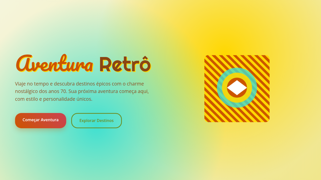
Nostalgic and adventurous retro landing page for a 70s-style travel blog. Ideal for landing pages, modern websites. AI-ready template.
Use case: Landing pages, Modern websites
Historical Context
The 1970s adventure aesthetic wasn't manufactured — it accumulated. Dust on a VW Westfalia dashboard. A dog-eared Rand McNally atlas. The golden-hour palette of Kodachrome film stock that made every roadside pull-off look like revelation. This was the era when National Geographic still felt dangerous, when their photographers disappeared into jungles for months and came back with images that smelled like humidity and diesel. What made it stick wasn't nostalgia — it was material honesty. Canvas, leather, oxidized metal. Typography that referenced hand-painted trail signs and national park signage. The color language pulled from actual terrain: burnt sienna from canyon walls, avocado from lichen-covered rock, mustard from late-afternoon light hitting a tent. Nothing was optimized for screens because screens didn't matter yet. The VW van became the icon not because of marketing but because of limitation. You couldn't carry much. You slowed down. The vehicle itself enforced a philosophy — go further by going slower. That constraint produced an entire visual culture: patch-covered denim, hand-drawn maps, sunset gradient everything. It communicated that adventure meant friction, not frictionlessness.
When to Use
Reach for this when the brand needs to feel lived-in rather than launched. Adventure travel blogs that want warmth over polish. Outdoor brands targeting the heritage crowd — people who care about waxed canvas and campfire coffee. Van life content that rejects the Instagram-clean aesthetic. Retro tourism campaigns where the destination matters less than the feeling of getting there. It falls apart fast on anything corporate or tech-forward. Keep it away from minimalism.
Design Principles
- Earn your texture — every grain, every paper fold, every worn edge should reference a real material. Fake distress is worse than no distress.
- Color from geography, not from swatches. Pull palette from landscapes: ochre, forest shadow, faded denim, sun-bleached canvas. If it couldn't exist in nature, it doesn't belong.
- Typography should feel carved or stamped, never rendered. Reference park signage, trail markers, hand-lettered van murals. Geometric sans-serifs with rounded terminals. Slab serifs with weight.
- Embrace the analog grid — slightly loose, slightly imperfect. Overlapping elements, rotated photos, torn-edge masks. The layout should feel pinned to a corkboard, not snapped to a pixel grid.
- Warm light as a design element, not an afterthought. Golden hour isn't a filter — it's a commitment to a specific emotional temperature that runs through every component.
DESIGN.md
---
version: "alpha"
name: "Retro Aventura Anos 70"
description: "Nostalgic and adventurous retro landing page for a 70s-style travel blog. Ideal for landing pages, modern websites. AI-ready template."
colors:
  primary: "#CC5500"
  secondary: "#6B8E23"
  tertiary: "#FFD700"
  neutral: "#8B4513"
  surface: "#40E0D0"
  accent: "#CB4154"
typography:
  h1:
    fontFamily: Pacifico
    fontSize: 2.5rem
    fontWeight: 700
  body-md:
    fontFamily: Pacifico
    fontSize: 1rem
    fontWeight: 400
components:
  button-primary:
    backgroundColor: "{colors.primary}"
    textColor: "{colors.neutral}"
    padding: 12px
---

## Overview

Nostalgic and adventurous retro landing page for a 70s-style travel blog. Ideal for landing pages, modern websites. AI-ready template. The 1970s adventure aesthetic wasn't manufactured — it accumulated. Dust on a VW Westfalia dashboard. A dog-eared Rand McNally atlas. The golden-hour palette of Kodachrome film stock that made every roadside pull-off look like revelation. This was the era when National Geographic still felt dangerous, when their photographers disappeared into jungles for months and came back with images that smelled like humidity and diesel.

What made it stick wasn't nostalgia — it was material honesty. Canvas, leather, oxidized metal. Typography that referenced hand-painted trail signs and national park signage. The color language pulled from actual terrain: burnt sienna from canyon walls, avocado from lichen-covered rock, mustard from late-afternoon light hitting a tent. Nothing was optimized for screens because screens didn't matter yet.

The VW van became the icon not because of marketing but because of limitation. You couldn't carry much. You slowed down. The vehicle itself enforced a philosophy — go further by going slower. That constraint produced an entire visual culture: patch-covered denim, hand-drawn maps, sunset gradient everything. It communicated that adventure meant friction, not frictionlessness.

- Density: 5/10 — Balanced
- Variance: 7/10 — Dynamic
- Motion: 4/10 — Subtle

- **Style:** Nostalgic, Adventurous, Earthy
- **Keywords:** travel blog, adventure, 70s retro, nostalgic, earthy, vibrant, free-spirited, authentic, exploration, warm
- **Era:** 1970s Exploration
- **Light/Dark:** ✓ Full / ✗ No

## Colors

- **Laranja Queimado** (#CC5500) — Warm accent, call-to-action secondary
- **Verde Oliva** (#6B8E23) — Secondary surface or text color
- **Amarelo Mostarda** (#FFD700) — Warning states, attention indicators
- **Marrom Terra** (#8B4513) — Supporting palette color
- **Azul Turquesa** (#40E0D0) — Secondary accent
- **Vermelho Tijolo** (#CB4154) — Error states, destructive actions
- **Bege** (#F5F5DC) — Extended palette, decorative use
- **Branco** (#FFFFFF) — Secondary surface


## Typography

- **Display / Hero:** Pacifico — Weight 700, tight tracking, used for headline impact
- **Body:** Pacifico — Weight 400, 16px/1.6 line-height, max 72ch per line
- **UI Labels / Captions:** Pacifico — 0.875rem, weight 500, slight letter-spacing
- **Monospace:** JetBrains Mono — Used for code, metadata, and technical values

Scale:
- Hero: clamp(2.5rem, 5vw, 4rem)
- H1: 2.25rem
- H2: 1.5rem
- Body: 1rem / 1.6
- Small: 0.875rem


## Layout

- **Grid:** CSS Grid primary. Max-width containment: 1280px centered with 1.5rem side padding.
- **Spacing rhythm:** Balanced. Base unit: 0.5rem (8px).
- **Section vertical gaps:** clamp(4rem, 8vw, 8rem).
- **Hero layout:** Asymmetric composition.
- **Feature sections:** Asymmetric grid with varied card sizes. No 3-equal-columns.
- **Mobile collapse:** All multi-column layouts collapse below 768px. No horizontal overflow.
- **z-index contract:** base (0) / sticky-nav (100) / overlay (200) / modal (300) / toast (500).


## Elevation & Depth

Cores quentes e terrosas, tipografia arredondada e psicodélica, fotografias com filtro vintage e vinheta, texturas de tecido e madeira, bordas com efeito de fita adesiva, micro-interações de hover com efeito de "zoom analógico", transições de seção com efeito de "slide de projetor".

- **Physics:** Ease-out curves, 200-300ms duration. Smooth and predictable.
- **Entry animations:** Fade + translate-Y (16px → 0) over 420ms ease-out. Staggered cascades for lists: 80ms between items.
- **Hover states:** Subtle color shift + shadow adjustment over 200ms.
- **Page transitions:** Fade only (200ms).
- **Performance:** Only transform and opacity animated. No layout-triggering properties.


## Shapes

Base corner radius: 8px. See rounded tokens in front matter for the full scale.


## Components

- **Primary Button:** Subtly rounded (0.5rem) shape. Accent color fill. Hover: 8% darken + subtle lift shadow. Active: -1px translate tactile press. Font weight 600. No outer glows.
- **Secondary / Ghost Button:** Outline variant. 1.5px border in muted color. Text in primary color. Hover: subtle background fill.
- **Cards:** Subtly rounded (0.5rem) corners. Surface background. Subtle shadow (0 2px 12px rgba(0,0,0,0.06)). 1px border stroke.
- **Inputs:** Label above input. 1px border stroke. Focus ring: 2px accent color offset 2px. Error text below in semantic red. No floating labels.
- **Navigation:** Primary surface background. Active item: accent color indicator. Font weight 500 when active.
- **Skeletons:** Shimmer animation matching component dimensions. No circular spinners.
- **Empty States:** Icon-based composition with descriptive text and action button.


## Do's and Don'ts

- No emojis in UI — use icon system only (Lucide, Heroicons)
- No pure black (#000000) — use off-black or charcoal variants
- No oversaturated accent colors (saturation cap: 80%)
- No 3-column equal-width feature layouts — use zig-zag or asymmetric grid
- No `h-screen` — use `min-h-[100dvh]`
- No AI copywriting clichés: "Elevate", "Seamless", "Unleash", "Next-Gen"
- No broken external image links — use picsum.photos or inline SVG
- No generic lorem ipsum in demos

- Do Cores quentes/terrosas
- Do Tipografia arredondada/psicodélica
- Do Fotos com filtro vintage
- Do Texturas de tecido/madeira
- Do Bordas com fita adesiva
- Do Transições de slide de projetor.


## Use Case

Landing pages, Modern websites
Technical Specs
CSS
background: #F5F5DC, color: #8B4513, border: 3px solid #CC5500, font-family: "Pacifico, cursive", text-shadow: 1px 1px 2px rgba(0,0,0,0.1), .vintage-filter, .psychedelic-font, .tape-border.
Variables
--burnt-orange: #CC5500, --olive-green: #6B8E23, --mustard-yellow: #FFD700, --earth-brown: #8B4513, --font-psychedelic: "Pacifico, cursive", --vintage-filter: sepia(0.5) saturate(1.5), --tape-border-effect: url("tape.png"), --projector-slide-transition: transform translateX(100%).Checklist
☐ Cores quentes/terrosas, ☐ Tipografia arredondada/psicodélica, ☐ Fotos com filtro vintage, ☐ Texturas de tecido/madeira, ☐ Bordas com fita adesiva, ☐ Transições de slide de projetor.
Colors
Primary
Secondary
Effects
Cores quentes e terrosas, tipografia arredondada e psicodélica, fotografias com filtro vintage e vinheta, texturas de tecido e madeira, bordas com efeito de fita adesiva, micro-interações de hover com efeito de "zoom analógico", transições de seção com efeito de "slide de projetor".
Light/Dark
✓ Full / ✗ No
AI Prompt
Act as a Senior Frontend Engineer and Expert UI Designer.
Your task is to code a complete Landing Page on the first attempt.
- Landing Page Theme: <INSERT THEME>
- Sections to add: <INSERT SECTIONS>

Generate the final code immediately following these definitions:

## Style

- **Name:** Retro Aventura Anos 70
- **Type:** Nostalgic, Adventurous, Earthy
- **Keywords:** travel blog, adventure, 70s retro, nostalgic, earthy, vibrant, free-spirited, authentic, exploration, warm
- **Era:** 1970s Exploration
- **Light/Dark:** ✓ Full / ✗ No

## Color Palette

- **Primary:** Laranja Queimado #CC5500, Verde Oliva #6B8E23, Amarelo Mostarda #FFD700, Marrom Terra #8B4513
- **Secondary:** Azul Turquesa #40E0D0, Vermelho Tijolo #CB4154, Bege #F5F5DC, Branco #FFFFFF

## Visual Effects

Cores quentes e terrosas, tipografia arredondada e psicodélica, fotografias com filtro vintage e vinheta, texturas de tecido e madeira, bordas com efeito de fita adesiva, micro-interações de hover com efeito de "zoom analógico", transições de seção com efeito de "slide de projetor".

## AI Visual Direction

Design a nostalgic and adventurous retro landing page for a 70s-style travel blog. Use: warm earthy colors, rounded psychedelic typography, vintage/vignette filtered photographs, fabric and wood textures, tape-effect borders, "analog zoom" hover micro-interactions, "projector slide" section transitions, burnt orange and olive green accents, free-spirited and authentic feel.

## CSS Technical

```css
background: #F5F5DC, color: #8B4513, border: 3px solid #CC5500, font-family: "Pacifico, cursive", text-shadow: 1px 1px 2px rgba(0,0,0,0.1), .vintage-filter, .psychedelic-font, .tape-border.
```

## Design System Variables

```css
--burnt-orange: #CC5500, --olive-green: #6B8E23, --mustard-yellow: #FFD700, --earth-brown: #8B4513, --font-psychedelic: "Pacifico, cursive", --vintage-filter: sepia(0.5) saturate(1.5), --tape-border-effect: url("tape.png"), --projector-slide-transition: transform translateX(100%).
```

## Implementation Checklist

- ☐ Cores quentes/terrosas
- ☐ Tipografia arredondada/psicodélica
- ☐ Fotos com filtro vintage
- ☐ Texturas de tecido/madeira
- ☐ Bordas com fita adesiva
- ☐ Transições de slide de projetor.

## Execution Rules

1. Strictly follow the defined visual style.
2. Use high-quality inline SVG icons (Heroicons or Lucide style) — NEVER use emojis as icons.
3. Add `cursor-pointer` and smooth `hover` states (transition-all) on all interactive elements.
4. Required Page Structure:
   - Navbar (Logo + Links + CTA)
   - Hero Section (Impactful Headline + Subtitle + 2 buttons + 3D/Abstract visual element via CSS)
   - Features (3 cards with icons)
   - Testimonials (3 cards)
   - Pricing (3 tiers, highlight the middle one)
   - Final CTA
   - Full Footer with social links, privacy policy, terms of use, contact and SEO links.
5. All text content must be in English.
6. The visual must be CLEARLY distinct — do not create a "default Bootstrap" design. Force the use of the provided design system variables.
7. Use `<style>` tags in the head for custom classes (especially for complex backdrop-filter effects and animations) that Tailwind CDN doesn't cover.
8. Full Responsiveness: Layout must adapt perfectly to Mobile, Tablet and Desktop (vertical stack on mobile).
9. Include basic SEO, Viewport and Open Graph meta tags in `<head>`.
10. Footer must contain: Copyright 2026, Secondary navigation links and Social media icons.
11. Make the creative decisions needed to deliver the complete, functional result now.Related
Last synced: 4/1/2026