Retro Arcade Pixelado
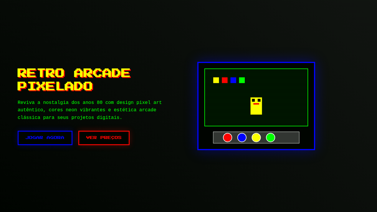
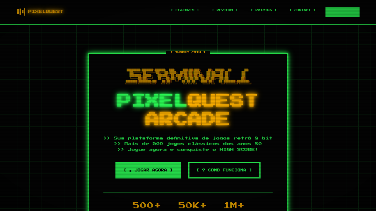
Nostalgic and playful retro landing page for an online classic arcade. Ideal for landing pages, modern websites. AI-ready template.
Use case: Landing pages, Modern websites
Historical Context
The pixel wasn't a choice. It was a constraint. When Namco shipped Pac-Man in 1980, those chunky 8×8 tile grids weren't aesthetic decisions — they were the literal ceiling of what hardware could render. Designers worked within brutal limitations: 16 colors, fixed palettes, sprites measured in single-digit pixels. And yet, within those constraints, they built an entire visual language. The glow of a CRT scan line. The flicker of a ghost turning blue. Every pixel earned its place. What's remarkable is how that language refused to die. When indie developers in the late 2000s reached for pixel art, they weren't just being nostalgic — they were choosing clarity. A pixel-art character reads instantly at any scale. The grid enforces intentionality: you can't hide behind anti-aliasing or gradients. Every single dot is a decision. Today the aesthetic lives in places its creators never imagined. Arcade bars in Brooklyn. Crypto projects chasing 8-bit credibility. Streetwear brands printing sprite sheets on hoodies. The constraint became the style. The limitation became the look.
When to Use
Reach for this when your project needs to feel handmade and intentional without feeling precious. It works for indie game studios that want credibility with retro-literate audiences. It works for arcade bars and entertainment venues selling nostalgia as experience. It's strong for brands targeting millennials who grew up feeding quarters into cabinets. But be honest with yourself — if your audience has no emotional connection to the source material, you're just cosplaying.
Design Principles
- Honor the grid. Pixels snap to whole units — no sub-pixel rendering, no fractional positioning. If it doesn't align to the grid, it doesn't belong.
- Limit your palette ruthlessly. Original hardware forced 16-color constraints. You don't need to match that exactly, but a restricted palette is what separates pixel art from low-resolution art.
- Let the CRT breathe. Scan lines, subtle glow, slight color bleed — these artifacts aren't decoration, they're context. Use them sparingly or the nostalgia turns into parody.
- Scale without smoothing. Nearest-neighbor interpolation only. The moment you apply bilinear filtering to pixel art, you've destroyed the entire point.
- Design at 1x, present at Nx. Build your assets at native resolution first. Scaling up is trivial. Scaling down from high-res to fake pixel art always looks wrong — and people notice.
DESIGN.md
---
version: "alpha"
name: "Retro Arcade Pixelado"
description: "Nostalgic and playful retro landing page for an online classic arcade. Ideal for landing pages, modern websites. AI-ready template."
colors:
  primary: "#0000FF"
  secondary: "#FF0000"
  tertiary: "#FFFF00"
  neutral: "#000000"
  surface: "#00FF00"
  accent: "#800080"
typography:
  h1:
    fontFamily: Press Start 2P
    fontSize: 2.5rem
    fontWeight: 700
  body-md:
    fontFamily: Press Start 2P
    fontSize: 1rem
    fontWeight: 400
components:
  button-primary:
    backgroundColor: "{colors.primary}"
    textColor: "{colors.neutral}"
    padding: 12px
---

## Overview

Nostalgic and playful retro landing page for an online classic arcade. Ideal for landing pages, modern websites. AI-ready template. The pixel wasn't a choice. It was a constraint. When Namco shipped Pac-Man in 1980, those chunky 8×8 tile grids weren't aesthetic decisions — they were the literal ceiling of what hardware could render. Designers worked within brutal limitations: 16 colors, fixed palettes, sprites measured in single-digit pixels. And yet, within those constraints, they built an entire visual language. The glow of a CRT scan line. The flicker of a ghost turning blue. Every pixel earned its place.

What's remarkable is how that language refused to die. When indie developers in the late 2000s reached for pixel art, they weren't just being nostalgic — they were choosing clarity. A pixel-art character reads instantly at any scale. The grid enforces intentionality: you can't hide behind anti-aliasing or gradients. Every single dot is a decision.

Today the aesthetic lives in places its creators never imagined. Arcade bars in Brooklyn. Crypto projects chasing 8-bit credibility. Streetwear brands printing sprite sheets on hoodies. The constraint became the style. The limitation became the look.

- Density: 5/10 — Balanced
- Variance: 7/10 — Dynamic
- Motion: 4/10 — Subtle

- **Style:** Nostalgic, Playful, Pixelated
- **Keywords:** retro gaming, arcade, pixel art, nostalgic, playful, classic, 8-bit, vibrant, fun, community
- **Era:** 1980s Arcade
- **Light/Dark:** ✗ No / ✓ Full

## Colors

- **Azul Elétrico** (#0000FF) — Accent highlight, links and focus states
- **Vermelho Cereja** (#FF0000) — Error states, destructive actions
- **Amarelo Brilhante** (#FFFF00) — Warning states, attention indicators
- **Preto** (#000000) — Dark surface, primary background
- **Verde Limão** (#00FF00) — Success states, positive indicators
- **Roxo** (#800080) — Accent color, emphasis elements
- **Ciano** (#00FFFF) — Extended palette, decorative use
- **Branco** (#FFFFFF) — Secondary surface


## Typography

- **Display / Hero:** Press Start 2P — Weight 700, tight tracking, used for headline impact
- **Body:** Press Start 2P — Weight 400, 16px/1.6 line-height, max 72ch per line
- **UI Labels / Captions:** Press Start 2P — 0.875rem, weight 500, slight letter-spacing
- **Monospace:** JetBrains Mono — Used for code, metadata, and technical values

Scale:
- Hero: clamp(2.5rem, 5vw, 4rem)
- H1: 2.25rem
- H2: 1.5rem
- Body: 1rem / 1.6
- Small: 0.875rem


## Layout

- **Grid:** CSS Grid primary. Max-width containment: 1280px centered with 1.5rem side padding.
- **Spacing rhythm:** Balanced. Base unit: 0.5rem (8px).
- **Section vertical gaps:** clamp(4rem, 8vw, 8rem).
- **Hero layout:** Asymmetric composition.
- **Feature sections:** Asymmetric grid with varied card sizes. No 3-equal-columns.
- **Mobile collapse:** All multi-column layouts collapse below 768px. No horizontal overflow.
- **z-index contract:** base (0) / sticky-nav (100) / overlay (200) / modal (300) / toast (500).


## Elevation & Depth

Pixel art em elementos gráficos, tipografia de 8-bit, texturas de tela CRT, bordas com efeito de scanline, micro-interações de clique com som de "blip", animações de transição de tela com efeito de "glitch" ou "fade" rápido.

- **Physics:** Ease-out curves, 200-300ms duration. Smooth and predictable.
- **Entry animations:** Fade + translate-Y (16px → 0) over 420ms ease-out. Staggered cascades for lists: 80ms between items.
- **Hover states:** Subtle color shift + shadow adjustment over 200ms.
- **Page transitions:** Fade only (200ms).
- **Performance:** Only transform and opacity animated. No layout-triggering properties.


## Shapes

Base corner radius: 8px. See rounded tokens in front matter for the full scale.


## Components

- **Primary Button:** Subtly rounded (0.5rem) shape. Accent color fill. Hover: 8% darken + subtle lift shadow. Active: -1px translate tactile press. Font weight 600. No outer glows.
- **Secondary / Ghost Button:** Outline variant. 1.5px border in muted color. Text in primary color. Hover: subtle background fill.
- **Cards:** Subtly rounded (0.5rem) corners. Surface background. Subtle shadow (0 2px 12px rgba(0,0,0,0.06)). 1px border stroke.
- **Inputs:** Label above input. 1px border stroke. Focus ring: 2px accent color offset 2px. Error text below in semantic red. No floating labels.
- **Navigation:** Primary surface background. Active item: accent color indicator. Font weight 500 when active.
- **Skeletons:** Shimmer animation matching component dimensions. No circular spinners.
- **Empty States:** Icon-based composition with descriptive text and action button.


## Do's and Don'ts

- No emojis in UI — use icon system only (Lucide, Heroicons)
- No pure black (#000000) — use off-black or charcoal variants
- No oversaturated accent colors (saturation cap: 80%)
- No 3-column equal-width feature layouts — use zig-zag or asymmetric grid
- No `h-screen` — use `min-h-[100dvh]`
- No AI copywriting clichés: "Elevate", "Seamless", "Unleash", "Next-Gen"
- No broken external image links — use picsum.photos or inline SVG
- No generic lorem ipsum in demos

- Do Pixel art
- Do Tipografia de 8-bit
- Do Texturas de tela CRT
- Do Bordas com scanline
- Do Micro-interações com som
- Do Animações de transição de tela.


## Use Case

Landing pages, Modern websites
Technical Specs
CSS
background: #000000, color: #FFFF00, text-shadow: 2px 2px #FF0000, border: 2px solid #00FFFF, font-family: "Press Start 2P, cursive", animation: crt-scanline 5s linear infinite, .pixel-art-graphic, .8bit-font, .scanline-effect.
Variables
--electric-blue: #0000FF, --cherry-red: #FF0000, --bright-yellow: #FFFF00, --black-bg: #000000, --font-pixel: "Press Start 2P, cursive", --crt-scanline-effect: url("scanline.png"), --border-neon: 2px solid #00FFFF.Checklist
☐ Pixel art, ☐ Tipografia de 8-bit, ☐ Texturas de tela CRT, ☐ Bordas com scanline, ☐ Micro-interações com som, ☐ Animações de transição de tela.
Colors
Primary
Secondary
Effects
Pixel art em elementos gráficos, tipografia de 8-bit, texturas de tela CRT, bordas com efeito de scanline, micro-interações de clique com som de "blip", animações de transição de tela com efeito de "glitch" ou "fade" rápido.
Light/Dark
✗ No / ✓ Full
AI Prompt
Act as a Senior Frontend Engineer and Expert UI Designer.
Your task is to code a complete Landing Page on the first attempt.
- Landing Page Theme: <INSERT THEME>
- Sections to add: <INSERT SECTIONS>

Generate the final code immediately following these definitions:

## Style

- **Name:** Retro Arcade Pixelado
- **Type:** Nostalgic, Playful, Pixelated
- **Keywords:** retro gaming, arcade, pixel art, nostalgic, playful, classic, 8-bit, vibrant, fun, community
- **Era:** 1980s Arcade
- **Light/Dark:** ✗ No / ✓ Full

## Color Palette

- **Primary:** Azul Elétrico #0000FF, Vermelho Cereja #FF0000, Amarelo Brilhante #FFFF00, Preto #000000
- **Secondary:** Verde Limão #00FF00, Roxo #800080, Ciano #00FFFF, Branco #FFFFFF

## Visual Effects

Pixel art em elementos gráficos, tipografia de 8-bit, texturas de tela CRT, bordas com efeito de scanline, micro-interações de clique com som de "blip", animações de transição de tela com efeito de "glitch" ou "fade" rápido.

## AI Visual Direction

Design a nostalgic and playful retro landing page for an online classic arcade. Use: pixel art graphics, 8-bit typography, CRT screen textures, scanline borders, "blip" sound click micro-interactions, fast glitch/fade screen transition animations, electric blue and cherry red accents, vibrant and fun feel.

## CSS Technical

```css
background: #000000, color: #FFFF00, text-shadow: 2px 2px #FF0000, border: 2px solid #00FFFF, font-family: "Press Start 2P, cursive", animation: crt-scanline 5s linear infinite, .pixel-art-graphic, .8bit-font, .scanline-effect.
```

## Design System Variables

```css
--electric-blue: #0000FF, --cherry-red: #FF0000, --bright-yellow: #FFFF00, --black-bg: #000000, --font-pixel: "Press Start 2P, cursive", --crt-scanline-effect: url("scanline.png"), --border-neon: 2px solid #00FFFF.
```

## Implementation Checklist

- ☐ Pixel art
- ☐ Tipografia de 8-bit
- ☐ Texturas de tela CRT
- ☐ Bordas com scanline
- ☐ Micro-interações com som
- ☐ Animações de transição de tela.

## Execution Rules

1. Strictly follow the defined visual style.
2. Use high-quality inline SVG icons (Heroicons or Lucide style) — NEVER use emojis as icons.
3. Add `cursor-pointer` and smooth `hover` states (transition-all) on all interactive elements.
4. Required Page Structure:
   - Navbar (Logo + Links + CTA)
   - Hero Section (Impactful Headline + Subtitle + 2 buttons + 3D/Abstract visual element via CSS)
   - Features (3 cards with icons)
   - Testimonials (3 cards)
   - Pricing (3 tiers, highlight the middle one)
   - Final CTA
   - Full Footer with social links, privacy policy, terms of use, contact and SEO links.
5. All text content must be in English.
6. The visual must be CLEARLY distinct — do not create a "default Bootstrap" design. Force the use of the provided design system variables.
7. Use `<style>` tags in the head for custom classes (especially for complex backdrop-filter effects and animations) that Tailwind CDN doesn't cover.
8. Full Responsiveness: Layout must adapt perfectly to Mobile, Tablet and Desktop (vertical stack on mobile).
9. Include basic SEO, Viewport and Open Graph meta tags in `<head>`.
10. Footer must contain: Copyright 2026, Secondary navigation links and Social media icons.
11. Make the creative decisions needed to deliver the complete, functional result now.Related
Last synced: 4/1/2026