Real Estate Imobiliária Digital
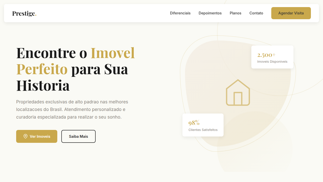
Real estate landing, property cards, listings, luxury, gold and beige, modern, maps, filters, home search. Ideal for landing pages, modern websites. AI-ready template.
Use case: Landing pages, Modern websites
Historical Context
Real estate UI didn't start with cards. It started with tables — endless rows of MLS data that only agents could parse. Zillow changed that in 2006 by treating properties like products: hero image, price, key stats. Suddenly everyone could browse homes the way they browsed Amazon. Rightmove refined the split-panel layout in the UK. Then Airbnb blew the doors off with emotional photography and map-first discovery, proving that location context isn't a nice-to-have — it's the primary navigation layer. The property card became universal because it solves a genuine density problem. You need to show price, location, size, bedrooms, and at least one photo — all scannable in under two seconds. Every PropTech startup since 2015 has shipped some variation of this pattern. The debate now isn't whether to use cards, but how much map you show alongside them. Map-first versus list-first is a false binary, honestly. The best implementations (Redfin, Hemnet) treat them as linked views — hover a card, the pin highlights. Click a pin, the card scrolls into view. The real design challenge is making that relationship feel instant and obvious without overwhelming mobile viewports where you simply cannot show both.
When to Use
Reach for this vertical when you're building anything that lists physical spaces — sales platforms, rental marketplaces, vacation booking, commercial real estate, co-working directories. It works whenever users need to compare properties visually, filter by location, and drill into detail pages. Also useful for adjacent domains: car dealerships, boat listings, land sales — anywhere a card grid plus geographic context drives the core browsing experience.
Design Principles
- Photography carries the hierarchy — if the image is bad, no amount of typography saves the card. Enforce aspect ratios and lazy-load aggressively.
- Price is always the loudest element. Users scan listings by cost first, location second, features third. Design the visual weight in that order.
- Map and list are one system, not two panels duct-taped together. State must sync bidirectionally — selection, hover, filter results — with zero perceptible lag.
- Filters are the product. In real estate, users don't browse — they narrow. Make filter controls persistent, visible, and fast to manipulate on every viewport.
- Density shifts by intent: search results need compact cards for comparison; detail pages need breathing room for decision-making. Don't use one density everywhere.
DESIGN.md
---
version: "alpha"
name: "Real Estate Imobiliária Digital"
description: "Real estate landing, property cards, listings, luxury, gold and beige, modern, maps, filters, home search. Ideal for landing pages, modern websites. AI-ready template."
colors:
  primary: "#F5F0E8"
  secondary: "#C9A84C"
  tertiary: "#333333"
  neutral: "#FFFFFF"
  surface: "#8B8680"
  accent: "#1A1A1A"
typography:
  h1:
    fontFamily: Playfair Display, serif
    fontSize: 2.25rem
    fontWeight: 700
  body-md:
    fontFamily: Inter, sans-serif
    fontSize: 1rem
    fontWeight: 400
  label-caps:
    fontFamily: Inter, sans-serif
    fontSize: 0.75rem
    fontWeight: 500
rounded:
  sm: 8px
  md: 16px
  lg: 24px
components:
  button-primary:
    backgroundColor: "{colors.primary}"
    textColor: "{colors.neutral}"
    rounded: "{rounded.sm}"
    padding: 12px
---

## Overview

Real estate landing, property cards, listings, luxury, gold and beige, modern, maps, filters, home search. Ideal for landing pages, modern websites. AI-ready template. Real estate UI didn't start with cards. It started with tables — endless rows of MLS data that only agents could parse. Zillow changed that in 2006 by treating properties like products: hero image, price, key stats. Suddenly everyone could browse homes the way they browsed Amazon. Rightmove refined the split-panel layout in the UK. Then Airbnb blew the doors off with emotional photography and map-first discovery, proving that location context isn't a nice-to-have — it's the primary navigation layer.

The property card became universal because it solves a genuine density problem. You need to show price, location, size, bedrooms, and at least one photo — all scannable in under two seconds. Every PropTech startup since 2015 has shipped some variation of this pattern. The debate now isn't whether to use cards, but how much map you show alongside them.

Map-first versus list-first is a false binary, honestly. The best implementations (Redfin, Hemnet) treat them as linked views — hover a card, the pin highlights. Click a pin, the card scrolls into view. The real design challenge is making that relationship feel instant and obvious without overwhelming mobile viewports where you simply cannot show both.

- Density: 5/10 — Balanced
- Variance: 4/10 — Moderate
- Motion: 4/10 — Subtle

- **Style:** Luxury, Elegant, Sophisticated
- **Keywords:** real estate landing, property cards, listings, luxury, gold and beige, modern, maps, filters, home search
- **Era:** 2020s Real Estate
- **Light/Dark:** ✓ Full / ✗ No

## Colors

- **Beige** (#F5F0E8) — Primary surface or dominant color
- **Gold** (#C9A84C) — Premium accent, decorative highlights
- **Dark Grey** (#333333) — Dark surface, primary background
- **White** (#FFFFFF) — Secondary surface
- **Warm Grey** (#8B8680) — Secondary text, borders, muted elements
- **Charcoal** (#1A1A1A) — Deep contrast surface


## Typography

- **Display / Hero:** Playfair Display — Weight 700, tight tracking, used for headline impact
- **Body:** Playfair Display — Weight 400, 16px/1.6 line-height, max 72ch per line
- **UI Labels / Captions:** Playfair Display — 0.875rem, weight 500, slight letter-spacing
- **Monospace:** JetBrains Mono — Used for code, metadata, and technical values

Scale:
- Hero: clamp(2.5rem, 5vw, 4rem)
- H1: 2.25rem
- H2: 1.5rem
- Body: 1rem / 1.6
- Small: 0.875rem


## Layout

- **Grid:** CSS Grid primary. Max-width containment: 1280px centered with 1.5rem side padding.
- **Spacing rhythm:** Balanced. Base unit: 0.5rem (8px).
- **Section vertical gaps:** clamp(4rem, 8vw, 8rem).
- **Hero layout:** Split-screen (text left, visual right).
- **Feature sections:** Zig-zag alternating text+image rows. No 3-equal-columns.
- **Mobile collapse:** All multi-column layouts collapse below 768px. No horizontal overflow.
- **z-index contract:** base (0) / sticky-nav (100) / overlay (200) / modal (300) / toast (500).


## Elevation & Depth

Cards de imóveis com foto, título, localização, preço e CTA, seção de filtros estilizados, grid responsivo, pseudo-elementos para divisores sutis.

- **Physics:** Ease-out curves, 200-300ms duration. Smooth and predictable.
- **Entry animations:** Fade + translate-Y (16px → 0) over 420ms ease-out. Staggered cascades for lists: 80ms between items.
- **Hover states:** Subtle color shift + shadow adjustment over 200ms.
- **Page transitions:** Fade only (200ms).
- **Performance:** Only transform and opacity animated. No layout-triggering properties.


## Shapes

Base corner radius: 8px. See rounded tokens in front matter for the full scale.


## Components

- **Primary Button:** Rounded (8px) shape. Accent color fill. Hover: 8% darken + subtle lift shadow. Active: -1px translate tactile press. Font weight 600. No outer glows.
- **Secondary / Ghost Button:** Outline variant. 1.5px border in muted color. Text in primary color. Hover: subtle background fill.
- **Cards:** Rounded (8px) corners. Surface background. Subtle shadow (0 2px 12px rgba(0,0,0,0.06)). 1px border stroke.
- **Inputs:** Label above input. 1px border stroke. Focus ring: 2px accent color offset 2px. Error text below in semantic red. No floating labels.
- **Navigation:** Primary surface background. Active item: accent color indicator. Font weight 500 when active.
- **Skeletons:** Shimmer animation matching component dimensions. No circular spinners.
- **Empty States:** Icon-based composition with descriptive text and action button.


## Do's and Don'ts

- No emojis in UI — use icon system only (Lucide, Heroicons)
- No pure black (#000000) — use off-black or charcoal variants
- No oversaturated accent colors (saturation cap: 80%)
- No 3-column equal-width feature layouts — use zig-zag or asymmetric grid
- No `h-screen` — use `min-h-[100dvh]`
- No AI copywriting clichés: "Elevate", "Seamless", "Unleash", "Next-Gen"
- No broken external image links — use picsum.photos or inline SVG
- No generic lorem ipsum in demos

- Do Navbar + Hero com busca rápida
- Do Listagem de Imóveis + Filtros
- Do Destaques + Depoimentos
- Do CTA 'Agendar visita'
- Do Meta tags SEO
- Do Fotos placeholder
- Do Ícones SVG (localização
- Do dormitórios
- Do vagas)
- Do Animações leves em cards.


## Use Case

Landing pages, Modern websites
Technical Specs
CSS
background: #FAFAF5, color: #333333, border-radius: 8px, box-shadow: 0 4px 15px rgba(0,0,0,0.08), font-family: 'Playfair Display, serif' for titles + 'Inter, sans-serif' for body, gold accent borders, property grid layout.
Variables
--beige: #F5F0E8, --gold: #C9A84C, --dark-grey: #333333, --white: #FFFFFF, --radius-card: 8px, --font-title: 'Playfair Display, serif', --font-body: 'Inter, sans-serif'.
Checklist
☐ Navbar + Hero com busca rápida, ☐ Listagem de Imóveis + Filtros, ☐ Destaques + Depoimentos, ☐ CTA 'Agendar visita', ☐ Meta tags SEO, ☐ Fotos placeholder, ☐ Ícones SVG (localização, dormitórios, vagas), ☐ Animações leves em cards.
Colors
Primary
Secondary
Effects
Cards de imóveis com foto, título, localização, preço e CTA, seção de filtros estilizados, grid responsivo, pseudo-elementos para divisores sutis.
Light/Dark
✓ Full / ✗ No
AI Prompt
Act as a Senior Frontend Engineer and Expert UI Designer.
Your task is to code a complete Landing Page on the first attempt.
- Landing Page Theme: <INSERT THEME>
- Sections to add: <INSERT SECTIONS>

Generate the final code immediately following these definitions:

## Style

- **Name:** Real Estate Imobiliária Digital
- **Type:** Luxury, Elegant, Sophisticated
- **Keywords:** real estate landing, property cards, listings, luxury, gold and beige, modern, maps, filters, home search
- **Era:** 2020s Real Estate
- **Light/Dark:** ✓ Full / ✗ No

## Color Palette

- **Primary:** Beige #F5F0E8, Gold #C9A84C, Dark Grey #333333
- **Secondary:** White #FFFFFF, Warm Grey #8B8680, Charcoal #1A1A1A

## Visual Effects

Cards de imóveis com foto, título, localização, preço e CTA, seção de filtros estilizados, grid responsivo, pseudo-elementos para divisores sutis.

## AI Visual Direction

real estate landing, property cards, listings, luxury, gold and beige, modern, maps, filters, home search.

## CSS Technical

```css
background: #FAFAF5, color: #333333, border-radius: 8px, box-shadow: 0 4px 15px rgba(0,0,0,0.08), font-family: 'Playfair Display, serif' for titles + 'Inter, sans-serif' for body, gold accent borders, property grid layout.
```

## Design System Variables

```css
--beige: #F5F0E8, --gold: #C9A84C, --dark-grey: #333333, --white: #FFFFFF, --radius-card: 8px, --font-title: 'Playfair Display, serif', --font-body: 'Inter, sans-serif'.
```

## Implementation Checklist

- ☐ Navbar + Hero com busca rápida
- ☐ Listagem de Imóveis + Filtros
- ☐ Destaques + Depoimentos
- ☐ CTA 'Agendar visita'
- ☐ Meta tags SEO
- ☐ Fotos placeholder
- ☐ Ícones SVG (localização
- dormitórios
- vagas)
- ☐ Animações leves em cards.

## Execution Rules

1. Strictly follow the defined visual style.
2. Use high-quality inline SVG icons (Heroicons or Lucide style) — NEVER use emojis as icons.
3. Add `cursor-pointer` and smooth `hover` states (transition-all) on all interactive elements.
4. Required Page Structure:
   - Navbar (Logo + Links + CTA)
   - Hero Section (Impactful Headline + Subtitle + 2 buttons + 3D/Abstract visual element via CSS)
   - Features (3 cards with icons)
   - Testimonials (3 cards)
   - Pricing (3 tiers, highlight the middle one)
   - Final CTA
   - Full Footer with social links, privacy policy, terms of use, contact and SEO links.
5. All text content must be in English.
6. The visual must be CLEARLY distinct — do not create a "default Bootstrap" design. Force the use of the provided design system variables.
7. Use `<style>` tags in the head for custom classes (especially for complex backdrop-filter effects and animations) that Tailwind CDN doesn't cover.
8. Full Responsiveness: Layout must adapt perfectly to Mobile, Tablet and Desktop (vertical stack on mobile).
9. Include basic SEO, Viewport and Open Graph meta tags in `<head>`.
10. Footer must contain: Copyright 2026, Secondary navigation links and Social media icons.
11. Make the creative decisions needed to deliver the complete, functional result now.
Related
Last synced: 4/1/2026