Mistral Golden Amber
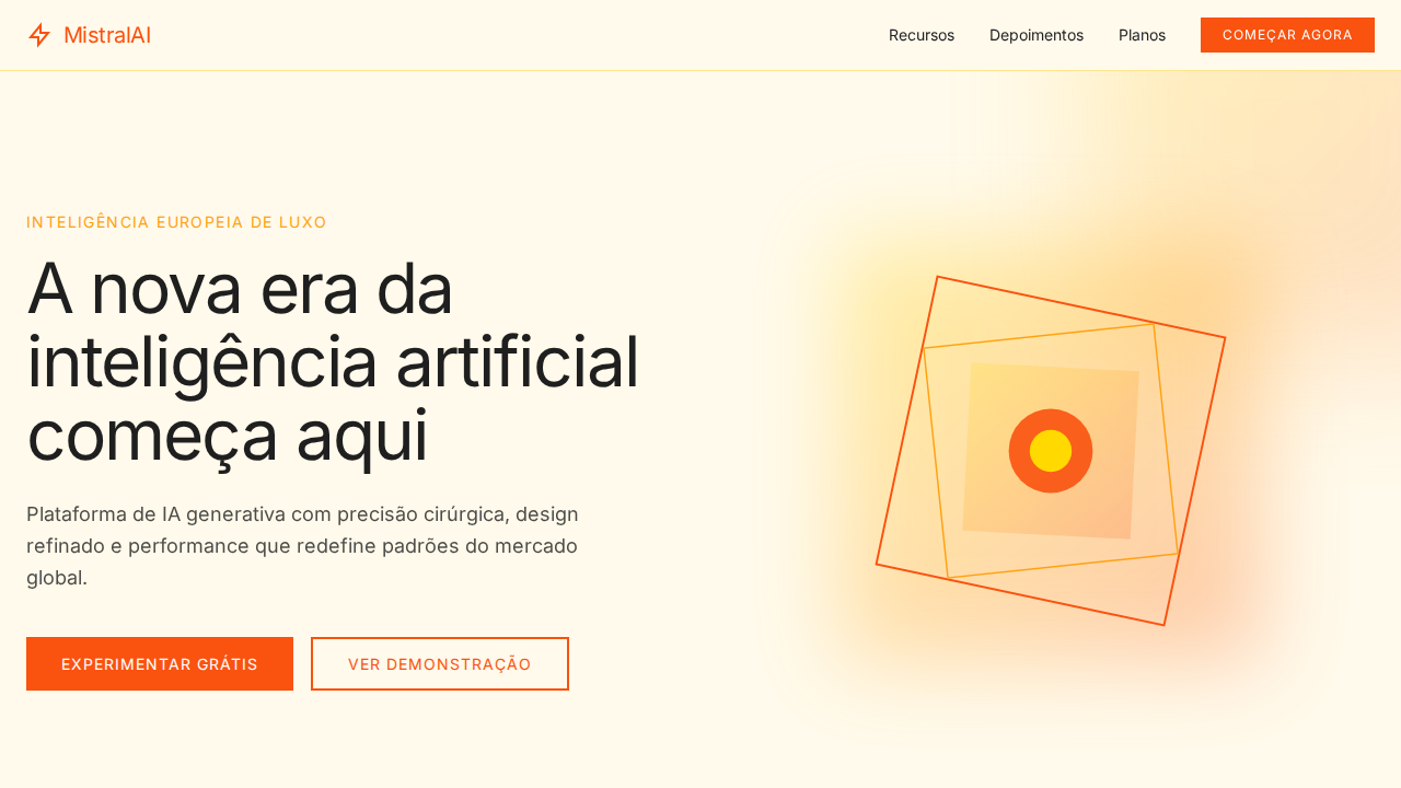
Mistral AI-inspired golden landing page. Ideal for ia europeia, marcas de luxo, plataformas premium, tecnologia francesa. AI-ready template.
Use case: IA europeia, Luxury brands, Platforms premium, Tecnologia francesa
Historical Context
Golden amber carries centuries of European craft memory — from the Baltic amber trade routes that defined medieval commerce to the warm lacquer finishes on French ormolu furniture. It's a color that whispers old money without shouting it. When Mistral emerged from Paris as a serious contender in the AI race, their visual identity leaned into this exact territory: warmth over the cold blues of Silicon Valley, sophistication over sterility. The choice wasn't accidental. French design has always understood that technology doesn't need to feel clinical. The amber-gold spectrum sits at the intersection of intellectual rigor and sensory pleasure — think gilded manuscript illuminations, the patina on a brass astrolabe, afternoon light through Haussmann windows. It signals that intelligence can be beautiful, that precision and warmth aren't opposites. For AI brands specifically, golden amber solves a real problem: it humanizes. While competitors default to electric blue or void-black to signal 'advanced technology,' amber grounds the product in something tactile and historical. It says 'we built something powerful, and we're not afraid to make it feel approachable.'
When to Use
Deploy Mistral Golden Amber when your AI product needs to feel European, premium, and distinctly non-Silicon Valley. It works beautifully for onboarding flows where you need to reduce intimidation, for pricing pages where warmth builds trust, and for brand moments where you want to signal craftsmanship over raw compute. Particularly effective for B2B AI tools targeting creative professionals, legal tech, and enterprise clients who associate blue-tinted interfaces with commodity software. Avoid it for developer-facing dashboards where amber might read as warning states.
Design Principles
- Warmth as differentiation — use amber to deliberately contrast the cold palette conventions of the AI industry, making technology feel handcrafted rather than manufactured
- Restrained opulence — golden tones should suggest quality through subtlety, never crossing into gaudy territory; think matte gold leaf, not Vegas signage
- Functional hierarchy through temperature — reserve the warmest amber saturations for primary actions and trust signals, cooling toward neutral as elements become secondary
- Cultural specificity over generic futurism — let the European heritage inform typography pairings, spacing rhythms, and illustration style; this palette demands serif confidence
- Amber as semantic anchor — establish golden amber as your product's signature moment color, appearing at key emotional beats rather than flooding every surface
DESIGN.md
---
version: "alpha"
name: "Mistral Golden Amber"
description: "Mistral AI-inspired golden landing page. Ideal for ia europeia, marcas de luxo, plataformas premium, tecnologia francesa. AI-ready template."
colors:
  primary: "#fa520f"
  secondary: "#fffaeb"
  tertiary: "#fff0c2"
  neutral: "#1f1f1f"
  surface: "#ffa110"
  accent: "#ffd900"
typography:
  h1:
    fontFamily: Arial
    fontSize: 2.5rem
    fontWeight: 700
  body-md:
    fontFamily: Arial
    fontSize: 1rem
    fontWeight: 400
rounded:
  sm: 2px
  md: 4px
  lg: 8px
components:
  button-primary:
    backgroundColor: "{colors.primary}"
    textColor: "{colors.neutral}"
    rounded: "{rounded.sm}"
    padding: 12px
---

## Overview

Mistral AI-inspired golden landing page. Ideal for ia europeia, marcas de luxo, plataformas premium, tecnologia francesa. AI-ready template. Golden amber carries centuries of European craft memory — from the Baltic amber trade routes that defined medieval commerce to the warm lacquer finishes on French ormolu furniture. It's a color that whispers old money without shouting it. When Mistral emerged from Paris as a serious contender in the AI race, their visual identity leaned into this exact territory: warmth over the cold blues of Silicon Valley, sophistication over sterility.

The choice wasn't accidental. French design has always understood that technology doesn't need to feel clinical. The amber-gold spectrum sits at the intersection of intellectual rigor and sensory pleasure — think gilded manuscript illuminations, the patina on a brass astrolabe, afternoon light through Haussmann windows. It signals that intelligence can be beautiful, that precision and warmth aren't opposites.

For AI brands specifically, golden amber solves a real problem: it humanizes. While competitors default to electric blue or void-black to signal 'advanced technology,' amber grounds the product in something tactile and historical. It says 'we built something powerful, and we're not afraid to make it feel approachable.'

- Density: 5/10 — Balanced
- Variance: 4/10 — Moderate
- Motion: 4/10 — Subtle

- **Style:** Golden Warm, Amber Gradients, Billboard Typography, Sharp Geometry, European Luxury
- **Keywords:** mistral, golden, amber, warm, billboard, sharp corners, European, luxury AI, golden shadows, single weight 400
- **Era:** 2024-2026 European AI Luxury
- **Light/Dark:** ✓ Full / ✗ Not Recommended

## Colors

- **Laranja Mistral** (#fa520f) — Warm accent, call-to-action secondary
- **Marfim Quente** (#fffaeb) — Secondary surface or text color
- **Creme** (#fff0c2) — Supporting palette color
- **Preto Mistral** (#1f1f1f) — Dark surface, primary background
- **Sunshine** (#ffa110) — Extended palette, decorative use
- **Ouro Brilhante** (#ffd900) — Premium accent, decorative highlights
- **Flame** (#fb6424) — Extended palette, decorative use
- **Block Orange** (#ff8105) — Warm accent, call-to-action secondary


## Typography

- **Display / Hero:** Arial — Weight 700, tight tracking, used for headline impact
- **Body:** Arial — Weight 400, 16px/1.6 line-height, max 72ch per line
- **UI Labels / Captions:** Arial — 0.875rem, weight 500, slight letter-spacing
- **Monospace:** JetBrains Mono — Used for code, metadata, and technical values

Scale:
- Hero: clamp(2.5rem, 5vw, 4rem)
- H1: 2.25rem
- H2: 1.5rem
- Body: 1rem / 1.6
- Small: 0.875rem


## Layout

- **Grid:** CSS Grid primary. Max-width containment: 1280px centered with 1.5rem side padding.
- **Spacing rhythm:** Balanced. Base unit: 0.5rem (8px).
- **Section vertical gaps:** clamp(4rem, 8vw, 8rem).
- **Hero layout:** Split-screen (text left, visual right).
- **Feature sections:** Zig-zag alternating text+image rows. No 3-equal-columns.
- **Mobile collapse:** All multi-column layouts collapse below 768px. No horizontal overflow.
- **z-index contract:** base (0) / sticky-nav (100) / overlay (200) / modal (300) / toast (500).


## Elevation & Depth

Universo de cor golden-amber — cada tom do marfim pálido ao laranja queimado. Headlines massivas (82px) weight 400 com letter-spacing -2.05px — autoridade sem peso bold. Sombras golden multi-camada com rgba(127,99,21) criando efeito 'golden hour'. Cantos afiados (near-zero radius) — geometria arquitetônica. Gradiente de bloco Mistral (amarelo → âmbar → laranja). Fotografia de paisagem em tons dourados. Uppercase em labels de botão para formalidade europeia.

- **Physics:** Ease-out curves, 200-300ms duration. Smooth and predictable.
- **Entry animations:** Fade + translate-Y (16px → 0) over 420ms ease-out. Staggered cascades for lists: 80ms between items.
- **Hover states:** Subtle color shift + shadow adjustment over 200ms.
- **Page transitions:** Fade only (200ms).
- **Performance:** Only transform and opacity animated. No layout-triggering properties.


## Shapes

Base corner radius: 0px. See rounded tokens in front matter for the full scale.


## Components

- **Primary Button:** Sharp edges (0px) shape. Accent color fill. Hover: 8% darken + subtle lift shadow. Active: -1px translate tactile press. Font weight 600. No outer glows.
- **Secondary / Ghost Button:** Outline variant. 1.5px border in muted color. Text in primary color. Hover: subtle background fill.
- **Cards:** Sharp edges (0px) corners. Surface background. Subtle shadow (0 2px 12px rgba(0,0,0,0.06)). 1px border stroke.
- **Inputs:** Label above input. 1px border stroke. Focus ring: 2px accent color offset 2px. Error text below in semantic red. No floating labels.
- **Navigation:** Primary surface background. Active item: accent color indicator. Font weight 500 when active.
- **Skeletons:** Shimmer animation matching component dimensions. No circular spinners.
- **Empty States:** Icon-based composition with descriptive text and action button.


## Do's and Don'ts

- No emojis in UI — use icon system only (Lucide, Heroicons)
- No pure black (#000000) — use off-black or charcoal variants
- No oversaturated accent colors (saturation cap: 80%)
- No 3-column equal-width feature layouts — use zig-zag or asymmetric grid
- No `h-screen` — use `min-h-[100dvh]`
- No AI copywriting clichés: "Elevate", "Seamless", "Unleash", "Next-Gen"
- No broken external image links — use picsum.photos or inline SVG
- No generic lorem ipsum in demos

- Do Fundo marfim quente #fffaeb
- Do Headlines 82px weight 400
- Do Sombras golden amber
- Do Cantos afiados zero radius
- Do Gradiente bloco Mistral
- Do Uppercase em botões
- Do Peso único 400
- Do Responsivo


## Use Case

IA europeia, Luxury brands, Platforms premium, Tecnologia francesa
Technical Specs
CSS
background: #fffaeb; color: #1f1f1f; accent: #fa520f; box-shadow: rgba(127,99,21,0.12) -8px 16px 39px multi-layer; border-radius: 0px; font-family: Arial, sans-serif; font-weight: 400; letter-spacing: -2.05px at 82px; text-transform: uppercase for buttons
Variables
--bg: #fffaeb; --surface: #fff0c2; --text: #1f1f1f; --accent: #fa520f; --flame: #fb6424; --sunshine: #ffa110; --gold: #ffd900; --shadow-amber: rgba(127,99,21,0.12); --radius: 0px
Checklist
☐ Fundo marfim quente #fffaeb, ☐ Headlines 82px weight 400, ☐ Sombras golden amber, ☐ Cantos afiados zero radius, ☐ Gradiente bloco Mistral, ☐ Uppercase em botões, ☐ Peso único 400, ☐ Responsivo
Colors
Primary
Secondary
Effects
Universo de cor golden-amber — cada tom do marfim pálido ao laranja queimado. Headlines massivas (82px) weight 400 com letter-spacing -2.05px — autoridade sem peso bold. Sombras golden multi-camada com rgba(127,99,21) criando efeito 'golden hour'. Cantos afiados (near-zero radius) — geometria arquitetônica. Gradiente de bloco Mistral (amarelo → âmbar → laranja). Fotografia de paisagem em tons dourados. Uppercase em labels de botão para formalidade europeia.
Light/Dark
✓ Full / ✗ Not Recommended
AI Prompt
Act as a Senior Frontend Engineer and Expert UI Designer.
Your task is to code a complete Landing Page on the first attempt.
- Landing Page Theme: <INSERT THEME>
- Sections to add: <INSERT SECTIONS>

Generate the final code immediately following these definitions:

## Style

- **Name:** Mistral Golden Amber
- **Type:** Golden Warm, Amber Gradients, Billboard Typography, Sharp Geometry, European Luxury
- **Keywords:** mistral, golden, amber, warm, billboard, sharp corners, European, luxury AI, golden shadows, single weight 400
- **Era:** 2024-2026 European AI Luxury
- **Light/Dark:** ✓ Full / ✗ Not Recommended

## Color Palette

- **Primary:** Laranja Mistral #fa520f, Marfim Quente #fffaeb, Creme #fff0c2, Preto Mistral #1f1f1f
- **Secondary:** Sunshine #ffa110, Ouro Brilhante #ffd900, Flame #fb6424, Block Orange #ff8105

## Visual Effects

Universo de cor golden-amber — cada tom do marfim pálido ao laranja queimado. Headlines massivas (82px) weight 400 com letter-spacing -2.05px — autoridade sem peso bold. Sombras golden multi-camada com rgba(127,99,21) criando efeito 'golden hour'. Cantos afiados (near-zero radius) — geometria arquitetônica. Gradiente de bloco Mistral (amarelo → âmbar → laranja). Fotografia de paisagem em tons dourados. Uppercase em labels de botão para formalidade europeia.

## AI Visual Direction

Design a Mistral AI-inspired golden landing page. Warm ivory background (#fffaeb). Massive headlines at 82px weight 400 with -2.05px letter-spacing — authority through lightness. Golden multi-layer shadows using rgba(127,99,21,0.12). Sharp architectural corners (near-zero border-radius). Mistral block gradient (yellow #ffd900 → amber #ffa110 → orange #fa520f). Cream (#fff0c2) secondary surfaces. Mistral Black (#1f1f1f) for text. Uppercase button labels for European formality. Single weight 400 throughout.

## CSS Technical

```css
background: #fffaeb; color: #1f1f1f; accent: #fa520f; box-shadow: rgba(127,99,21,0.12) -8px 16px 39px multi-layer; border-radius: 0px; font-family: Arial, sans-serif; font-weight: 400; letter-spacing: -2.05px at 82px; text-transform: uppercase for buttons
```

## Design System Variables

```css
--bg: #fffaeb; --surface: #fff0c2; --text: #1f1f1f; --accent: #fa520f; --flame: #fb6424; --sunshine: #ffa110; --gold: #ffd900; --shadow-amber: rgba(127,99,21,0.12); --radius: 0px
```

## Implementation Checklist

- ☐ Fundo marfim quente #fffaeb
- ☐ Headlines 82px weight 400
- ☐ Sombras golden amber
- ☐ Cantos afiados zero radius
- ☐ Gradiente bloco Mistral
- ☐ Uppercase em botões
- ☐ Peso único 400
- ☐ Responsivo

## Execution Rules

1. Strictly follow the defined visual style.
2. Use high-quality inline SVG icons (Heroicons or Lucide style) — NEVER use emojis as icons.
3. Add `cursor-pointer` and smooth `hover` states (transition-all) on all interactive elements.
4. Required Page Structure:
   - Navbar (Logo + Links + CTA)
   - Hero Section (Impactful Headline + Subtitle + 2 buttons + 3D/Abstract visual element via CSS)
   - Features (3 cards with icons)
   - Testimonials (3 cards)
   - Pricing (3 tiers, highlight the middle one)
   - Final CTA
   - Full Footer with social links, privacy policy, terms of use, contact and SEO links.
5. All text content must be in English.
6. The visual must be CLEARLY distinct — do not create a "default Bootstrap" design. Force the use of the provided design system variables.
7. Use `<style>` tags in the head for custom classes (especially for complex backdrop-filter effects and animations) that Tailwind CDN doesn't cover.
8. Full Responsiveness: Layout must adapt perfectly to Mobile, Tablet and Desktop (vertical stack on mobile).
9. Include basic SEO, Viewport and Open Graph meta tags in `<head>`.
10. Footer must contain: Copyright 2026, Secondary navigation links and Social media icons.
11. Make the creative decisions needed to deliver the complete, functional result now.
Related
Last synced: 4/1/2026