Midnight Garden Premium
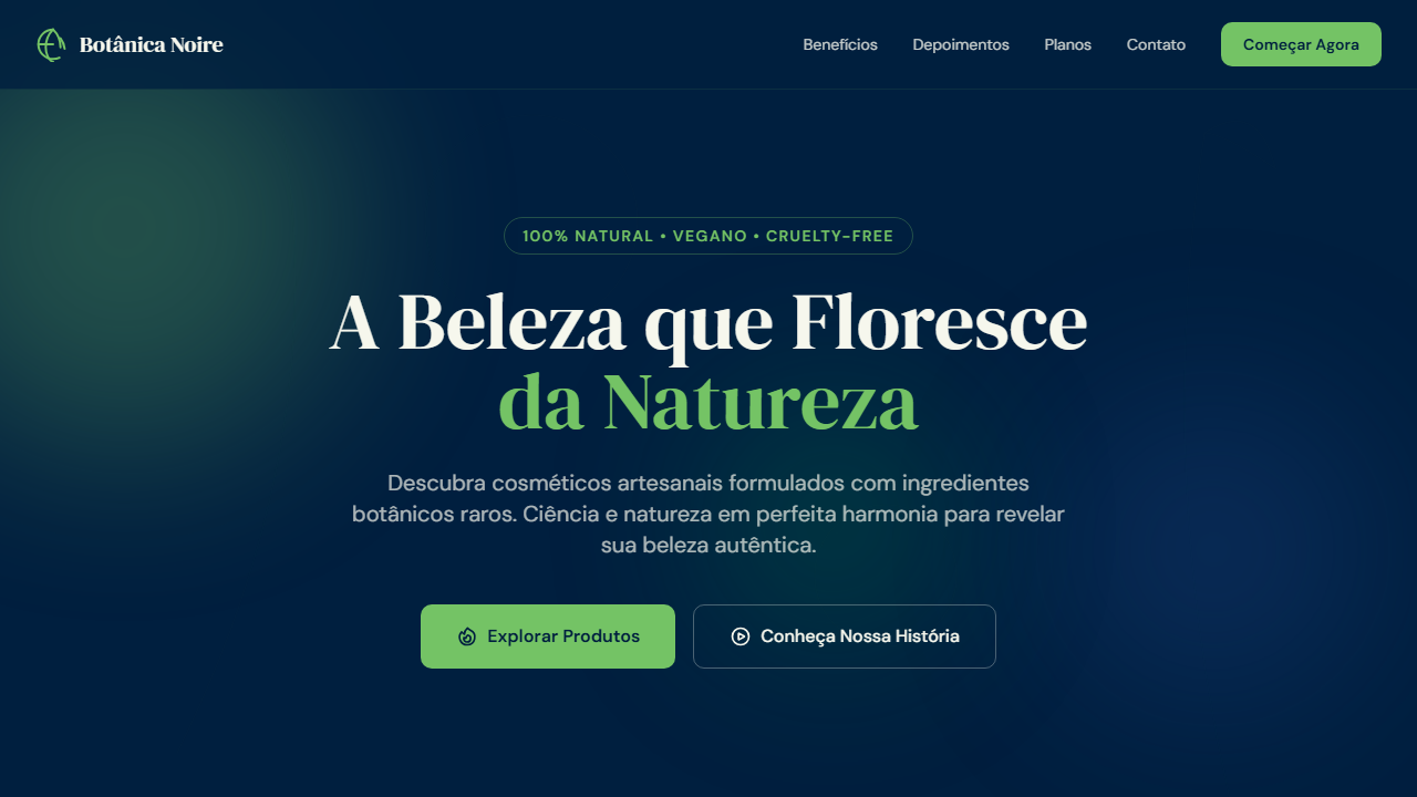
Create an elegant, premium UI with a nocturnal botanical garden atmosphere. Ideal for marcas sustentáveis premium, jardins botânicos, cosméticos naturais, wellness de luxo, resorts ecológicos. AI-ready template.
Use case: Brands sustentáveis premium, Jardins botânicos, Cosméticos naturais, Wellness de luxo, Resorts ecológicos
Historical Context
Dark florals have a lineage that predates digital design by centuries. Dutch Golden Age still lifes — Bosschaert, van Huysum — placed luminous botanicals against pitch-black voids not for drama alone, but because darkness made color truthful. Every petal read as precious. That visual logic resurfaced in Victorian mourning textiles, Art Nouveau posters, and eventually the lacquered packaging of mid-century French perfumeries where deep navy replaced pure black to suggest night rather than absence. The contemporary dark botanical trend owes less to minimalism and more to maximalism held under tension. When brands like Byredo and Aesop shifted luxury packaging toward muted restraint, a counter-movement emerged: richness without loudness. Deep blue grounds — not black, never pure black — allow floral illustrations to feel alive rather than gothic. The distinction matters. Black kills depth; midnight blue creates it. What we now call 'Midnight Garden' as a design direction is really the intersection of two impulses: the desire for visual opulence and the modern demand for sophistication. It works because it refuses to choose between them.
When to Use
Reach for this when the brand needs to feel expensive without feeling cold. Dark botanical works best for products tied to sensory experience — fragrance, skincare, candles, spirits — where the packaging itself should evoke atmosphere. It's wrong for anything that needs to feel accessible or casual. This is a velvet-rope palette. Use it when your client says 'luxury' but means 'intimate,' not 'flashy.' If the brief mentions gold foil and marble textures in the same breath, walk away — Midnight Garden is about restraint within richness, not accumulation.
Design Principles
- Depth over darkness — use layered deep blues (navy, indigo, midnight) instead of flat black; black is a void, blue is a space you can inhabit
- Botanical elements earn their place through detail — simplified or abstracted florals collapse into wallpaper; commit to the illustration or don't use it
- Contrast is structural, not decorative — reserve light tones (cream, gold, soft white) for typography and key information; if everything glows, nothing does
- Texture implies materiality — subtle grain, linen overlays, or paper texture in backgrounds signal physical craft and justify premium positioning
- Negative space is the luxury — resist filling every surface with pattern; the garden is more powerful when it emerges from emptiness rather than competing with itself
DESIGN.md
---
version: "alpha"
name: "Midnight Garden Premium"
description: "Create an elegant, premium UI with a nocturnal botanical garden atmosphere. Ideal for marcas sustentáveis premium, jardins botânicos, cosméticos naturais, wellness de luxo, resorts ecológicos. AI-ready template."
colors:
  primary: "#001F3F"
  secondary: "#74C365"
  tertiary: "#F6F7ED"
  neutral: "#DBE64C"
  surface: "#00804C"
  accent: "#1E488F"
typography:
  h1:
    fontFamily: DM Serif Display
    fontSize: 2.25rem
    fontWeight: 700
  body-md:
    fontFamily: DM Sans
    fontSize: 1rem
    fontWeight: 400
  label-caps:
    fontFamily: DM Sans
    fontSize: 0.75rem
    fontWeight: 500
rounded:
  sm: 10px
  md: 20px
  lg: 30px
components:
  button-primary:
    backgroundColor: "{colors.primary}"
    textColor: "{colors.neutral}"
    rounded: "{rounded.sm}"
    padding: 12px
---

## Overview

Create an elegant, premium UI with a nocturnal botanical garden atmosphere. Ideal for marcas sustentáveis premium, jardins botânicos, cosméticos naturais, wellness de luxo, resorts ecológicos. AI-ready template. Dark florals have a lineage that predates digital design by centuries. Dutch Golden Age still lifes — Bosschaert, van Huysum — placed luminous botanicals against pitch-black voids not for drama alone, but because darkness made color truthful. Every petal read as precious. That visual logic resurfaced in Victorian mourning textiles, Art Nouveau posters, and eventually the lacquered packaging of mid-century French perfumeries where deep navy replaced pure black to suggest night rather than absence.

The contemporary dark botanical trend owes less to minimalism and more to maximalism held under tension. When brands like Byredo and Aesop shifted luxury packaging toward muted restraint, a counter-movement emerged: richness without loudness. Deep blue grounds — not black, never pure black — allow floral illustrations to feel alive rather than gothic. The distinction matters. Black kills depth; midnight blue creates it.

What we now call 'Midnight Garden' as a design direction is really the intersection of two impulses: the desire for visual opulence and the modern demand for sophistication. It works because it refuses to choose between them.

- Density: 5/10 — Balanced
- Variance: 8/10 — Expressive
- Motion: 4/10 — Subtle

- **Style:** Natural Elegance & Deep Contrast
- **Keywords:** Elegant, botanical, deep blue, verdant, sophisticated, nocturnal, lush, premium, contrast, organic
- **Era:** 2020s Premium Botanical
- **Light/Dark:** ✓ Full

## Colors

- **Midnight Mirage** (#001F3F) — Dark surface, primary background
- **Mantis Green** (#74C365) — Secondary surface or text color
- **Praxeti White** (#F6F7ED) — Light surface, card backgrounds
- **Spring Lime** (#DBE64C) — Extended palette, decorative use
- **Book Green** (#00804C) — Success states, positive indicators
- **Nuit Blanche Blue** (#1E488F) — Secondary accent


## Typography

- **Display / Hero:** DM Serif Display — Weight 700, tight tracking, used for headline impact
- **Accent:** DM Sans — Used for decorative or emphasis text
- **Body:** DM Serif Display — Weight 400, 16px/1.6 line-height, max 72ch per line
- **UI Labels / Captions:** DM Serif Display — 0.875rem, weight 500, slight letter-spacing
- **Monospace:** JetBrains Mono — Used for code, metadata, and technical values

Scale:
- Hero: clamp(2.5rem, 5vw, 4rem)
- H1: 2.25rem
- H2: 1.5rem
- Body: 1rem / 1.6
- Small: 0.875rem


## Layout

- **Grid:** CSS Grid primary. Max-width containment: 1280px centered with 1.5rem side padding.
- **Spacing rhythm:** Balanced. Base unit: 0.5rem (8px).
- **Section vertical gaps:** clamp(4rem, 8vw, 8rem).
- **Hero layout:** Asymmetric composition.
- **Feature sections:** Asymmetric grid with varied card sizes. No 3-equal-columns.
- **Mobile collapse:** All multi-column layouts collapse below 768px. No horizontal overflow.
- **z-index contract:** base (0) / sticky-nav (100) / overlay (200) / modal (300) / toast (500).


## Elevation & Depth

Deep dark backgrounds with vivid green accents, botanical SVG illustrations, layered depth with translucent panels (rgba overlays), crisp typography contrast (light on dark), subtle glow effects on interactive elements, smooth 300ms transitions, fine 1px borders with low opacity

- **Physics:** Ease-out curves, 200-300ms duration. Smooth and predictable.
- **Entry animations:** Fade + translate-Y (16px → 0) over 420ms ease-out. Staggered cascades for lists: 80ms between items.
- **Hover states:** Subtle color shift + shadow adjustment over 200ms.
- **Page transitions:** Fade only (200ms).
- **Performance:** Only transform and opacity animated. No layout-triggering properties.


## Shapes

Base corner radius: 10px. See rounded tokens in front matter for the full scale.


## Components

- **Primary Button:** Rounded (10px) shape. Accent color fill. Hover: 8% darken + subtle lift shadow. Active: -1px translate tactile press. Font weight 600. No outer glows.
- **Secondary / Ghost Button:** Outline variant. 1.5px border in muted color. Text in primary color. Hover: subtle background fill.
- **Cards:** Rounded (10px) corners. Surface background. Subtle shadow (0 2px 12px rgba(0,0,0,0.06)). 1px border stroke.
- **Inputs:** Label above input. 1px border stroke. Focus ring: 2px accent color offset 2px. Error text below in semantic red. No floating labels.
- **Navigation:** Primary surface background. Active item: accent color indicator. Font weight 500 when active.
- **Skeletons:** Shimmer animation matching component dimensions. No circular spinners.
- **Empty States:** Icon-based composition with descriptive text and action button.


## Do's and Don'ts

- No emojis in UI — use icon system only (Lucide, Heroicons)
- No pure black (#000000) — use off-black or charcoal variants
- No oversaturated accent colors (saturation cap: 80%)
- No 3-column equal-width feature layouts — use zig-zag or asymmetric grid
- No `h-screen` — use `min-h-[100dvh]`
- No AI copywriting clichés: "Elevate", "Seamless", "Unleash", "Next-Gen"
- No broken external image links — use picsum.photos or inline SVG
- No generic lorem ipsum in demos

- Do Midnight Mirage #001F3F background
- Do Mantis Green #74C365 accent
- Do Praxeti White #F6F7ED text
- Do Botanical SVG illustrations
- Do Translucent card panels
- Do High contrast typography
- Do Subtle green glow on hover
- Do Responsive layout


## Use Case

Brands sustentáveis premium, Jardins botânicos, Cosméticos naturais, Wellness de luxo, Resorts ecológicos
Technical Specs
CSS
font-family: 'DM Serif Display', serif; --font-body: 'DM Sans', sans-serif; background-color: #001F3F; color: #F6F7ED; --accent: #74C365; border-radius: 10px; box-shadow: 0 8px 32px rgba(0,31,63,0.4); border: 1px solid rgba(116,195,101,0.15); transition: all 0.3s cubic-bezier(0.4, 0, 0.2, 1);
Variables
--color-midnight: #001F3F; --color-mantis: #74C365; --color-praxeti: #F6F7ED; --color-spring: #DBE64C; --color-book-green: #00804C; --color-nuit: #1E488F; --font-display: 'DM Serif Display', serif; --font-body: 'DM Sans', sans-serif; --radius-md: 10px; --shadow-deep: 0 8px 32px rgba(0,31,63,0.4); --glow-green: 0 0 20px rgba(116,195,101,0.15);
Checklist
☐ Midnight Mirage #001F3F background, ☐ Mantis Green #74C365 accent, ☐ Praxeti White #F6F7ED text, ☐ Botanical SVG illustrations, ☐ Translucent card panels, ☐ High contrast typography, ☐ Subtle green glow on hover, ☐ Responsive layout
Colors
Primary
Secondary
Effects
Deep dark backgrounds with vivid green accents, botanical SVG illustrations, layered depth with translucent panels (rgba overlays), crisp typography contrast (light on dark), subtle glow effects on interactive elements, smooth 300ms transitions, fine 1px borders with low opacity
Light/Dark
✓ Full
AI Prompt
Act as a Senior Frontend Engineer and Expert UI Designer.
Your task is to code a complete Landing Page on the first attempt.
- Landing Page Theme: <INSERT THEME>
- Sections to add: <INSERT SECTIONS>

Generate the final code immediately following these definitions:

## Style

- **Name:** Midnight Garden Premium
- **Type:** Natural Elegance & Deep Contrast
- **Keywords:** Elegant, botanical, deep blue, verdant, sophisticated, nocturnal, lush, premium, contrast, organic
- **Era:** 2020s Premium Botanical
- **Light/Dark:** ✓ Full

## Color Palette

- **Primary:** Midnight Mirage #001F3F, Mantis Green #74C365, Praxeti White #F6F7ED
- **Secondary:** Spring Lime #DBE64C, Book Green #00804C, Nuit Blanche Blue #1E488F

## Visual Effects

Deep dark backgrounds with vivid green accents, botanical SVG illustrations, layered depth with translucent panels (rgba overlays), crisp typography contrast (light on dark), subtle glow effects on interactive elements, smooth 300ms transitions, fine 1px borders with low opacity

## AI Visual Direction

Create an elegant, premium UI with a nocturnal botanical garden atmosphere. Use deep midnight blue (#001F3F) as the dominant background with vivid mantis green (#74C365) as the primary accent. Praxeti white (#F6F7ED) for text and surfaces. Incorporate botanical SVG line art, translucent card panels, crisp high-contrast typography, and subtle green glow effects on hover. The feel should be lush, sophisticated, and immersive — like walking through a moonlit garden.

## CSS Technical

```css
font-family: 'DM Serif Display', serif; --font-body: 'DM Sans', sans-serif; background-color: #001F3F; color: #F6F7ED; --accent: #74C365; border-radius: 10px; box-shadow: 0 8px 32px rgba(0,31,63,0.4); border: 1px solid rgba(116,195,101,0.15); transition: all 0.3s cubic-bezier(0.4, 0, 0.2, 1);
```

## Design System Variables

```css
--color-midnight: #001F3F; --color-mantis: #74C365; --color-praxeti: #F6F7ED; --color-spring: #DBE64C; --color-book-green: #00804C; --color-nuit: #1E488F; --font-display: 'DM Serif Display', serif; --font-body: 'DM Sans', sans-serif; --radius-md: 10px; --shadow-deep: 0 8px 32px rgba(0,31,63,0.4); --glow-green: 0 0 20px rgba(116,195,101,0.15);
```

## Implementation Checklist

- ☐ Midnight Mirage #001F3F background
- ☐ Mantis Green #74C365 accent
- ☐ Praxeti White #F6F7ED text
- ☐ Botanical SVG illustrations
- ☐ Translucent card panels
- ☐ High contrast typography
- ☐ Subtle green glow on hover
- ☐ Responsive layout

## Execution Rules

1. Strictly follow the defined visual style.
2. Use high-quality inline SVG icons (Heroicons or Lucide style) — NEVER use emojis as icons.
3. Add `cursor-pointer` and smooth `hover` states (transition-all) on all interactive elements.
4. Required Page Structure:
   - Navbar (Logo + Links + CTA)
   - Hero Section (Impactful Headline + Subtitle + 2 buttons + 3D/Abstract visual element via CSS)
   - Features (3 cards with icons)
   - Testimonials (3 cards)
   - Pricing (3 tiers, highlight the middle one)
   - Final CTA
   - Full Footer with social links, privacy policy, terms of use, contact and SEO links.
5. All text content must be in English.
6. The visual must be CLEARLY distinct — do not create a "default Bootstrap" design. Force the use of the provided design system variables.
7. Use `<style>` tags in the head for custom classes (especially for complex backdrop-filter effects and animations) that Tailwind CDN doesn't cover.
8. Full Responsiveness: Layout must adapt perfectly to Mobile, Tablet and Desktop (vertical stack on mobile).
9. Include basic SEO, Viewport and Open Graph meta tags in `<head>`.
10. Footer must contain: Copyright 2026, Secondary navigation links and Social media icons.
11. Make the creative decisions needed to deliver the complete, functional result now.
Related
Last synced: 4/1/2026