Micro-Sound UX
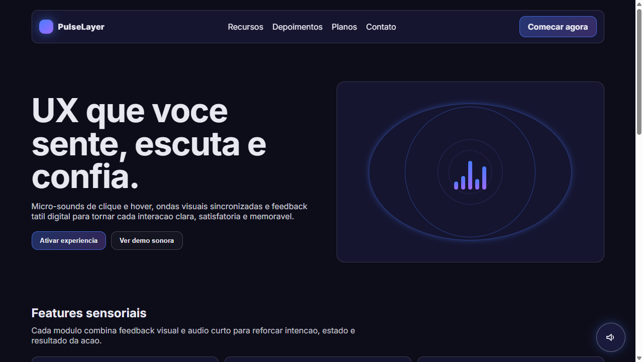
Multisensory landing page with micro-sound UX integration. Ideal for apps de produtividade premium, plataformas de musica, interfaces de gaming, dashboards interativos, experiencias imersivas, ferramentas criativas. AI-ready template.
Use case: Apps de produtividade premium, Platforms de musica, Interfaces de gaming, Dashboards interactive, Experiencias imersivas, Tools creative
Historical Context
Sound in interfaces wasn't always intentional. For decades, computers beeped at you — error tones, dial-up screeches, the aggressive buzz of a failed floppy read. Then Jim Reekes composed the Mac startup chime in 1991, and suddenly someone was thinking about what a computer should *sound like* rather than just what noise it happened to make. That single chord — a C major with overtones designed to feel reassuring — proved that audio could carry emotional weight in a digital context. The discipline stayed dormant for years. Mobile changed everything. When touch replaced physical buttons, we lost tactile confirmation. The iPhone's keyboard clicks, the subtle lock sound, the payment ding — these weren't decoration, they were replacing the feedback that hardware used to provide for free. Designers had to learn psychoacoustics. Today micro-sound lives at the intersection of haptics, animation, and audio. A notification isn't just a tone — it's a synchronized vibration pattern, a visual pulse, and a carefully pitched sound that your brain processes as a single event. The best sonic UX disappears entirely. You never notice it's there, but you'd immediately feel its absence.
When to Use
Micro-sound earns its place wherever confirmation matters and screens can't guarantee attention. Mobile apps need it for transactional moments — payment success, message sent, error states. Gaming relies on it for spatial awareness and reward loops. Premium products use bespoke sonic branding to build subconscious brand recognition (think the Porsche Taycan's synthesized engine note). Accessibility depends on it — screen readers aside, audio cues help low-vision users navigate state changes that visual indicators alone can't communicate reliably.
Design Principles
- Subtraction over addition — every sound you add is cognitive load. The best micro-sound palettes have fewer than 8 distinct tones across an entire product. If you're reaching for a sound, ask whether silence would work better first.
- Pitch relationships matter more than individual tones — your success sound, error sound, and neutral confirmation should form a coherent harmonic family. Users unconsciously learn the emotional grammar of your sound palette within minutes.
- Duration is your primary constraint — interface sounds above 300ms feel like interruptions. The sweet spot lives between 50-150ms for confirmations. Anything longer needs to justify its existence with information density (progress indicators, spatial audio cues).
- Haptics and sound are one system, not two — designing audio without considering vibration is like designing color without considering contrast. The tap pattern and the tone must feel like a single event. Latency above 20ms between them breaks the illusion.
- Context-awareness is non-negotiable — a notification sound appropriate at a desk becomes hostile in a quiet room at 2am. Micro-sound must respect system volume, time-of-day, and user attention state. The same app should sound different in focus mode versus casual browsing.
DESIGN.md
---
version: "alpha"
name: "Micro-Sound UX"
description: "Multisensory landing page with micro-sound UX integration. Ideal for apps de produtividade premium, plataformas de musica, interfaces de gaming, dashboards interativos, experiencias imersivas, ferramentas criativas. AI-ready template."
colors:
  primary: "#0D0D1A"
  secondary: "#1A1A3E"
  tertiary: "#E8E8F0"
  neutral: "#4A7CFF"
  surface: "#00E676"
  accent: "#FF5252"
typography:
  h1:
    fontFamily: Inter
    fontSize: 2.5rem
    fontWeight: 700
  body-md:
    fontFamily: Inter
    fontSize: 1rem
    fontWeight: 400
rounded:
  sm: 12px
  md: 24px
  lg: 36px
components:
  button-primary:
    backgroundColor: "{colors.primary}"
    textColor: "{colors.neutral}"
    rounded: "{rounded.sm}"
    padding: 12px
---

## Overview

Multisensory landing page with micro-sound UX integration. Ideal for apps de produtividade premium, plataformas de musica, interfaces de gaming, dashboards interativos, experiencias imersivas, ferramentas criativas. AI-ready template. Sound in interfaces wasn't always intentional. For decades, computers beeped at you — error tones, dial-up screeches, the aggressive buzz of a failed floppy read. Then Jim Reekes composed the Mac startup chime in 1991, and suddenly someone was thinking about what a computer should *sound like* rather than just what noise it happened to make. That single chord — a C major with overtones designed to feel reassuring — proved that audio could carry emotional weight in a digital context.

The discipline stayed dormant for years. Mobile changed everything. When touch replaced physical buttons, we lost tactile confirmation. The iPhone's keyboard clicks, the subtle lock sound, the payment ding — these weren't decoration, they were replacing the feedback that hardware used to provide for free. Designers had to learn psychoacoustics.

Today micro-sound lives at the intersection of haptics, animation, and audio. A notification isn't just a tone — it's a synchronized vibration pattern, a visual pulse, and a carefully pitched sound that your brain processes as a single event. The best sonic UX disappears entirely. You never notice it's there, but you'd immediately feel its absence.

- Density: 5/10 — Balanced
- Variance: 4/10 — Moderate
- Motion: 6/10 — Expressive

- **Style:** Multisensory, Audio-Visual, Tactile Feedback, Haptic-Inspired, Interactive Sound
- **Keywords:** micro-sound, UX sound, audio feedback, multisensory, tactile, haptic, click sound, hover tone, success chime, error beep, Web Audio API, sound design, interactive audio, satisfying clicks, low-frequency tones
- **Era:** 2025-2026 Multisensory Web
- **Light/Dark:** ✗ None / ✓ Full

## Colors

- **Escuro Profundo** (#0D0D1A) — Primary background surface
- **Azul Noturno** (#1A1A3E) — Accent highlight, links and focus states
- **Branco Suave** (#E8E8F0) — Light surface, card backgrounds
- **Azul Interacao** (#4A7CFF) — Secondary accent
- **Verde Sucesso** (#00E676) — Success states, positive indicators
- **Vermelho Erro** (#FF5252) — Error states, destructive actions
- **Amarelo Atencao** (#FFD740) — Warning states, attention indicators
- **Roxo Hover** (#9C6AFF) — Accent color, emphasis elements


## Typography

- **Display / Hero:** Inter — Weight 700, tight tracking, used for headline impact
- **Body:** Inter — Weight 400, 16px/1.6 line-height, max 72ch per line
- **UI Labels / Captions:** Inter — 0.875rem, weight 500, slight letter-spacing
- **Monospace:** JetBrains Mono — Used for code, metadata, and technical values

Scale:
- Hero: clamp(2.5rem, 5vw, 4rem)
- H1: 2.25rem
- H2: 1.5rem
- Body: 1rem / 1.6
- Small: 0.875rem


## Layout

- **Grid:** CSS Grid primary. Max-width containment: 1280px centered with 1.5rem side padding.
- **Spacing rhythm:** Balanced. Base unit: 0.5rem (8px).
- **Section vertical gaps:** clamp(4rem, 8vw, 8rem).
- **Hero layout:** Split-screen (text left, visual right).
- **Feature sections:** Zig-zag alternating text+image rows. No 3-equal-columns.
- **Mobile collapse:** All multi-column layouts collapse below 768px. No horizontal overflow.
- **z-index contract:** base (0) / sticky-nav (100) / overlay (200) / modal (300) / toast (500).


## Elevation & Depth

UX Multissensorial com micro-sons: clique mecanico satisfatorio ao apertar botoes (Web Audio API oscillator 80ms), tons suaves low-frequency ao hover em links (sine wave 200Hz 50ms fade), bipes curtos para sucesso/erro de formularios, indicador visual de som ativo (icone speaker pulsante), ondas sonoras visuais (CSS animation em circulos concentricos), ripple effect tatil nos cliques, feedback visual sincronizado com audio (flash de cor no momento do som), toggle mute respeitando preferencias do usuario

- **Physics:** Spring — stiffness 120, damping 20. Confident, weighted transitions.
- **Entry animations:** Fade + translate-Y (16px → 0) over 480ms ease-out. Staggered cascades for lists: 100ms between items.
- **Hover states:** Scale(1.03) + shadow lift over 200ms.
- **Page transitions:** Fade + slide (300ms).
- **Performance:** Only transform and opacity animated. No layout-triggering properties.


## Shapes

Base corner radius: 12px. See rounded tokens in front matter for the full scale.


## Components

- **Primary Button:** Rounded (12px) shape. Accent color fill. Hover: 8% darken + subtle lift shadow. Active: -1px translate tactile press. Font weight 600. No outer glows.
- **Secondary / Ghost Button:** Outline variant. 1.5px border in muted color. Text in primary color. Hover: subtle background fill.
- **Cards:** Rounded (12px) corners. Surface background. Subtle shadow (0 2px 12px rgba(0,0,0,0.06)). 1px border stroke.
- **Inputs:** Label above input. 1px border stroke. Focus ring: 2px accent color offset 2px. Error text below in semantic red. No floating labels.
- **Navigation:** Primary surface background. Active item: accent color indicator. Font weight 500 when active.
- **Skeletons:** Shimmer animation matching component dimensions. No circular spinners.
- **Empty States:** Icon-based composition with descriptive text and action button.


## Do's and Don'ts

- No emojis in UI — use icon system only (Lucide, Heroicons)
- No pure black (#000000) — use off-black or charcoal variants
- No oversaturated accent colors (saturation cap: 80%)
- No 3-column equal-width feature layouts — use zig-zag or asymmetric grid
- No `h-screen` — use `min-h-[100dvh]`
- No AI copywriting clichés: "Elevate", "Seamless", "Unleash", "Next-Gen"
- No broken external image links — use picsum.photos or inline SVG
- No generic lorem ipsum in demos

- Do Fundo escuro profundo com elementos interativos brilhantes
- Do Ripple wave animation em cliques de botao
- Do Pulse glow no hover de elementos interativos
- Do Ondas sonoras visuais (circulos concentricos animados)
- Do Shake animation para erros
- Do Icone speaker pulsante flutuante
- Do Web Audio API para micro-sons reais
- Do Toggle mute com localStorage
- Do Feedback visual sincronizado com audio
- Do Color coding por tipo de interacao


## Use Case

Apps de produtividade premium, Platforms de musica, Interfaces de gaming, Dashboards interactive, Experiencias imersivas, Tools creative
Technical Specs
CSS
background: #0D0D1A; color: #E8E8F0; font-family: 'Inter', sans-serif; @keyframes ripple { from { transform: scale(0); opacity: 0.6 } to { transform: scale(4); opacity: 0 } }; @keyframes pulse-glow { 0%,100% { box-shadow: 0 0 10px color } 50% { box-shadow: 0 0 25px color } }; @keyframes shake { 0%,100% { transform: translateX(0) } 25% { transform: translateX(-4px) } 75% { transform: translateX(4px) } }; transition: all 200ms ease; border-radius: 12pxVariables
--bg-deep: #0D0D1A; --bg-surface: #1A1A3E; --color-text: #E8E8F0; --color-interactive: #4A7CFF; --color-success: #00E676; --color-error: #FF5252; --color-warning: #FFD740; --color-hover: #9C6AFF; --ripple-duration: 600ms; --pulse-duration: 2s; --sound-click-freq: 200; --sound-hover-freq: 150; --sound-duration: 80; --border-radius: 12px; --font-primary: 'Inter', sans-serif
Checklist
☐ Fundo escuro profundo com elementos interativos brilhantes, ☐ Ripple wave animation em cliques de botao, ☐ Pulse glow no hover de elementos interativos, ☐ Ondas sonoras visuais (circulos concentricos animados), ☐ Shake animation para erros, ☐ Icone speaker pulsante flutuante, ☐ Web Audio API para micro-sons reais, ☐ Toggle mute com localStorage, ☐ Feedback visual sincronizado com audio, ☐ Color coding por tipo de interacao
Colors
Primary
Secondary
Effects
UX Multissensorial com micro-sons: clique mecanico satisfatorio ao apertar botoes (Web Audio API oscillator 80ms), tons suaves low-frequency ao hover em links (sine wave 200Hz 50ms fade), bipes curtos para sucesso/erro de formularios, indicador visual de som ativo (icone speaker pulsante), ondas sonoras visuais (CSS animation em circulos concentricos), ripple effect tatil nos cliques, feedback visual sincronizado com audio (flash de cor no momento do som), toggle mute respeitando preferencias do usuario
Light/Dark
✗ None / ✓ Full
AI Prompt
Act as a Senior Frontend Engineer and Expert UI Designer.
Your task is to code a complete Landing Page on the first attempt.
- Landing Page Theme: <INSERT THEME>
- Sections to add: <INSERT SECTIONS>

Generate the final code immediately following these definitions:

## Style

- **Name:** Micro-Sound UX
- **Type:** Multisensory, Audio-Visual, Tactile Feedback, Haptic-Inspired, Interactive Sound
- **Keywords:** micro-sound, UX sound, audio feedback, multisensory, tactile, haptic, click sound, hover tone, success chime, error beep, Web Audio API, sound design, interactive audio, satisfying clicks, low-frequency tones
- **Era:** 2025-2026 Multisensory Web
- **Light/Dark:** ✗ None / ✓ Full

## Color Palette

- **Primary:** Escuro Profundo #0D0D1A, Azul Noturno #1A1A3E, Branco Suave #E8E8F0
- **Secondary:** Azul Interacao #4A7CFF, Verde Sucesso #00E676, Vermelho Erro #FF5252, Amarelo Atencao #FFD740, Roxo Hover #9C6AFF

## Visual Effects

UX Multissensorial com micro-sons: clique mecanico satisfatorio ao apertar botoes (Web Audio API oscillator 80ms), tons suaves low-frequency ao hover em links (sine wave 200Hz 50ms fade), bipes curtos para sucesso/erro de formularios, indicador visual de som ativo (icone speaker pulsante), ondas sonoras visuais (CSS animation em circulos concentricos), ripple effect tatil nos cliques, feedback visual sincronizado com audio (flash de cor no momento do som), toggle mute respeitando preferencias do usuario

## AI Visual Direction

Design a multisensory landing page with micro-sound UX integration. Dark deep background (#0D0D1A) with glowing interactive elements. Each interactive element has VISUAL FEEDBACK that suggests sound: buttons show ripple wave animation on click (concentric circles expanding outward), hover states pulse with a subtle glow animation (suggesting a soft tone), form success shows expanding green sound wave rings, form error shows red vibration shake animation. Include a floating speaker icon that pulses to indicate audio is available. Visual sound wave representations: animated concentric circles, oscillating sine wave SVG paths, equalizer bar animations. Use Web Audio API via minimal inline JS for actual micro-sounds: oscillator sine wave 200Hz for 80ms on button click, 150Hz for 50ms on hover, ascending tone for success, descending for error. Include a mute toggle that respects user preference (localStorage). Color coding: blue for interactive, green for success, red for error, purple for hover state. Typography clean and modern (Inter). All visual animations should FEEL tactile and satisfying.

## CSS Technical

```css
background: #0D0D1A; color: #E8E8F0; font-family: 'Inter', sans-serif; @keyframes ripple { from { transform: scale(0); opacity: 0.6 } to { transform: scale(4); opacity: 0 } }; @keyframes pulse-glow { 0%,100% { box-shadow: 0 0 10px color } 50% { box-shadow: 0 0 25px color } }; @keyframes shake { 0%,100% { transform: translateX(0) } 25% { transform: translateX(-4px) } 75% { transform: translateX(4px) } }; transition: all 200ms ease; border-radius: 12px
```

## Design System Variables

```css
--bg-deep: #0D0D1A; --bg-surface: #1A1A3E; --color-text: #E8E8F0; --color-interactive: #4A7CFF; --color-success: #00E676; --color-error: #FF5252; --color-warning: #FFD740; --color-hover: #9C6AFF; --ripple-duration: 600ms; --pulse-duration: 2s; --sound-click-freq: 200; --sound-hover-freq: 150; --sound-duration: 80; --border-radius: 12px; --font-primary: 'Inter', sans-serif
```

## Implementation Checklist

- ☐ Fundo escuro profundo com elementos interativos brilhantes
- ☐ Ripple wave animation em cliques de botao
- ☐ Pulse glow no hover de elementos interativos
- ☐ Ondas sonoras visuais (circulos concentricos animados)
- ☐ Shake animation para erros
- ☐ Icone speaker pulsante flutuante
- ☐ Web Audio API para micro-sons reais
- ☐ Toggle mute com localStorage
- ☐ Feedback visual sincronizado com audio
- ☐ Color coding por tipo de interacao

## Execution Rules

1. Strictly follow the defined visual style.
2. Use high-quality inline SVG icons (Heroicons or Lucide style) — NEVER use emojis as icons.
3. Add `cursor-pointer` and smooth `hover` states (transition-all) on all interactive elements.
4. Required Page Structure:
   - Navbar (Logo + Links + CTA)
   - Hero Section (Impactful Headline + Subtitle + 2 buttons + 3D/Abstract visual element via CSS)
   - Features (3 cards with icons)
   - Testimonials (3 cards)
   - Pricing (3 tiers, highlight the middle one)
   - Final CTA
   - Full Footer with social links, privacy policy, terms of use, contact and SEO links.
5. All text content must be in English.
6. The visual must be CLEARLY distinct — do not create a "default Bootstrap" design. Force the use of the provided design system variables.
7. Use `<style>` tags in the head for custom classes (especially for complex backdrop-filter effects and animations) that Tailwind CDN doesn't cover.
8. Full Responsiveness: Layout must adapt perfectly to Mobile, Tablet and Desktop (vertical stack on mobile).
9. Include basic SEO, Viewport and Open Graph meta tags in `<head>`.
10. Footer must contain: Copyright 2026, Secondary navigation links and Social media icons.
11. Make the creative decisions needed to deliver the complete, functional result now.Related
Last synced: 4/1/2026