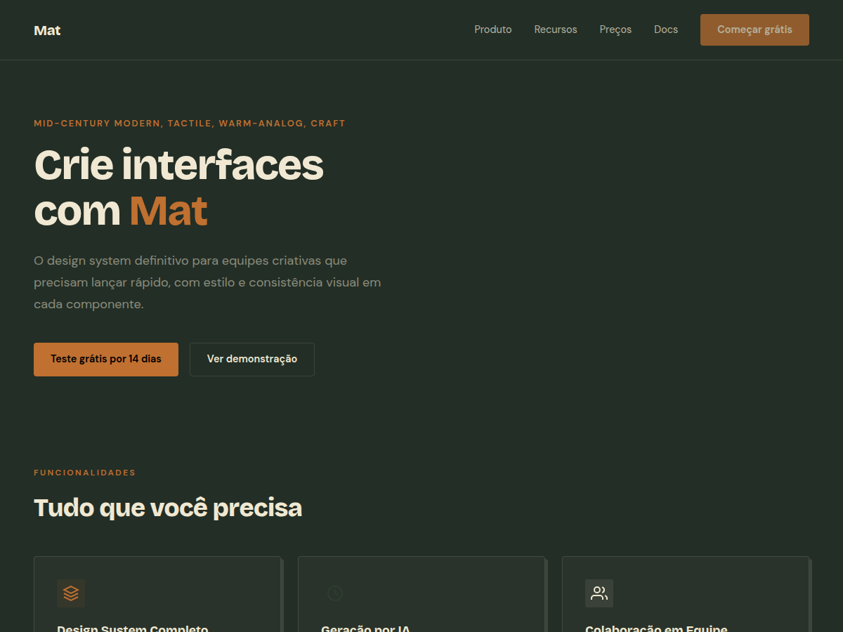
Mat
Mat — Dark sage canvas with bone paper and burnt-orange accent; mid-century modern with wood undertones. Bricolage Grotesque typography. muted sage green canvas with warm bone paper and a saturated burnt-orange accent. Best for design studio credentials, architecture / interior brand, ceramics or craft brand. AI-ready design system.
Use case: design studio credentials, architecture / interior brand, ceramics or craft brand, furniture pitch, advisory deliverable, bilingual EN/CN deck
Historical Context
Mat finishes have roots in Japanese wabi-sabi and Scandinavian craft traditions—surfaces that refuse to perform. The dark sage and bone paper combination draws directly from 1970s back-to-land publishing: think Whole Earth Catalog covers, hand-set type on uncoated stock, ink that sat heavy and uneven. There's a reason artisan ceramicists and natural dyers keep returning to these palettes. They signal process over polish. The burnt-orange accent isn't decorative—it's functional warmth. Historically it appeared in terracotta glazes, aged leather tooling, and the oxidized edges of copper vessels. It's the color of things that have been touched, used, lived with. When you pair it against sage and bone, you get a palette that feels inherited rather than designed. That's the entire point. Mat rejects the clinical precision of luxury minimalism in favor of something more honest: surfaces you want to run your hand across.
When to Use
Reach for Mat when the brand makes something by hand—or wants to feel like it does. Sourdough starters, small-batch skincare, hand-thrown pottery, single-origin anything. It works when your client's competitive advantage is craft and provenance, not scale. Avoid it for anything that needs to feel fast, digital-native, or mass-market. Mat is slow on purpose. It rewards the viewer who lingers.
Design Principles
- Texture over flatness—every surface should imply material weight and physical presence
- Burnt-orange enters only at points of action or emphasis; it earns its warmth through scarcity
- Typography sits heavy on bone backgrounds like ink pressed into soft paper—generous x-height, tight tracking
- Negative space functions as breathing room, not emptiness—the layout should feel unhurried and deliberate
- Color transitions are never gradient-smooth; allow hard edges where sage meets bone, honoring the handmade
Technical Specs
Colors
Primary
Secondary
Effects
display font Bricolage Grotesque for hero headlines, smooth hover transitions (200-250ms), subtle lift shadows, alternating light/dark sections for rhythm, dark sage canvas, bone paper cards, burnt-orange rule accents
Light/Dark
✓ Full / ◐ Partial
Related
Last synced: 5/6/2026