Manga Instructional Comic
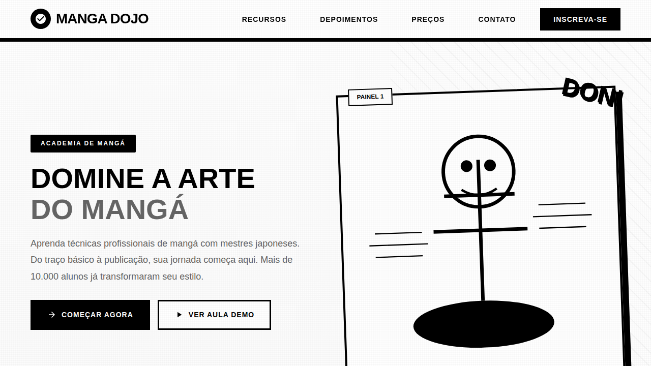
Manga style landing page, black and white comic, speed lines, dynamic panels, ink aesthetic, instructional comic design. Ideal for landing pages, modern websites. AI-ready template.
Use case: Landing pages, Modern websites
Historical Context
Manga as instructional medium didn't emerge from some corporate brainstorm. It grew organically in post-war Japan, where publishers realized sequential art could teach everything from cooking to electronics repair. The format exploded in the 1960s and 70s — government manuals, workplace safety guides, even tax filing instructions rendered in panels with expressive characters and dramatic pacing. What made it stick wasn't novelty. It was comprehension. Studies consistently showed readers retained more from manga-format instructions than from plain text equivalents. The retro-pop aesthetic we associate with instructional manga — bold screentones, exaggerated reactions, speed lines on mundane tasks — crystallized in the 1980s. Publishers like Gakken and Shogakukan perfected the formula: a relatable protagonist encounters a problem, a mentor figure appears, knowledge transfers through dialogue and visual demonstration. The format respected readers enough to entertain them while teaching. Western design finally caught on decades later. Now everyone wants "manga-style onboarding" without understanding the grammar. The panel transitions, the emotional beats between information dumps, the careful balance of white space and density — these aren't decorative choices. They're pedagogical architecture refined over sixty years.
When to Use
Reach for this when your content is procedural and your audience's attention is earned, not guaranteed. Tutorials that would otherwise be walls of numbered steps. Onboarding flows where users need motivation alongside instruction. Educational products targeting younger demographics or Japanese-market audiences who read this grammar natively. It works brilliantly for complex multi-step processes — assembly guides, software workflows, cooking sequences — where showing emotional context (frustration, then breakthrough) keeps people moving forward instead of abandoning at step four.
Design Principles
- Panel rhythm dictates comprehension speed — alternate dense informational panels with breathing-room reaction shots. Never stack three heavy panels consecutively.
- Characters exist to externalize the learner's internal state. Their confusion is permission for the reader to not already know. Their excitement signals that mastery is coming.
- Screentones and speed lines aren't decoration — they're hierarchy tools. Use them to direct the eye toward the critical action within a panel, not to fill empty space.
- Respect the gutter. Panel transitions carry meaning: moment-to-moment for precision tasks, action-to-action for workflows, scene-to-scene for context shifts. Wrong transition type breaks the teaching rhythm.
- Retro-pop color palettes (limited, high-contrast, halftone-friendly) enforce visual consistency across long sequences. Restraint in color means each accent actually signals something.
DESIGN.md
---
version: "alpha"
name: "Manga Instructional Comic"
description: "Manga style landing page, black and white comic, speed lines, dynamic panels, ink aesthetic, instructional comic design. Ideal for landing pages, modern websites. AI-ready template."
colors:
  primary: "#FFFFFF"
  secondary: "#000000"
  tertiary: "#1A1A1A"
  neutral: "#CCCCCC"
  surface: "#000000"
  accent: "#FFFFFF"
typography:
  h1:
    fontFamily: Manga Temple
    fontSize: 2.5rem
    fontWeight: 700
  body-md:
    fontFamily: Manga Temple
    fontSize: 1rem
    fontWeight: 400
components:
  button-primary:
    backgroundColor: "{colors.primary}"
    textColor: "{colors.neutral}"
    padding: 12px
---

## Overview

Manga style landing page, black and white comic, speed lines, dynamic panels, ink aesthetic, instructional comic design. Ideal for landing pages, modern websites. AI-ready template. Manga as instructional medium didn't emerge from some corporate brainstorm. It grew organically in post-war Japan, where publishers realized sequential art could teach everything from cooking to electronics repair. The format exploded in the 1960s and 70s — government manuals, workplace safety guides, even tax filing instructions rendered in panels with expressive characters and dramatic pacing. What made it stick wasn't novelty. It was comprehension. Studies consistently showed readers retained more from manga-format instructions than from plain text equivalents.

The retro-pop aesthetic we associate with instructional manga — bold screentones, exaggerated reactions, speed lines on mundane tasks — crystallized in the 1980s. Publishers like Gakken and Shogakukan perfected the formula: a relatable protagonist encounters a problem, a mentor figure appears, knowledge transfers through dialogue and visual demonstration. The format respected readers enough to entertain them while teaching.

Western design finally caught on decades later. Now everyone wants "manga-style onboarding" without understanding the grammar. The panel transitions, the emotional beats between information dumps, the careful balance of white space and density — these aren't decorative choices. They're pedagogical architecture refined over sixty years.

- Density: 5/10 — Balanced
- Variance: 7/10 — Dynamic
- Motion: 4/10 — Subtle

- **Style:** Energetic, Expressive, Narrative
- **Keywords:** manga, comic, japanese, black and white, speed lines, ink, action, panel
- **Era:** Modern Manga
- **Light/Dark:** ✓ Full / ✗ No

## Colors

- **Background** (#FFFFFF) — Primary background surface
- **Text** (#000000) — Primary text color
- **Accent** (#1A1A1A) — Primary accent, CTAs and interactive elements
- **Screen Tone** (#CCCCCC) — Extended palette, decorative use
- **Speed Line** (#000000) — Extended palette, decorative use
- **Paper White** (#FFFFFF) — Secondary surface


## Typography

- **Display / Hero:** Manga Temple — Weight 700, tight tracking, used for headline impact
- **Body:** Manga Temple — Weight 400, 16px/1.6 line-height, max 72ch per line
- **UI Labels / Captions:** Manga Temple — 0.875rem, weight 500, slight letter-spacing
- **Monospace:** JetBrains Mono — Used for code, metadata, and technical values

Scale:
- Hero: clamp(2.5rem, 5vw, 4rem)
- H1: 2.25rem
- H2: 1.5rem
- Body: 1rem / 1.6
- Small: 0.875rem


## Layout

- **Grid:** CSS Grid primary. Max-width containment: 1280px centered with 1.5rem side padding.
- **Spacing rhythm:** Balanced. Base unit: 0.5rem (8px).
- **Section vertical gaps:** clamp(4rem, 8vw, 8rem).
- **Hero layout:** Asymmetric composition.
- **Feature sections:** Asymmetric grid with varied card sizes. No 3-equal-columns.
- **Mobile collapse:** All multi-column layouts collapse below 768px. No horizontal overflow.
- **z-index contract:** base (0) / sticky-nav (100) / overlay (200) / modal (300) / toast (500).


## Elevation & Depth

Dynamic comic paneling, speed lines (beta flash), impact bursts, expressive character acting, traditional ink aesthetics, halftone screentones.

- **Physics:** Ease-out curves, 200-300ms duration. Smooth and predictable.
- **Entry animations:** Fade + translate-Y (16px → 0) over 420ms ease-out. Staggered cascades for lists: 80ms between items.
- **Hover states:** Subtle color shift + shadow adjustment over 200ms.
- **Page transitions:** Fade only (200ms).
- **Performance:** Only transform and opacity animated. No layout-triggering properties.


## Shapes

Base corner radius: 8px. See rounded tokens in front matter for the full scale.


## Components

- **Primary Button:** Subtly rounded (0.5rem) shape. Accent color fill. Hover: 8% darken + subtle lift shadow. Active: -1px translate tactile press. Font weight 600. No outer glows.
- **Secondary / Ghost Button:** Outline variant. 1.5px border in muted color. Text in primary color. Hover: subtle background fill.
- **Cards:** Subtly rounded (0.5rem) corners. Surface background. Subtle shadow (0 2px 12px rgba(0,0,0,0.06)). 1px border stroke.
- **Inputs:** Label above input. 1px border stroke. Focus ring: 2px accent color offset 2px. Error text below in semantic red. No floating labels.
- **Navigation:** Primary surface background. Active item: accent color indicator. Font weight 500 when active.
- **Skeletons:** Shimmer animation matching component dimensions. No circular spinners.
- **Empty States:** Icon-based composition with descriptive text and action button.


## Do's and Don'ts

- No emojis in UI — use icon system only (Lucide, Heroicons)
- No pure black (#000000) — use off-black or charcoal variants
- No oversaturated accent colors (saturation cap: 80%)
- No 3-column equal-width feature layouts — use zig-zag or asymmetric grid
- No `h-screen` — use `min-h-[100dvh]`
- No AI copywriting clichés: "Elevate", "Seamless", "Unleash", "Next-Gen"
- No broken external image links — use picsum.photos or inline SVG
- No generic lorem ipsum in demos

- Do Black and White dominant
- Do Manga style speed lines
- Do Angled/Dynamic panels
- Do Screentone textures
- Do Sound effect graphics (text)


## Use Case

Landing pages, Modern websites
Technical Specs
CSS
background-color: #FFFFFF; color: #000000; font-family: 'Manga Temple', sans-serif; border: 2px solid #000000; clip-path: polygon(0 0, 100% 0, 95% 100%, 5% 100%);
Variables
--manga-white: #FFFFFF, --manga-black: #000000, --tone-grey: #CCCCCC, --font-manga: sans-serif, --speed-line: repeating-linear-gradient(45deg, #000, transparent 2px)
Checklist
☐ Black and White dominant, ☐ Manga style speed lines, ☐ Angled/Dynamic panels, ☐ Screentone textures, ☐ Sound effect graphics (text)
Colors
Primary
Secondary
Effects
Dynamic comic paneling, speed lines (beta flash), impact bursts, expressive character acting, traditional ink aesthetics, halftone screentones.
Light/Dark
✓ Full / ✗ No
AI Prompt
Act as a Senior Frontend Engineer and Expert UI Designer.
Your task is to code a complete Landing Page on the first attempt.
- Landing Page Theme: <INSERT THEME>
- Sections to add: <INSERT SECTIONS>

Generate the final code immediately following these definitions:

## Style

- **Name:** Manga Instructional Comic
- **Type:** Energetic, Expressive, Narrative
- **Keywords:** manga, comic, japanese, black and white, speed lines, ink, action, panel
- **Era:** Modern Manga
- **Light/Dark:** ✓ Full / ✗ No

## Color Palette

- **Primary:** Background #FFFFFF, Text #000000, Accent #1A1A1A
- **Secondary:** Screen Tone #CCCCCC, Speed Line #000000, Paper White #FFFFFF

## Visual Effects

Dynamic comic paneling, speed lines (beta flash), impact bursts, expressive character acting, traditional ink aesthetics, halftone screentones.

## AI Visual Direction

manga style landing page, black and white comic, speed lines, dynamic panels, ink aesthetic, instructional comic design.

## CSS Technical

```css
background-color: #FFFFFF; color: #000000; font-family: 'Manga Temple', sans-serif; border: 2px solid #000000; clip-path: polygon(0 0, 100% 0, 95% 100%, 5% 100%);
```

## Design System Variables

```css
--manga-white: #FFFFFF, --manga-black: #000000, --tone-grey: #CCCCCC, --font-manga: sans-serif, --speed-line: repeating-linear-gradient(45deg, #000, transparent 2px)
```

## Implementation Checklist

- ☐ Black and White dominant
- ☐ Manga style speed lines
- ☐ Angled/Dynamic panels
- ☐ Screentone textures
- ☐ Sound effect graphics (text)

## Execution Rules

1. Strictly follow the defined visual style.
2. Use high-quality inline SVG icons (Heroicons or Lucide style) — NEVER use emojis as icons.
3. Add `cursor-pointer` and smooth `hover` states (transition-all) on all interactive elements.
4. Required Page Structure:
   - Navbar (Logo + Links + CTA)
   - Hero Section (Impactful Headline + Subtitle + 2 buttons + 3D/Abstract visual element via CSS)
   - Features (3 cards with icons)
   - Testimonials (3 cards)
   - Pricing (3 tiers, highlight the middle one)
   - Final CTA
   - Full Footer with social links, privacy policy, terms of use, contact and SEO links.
5. All text content must be in English.
6. The visual must be CLEARLY distinct — do not create a "default Bootstrap" design. Force the use of the provided design system variables.
7. Use `<style>` tags in the head for custom classes (especially for complex backdrop-filter effects and animations) that Tailwind CDN doesn't cover.
8. Full Responsiveness: Layout must adapt perfectly to Mobile, Tablet and Desktop (vertical stack on mobile).
9. Include basic SEO, Viewport and Open Graph meta tags in `<head>`.
10. Footer must contain: Copyright 2026, Secondary navigation links and Social media icons.
11. Make the creative decisions needed to deliver the complete, functional result now.
Related
Last synced: 4/1/2026