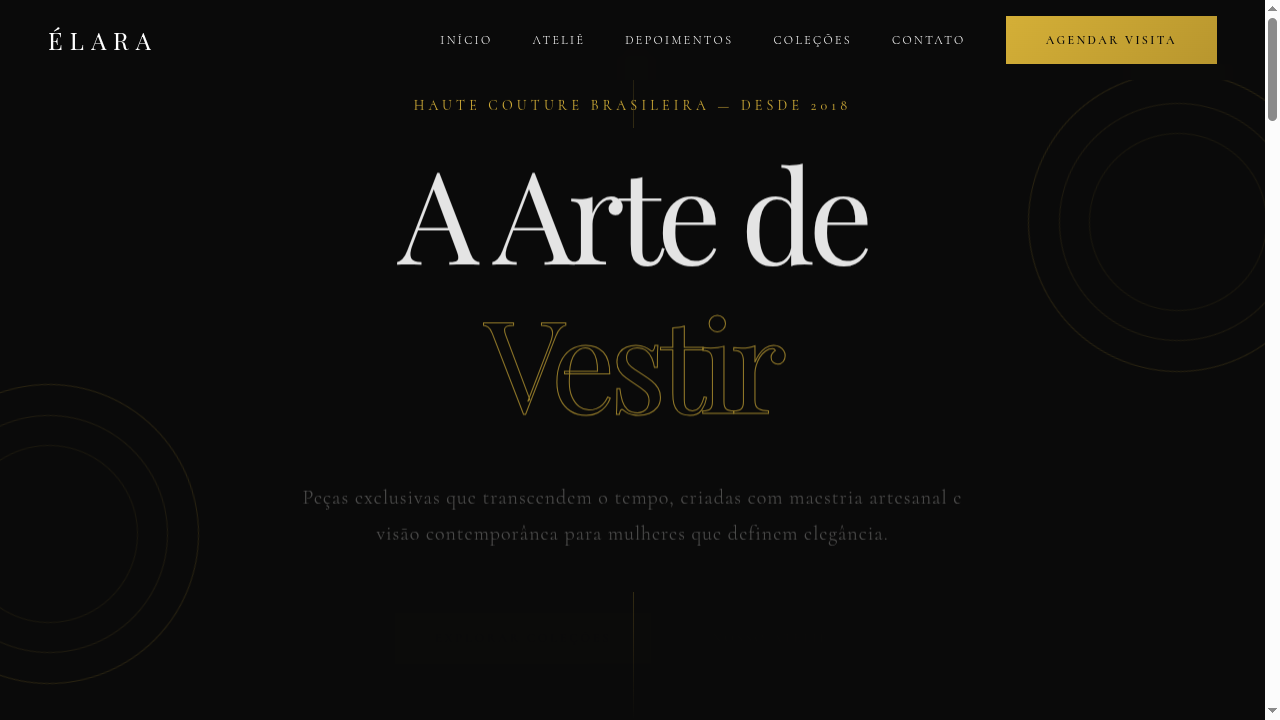
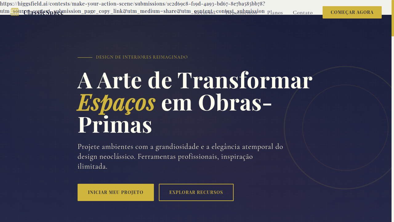
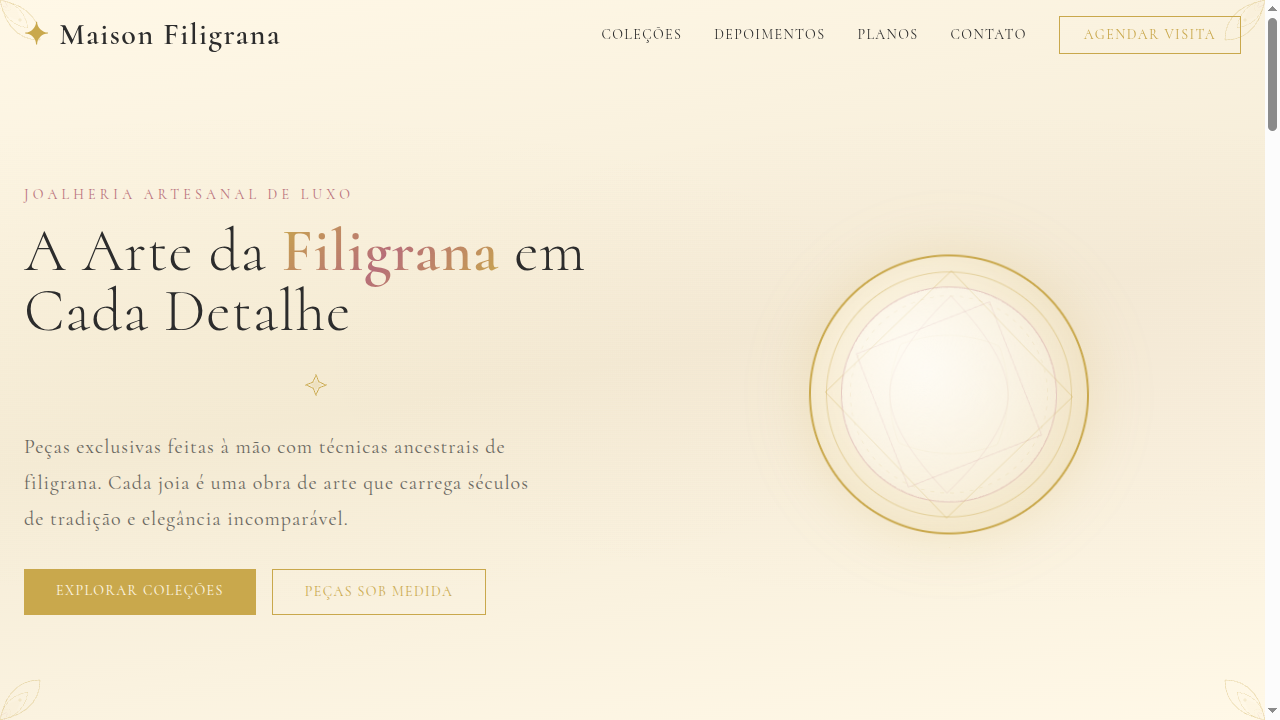
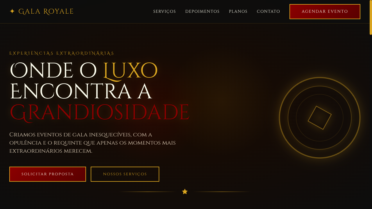
Luxury Typography
Luxury typography-focused landing page where type IS the design. Ideal for moda haute couture, embalagens premium, streetwear de luxo, capas de revistas. AI-ready template.
Use case: Moda haute couture, Embalagens premium, Streetwear de luxo, Capas de revistas
Historical Context
Luxury typography didn't emerge from design schools — it came from engravers, punchcutters, and the private presses of aristocratic patrons. The Didones of Bodoni and Firmin Didot weren't exercises in geometry; they were status symbols cast in metal, their hairline strokes impossible to reproduce on anything less than the finest paper with the most precise presses. That extreme contrast — thick verticals dissolving into impossibly thin horizontals — was a deliberate flex of craft and capital. Calligraphic scripts followed a parallel aristocratic lineage. Copperplate hands like Snell Roundhand descended from the writing masters of 17th-century merchant courts, where the quality of your penmanship literally determined your social standing. The pointed nib created swells and tapers that no broad-edge tool could achieve — organic, gestural, unmistakably human. Today's luxury typographic landscape sits at a tension point. The heritage houses still lean on Didot and Garamond, but a new wave treats restraint itself as the luxury signal — think Céline's shift to a clean sans, or Bottega Veneta's typographic minimalism. The real skill is knowing which register to pull: historical opulence or contemporary austerity. Both whisper money. They just speak different dialects.
When to Use
Deploy luxury typography when the product demands perceived value far beyond its material cost — when you're selling aspiration, not function. High fashion editorials, jewelry campaigns, five-star hospitality collateral, premium spirits, and invitation suites all live here. The key qualifier: does your audience expect to feel elevated by the communication itself? If the packaging or layout needs to perform as a status object — something people keep, frame, or photograph — luxury type is doing real work, not decoration.
Design Principles
- Contrast is currency — exploit extreme thick-thin ratios in Didones or the tension between a delicate script and generous whitespace. Timidity reads as budget.
- Letterspacing is non-negotiable — uppercase settings demand tracked-out spacing (often +50 to +120 units). Tight caps scream amateur hour regardless of how expensive the typeface was.
- Hierarchy through restraint, not volume — one typeface at two weights beats three families fighting for attention. Luxury is editing, not accumulating.
- Paper and screen are different instruments — hairline strokes that sing on uncoated 300gsm stock will vanish on a retina display at body size. Adapt weight and contrast to medium or accept failure.
- Calligraphic scripts are seasoning, never the main course — use them for a monogram, a single word, an accent. A full paragraph in copperplate isn't luxurious, it's a wedding invitation from 2007.
Technical Specs
Colors
Primary
Secondary
Effects
Dramatic font-size contrasts (display: 8-12vw), ultra-thin to ultra-bold weight range (100-900), letter-spacing variations (-0.05em to 0.3em), text-stroke for outline typography, subtle gold shimmer on hover, smooth scroll-triggered text reveals
Light/Dark
✓ Full / ✓ Full
Related
Last synced: 4/1/2026