IBM Carbon Enterprise
Design an IBM Carbon-inspired enterprise landing page. Ideal for enterprise, infraestrutura cloud, plataformas corporativas, consultoria tech. AI-ready template.
Use case: Enterprise, Infraestrutura cloud, Platforms corporativas, Consulting tech
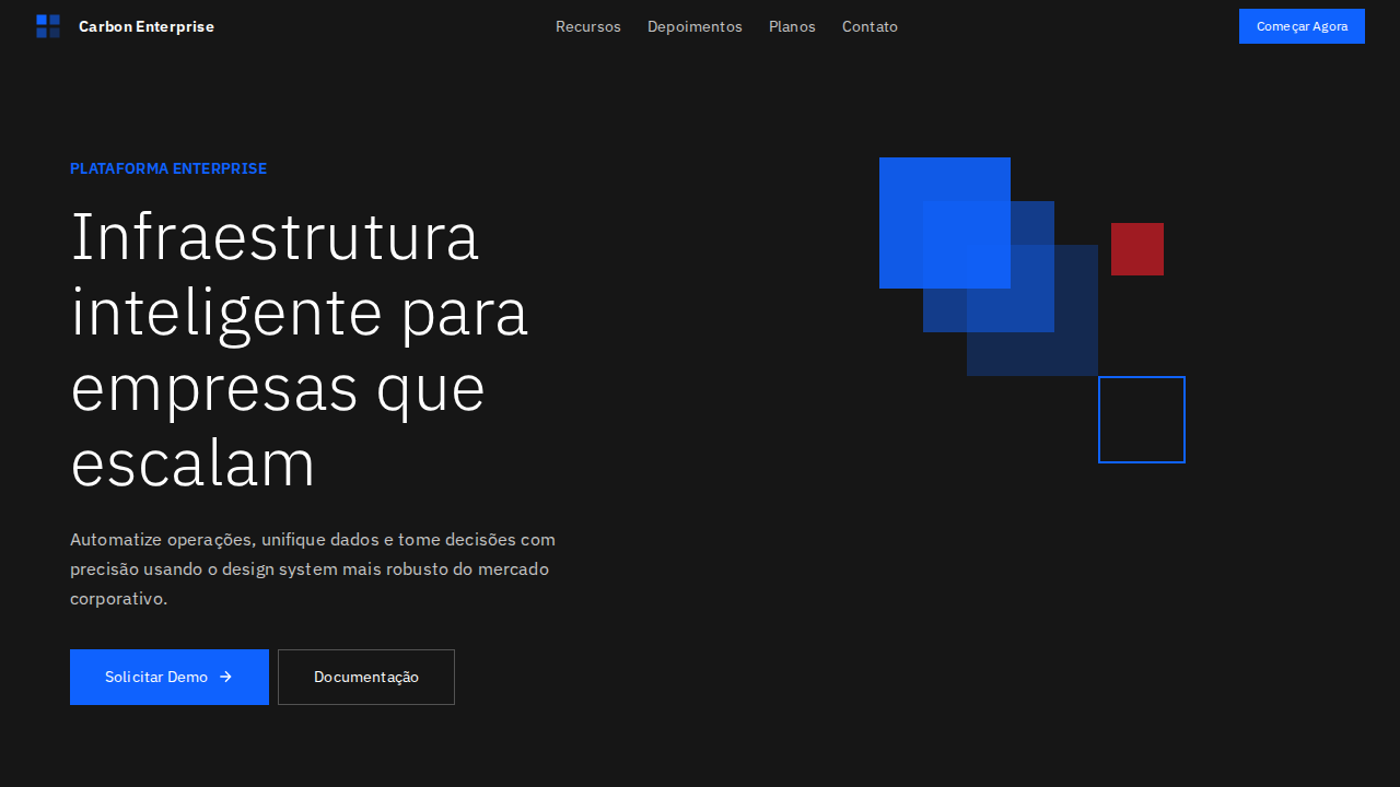
Historical Context
Carbon didn't emerge from a rebrand exercise or a startup's weekend hackathon. It came out of IBM's decades-long struggle with enterprise software that needed to display absurd amounts of data without making analysts want to quit. The system crystallized around 2017 when IBM finally admitted that their sprawling product portfolio—Watson, Cloud Pak, Cognos—needed a shared visual language that could handle density without collapsing into noise. What makes Carbon genuinely interesting is the constraint it was born from: real enterprise environments where a single dashboard might show 200+ data points, where users spend eight hours a day staring at tables, and where "delight" means not getting a headache by 3pm. The 2x grid, the muted cool-gray palette, the obsessive spacing tokens—none of this is arbitrary minimalism. It's information architecture disguised as a design system. Carbon's data visualization library (carbon-charts) deserves particular attention. While most design systems bolt on charting as an afterthought, IBM built theirs from the same atomic tokens. Color sequences are optimized for categorical distinction at scale, not aesthetic pleasure. That's a fundamentally different design philosophy than what you'll find in consumer-facing systems.
When to Use
Reach for Carbon when your interface is primarily about data comprehension at scale—when users need to parse, compare, and act on dense information sets across long sessions. It excels in enterprise dashboards where information hierarchy matters more than emotional engagement, in data platforms where consistency across dozens of views prevents cognitive fatigue, and in corporate tooling where accessibility compliance isn't optional. Skip it if your product needs warmth or personality. Carbon is deliberately impersonal—that's the point.
Design Principles
- Density over decoration — every pixel serves information delivery, ornament is actively hostile to the use case
- Systematic neutrality — the cool-gray foundation exists so data color carries all the semantic weight without competing with chrome
- Predictable rhythm via the 2x grid — spatial consistency reduces parsing effort across marathon work sessions
- Accessibility as structural requirement, not afterthought — WCAG AA minimum baked into token definitions, not patched in later
- Component composability for data contexts — tables, filters, charts, and controls designed to coexist in tight layouts without collision
DESIGN.md
---
version: "alpha"
name: "IBM Carbon Enterprise"
description: "Design an IBM Carbon-inspired enterprise landing page. Ideal for enterprise, infraestrutura cloud, plataformas corporativas, consultoria tech. AI-ready template."
colors:
  primary: "#0f62fe"
  secondary: "#ffffff"
  tertiary: "#161616"
  neutral: "#f4f4f4"
  surface: "#525252"
  accent: "#c6c6c6"
typography:
  h1:
    fontFamily: IBM Plex Sans
    fontSize: 2.5rem
    fontWeight: 700
  body-md:
    fontFamily: IBM Plex Sans
    fontSize: 1rem
    fontWeight: 400
rounded:
  sm: 2px
  md: 4px
  lg: 8px
components:
  button-primary:
    backgroundColor: "{colors.primary}"
    textColor: "{colors.neutral}"
    rounded: "{rounded.sm}"
    padding: 12px
---

## Overview

Design an IBM Carbon-inspired enterprise landing page. Ideal for enterprise, infraestrutura cloud, plataformas corporativas, consultoria tech. AI-ready template. Carbon didn't emerge from a rebrand exercise or a startup's weekend hackathon. It came out of IBM's decades-long struggle with enterprise software that needed to display absurd amounts of data without making analysts want to quit. The system crystallized around 2017 when IBM finally admitted that their sprawling product portfolio—Watson, Cloud Pak, Cognos—needed a shared visual language that could handle density without collapsing into noise.

What makes Carbon genuinely interesting is the constraint it was born from: real enterprise environments where a single dashboard might show 200+ data points, where users spend eight hours a day staring at tables, and where "delight" means not getting a headache by 3pm. The 2x grid, the muted cool-gray palette, the obsessive spacing tokens—none of this is arbitrary minimalism. It's information architecture disguised as a design system.

Carbon's data visualization library (carbon-charts) deserves particular attention. While most design systems bolt on charting as an afterthought, IBM built theirs from the same atomic tokens. Color sequences are optimized for categorical distinction at scale, not aesthetic pleasure. That's a fundamentally different design philosophy than what you'll find in consumer-facing systems.

- Density: 5/10 — Balanced
- Variance: 2/10 — Structured
- Motion: 4/10 — Subtle

- **Style:** Carbon Design System, Enterprise Precision, IBM Plex, Blue-60 Accent, Zero Radius Buttons
- **Keywords:** IBM, Carbon, enterprise, IBM Plex, Blue-60, zero radius, bottom-border inputs, 8px grid, token system, flat depth
- **Era:** 2024-2026 Enterprise Carbon
- **Light/Dark:** ✓ Full / ✓ Full

## Colors

- **Azul IBM** (#0f62fe) — Accent highlight, links and focus states
- **Branco** (#ffffff) — Light surface, card backgrounds
- **Gray 100** (#161616) — Secondary text, borders, muted elements
- **Gray 10** (#f4f4f4) — Secondary text, borders, muted elements
- **Gray 70** (#525252) — Secondary text, borders, muted elements
- **Gray 30** (#c6c6c6) — Secondary text, borders, muted elements
- **Azul Hover** (#0043ce) — Secondary accent
- **Vermelho** (#da1e28) — Error states, destructive actions


## Typography

- **Display / Hero:** IBM Plex Sans — Weight 700, tight tracking, used for headline impact
- **Body:** IBM Plex Sans — Weight 400, 16px/1.6 line-height, max 72ch per line
- **UI Labels / Captions:** IBM Plex Sans — 0.875rem, weight 500, slight letter-spacing
- **Monospace:** JetBrains Mono — Used for code, metadata, and technical values

Scale:
- Hero: clamp(2.5rem, 5vw, 4rem)
- H1: 2.25rem
- H2: 1.5rem
- Body: 1rem / 1.6
- Small: 0.875rem


## Layout

- **Grid:** CSS Grid primary. Max-width containment: 1280px centered with 1.5rem side padding.
- **Spacing rhythm:** Balanced. Base unit: 0.5rem (8px).
- **Section vertical gaps:** clamp(4rem, 8vw, 8rem).
- **Hero layout:** Split-screen (text left, visual right).
- **Feature sections:** Zig-zag alternating text+image rows. No 3-equal-columns.
- **Mobile collapse:** All multi-column layouts collapse below 768px. No horizontal overflow.
- **z-index contract:** base (0) / sticky-nav (100) / overlay (200) / modal (300) / toast (500).


## Elevation & Depth

IBM Plex Sans weight 300 (Light) para display — gravitas corporativa com leveza tipográfica. Único acento: IBM Blue 60 (#0f62fe) para tudo interativo. Border-radius 0px em botões primários — retângulos sem suavização. Inputs com bottom-border (não boxed) — padrão Carbon. Profundidade via layering de cor de fundo (branco → gray 10 → gray 20) sem sombras. Grid 2x de 8px com aderência estrita. Token system --cds-* para todas as cores semânticas. Micro letter-spacing (0.16px em 14px, 0.32px em 12px).

- **Physics:** Ease-out curves, 200-300ms duration. Smooth and predictable.
- **Entry animations:** Fade + translate-Y (16px → 0) over 420ms ease-out. Staggered cascades for lists: 80ms between items.
- **Hover states:** Subtle color shift + shadow adjustment over 200ms.
- **Page transitions:** Fade only (200ms).
- **Performance:** Only transform and opacity animated. No layout-triggering properties.


## Shapes

Base corner radius: 0px. See rounded tokens in front matter for the full scale.


## Components

- **Primary Button:** Sharp edges (0px) shape. Accent color fill. Hover: 8% darken + subtle lift shadow. Active: -1px translate tactile press. Font weight 600. No outer glows.
- **Secondary / Ghost Button:** Outline variant. 1.5px border in muted color. Text in primary color. Hover: subtle background fill.
- **Cards:** Sharp edges (0px) corners. Surface background. Subtle shadow (0 2px 12px rgba(0,0,0,0.06)). 1px border stroke.
- **Inputs:** Label above input. 1px border stroke. Focus ring: 2px accent color offset 2px. Error text below in semantic red. No floating labels.
- **Navigation:** Primary surface background. Active item: accent color indicator. Font weight 500 when active.
- **Skeletons:** Shimmer animation matching component dimensions. No circular spinners.
- **Empty States:** Icon-based composition with descriptive text and action button.


## Do's and Don'ts

- No emojis in UI — use icon system only (Lucide, Heroicons)
- No pure black (#000000) — use off-black or charcoal variants
- No oversaturated accent colors (saturation cap: 80%)
- No 3-column equal-width feature layouts — use zig-zag or asymmetric grid
- No `h-screen` — use `min-h-[100dvh]`
- No AI copywriting clichés: "Elevate", "Seamless", "Unleash", "Next-Gen"
- No broken external image links — use picsum.photos or inline SVG
- No generic lorem ipsum in demos

- Do IBM Plex Sans weight 300 display
- Do Azul #0f62fe único acento
- Do Radius 0px em botões
- Do Inputs bottom-border
- Do Profundidade via cor de fundo
- Do Grid 8px estrito
- Do Micro letter-spacing
- Do Responsivo


## Use Case

Enterprise, Infraestrutura cloud, Platforms corporativas, Consulting tech
Technical Specs
CSS
background: #ffffff; color: #161616; accent: #0f62fe; border-radius: 0px buttons; border-bottom: 2px solid #161616 inputs; font-family: 'IBM Plex Sans', sans-serif; font-weight: 300 display; letter-spacing: 0.16px at 14px; layer: #f4f4f4 cards
Variables
--cds-background: #ffffff; --cds-text-primary: #161616; --cds-button-primary: #0f62fe; --cds-button-primary-hover: #0353e9; --cds-layer-01: #f4f4f4; --cds-border-subtle: #c6c6c6; --cds-text-secondary: #525252; --cds-focus: #0f62fe; --radius: 0px
Checklist
☐ IBM Plex Sans weight 300 display, ☐ Azul #0f62fe único acento, ☐ Radius 0px em botões, ☐ Inputs bottom-border, ☐ Profundidade via cor de fundo, ☐ Grid 8px estrito, ☐ Micro letter-spacing, ☐ Responsivo
Colors
Primary
Secondary
Effects
IBM Plex Sans weight 300 (Light) para display — gravitas corporativa com leveza tipográfica. Único acento: IBM Blue 60 (#0f62fe) para tudo interativo. Border-radius 0px em botões primários — retângulos sem suavização. Inputs com bottom-border (não boxed) — padrão Carbon. Profundidade via layering de cor de fundo (branco → gray 10 → gray 20) sem sombras. Grid 2x de 8px com aderência estrita. Token system --cds-* para todas as cores semânticas. Micro letter-spacing (0.16px em 14px, 0.32px em 12px).
Light/Dark
✓ Full / ✓ Full
AI Prompt
Act as a Senior Frontend Engineer and Expert UI Designer.
Your task is to code a complete Landing Page on the first attempt.
- Landing Page Theme: <INSERT THEME>
- Sections to add: <INSERT SECTIONS>

Generate the final code immediately following these definitions:

## Style

- **Name:** IBM Carbon Enterprise
- **Type:** Carbon Design System, Enterprise Precision, IBM Plex, Blue-60 Accent, Zero Radius Buttons
- **Keywords:** IBM, Carbon, enterprise, IBM Plex, Blue-60, zero radius, bottom-border inputs, 8px grid, token system, flat depth
- **Era:** 2024-2026 Enterprise Carbon
- **Light/Dark:** ✓ Full / ✓ Full

## Color Palette

- **Primary:** Azul IBM #0f62fe, Branco #ffffff, Gray 100 #161616, Gray 10 #f4f4f4
- **Secondary:** Gray 70 #525252, Gray 30 #c6c6c6, Azul Hover #0043ce, Vermelho #da1e28

## Visual Effects

IBM Plex Sans weight 300 (Light) para display — gravitas corporativa com leveza tipográfica. Único acento: IBM Blue 60 (#0f62fe) para tudo interativo. Border-radius 0px em botões primários — retângulos sem suavização. Inputs com bottom-border (não boxed) — padrão Carbon. Profundidade via layering de cor de fundo (branco → gray 10 → gray 20) sem sombras. Grid 2x de 8px com aderência estrita. Token system --cds-* para todas as cores semânticas. Micro letter-spacing (0.16px em 14px, 0.32px em 12px).

## AI Visual Direction

Design an IBM Carbon-inspired enterprise landing page. IBM Plex Sans at weight 300 (Light) for display headlines at 60px. Single accent: IBM Blue 60 (#0f62fe) for all interactive elements. 0px border-radius on primary buttons — unapologetically rectangular. Bottom-border inputs (not boxed). Depth through background-color layering (white → #f4f4f4 → #e0e0e0), no shadows. Strict 8px grid. Gray 100 (#161616) for text and dark surfaces. Micro letter-spacing (0.16px at 14px). Three weights: 300 display, 400 body, 600 emphasis.

## CSS Technical

```css
background: #ffffff; color: #161616; accent: #0f62fe; border-radius: 0px buttons; border-bottom: 2px solid #161616 inputs; font-family: 'IBM Plex Sans', sans-serif; font-weight: 300 display; letter-spacing: 0.16px at 14px; layer: #f4f4f4 cards
```

## Design System Variables

```css
--cds-background: #ffffff; --cds-text-primary: #161616; --cds-button-primary: #0f62fe; --cds-button-primary-hover: #0353e9; --cds-layer-01: #f4f4f4; --cds-border-subtle: #c6c6c6; --cds-text-secondary: #525252; --cds-focus: #0f62fe; --radius: 0px
```

## Implementation Checklist

- ☐ IBM Plex Sans weight 300 display
- ☐ Azul #0f62fe único acento
- ☐ Radius 0px em botões
- ☐ Inputs bottom-border
- ☐ Profundidade via cor de fundo
- ☐ Grid 8px estrito
- ☐ Micro letter-spacing
- ☐ Responsivo

## Execution Rules

1. Strictly follow the defined visual style.
2. Use high-quality inline SVG icons (Heroicons or Lucide style) — NEVER use emojis as icons.
3. Add `cursor-pointer` and smooth `hover` states (transition-all) on all interactive elements.
4. Required Page Structure:
   - Navbar (Logo + Links + CTA)
   - Hero Section (Impactful Headline + Subtitle + 2 buttons + 3D/Abstract visual element via CSS)
   - Features (3 cards with icons)
   - Testimonials (3 cards)
   - Pricing (3 tiers, highlight the middle one)
   - Final CTA
   - Full Footer with social links, privacy policy, terms of use, contact and SEO links.
5. All text content must be in English.
6. The visual must be CLEARLY distinct — do not create a "default Bootstrap" design. Force the use of the provided design system variables.
7. Use `<style>` tags in the head for custom classes (especially for complex backdrop-filter effects and animations) that Tailwind CDN doesn't cover.
8. Full Responsiveness: Layout must adapt perfectly to Mobile, Tablet and Desktop (vertical stack on mobile).
9. Include basic SEO, Viewport and Open Graph meta tags in `<head>`.
10. Footer must contain: Copyright 2026, Secondary navigation links and Social media icons.
11. Make the creative decisions needed to deliver the complete, functional result now.
Related
Last synced: 4/1/2026