High-Contrast Tech
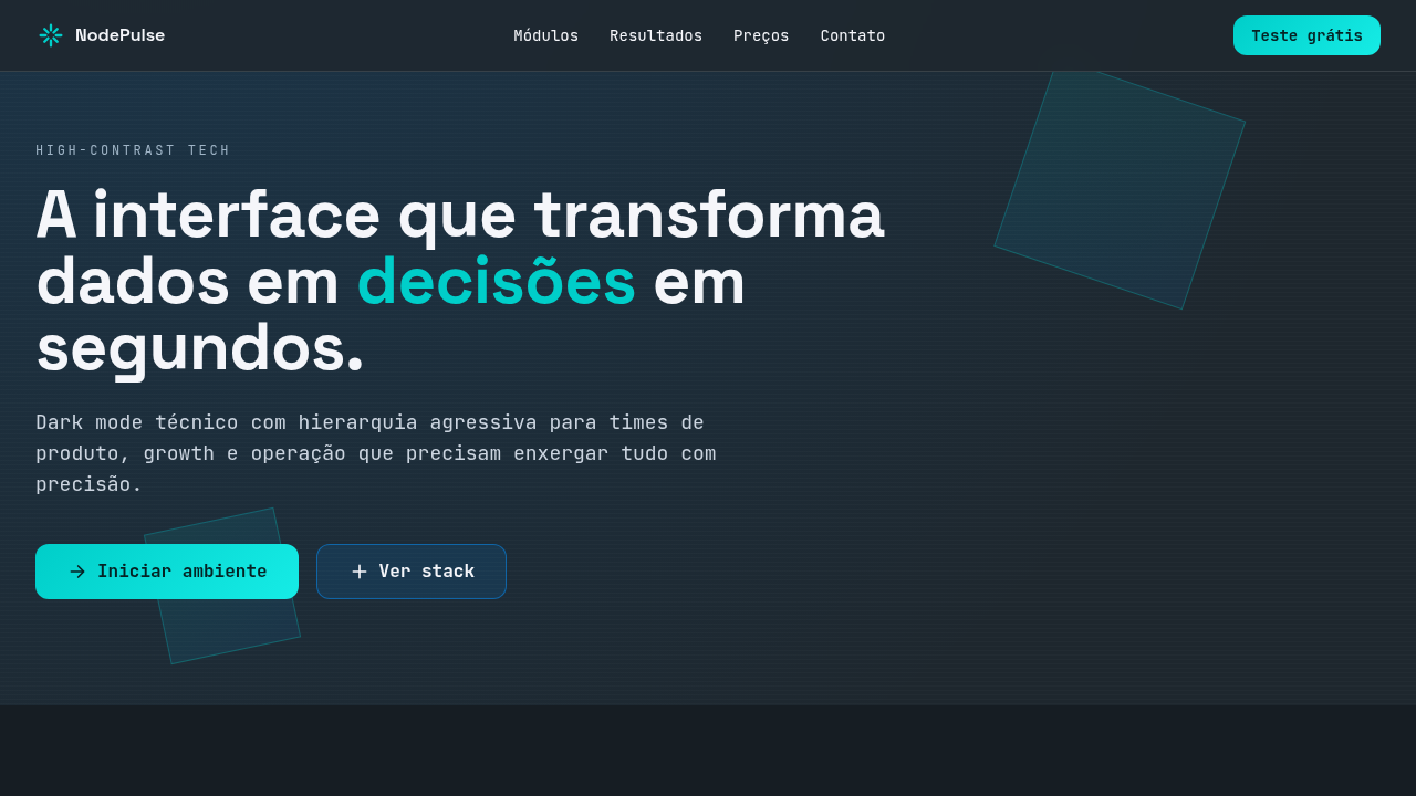
High-contrast tech interface with strict 60/30/10 color distribution. Ideal for ux/ui de produto digital, dashboards analytics, saas platforms, conteúdo tecnológico, apps b2b. AI-ready template.
Use case: Digital product UX/UI, Analytics dashboards, SaaS platforms, Tech content, B2B apps
Historical Context
High-contrast interfaces didn't emerge from aesthetic preference — they emerged from necessity. Early terminal displays were high-contrast by default: phosphor green on black, amber on void. There was no design decision there, just physics. When GUIs arrived and everyone rushed toward light themes and soft gradients, the developers kept their dark terminals. They knew something the design world would take decades to rediscover: contrast isn't decoration, it's information density. The resurgence started around 2015-2018 when tools like VS Code, Figma, and Linear normalized dark-first interfaces for professional software. These weren't "dark modes" bolted onto light designs — they were conceived in darkness. The philosophy shifted: instead of asking users to opt into dark mode, you designed for the void first and treated light as the accommodation. This inversion changed everything about how we think about hierarchy, because when your canvas is already at zero luminance, every pixel of light becomes intentional. You earn attention through precision, not volume.
When to Use
When your users live in their tools for 8+ hours a day and eye strain is a real concern, not a hypothetical. Developer tools, IDEs, monitoring dashboards, API platforms, CLI companions — anything where the interface should recede and the content should cut. Also appropriate for tech products that want to signal competence over friendliness. If your brand voice is "we built this for people who build things," this is your palette. Avoid it for consumer apps targeting broad demographics or anything requiring warmth.
Design Principles
- Luminance as hierarchy — reserve pure white (#FFFFFF) exclusively for primary content; everything else lives in calculated gray steps that establish reading order without decoration
- Surgical color application — accent colors appear only at interaction points and system status; if more than 5% of your viewport is chromatic, you've lost the plot
- Borders are failures — if you need a visible border to separate content, your spacing and background differentiation aren't working hard enough; use subtle elevation shifts instead
- Typography does the heavy lifting — with decoration stripped away, your type scale, weight contrast, and monospace/sans pairing become the entire personality of the interface
- Precision over padding — tighter spacing, sharper corners (2-4px max), and deliberate alignment communicate competence; generous whitespace reads as consumer-friendly, density reads as professional
DESIGN.md
---
version: "alpha"
name: "High-Contrast Tech"
description: "High-contrast tech interface with strict 60/30/10 color distribution. Ideal for ux/ui de produto digital, dashboards analytics, saas platforms, conteúdo tecnológico, apps b2b. AI-ready template."
colors:
  primary: "#1E272E"
  secondary: "#F5F6FA"
  tertiary: "#0984E3"
typography:
  h1:
    fontFamily: System UI stack
    fontSize: 2.25rem
    fontWeight: 700
  body-md:
    fontFamily: System UI stack
    fontSize: 1rem
    fontWeight: 400
  label-caps:
    fontFamily: System UI stack
    fontSize: 0.75rem
    fontWeight: 500
components:
  button-primary:
    backgroundColor: "{colors.primary}"
    padding: 12px
---

## Overview

High-contrast tech interface with strict 60/30/10 color distribution. Ideal for ux/ui de produto digital, dashboards analytics, saas platforms, conteúdo tecnológico, apps b2b. AI-ready template. High-contrast interfaces didn't emerge from aesthetic preference — they emerged from necessity. Early terminal displays were high-contrast by default: phosphor green on black, amber on void. There was no design decision there, just physics. When GUIs arrived and everyone rushed toward light themes and soft gradients, the developers kept their dark terminals. They knew something the design world would take decades to rediscover: contrast isn't decoration, it's information density.

The resurgence started around 2015-2018 when tools like VS Code, Figma, and Linear normalized dark-first interfaces for professional software. These weren't "dark modes" bolted onto light designs — they were conceived in darkness. The philosophy shifted: instead of asking users to opt into dark mode, you designed for the void first and treated light as the accommodation. This inversion changed everything about how we think about hierarchy, because when your canvas is already at zero luminance, every pixel of light becomes intentional. You earn attention through precision, not volume.

- Density: 8/10 — Dense
- Variance: 4/10 — Moderate
- Motion: 4/10 — Subtle

- **Style:** Dark, Precise, High-Contrast, Conversion-Focused
- **Keywords:** tech, dark mode, contrast, neon, dashboards, product UI, high readability, modern, digital, performance
- **Era:** 2020s Tech Product Design
- **Light/Dark:** ✓ Full / ✓ Full

## Colors

- **Night Black** (#1E272E) — Dark surface, primary background
- **Cloud White** (#F5F6FA) — Secondary surface
- **Electric Blue** (#0984E3) — Secondary accent


## Typography

- **Display / Hero:** System UI stack (-apple-system, sans-serif) — Weight 700, tight tracking, used for headline impact
- **Body:** System UI stack (-apple-system, sans-serif) — Weight 400, 16px/1.6 line-height, max 72ch per line
- **UI Labels / Captions:** System UI stack (-apple-system, sans-serif) — 0.875rem, weight 500, slight letter-spacing
- **Monospace:** JetBrains Mono — Used for code, metadata, and technical values

Scale:
- Hero: clamp(2.5rem, 5vw, 4rem)
- H1: 2.25rem
- H2: 1.5rem
- Body: 1rem / 1.6
- Small: 0.875rem


## Layout

- **Grid:** CSS Grid primary. Max-width containment: 1280px centered with 1.5rem side padding.
- **Spacing rhythm:** Balanced. Base unit: 0.5rem (8px).
- **Section vertical gaps:** clamp(4rem, 8vw, 8rem).
- **Hero layout:** Split-screen (text left, visual right).
- **Feature sections:** Zig-zag alternating text+image rows. No 3-equal-columns.
- **Mobile collapse:** All multi-column layouts collapse below 768px. No horizontal overflow.
- **z-index contract:** base (0) / sticky-nav (100) / overlay (200) / modal (300) / toast (500).


## Elevation & Depth

10%: Cyan Neon #00CEC9 para botões primários, notificações e elementos interativos; brilho controlado, bordas técnicas e transições rápidas (180-220ms)

- **Physics:** Ease-out curves, 200-300ms duration. Smooth and predictable.
- **Entry animations:** Fade + translate-Y (16px → 0) over 420ms ease-out. Staggered cascades for lists: 80ms between items.
- **Hover states:** Subtle color shift + shadow adjustment over 200ms.
- **Page transitions:** Fade only (200ms).
- **Performance:** Only transform and opacity animated. No layout-triggering properties.


## Shapes

Base corner radius: 24px. See rounded tokens in front matter for the full scale.


## Components

- **Primary Button:** Generously rounded (1.5rem) shape. Accent color fill. Hover: 8% darken + subtle lift shadow. Active: -1px translate tactile press. Font weight 600. No outer glows.
- **Secondary / Ghost Button:** Outline variant. 1.5px border in muted color. Text in primary color. Hover: subtle background fill.
- **Cards:** Generously rounded (1.5rem) corners. Surface background. Subtle shadow (0 2px 12px rgba(0,0,0,0.06)). 1px border stroke.
- **Inputs:** Label above input. 1px border stroke. Focus ring: 2px accent color offset 2px. Error text below in semantic red. No floating labels.
- **Navigation:** Primary surface background. Active item: accent color indicator. Font weight 500 when active.
- **Skeletons:** Shimmer animation matching component dimensions. No circular spinners.
- **Empty States:** Icon-based composition with descriptive text and action button.


## Do's and Don'ts

- No emojis in UI — use icon system only (Lucide, Heroicons)
- No pure white (#FFFFFF) backgrounds — use off-white or dark surfaces
- No oversaturated accent colors (saturation cap: 80%)
- No 3-column equal-width feature layouts — use zig-zag or asymmetric grid
- No `h-screen` — use `min-h-[100dvh]`
- No AI copywriting clichés: "Elevate", "Seamless", "Unleash", "Next-Gen"
- No broken external image links — use picsum.photos or inline SVG
- No generic lorem ipsum in demos

- Do Base dark #1E272E predominante (60%)
- Do Leitura forte com #F5F6FA
- Do Estrutura secundária em #0984E3
- Do Destaque neon #00CEC9 limitado a 10%
- Do Contraste AA/AAA validado
- Do Responsivo


## Use Case

Digital product UX/UI, Analytics dashboards, SaaS platforms, Tech content, B2B apps
Technical Specs
CSS
background: #1E272E; color: #F5F6FA; --blue-struct: #0984E3; --accent-neon: #00CEC9; border: 1px solid rgba(245,246,250,0.12); box-shadow: 0 0 0 1px rgba(0,206,201,0.15), 0 8px 24px rgba(0,0,0,0.35); transition: all 0.2s ease;
Variables
--color-dominant-60: #1E272E; --color-secondary-30-text: #F5F6FA; --color-secondary-30-struct: #0984E3; --color-accent-10: #00CEC9; --radius-md: 10px; --focus-ring: 0 0 0 3px rgba(0,206,201,0.35); --shadow-tech: 0 8px 24px rgba(0,0,0,0.35);
Checklist
☐ Base dark #1E272E predominante (60%), ☐ Leitura forte com #F5F6FA, ☐ Estrutura secundária em #0984E3, ☐ Destaque neon #00CEC9 limitado a 10%, ☐ Contraste AA/AAA validado, ☐ Responsivo
Colors
Primary
Secondary
Effects
10%: Cyan Neon #00CEC9 para botões primários, notificações e elementos interativos; brilho controlado, bordas técnicas e transições rápidas (180-220ms)
Light/Dark
✓ Full / ✓ Full
AI Prompt
Act as a Senior Frontend Engineer and Expert UI Designer.
Your task is to code a complete Landing Page on the first attempt.
- Landing Page Theme: <INSERT THEME>
- Sections to add: <INSERT SECTIONS>

Generate the final code immediately following these definitions:

## Style

- **Name:** High-Contrast Tech
- **Type:** Dark, Precise, High-Contrast, Conversion-Focused
- **Keywords:** tech, dark mode, contrast, neon, dashboards, product UI, high readability, modern, digital, performance
- **Era:** 2020s Tech Product Design
- **Light/Dark:** ✓ Full / ✓ Full

## Color Palette

- **Primary:** 60%: Night Black #1E272E como base de dark mode para fundos principais e áreas de profundidade
- **Secondary:** 30%: Cloud White #F5F6FA para textos/ícones + Electric Blue #0984E3 para navegação secundária e blocos informativos

## Visual Effects

10%: Cyan Neon #00CEC9 para botões primários, notificações e elementos interativos; brilho controlado, bordas técnicas e transições rápidas (180-220ms)

## AI Visual Direction

Create a high-contrast tech interface with strict 60/30/10 color distribution. Use 60% night black (#1E272E) as the dark-mode foundation, 30% cloud white (#F5F6FA) plus electric blue (#0984E3) for readability and structural hierarchy, and 10% cyan neon (#00CEC9) for primary actions and interaction cues. Emphasize clarity, data-driven hierarchy, and crisp UI components.

## CSS Technical

```css
background: #1E272E; color: #F5F6FA; --blue-struct: #0984E3; --accent-neon: #00CEC9; border: 1px solid rgba(245,246,250,0.12); box-shadow: 0 0 0 1px rgba(0,206,201,0.15), 0 8px 24px rgba(0,0,0,0.35); transition: all 0.2s ease;
```

## Design System Variables

```css
--color-dominant-60: #1E272E; --color-secondary-30-text: #F5F6FA; --color-secondary-30-struct: #0984E3; --color-accent-10: #00CEC9; --radius-md: 10px; --focus-ring: 0 0 0 3px rgba(0,206,201,0.35); --shadow-tech: 0 8px 24px rgba(0,0,0,0.35);
```

## Implementation Checklist

- ☐ Base dark #1E272E predominante (60%)
- ☐ Leitura forte com #F5F6FA
- ☐ Estrutura secundária em #0984E3
- ☐ Destaque neon #00CEC9 limitado a 10%
- ☐ Contraste AA/AAA validado
- ☐ Responsivo

## Execution Rules

1. Strictly follow the defined visual style.
2. Use high-quality inline SVG icons (Heroicons or Lucide style) — NEVER use emojis as icons.
3. Add `cursor-pointer` and smooth `hover` states (transition-all) on all interactive elements.
4. Required Page Structure:
   - Navbar (Logo + Links + CTA)
   - Hero Section (Impactful Headline + Subtitle + 2 buttons + 3D/Abstract visual element via CSS)
   - Features (3 cards with icons)
   - Testimonials (3 cards)
   - Pricing (3 tiers, highlight the middle one)
   - Final CTA
   - Full Footer with social links, privacy policy, terms of use, contact and SEO links.
5. All text content must be in English.
6. The visual must be CLEARLY distinct — do not create a "default Bootstrap" design. Force the use of the provided design system variables.
7. Use `<style>` tags in the head for custom classes (especially for complex backdrop-filter effects and animations) that Tailwind CDN doesn't cover.
8. Full Responsiveness: Layout must adapt perfectly to Mobile, Tablet and Desktop (vertical stack on mobile).
9. Include basic SEO, Viewport and Open Graph meta tags in `<head>`.
10. Footer must contain: Copyright 2026, Secondary navigation links and Social media icons.
11. Make the creative decisions needed to deliver the complete, functional result now.
Related
Last synced: 4/1/2026