Grove
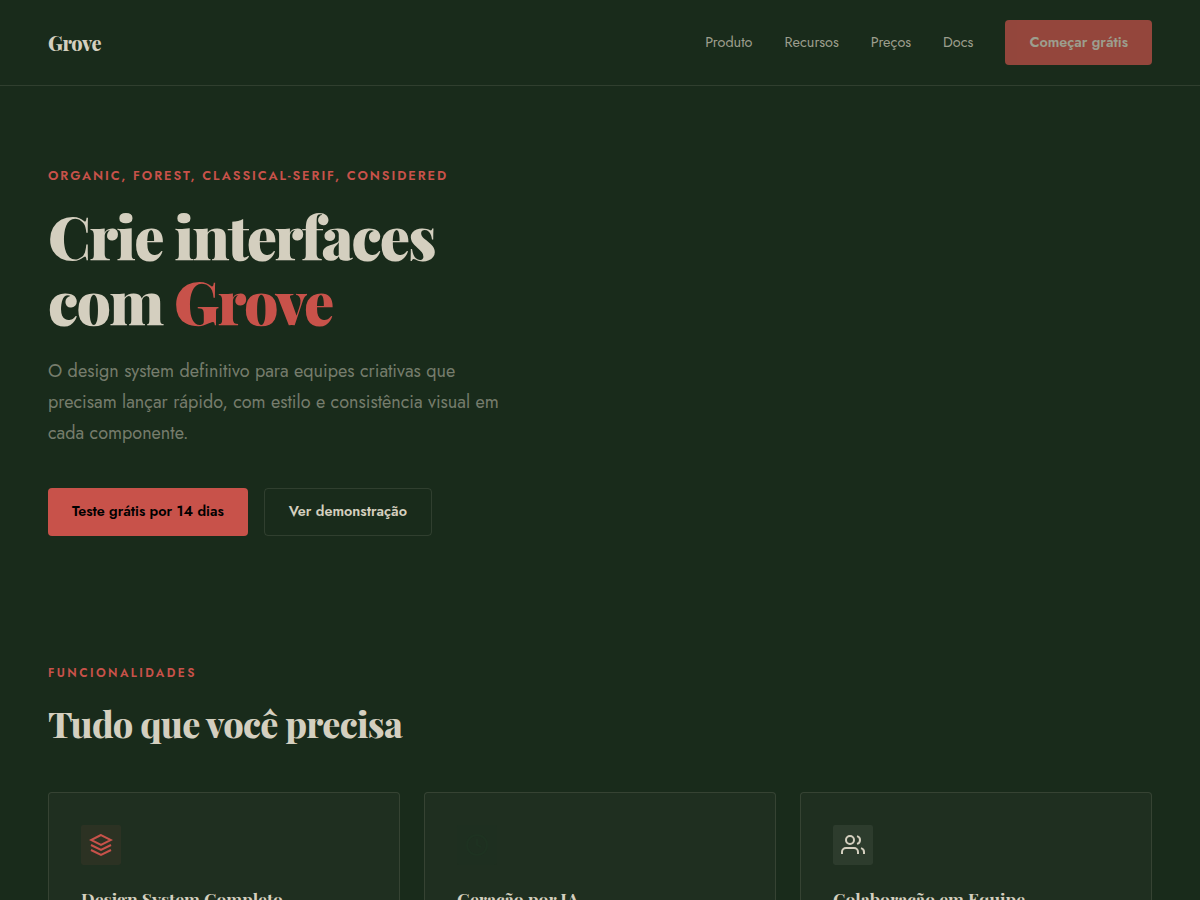
Grove — Forest-green canvas with cream type, classical Playfair serifs, and a single rust accent. Playfair Display typography. deep forest green canvas with warm bone type and a single rust-red accent. Best for sustainability brand, wellness brand, outdoor / nature product. AI-ready design system.
Use case: sustainability brand, wellness brand, outdoor / nature product, winery or restaurant, literary or arts deck, advisory deliverable, bilingual EN/CN deck
Historical Context
The pairing of deep greens with earthy rust tones isn't a trend — it's a return to something older than graphic design itself. William Morris built an entire movement around it in the 1870s, rejecting industrial aesthetics in favor of natural pigments and botanical forms. The Arts & Crafts palette was never about decoration; it was ideological. Green meant growth, craft, resistance to the machine. Playfair Display carries that same tension between refinement and groundedness. Its high contrast and sharp serifs feel editorial, almost aristocratic, but paired with forest green it reads as something rooted rather than precious. The rust accent does the heavy lifting here — it stops the palette from feeling too pristine, too "wellness brand circa 2019." Rust is the color of iron oxidizing, of leaves turning, of things that have been outside long enough to earn their texture. This combination works because it doesn't try to aestheticize nature — it references the actual material reality of organic things. Soil, bark, lichen, patina. Designers who reach for mint and sage are decorating. Grove is documenting.
When to Use
Reach for Grove when the brand has substance behind its sustainability claims — certifications, supply chain transparency, actual dirt under its fingernails. It's wrong for greenwashing. The Playfair serif demands content density: long-form storytelling, ingredient provenance, founder narratives. Works beautifully for DTC organic goods, outdoor heritage brands, regenerative agriculture, botanical skincare with real formulation stories. Avoid if the product is purely digital or the brand voice is playful — Grove is serious without being stern.
Design Principles
- Let texture do the talking — linen backgrounds, grain overlays, and paper-like surfaces over flat minimalism. The palette needs materiality to breathe.
- Playfair owns the hierarchy. Use it for headlines and pull quotes only. Pair with a humanist sans-serif for body text — never let the serif compete with itself at small sizes.
- Rust is seasoning, not the main course. Deploy it for CTAs, accent borders, and hover states. More than 15% coverage and the palette tips from earthy to aggressive.
- Embrace asymmetry and generous whitespace. Nature doesn't center-align. Let compositions feel found rather than constructed — offset grids, ragged edges, breathing room.
- Photography should feel documentary, not aspirational. Overcast light, imperfect produce, hands in soil. The design system falls apart the moment you introduce stock-photo sunshine.
DESIGN.md
---
version: "alpha"
name: "Grove"
description: "Grove — Forest-green canvas with cream type, classical Playfair serifs, and a single rust accent. Playfair Display typography. deep forest green canvas with warm bone type and a single rust-red accent. Best for sustainability brand, wellness brand, outdoor / nature product. AI-ready design system."
colors:
  primary: "#192b1b"
  secondary: "#1e3221"
  tertiary: "#d4cfbf"
  neutral: "#c8524a"
  surface: "#e8e4d6"
typography:
  h1:
    fontFamily: Playfair Display
    fontSize: 2.25rem
    fontWeight: 700
  body-md:
    fontFamily: Jost
    fontSize: 1rem
    fontWeight: 400
  label-caps:
    fontFamily: Jost
    fontSize: 0.75rem
    fontWeight: 500
spacing:
  sm: 1.5rem
  md: 3.0rem
  lg: 6.0rem
components:
  button-primary:
    backgroundColor: "{colors.primary}"
    textColor: "{colors.neutral}"
    padding: 12px
---

## Overview

Grove — Forest-green canvas with cream type, classical Playfair serifs, and a single rust accent. Playfair Display typography. deep forest green canvas with warm bone type and a single rust-red accent. Best for sustainability brand, wellness brand, outdoor / nature product. AI-ready design system. The pairing of deep greens with earthy rust tones isn't a trend — it's a return to something older than graphic design itself. William Morris built an entire movement around it in the 1870s, rejecting industrial aesthetics in favor of natural pigments and botanical forms. The Arts & Crafts palette was never about decoration; it was ideological. Green meant growth, craft, resistance to the machine.

Playfair Display carries that same tension between refinement and groundedness. Its high contrast and sharp serifs feel editorial, almost aristocratic, but paired with forest green it reads as something rooted rather than precious. The rust accent does the heavy lifting here — it stops the palette from feeling too pristine, too "wellness brand circa 2019." Rust is the color of iron oxidizing, of leaves turning, of things that have been outside long enough to earn their texture.

This combination works because it doesn't try to aestheticize nature — it references the actual material reality of organic things. Soil, bark, lichen, patina. Designers who reach for mint and sage are decorating. Grove is documenting.

- Density: 5/10 — Balanced
- Variance: 6/10 — Dynamic
- Motion: 2/10 — Minimal

- **Style:** Organic, Forest, Classical-Serif, Considered
- **Keywords:** Forest green, rust accent, Playfair serif, organic, natural, sustainability, classical, warm
- **Era:** Mid-Century Modern
- **Light/Dark:** ✓ Full / ◐ Partial

## Colors

- **Bg** (#192b1b) — Primary surface or dominant color
- **Bg Alt** (#1e3221) — Accent highlight, links and focus states
- **Fg** (#d4cfbf) — Secondary accent
- **Accent** (#c8524a) — Accent color, emphasis elements
- **Bg Light** (#e8e4d6) — Extended palette, decorative use


## Typography

- **Display / Hero:** Playfair Display — Weight 700, tight tracking, used for headline impact
- **Body:** Jost — Weight 400, 16px/1.6 line-height, max 72ch per line
- **UI Labels / Captions:** Jost — 0.875rem, weight 500, slight letter-spacing
- **Monospace:** JetBrains Mono — Used for code, metadata, and technical values

Scale:
- Hero: clamp(2.5rem, 5vw, 4rem)
- H1: 2.25rem
- H2: 1.5rem
- Body: 1rem / 1.6
- Small: 0.875rem


## Layout

- **Grid:** CSS Grid primary. Max-width containment: 1280px centered with 1.5rem side padding.
- **Spacing rhythm:** Balanced. Base unit: 0.5rem (8px).
- **Section vertical gaps:** clamp(4rem, 8vw, 8rem).
- **Hero layout:** Split-screen (text left, visual right).
- **Feature sections:** Zig-zag alternating text+image rows. No 3-equal-columns.
- **Mobile collapse:** All multi-column layouts collapse below 768px. No horizontal overflow.
- **z-index contract:** base (0) / sticky-nav (100) / overlay (200) / modal (300) / toast (500).


## Elevation & Depth

display font Playfair Display for hero headlines, subtle hover (opacity 0.8, 200ms), refined focus rings, alternating light/dark sections for rhythm, forest-green full-bleed hero, rust accent rule lines, cream text

- **Physics:** Ease-out curves, 200-300ms duration. Smooth and predictable.
- **Entry animations:** Fade + translate-Y (16px → 0) over 420ms ease-out. Staggered cascades for lists: 80ms between items.
- **Hover states:** Subtle color shift + shadow adjustment over 200ms.
- **Page transitions:** Fade only (200ms).
- **Performance:** Only transform and opacity animated. No layout-triggering properties.


## Shapes

Base corner radius: 4px. See rounded tokens in front matter for the full scale.


## Components

- **Primary Button:** 4px border-radius. Accent color fill. Hover: 8% darken + subtle lift shadow. Active: -1px translate tactile press. Font weight 600. No outer glows.
- **Secondary / Ghost Button:** Outline variant. 1.5px border in muted color. Text in primary color. Hover: subtle background fill.
- **Cards:** 4px corners. Surface background. Subtle shadow (0 2px 12px rgba(0,0,0,0.06)). 1px border stroke.
- **Inputs:** Label above input. 1px border stroke. Focus ring: 2px accent color offset 2px. Error text below in semantic red. No floating labels.
- **Navigation:** Primary surface background. Active item: accent color indicator. Font weight 500 when active.
- **Skeletons:** Shimmer animation matching component dimensions. No circular spinners.
- **Empty States:** Icon-based composition with descriptive text and action button.


## Do's and Don'ts

- No emojis in UI — use icon system only (Lucide, Heroicons)
- No pure black (#000000) — use off-black or charcoal variants
- No oversaturated accent colors (saturation cap: 80%)
- No 3-column equal-width feature layouts — use zig-zag or asymmetric grid
- No `h-screen` — use `min-h-[100dvh]`
- No AI copywriting clichés: "Elevate", "Seamless", "Unleash", "Next-Gen"
- No broken external image links — use picsum.photos or inline SVG
- No generic lorem ipsum in demos

- Do Playfair Display display font loaded via Google Fonts
- Do Color palette variables applied consistently
- Do Typography scale: hero clamp(2.5rem,5vw,4rem)
- Do H1 2.25rem
- Do body 1rem/1.6
- Do WCAG AA contrast ratio verified (4.5:1 body text)
- Do Serif typography hierarchy clear (display vs body)
- Do Mobile responsive layout (stack below 768px)


## Use Case

sustainability brand, wellness brand, outdoor / nature product, winery or restaurant, literary or arts deck, advisory deliverable, bilingual EN/CN deck
Technical Specs
CSS
font-family: 'Playfair Display', serif; background: #2D4A2D; color: #F5F0E0; --accent: #C4703C; border-top: 2px solid #C4703C
Variables
--bg: #192b1b, --fg: #d4cfbf, --accent: #c8524a, --font-display: 'Playfair Display', --font-body: 'Jost', --radius: 4px, --spacing: 1.5rem
Checklist
☐ Playfair Display display font loaded via Google Fonts, ☐ Color palette variables applied consistently, ☐ Typography scale: hero clamp(2.5rem,5vw,4rem), H1 2.25rem, body 1rem/1.6, ☐ WCAG AA contrast ratio verified (4.5:1 body text), ☐ Serif typography hierarchy clear (display vs body), ☐ Mobile responsive layout (stack below 768px)
Colors
Primary
Secondary
Effects
display font Playfair Display for hero headlines, subtle hover (opacity 0.8, 200ms), refined focus rings, alternating light/dark sections for rhythm, forest-green full-bleed hero, rust accent rule lines, cream text
Light/Dark
✓ Full / ◐ Partial
AI Prompt
Act as a Senior Frontend Engineer and Expert UI Designer.
Your task is to code a complete Landing Page on the first attempt.
- Landing Page Theme: <INSERT THEME>
- Sections to add: <INSERT SECTIONS>

Generate the final code immediately following these definitions:

## Style

- **Name:** Grove
- **Type:** Organic, Forest, Classical-Serif, Considered
- **Keywords:** Forest green, rust accent, Playfair serif, organic, natural, sustainability, classical, warm
- **Era:** Mid-Century Modern
- **Light/Dark:** ✓ Full / ◐ Partial

## Color Palette

- **Primary:** Bg #192b1b, Bg Alt #1e3221, Fg #d4cfbf
- **Secondary:** Accent #c8524a, Bg Light #e8e4d6

## Visual Effects

display font Playfair Display for hero headlines, subtle hover (opacity 0.8, 200ms), refined focus rings, alternating light/dark sections for rhythm, forest-green full-bleed hero, rust accent rule lines, cream text

## AI Visual Direction

Design an organic considered layout on forest-green canvas (#2D4A2D). Use: cream text (#F5F0E0), rust accent (#C4703C) for rules and highlights ONLY, Playfair Display serif headers, clean sans body, top border 2px rust. Classical, patient, no neon.

## CSS Technical

```css
font-family: 'Playfair Display', serif; background: #2D4A2D; color: #F5F0E0; --accent: #C4703C; border-top: 2px solid #C4703C
```

## Design System Variables

```css
--bg: #192b1b, --fg: #d4cfbf, --accent: #c8524a, --font-display: 'Playfair Display', --font-body: 'Jost', --radius: 4px, --spacing: 1.5rem
```

## Implementation Checklist

- ☐ Playfair Display display font loaded via Google Fonts
- ☐ Color palette variables applied consistently
- ☐ Typography scale: hero clamp(2.5rem,5vw,4rem)
- H1 2.25rem
- body 1rem/1.6
- ☐ WCAG AA contrast ratio verified (4.5:1 body text)
- ☐ Serif typography hierarchy clear (display vs body)
- ☐ Mobile responsive layout (stack below 768px)

## Execution Rules

1. Strictly follow the defined visual style.
2. Use high-quality inline SVG icons (Heroicons or Lucide style) — NEVER use emojis as icons.
3. Add `cursor-pointer` and smooth `hover` states (transition-all) on all interactive elements.
4. Required Page Structure:
   - Navbar (Logo + Links + CTA)
   - Hero Section (Impactful Headline + Subtitle + 2 buttons + 3D/Abstract visual element via CSS)
   - Features (3 cards with icons)
   - Testimonials (3 cards)
   - Pricing (3 tiers, highlight the middle one)
   - Final CTA
   - Full Footer with social links, privacy policy, terms of use, contact and SEO links.
5. All text content must be in English.
6. The visual must be CLEARLY distinct — do not create a "default Bootstrap" design. Force the use of the provided design system variables.
7. Use `<style>` tags in the head for custom classes (especially for complex backdrop-filter effects and animations) that Tailwind CDN doesn't cover.
8. Full Responsiveness: Layout must adapt perfectly to Mobile, Tablet and Desktop (vertical stack on mobile).
9. Include basic SEO, Viewport and Open Graph meta tags in `<head>`.
10. Footer must contain: Copyright 2026, Secondary navigation links and Social media icons.
11. Make the creative decisions needed to deliver the complete, functional result now.
Related

Last synced: 5/6/2026