Editorial Interativo Digital
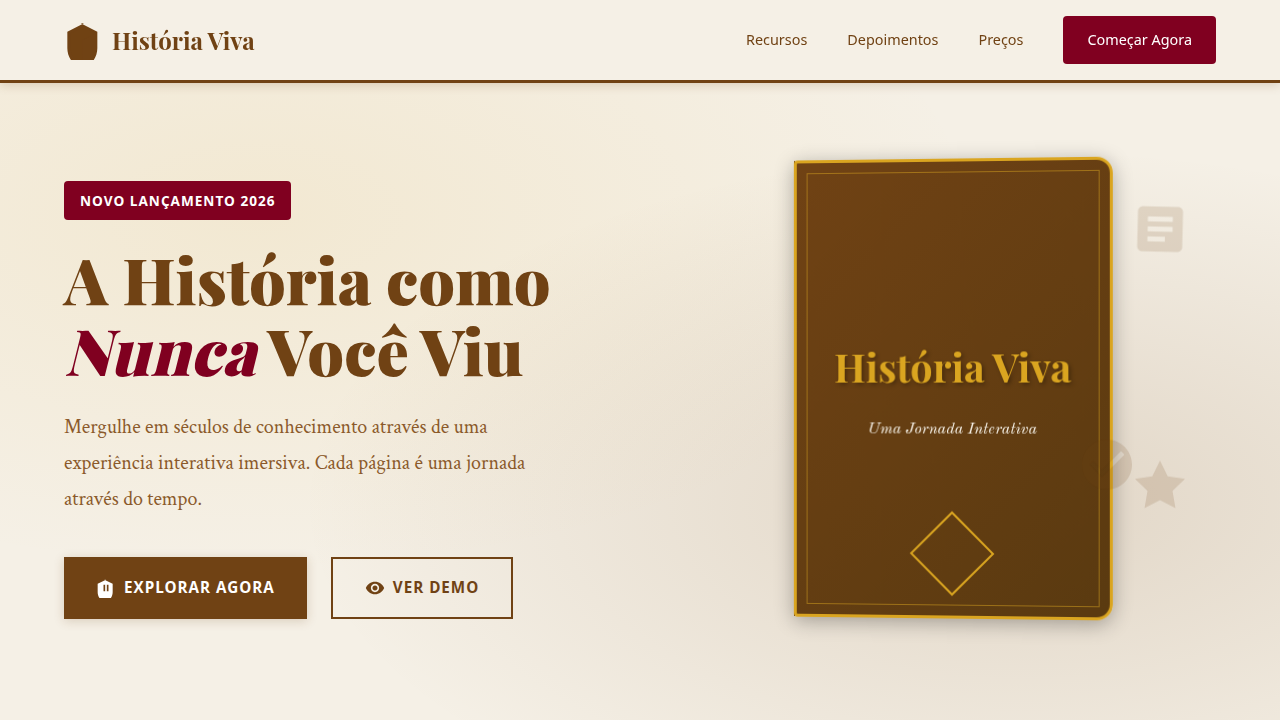
Design an engaging and informative editorial landing page for an interactive digital book. Ideal for landing pages, modern websites. AI-ready template.
Use case: Landing pages, Modern websites
Historical Context
The static article died somewhere around 2012, and nobody mourned it. Snow Fall landed at the New York Times and suddenly editors realized text could move, respond, breathe. But the roots go deeper — CD-ROMs in the 90s already attempted interactive narrative, clunky as they were. Encarta wasn't just an encyclopedia; it was a promise that reading could become exploration. Scrollytelling emerged as the dominant grammar. Parallax wasn't decoration — it was pacing. Designers discovered that vertical scroll could replace the page turn, that viewport triggers could control dramatic timing better than any chapter break. The New York Times, The Guardian, Bloomberg — they all built bespoke storytelling engines. Each piece was a prototype. Now the language has matured. We have established patterns: scroll-triggered animations, progressive disclosure of data, spatial audio cues, branching paths. The interactive digital editorial isn't experimental anymore. It's a medium with its own conventions, its own failures, its own clichés. The challenge shifted from 'can we do this' to 'should we do this here.'
When to Use
When linear reading fails your content. History that spans centuries needs a timeline you can scrub. Scientific processes need animation, not diagrams. Museum archives need context that unfolds as curiosity demands. Use interactive editorial when your reader needs to feel sequence, scale, or causality — not just comprehend it intellectually. Also: when your audience expects agency. Digital-native readers abandon passive walls of text. Give them something to pull apart.
Design Principles
- Scroll is your primary interaction — respect it. Every trigger should feel inevitable, not surprising. The reader should never wonder what caused a transition.
- Typography leads, interaction follows. The text must work if every animation fails. Progressive enhancement isn't optional in editorial — it's the entire philosophy.
- Pacing over spectacle. A single well-timed reveal beats twelve parallax layers. Restraint is what separates editorial from marketing.
- Content density must vary. Dense passages need breathing room before and after. White space in interactive editorial isn't empty — it's a tempo marking.
- Test on slow connections and old devices. If your interactive editorial only works on a MacBook Pro with fiber, you've built a demo, not a publication.
DESIGN.md
---
version: "alpha"
name: "Editorial Interativo Digital"
description: "Design an engaging and informative editorial landing page for an interactive digital book. Ideal for landing pages, modern websites. AI-ready template."
colors:
  primary: "#704214"
  secondary: "#FFFFFF"
  tertiary: "#000000"
  neutral: "#006400"
  surface: "#4682B4"
  accent: "#800020"
typography:
  h1:
    fontFamily: Old Standard TT
    fontSize: 2.5rem
    fontWeight: 700
  body-md:
    fontFamily: Old Standard TT
    fontSize: 1rem
    fontWeight: 400
components:
  button-primary:
    backgroundColor: "{colors.primary}"
    textColor: "{colors.neutral}"
    padding: 12px
---

## Overview

Design an engaging and informative editorial landing page for an interactive digital book. Ideal for landing pages, modern websites. AI-ready template. The static article died somewhere around 2012, and nobody mourned it. Snow Fall landed at the New York Times and suddenly editors realized text could move, respond, breathe. But the roots go deeper — CD-ROMs in the 90s already attempted interactive narrative, clunky as they were. Encarta wasn't just an encyclopedia; it was a promise that reading could become exploration.

Scrollytelling emerged as the dominant grammar. Parallax wasn't decoration — it was pacing. Designers discovered that vertical scroll could replace the page turn, that viewport triggers could control dramatic timing better than any chapter break. The New York Times, The Guardian, Bloomberg — they all built bespoke storytelling engines. Each piece was a prototype.

Now the language has matured. We have established patterns: scroll-triggered animations, progressive disclosure of data, spatial audio cues, branching paths. The interactive digital editorial isn't experimental anymore. It's a medium with its own conventions, its own failures, its own clichés. The challenge shifted from 'can we do this' to 'should we do this here.'

- Density: 5/10 — Balanced
- Variance: 4/10 — Moderate
- Motion: 8/10 — Cinematic

- **Style:** Engaging, Informative, Visual
- **Keywords:** interactive book, digital, history, engaging, informative, visual, storytelling, modern, curated, immersive
- **Era:** 2026+ Leitura Imersiva
- **Light/Dark:** ✓ Full / ✗ No

## Colors

- **Sépia** (#704214) — Primary surface or dominant color
- **Branco** (#FFFFFF) — Light surface, card backgrounds
- **Preto** (#000000) — Dark surface, primary background
- **Verde Escuro** (#006400) — Dark surface, primary background
- **Azul Antigo** (#4682B4) — Secondary accent
- **Vermelho Borgonha** (#800020) — Error states, destructive actions
- **Amarelo Queimado** (#DAA520) — Warning states, attention indicators
- **Cinza Claro** (#E0E0E0) — Secondary text, borders, muted elements


## Typography

- **Display / Hero:** Old Standard TT — Weight 700, tight tracking, used for headline impact
- **Body:** Old Standard TT — Weight 400, 16px/1.6 line-height, max 72ch per line
- **UI Labels / Captions:** Old Standard TT — 0.875rem, weight 500, slight letter-spacing
- **Monospace:** JetBrains Mono — Used for code, metadata, and technical values

Scale:
- Hero: clamp(2.5rem, 5vw, 4rem)
- H1: 2.25rem
- H2: 1.5rem
- Body: 1rem / 1.6
- Small: 0.875rem


## Layout

- **Grid:** CSS Grid primary. Max-width containment: 1280px centered with 1.5rem side padding.
- **Spacing rhythm:** Balanced. Base unit: 0.5rem (8px).
- **Section vertical gaps:** clamp(4rem, 8vw, 8rem).
- **Hero layout:** Split-screen (text left, visual right).
- **Feature sections:** Zig-zag alternating text+image rows. No 3-equal-columns.
- **Mobile collapse:** All multi-column layouts collapse below 768px. No horizontal overflow.
- **z-index contract:** base (0) / sticky-nav (100) / overlay (200) / modal (300) / toast (500).


## Elevation & Depth

Capa de livro animada, tipografia serifada clássica para o corpo e sans-serif para elementos interativos, layouts de página de livro, imagens históricas em alta resolução, micro-interações de destaque de texto e elementos interativos, transições de página com efeito de "virar página" suave.

- **Physics:** Spring — stiffness 120, damping 20. Confident, weighted transitions.
- **Entry animations:** Fade + translate-Y (16px → 0) over 540ms ease-out. Staggered cascades for lists: 120ms between items.
- **Hover states:** Scale(1.03) + shadow lift over 200ms.
- **Page transitions:** Fade + slide (300ms).
- **Performance:** Only transform and opacity animated. No layout-triggering properties.


## Shapes

Base corner radius: 8px. See rounded tokens in front matter for the full scale.


## Components

- **Primary Button:** Subtly rounded (0.5rem) shape. Accent color fill. Hover: 8% darken + subtle lift shadow. Active: -1px translate tactile press. Font weight 600. No outer glows.
- **Secondary / Ghost Button:** Outline variant. 1.5px border in muted color. Text in primary color. Hover: subtle background fill.
- **Cards:** Subtly rounded (0.5rem) corners. Surface background. Subtle shadow (0 2px 12px rgba(0,0,0,0.06)). 1px border stroke.
- **Inputs:** Label above input. 1px border stroke. Focus ring: 2px accent color offset 2px. Error text below in semantic red. No floating labels.
- **Navigation:** Primary surface background. Active item: accent color indicator. Font weight 500 when active.
- **Skeletons:** Shimmer animation matching component dimensions. No circular spinners.
- **Empty States:** Icon-based composition with descriptive text and action button.


## Do's and Don'ts

- No emojis in UI — use icon system only (Lucide, Heroicons)
- No pure black (#000000) — use off-black or charcoal variants
- No oversaturated accent colors (saturation cap: 80%)
- No 3-column equal-width feature layouts — use zig-zag or asymmetric grid
- No `h-screen` — use `min-h-[100dvh]`
- No AI copywriting clichés: "Elevate", "Seamless", "Unleash", "Next-Gen"
- No broken external image links — use picsum.photos or inline SVG
- No generic lorem ipsum in demos

- Do Capa de livro animada
- Do Tipografia serifada/sans-serif
- Do Layouts de página de livro
- Do Imagens históricas
- Do Micro-interações de destaque
- Do Transições de "virar página" suave.


## Use Case

Landing pages, Modern websites
Technical Specs
CSS
background: #FFFFFF, color: #704214, border-bottom: 1px solid #D2B48C, font-family: "Old Standard TT, serif", line-height: 1.7, transition: all 0.6s ease-in-out, .book-cover-animated, .page-layout, .interactive-element-highlight.
Variables
--sepia-bg: #704214, --white-text: #FFFFFF, --black-text: #000000, --dark-green: #006400, --font-serif-book: "Old Standard TT, serif", --font-sans-interactive: "Roboto, sans-serif", --line-height-body: 1.7, --page-turn-duration: 0.6s.
Checklist
☐ Capa de livro animada, ☐ Tipografia serifada/sans-serif, ☐ Layouts de página de livro, ☐ Imagens históricas, ☐ Micro-interações de destaque, ☐ Transições de "virar página" suave.
Colors
Primary
Secondary
Effects
Capa de livro animada, tipografia serifada clássica para o corpo e sans-serif para elementos interativos, layouts de página de livro, imagens históricas em alta resolução, micro-interações de destaque de texto e elementos interativos, transições de página com efeito de "virar página" suave.
Light/Dark
✓ Full / ✗ No
AI Prompt
Act as a Senior Frontend Engineer and Expert UI Designer.
Your task is to code a complete Landing Page on the first attempt.
- Landing Page Theme: <INSERT THEME>
- Sections to add: <INSERT SECTIONS>

Generate the final code immediately following these definitions:

## Style

- **Name:** Editorial Interativo Digital
- **Type:** Engaging, Informative, Visual
- **Keywords:** interactive book, digital, history, engaging, informative, visual, storytelling, modern, curated, immersive
- **Era:** 2026+ Leitura Imersiva
- **Light/Dark:** ✓ Full / ✗ No

## Color Palette

- **Primary:** Sépia #704214, Branco #FFFFFF, Preto #000000, Verde Escuro #006400
- **Secondary:** Azul Antigo #4682B4, Vermelho Borgonha #800020, Amarelo Queimado #DAA520, Cinza Claro #E0E0E0

## Visual Effects

Capa de livro animada, tipografia serifada clássica para o corpo e sans-serif para elementos interativos, layouts de página de livro, imagens históricas em alta resolução, micro-interações de destaque de texto e elementos interativos, transições de página com efeito de "virar página" suave.

## AI Visual Direction

Design an engaging and informative editorial landing page for an interactive digital book. Use: animated book cover, classic serif typography for body, sans-serif for interactive elements, book page layouts, high-resolution historical images, text and interactive element highlight micro-interactions, smooth page-turn transition effects, sepia and antique blue accents, immersive storytelling feel.

## CSS Technical

```css
background: #FFFFFF, color: #704214, border-bottom: 1px solid #D2B48C, font-family: "Old Standard TT, serif", line-height: 1.7, transition: all 0.6s ease-in-out, .book-cover-animated, .page-layout, .interactive-element-highlight.
```

## Design System Variables

```css
--sepia-bg: #704214, --white-text: #FFFFFF, --black-text: #000000, --dark-green: #006400, --font-serif-book: "Old Standard TT, serif", --font-sans-interactive: "Roboto, sans-serif", --line-height-body: 1.7, --page-turn-duration: 0.6s.
```

## Implementation Checklist

- ☐ Capa de livro animada
- ☐ Tipografia serifada/sans-serif
- ☐ Layouts de página de livro
- ☐ Imagens históricas
- ☐ Micro-interações de destaque
- ☐ Transições de "virar página" suave.

## Execution Rules

1. Strictly follow the defined visual style.
2. Use high-quality inline SVG icons (Heroicons or Lucide style) — NEVER use emojis as icons.
3. Add `cursor-pointer` and smooth `hover` states (transition-all) on all interactive elements.
4. Required Page Structure:
   - Navbar (Logo + Links + CTA)
   - Hero Section (Impactful Headline + Subtitle + 2 buttons + 3D/Abstract visual element via CSS)
   - Features (3 cards with icons)
   - Testimonials (3 cards)
   - Pricing (3 tiers, highlight the middle one)
   - Final CTA
   - Full Footer with social links, privacy policy, terms of use, contact and SEO links.
5. All text content must be in English.
6. The visual must be CLEARLY distinct — do not create a "default Bootstrap" design. Force the use of the provided design system variables.
7. Use `<style>` tags in the head for custom classes (especially for complex backdrop-filter effects and animations) that Tailwind CDN doesn't cover.
8. Full Responsiveness: Layout must adapt perfectly to Mobile, Tablet and Desktop (vertical stack on mobile).
9. Include basic SEO, Viewport and Open Graph meta tags in `<head>`.
10. Footer must contain: Copyright 2026, Secondary navigation links and Social media icons.
11. Make the creative decisions needed to deliver the complete, functional result now.
Related
Last synced: 4/1/2026