Editorial Contemporâneo
Design an artistic and immersive editorial landing page for a contemporary culture and art digital magazine. Ideal for landing pages, modern websites. AI-ready template.
Use case: Landing pages, Modern websites
Historical Context
For years, digital magazines were just PDFs with ambition. Flipbooks, page-curl animations, the whole embarrassing theater of pretending a screen was paper. It took until roughly 2013-2015 for editorial design online to find its own voice — and that voice belonged largely to the NYT's digital features team and Bloomberg Businessweek's web presence. The NYT's Snow Fall wasn't the first longform interactive piece, but it broke something open in the industry's imagination. Suddenly editorial meant scroll-driven narrative, typographic drama at viewport scale, and imagery that breathed between paragraphs rather than sitting trapped in columns. Bloomberg took a different angle — irreverent, almost confrontational layouts where type became illustration and whitespace became editorial stance. What emerged from this era is contemporary editorial: design that treats the browser as a first-class publishing medium. Not print nostalgia. Not blog minimalism. A third thing — where the layout itself carries opinion, where typographic hierarchy does the work that art direction once monopolized in print.
When to Use
When content demands authority and atmosphere simultaneously. Online magazines that need to feel curated, not templated. Cultural criticism where the visual tone signals intellectual weight before a single word is read. Art publications where the design must hold its own against the work it presents. Any context where you need readers to slow down, to treat the screen like something worth their full attention rather than another feed to scroll past.
Design Principles
- Typography carries the editorial voice — size, weight, and spacing are opinions, not defaults. A 120px serif headline isn't decoration, it's a statement about what matters on the page.
- Whitespace is editorial real estate, not empty space. The pause between sections, the breathing room around a pull quote — these are pacing decisions, same as a film editor choosing where to cut.
- Imagery operates at two scales only: dominant or absent. Medium-sized photos are the hallmark of indecision. Either the image commands the viewport or the typography does. Pick one per section.
- Vertical rhythm creates reading tempo. Tight leading in body copy for density and momentum. Generous gaps between sections for cognitive reset. The scroll itself becomes a narrative device.
- Restraint in color — let one or two accent choices do heavy lifting against a near-monochrome foundation. Editorial confidence reads as reduction, not addition.
DESIGN.md
---
version: "alpha"
name: "Editorial Contemporâneo"
description: "Design an artistic and immersive editorial landing page for a contemporary culture and art digital magazine. Ideal for landing pages, modern websites. AI-ready template."
colors:
primary: "#FFFFFF"
secondary: "#000000"
tertiary: "#800000"
neutral: "#333333"
surface: "#FFD700"
accent: "#000080"
typography:
h1:
fontFamily: Playfair Display
fontSize: 2.25rem
fontWeight: 700
body-md:
fontFamily: Playfair Display
fontSize: 1rem
fontWeight: 400
label-caps:
fontFamily: Playfair Display
fontSize: 0.75rem
fontWeight: 500
components:
button-primary:
backgroundColor: "{colors.primary}"
textColor: "{colors.neutral}"
padding: 12px
---
## Overview
Design an artistic and immersive editorial landing page for a contemporary culture and art digital magazine. Ideal for landing pages, modern websites. AI-ready template. For years, digital magazines were just PDFs with ambition. Flipbooks, page-curl animations, the whole embarrassing theater of pretending a screen was paper. It took until roughly 2013-2015 for editorial design online to find its own voice — and that voice belonged largely to the NYT's digital features team and Bloomberg Businessweek's web presence.
The NYT's Snow Fall wasn't the first longform interactive piece, but it broke something open in the industry's imagination. Suddenly editorial meant scroll-driven narrative, typographic drama at viewport scale, and imagery that breathed between paragraphs rather than sitting trapped in columns. Bloomberg took a different angle — irreverent, almost confrontational layouts where type became illustration and whitespace became editorial stance.
What emerged from this era is contemporary editorial: design that treats the browser as a first-class publishing medium. Not print nostalgia. Not blog minimalism. A third thing — where the layout itself carries opinion, where typographic hierarchy does the work that art direction once monopolized in print.
- Density: 5/10 — Balanced
- Variance: 8/10 — Expressive
- Motion: 4/10 — Subtle
- **Style:** Artistic, Content-Rich, Immersive
- **Keywords:** magazine, culture, art, editorial, immersive, visual, sophisticated, engaging, curated, modern
- **Era:** 2026+ Jornalismo Visual
- **Light/Dark:** ✓ Full / ✗ No
## Colors
- **Branco** (#FFFFFF) — Light surface, card backgrounds
- **Preto** (#000000) — Dark surface, primary background
- **Vermelho Vinho** (#800000) — Error states, destructive actions
- **Cinza Escuro** (#333333) — Dark surface, primary background
- **Dourado** (#FFD700) — Premium accent, decorative highlights
- **Azul Marinho** (#000080) — Secondary accent
- **Verde Esmeralda** (#2ECC40) — Success states, positive indicators
- **Bege** (#F5F5DC) — Extended palette, decorative use
## Typography
- **Display / Hero:** Playfair Display — Weight 700, tight tracking, used for headline impact
- **Body:** Playfair Display — Weight 400, 16px/1.6 line-height, max 72ch per line
- **UI Labels / Captions:** Playfair Display — 0.875rem, weight 500, slight letter-spacing
- **Monospace:** JetBrains Mono — Used for code, metadata, and technical values
Scale:
- Hero: clamp(2.5rem, 5vw, 4rem)
- H1: 2.25rem
- H2: 1.5rem
- Body: 1rem / 1.6
- Small: 0.875rem
## Layout
- **Grid:** CSS Grid primary. Max-width containment: 1280px centered with 1.5rem side padding.
- **Spacing rhythm:** Balanced. Base unit: 0.5rem (8px).
- **Section vertical gaps:** clamp(4rem, 8vw, 8rem).
- **Hero layout:** Asymmetric composition.
- **Feature sections:** Asymmetric grid with varied card sizes. No 3-equal-columns.
- **Mobile collapse:** All multi-column layouts collapse below 768px. No horizontal overflow.
- **z-index contract:** base (0) / sticky-nav (100) / overlay (200) / modal (300) / toast (500).
## Elevation & Depth
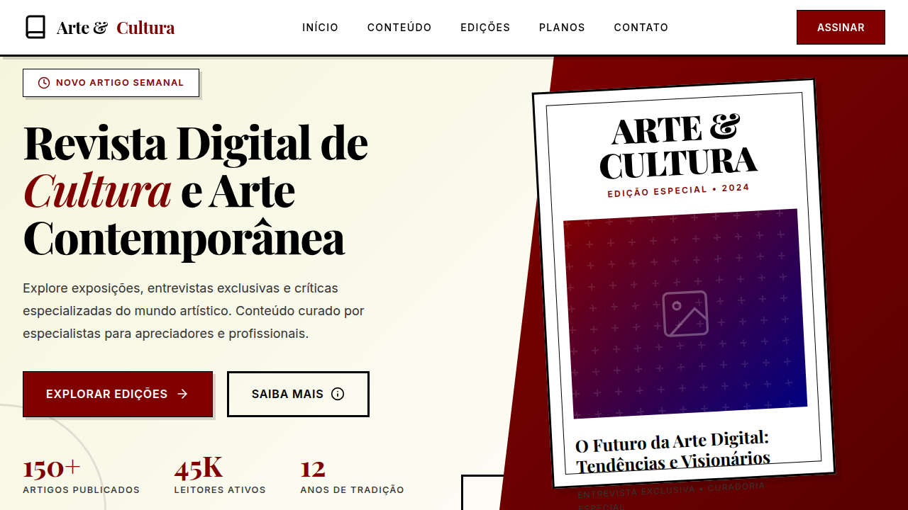
Tipografia contrastante (serifada decorativa para títulos, sans-serif legível para corpo), composição multicamadas com imagens e texto, foco em conteúdo visual de alta qualidade, elementos decorativos (linhas, molduras), micro-interações de destaque de artigo, transições de página com efeito de "virar revista".
- **Physics:** Ease-out curves, 200-300ms duration. Smooth and predictable.
- **Entry animations:** Fade + translate-Y (16px → 0) over 420ms ease-out. Staggered cascades for lists: 80ms between items.
- **Hover states:** Subtle color shift + shadow adjustment over 200ms.
- **Page transitions:** Fade only (200ms).
- **Performance:** Only transform and opacity animated. No layout-triggering properties.
## Shapes
Base corner radius: 8px. See rounded tokens in front matter for the full scale.
## Components
- **Primary Button:** Subtly rounded (0.5rem) shape. Accent color fill. Hover: 8% darken + subtle lift shadow. Active: -1px translate tactile press. Font weight 600. No outer glows.
- **Secondary / Ghost Button:** Outline variant. 1.5px border in muted color. Text in primary color. Hover: subtle background fill.
- **Cards:** Subtly rounded (0.5rem) corners. Surface background. Subtle shadow (0 2px 12px rgba(0,0,0,0.06)). 1px border stroke.
- **Inputs:** Label above input. 1px border stroke. Focus ring: 2px accent color offset 2px. Error text below in semantic red. No floating labels.
- **Navigation:** Primary surface background. Active item: accent color indicator. Font weight 500 when active.
- **Skeletons:** Shimmer animation matching component dimensions. No circular spinners.
- **Empty States:** Icon-based composition with descriptive text and action button.
## Do's and Don'ts
- No emojis in UI — use icon system only (Lucide, Heroicons)
- No pure black (#000000) — use off-black or charcoal variants
- No oversaturated accent colors (saturation cap: 80%)
- No 3-column equal-width feature layouts — use zig-zag or asymmetric grid
- No `h-screen` — use `min-h-[100dvh]`
- No AI copywriting clichés: "Elevate", "Seamless", "Unleash", "Next-Gen"
- No broken external image links — use picsum.photos or inline SVG
- No generic lorem ipsum in demos
- Do Tipografia contrastante
- Do Composição multicamadas
- Do Foco em conteúdo visual
- Do Elementos decorativos
- Do Micro-interações de destaque
- Do Transições de "virar revista".
## Use Case
Landing pages, Modern websites
Technical Specs
CSS
background: #FFFFFF, color: #000000, border-bottom: 1px solid #E0E0E0, font-family: "Playfair Display, serif", line-height: 1.7, transition: all 0.5s ease-in-out, .magazine-cover, .article-layout-multilayer, .decorative-frame.
Variables
--white-bg: #FFFFFF, --black-text: #000000, --wine-red: #800000, --dark-grey: #333333, --font-serif-display: "Playfair Display, serif", --font-sans-body: "Lato, sans-serif", --line-height-body: 1.7, --page-turn-transition: all 0.5s ease-in-out.
Checklist
☐ Tipografia contrastante, ☐ Composição multicamadas, ☐ Foco em conteúdo visual, ☐ Elementos decorativos, ☐ Micro-interações de destaque, ☐ Transições de "virar revista".
Colors
Primary
Secondary
Effects
Tipografia contrastante (serifada decorativa para títulos, sans-serif legível para corpo), composição multicamadas com imagens e texto, foco em conteúdo visual de alta qualidade, elementos decorativos (linhas, molduras), micro-interações de destaque de artigo, transições de página com efeito de "virar revista".
Light/Dark
✓ Full / ✗ No
AI Prompt
Act as a Senior Frontend Engineer and Expert UI Designer.
Your task is to code a complete Landing Page on the first attempt.
- Landing Page Theme: <INSERT THEME>
- Sections to add: <INSERT SECTIONS>

Generate the final code immediately following these definitions:

## Style

- **Name:** Editorial Contemporâneo
- **Type:** Artistic, Content-Rich, Immersive
- **Keywords:** magazine, culture, art, editorial, immersive, visual, sophisticated, engaging, curated, modern
- **Era:** 2026+ Jornalismo Visual
- **Light/Dark:** ✓ Full / ✗ No

## Color Palette

- **Primary:** Branco #FFFFFF, Preto #000000, Vermelho Vinho #800000, Cinza Escuro #333333
- **Secondary:** Dourado #FFD700, Azul Marinho #000080, Verde Esmeralda #2ECC40, Bege #F5F5DC

## Visual Effects

Tipografia contrastante (serifada decorativa para títulos, sans-serif legível para corpo), composição multicamadas com imagens e texto, foco em conteúdo visual de alta qualidade, elementos decorativos (linhas, molduras), micro-interações de destaque de artigo, transições de página com efeito de "virar revista".

## AI Visual Direction

Design an artistic and immersive editorial landing page for a contemporary culture and art digital magazine. Use: contrasting typography (decorative serif for headlines, legible sans-serif for body), multilayer composition with images and text, high-quality visual content focus, decorative elements (lines, frames), article highlight micro-interactions, page-turn transition effects, wine red and gold accents, sophisticated and engaging feel.

## CSS Technical

```css
background: #FFFFFF, color: #000000, border-bottom: 1px solid #E0E0E0, font-family: "Playfair Display, serif", line-height: 1.7, transition: all 0.5s ease-in-out, .magazine-cover, .article-layout-multilayer, .decorative-frame.
```

## Design System Variables

```css
--white-bg: #FFFFFF, --black-text: #000000, --wine-red: #800000, --dark-grey: #333333, --font-serif-display: "Playfair Display, serif", --font-sans-body: "Lato, sans-serif", --line-height-body: 1.7, --page-turn-transition: all 0.5s ease-in-out.
```

## Implementation Checklist

- ☐ Tipografia contrastante
- ☐ Composição multicamadas
- ☐ Foco em conteúdo visual
- ☐ Elementos decorativos
- ☐ Micro-interações de destaque
- ☐ Transições de "virar revista".

## Execution Rules

1. Strictly follow the defined visual style.
2. Use high-quality inline SVG icons (Heroicons or Lucide style) — NEVER use emojis as icons.
3. Add `cursor-pointer` and smooth `hover` states (transition-all) on all interactive elements.
4. Required Page Structure:
   - Navbar (Logo + Links + CTA)
   - Hero Section (Impactful Headline + Subtitle + 2 buttons + 3D/Abstract visual element via CSS)
   - Features (3 cards with icons)
   - Testimonials (3 cards)
   - Pricing (3 tiers, highlight the middle one)
   - Final CTA
   - Full Footer with social links, privacy policy, terms of use, contact and SEO links.
5. All text content must be in English.
6. The visual must be CLEARLY distinct — do not create a "default Bootstrap" design. Force the use of the provided design system variables.
7. Use `<style>` tags in the head for custom classes (especially for complex backdrop-filter effects and animations) that Tailwind CDN doesn't cover.
8. Full Responsiveness: Layout must adapt perfectly to Mobile, Tablet and Desktop (vertical stack on mobile).
9. Include basic SEO, Viewport and Open Graph meta tags in `<head>`.
10. Footer must contain: Copyright 2026, Secondary navigation links and Social media icons.
11. Make the creative decisions needed to deliver the complete, functional result now.
Related
Last synced: 4/1/2026