Editorial de Viagem Sofisticado
Design an elegant and aspirational editorial landing page for a luxury travel blog. Ideal for landing pages, modern websites. AI-ready template.
Use case: Landing pages, Modern websites
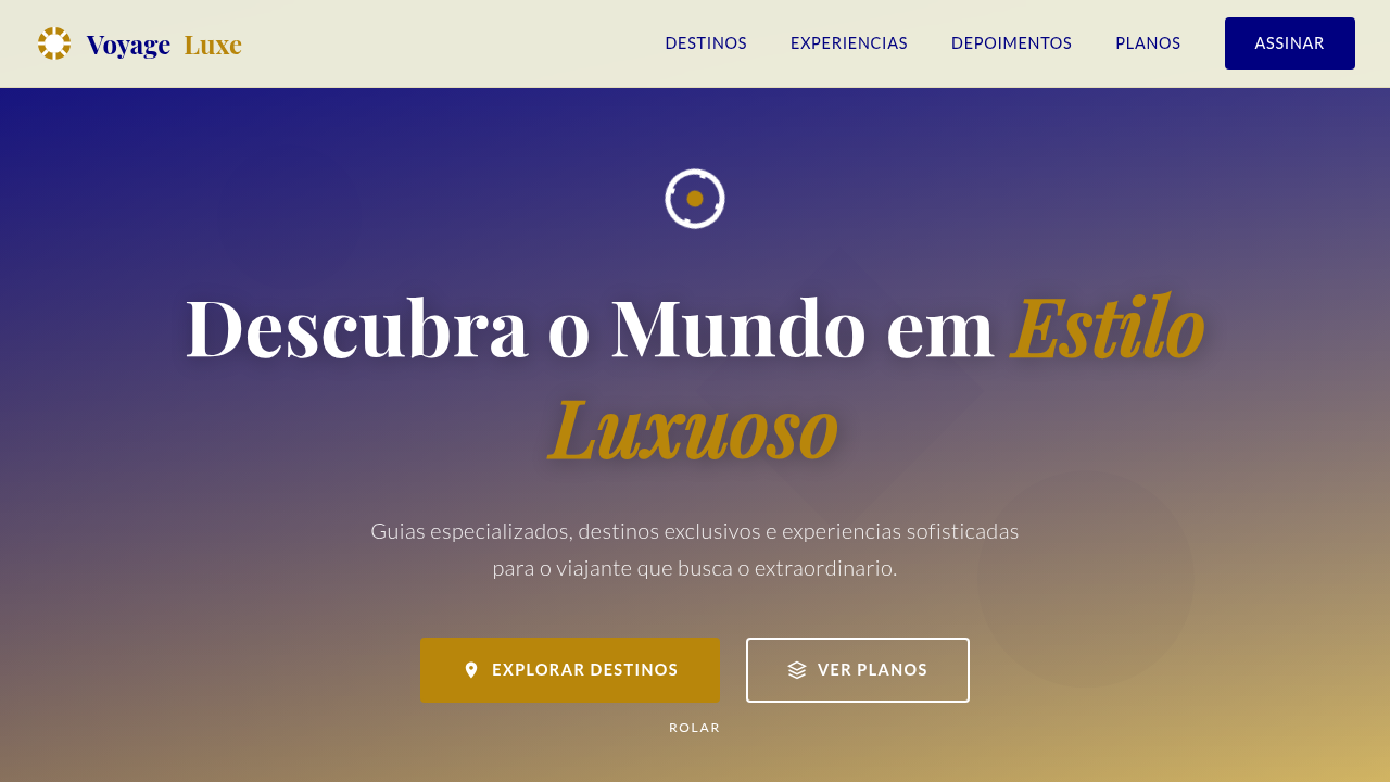
Historical Context
The luxury travel editorial owes everything to print. Condé Nast Traveler established the formula in the eighties: full-bleed photography, restrained serif typography, and white space treated as a material rather than absence. Monocle refined it further — tighter grids, considered paper stock choices, a rejection of visual noise. The magazine said: we respect your intelligence enough to let the image breathe. Translating this to screens required killing sacred cows. The fixed column gave way to fluid containers. But the core tension remained — photography must dominate without becoming wallpaper. The best digital travel editorials (Cereal, Kinfolk's travel issues, Suitcase Magazine online) solve this by treating viewport height as their bleed edge. One image. Full screen. Then text arrives with ceremony, not apology. What separates luxury travel layouts from generic blog templates isn't budget — it's restraint. Every element earns its pixel. The typography doesn't compete with Santorini sunsets; it frames them. Negative space isn't laziness, it's the visual equivalent of a pause between courses at a tasting menu.
When to Use
When content leads with photography and the writing deserves room to land. Travel magazines translating print DNA to responsive layouts. Luxury tourism brands that need editorial credibility over conversion urgency. Experience blogs where the reading itself should feel like slow travel — unhurried, considered, worth lingering over. Not for itinerary-heavy utility content or SEO-first listicles.
Design Principles
- Photography is architecture, not decoration — images define the spatial rhythm of the entire page, dictating where text lives and how readers breathe between sections
- Typography plays second chair deliberately — refined serifs at generous sizes, but never louder than the destination itself; the typeface should feel like a whispered recommendation
- White space is the luxury signal — cramped layouts read as budget travel; generous margins and vertical rhythm communicate the same exclusivity as a half-empty restaurant with a six-month waitlist
- Pacing over density — alternate between immersive full-viewport moments and intimate text blocks; the scroll should feel like turning pages in a well-edited magazine, not consuming a feed
- Restrained color palette drawn from photography — let the destinations provide chromatic richness; UI elements stay neutral, warm grays, off-whites, and the occasional rule line to anchor hierarchy
DESIGN.md
---
version: "alpha"
name: "Editorial de Viagem Sofisticado"
description: "Design an elegant and aspirational editorial landing page for a luxury travel blog. Ideal for landing pages, modern websites. AI-ready template."
colors:
  primary: "#F5F5DC"
  secondary: "#B8860B"
  tertiary: "#000080"
  neutral: "#FFFFFF"
  surface: "#6B8E23"
  accent: "#E0BBE4"
typography:
  h1:
    fontFamily: Georgia
    fontSize: 2.5rem
    fontWeight: 700
  body-md:
    fontFamily: Georgia
    fontSize: 1rem
    fontWeight: 400
components:
  button-primary:
    backgroundColor: "{colors.primary}"
    textColor: "{colors.neutral}"
    padding: 12px
---

## Overview

Design an elegant and aspirational editorial landing page for a luxury travel blog. Ideal for landing pages, modern websites. AI-ready template. The luxury travel editorial owes everything to print. Condé Nast Traveler established the formula in the eighties: full-bleed photography, restrained serif typography, and white space treated as a material rather than absence. Monocle refined it further — tighter grids, considered paper stock choices, a rejection of visual noise. The magazine said: we respect your intelligence enough to let the image breathe.

Translating this to screens required killing sacred cows. The fixed column gave way to fluid containers. But the core tension remained — photography must dominate without becoming wallpaper. The best digital travel editorials (Cereal, Kinfolk's travel issues, Suitcase Magazine online) solve this by treating viewport height as their bleed edge. One image. Full screen. Then text arrives with ceremony, not apology.

What separates luxury travel layouts from generic blog templates isn't budget — it's restraint. Every element earns its pixel. The typography doesn't compete with Santorini sunsets; it frames them. Negative space isn't laziness, it's the visual equivalent of a pause between courses at a tasting menu.

- Density: 5/10 — Balanced
- Variance: 4/10 — Moderate
- Motion: 4/10 — Subtle

- **Style:** Elegant, Aspirational, Visual
- **Keywords:** luxury travel, blog, experiences, elegant, aspirational, visual, sophisticated, immersive, curated, exclusive
- **Era:** 2026+ Viagens de Sonho
- **Light/Dark:** ✓ Full / ✗ No

## Colors

- **Bege** (#F5F5DC) — Primary surface or dominant color
- **Dourado** (#B8860B) — Premium accent, decorative highlights
- **Azul Marinho** (#000080) — Accent highlight, links and focus states
- **Branco** (#FFFFFF) — Light surface, card backgrounds
- **Verde Oliva** (#6B8E23) — Success states, positive indicators
- **Rosa Antigo** (#E0BBE4) — Decorative accent, highlight elements
- **Cinza Claro** (#E0E0E0) — Secondary text, borders, muted elements
- **Marrom** (#A52A2A) — Extended palette, decorative use


## Typography

- **Display / Hero:** Georgia — Weight 700, tight tracking, used for headline impact
- **Body:** Georgia — Weight 400, 16px/1.6 line-height, max 72ch per line
- **UI Labels / Captions:** Georgia — 0.875rem, weight 500, slight letter-spacing
- **Monospace:** JetBrains Mono — Used for code, metadata, and technical values

Scale:
- Hero: clamp(2.5rem, 5vw, 4rem)
- H1: 2.25rem
- H2: 1.5rem
- Body: 1rem / 1.6
- Small: 0.875rem


## Layout

- **Grid:** CSS Grid primary. Max-width containment: 1280px centered with 1.5rem side padding.
- **Spacing rhythm:** Balanced. Base unit: 0.5rem (8px).
- **Section vertical gaps:** clamp(4rem, 8vw, 8rem).
- **Hero layout:** Split-screen (text left, visual right).
- **Feature sections:** Zig-zag alternating text+image rows. No 3-equal-columns.
- **Mobile collapse:** All multi-column layouts collapse below 768px. No horizontal overflow.
- **z-index contract:** base (0) / sticky-nav (100) / overlay (200) / modal (300) / toast (500).


## Elevation & Depth

Imagens de destinos em tela cheia, tipografia serifada clássica para títulos e sans-serif para corpo, layouts de coluna variados, micro-interações de hover em imagens com descrições, transições de seção suaves e com paralaxe, elementos decorativos de mapa e bússola.

- **Physics:** Ease-out curves, 200-300ms duration. Smooth and predictable.
- **Entry animations:** Fade + translate-Y (16px → 0) over 420ms ease-out. Staggered cascades for lists: 80ms between items.
- **Hover states:** Subtle color shift + shadow adjustment over 200ms.
- **Page transitions:** Fade only (200ms).
- **Performance:** Only transform and opacity animated. No layout-triggering properties.


## Shapes

Base corner radius: 12px. See rounded tokens in front matter for the full scale.


## Components

- **Primary Button:** Moderately rounded (0.75rem) shape. Accent color fill. Hover: 8% darken + subtle lift shadow. Active: -1px translate tactile press. Font weight 600. No outer glows.
- **Secondary / Ghost Button:** Outline variant. 1.5px border in muted color. Text in primary color. Hover: subtle background fill.
- **Cards:** Moderately rounded (0.75rem) corners. Surface background. Subtle shadow (0 2px 12px rgba(0,0,0,0.06)). 1px border stroke.
- **Inputs:** Label above input. 1px border stroke. Focus ring: 2px accent color offset 2px. Error text below in semantic red. No floating labels.
- **Navigation:** Primary surface background. Active item: accent color indicator. Font weight 500 when active.
- **Skeletons:** Shimmer animation matching component dimensions. No circular spinners.
- **Empty States:** Icon-based composition with descriptive text and action button.


## Do's and Don'ts

- No emojis in UI — use icon system only (Lucide, Heroicons)
- No pure black (#000000) — use off-black or charcoal variants
- No oversaturated accent colors (saturation cap: 80%)
- No 3-column equal-width feature layouts — use zig-zag or asymmetric grid
- No `h-screen` — use `min-h-[100dvh]`
- No AI copywriting clichés: "Elevate", "Seamless", "Unleash", "Next-Gen"
- No broken external image links — use picsum.photos or inline SVG
- No generic lorem ipsum in demos

- Do Imagens de destinos em tela cheia
- Do Tipografia serifada clássica
- Do Layouts de coluna variados
- Do Micro-interações de hover em imagens
- Do Transições com paralaxe
- Do Elementos decorativos de mapa.


## Use Case

Landing pages, Modern websites
Technical Specs
CSS
background: #F5F5DC, color: #000000, border-bottom: 1px solid #D4AF37, font-family: "Georgia, serif", line-height: 1.6, transition: all 0.6s ease-in-out, .hero-parallax, .destination-card-hover, .map-decor.
Variables
--beige-bg: #F5F5DC, --black-text: #000000, --soft-gold: #B8860B, --navy-blue: #000080, --font-serif-classic: "Georgia, serif", --font-sans-body: "Open Sans, sans-serif", --line-height-body: 1.6, --parallax-speed: 0.5.
Checklist
☐ Imagens de destinos em tela cheia, ☐ Tipografia serifada clássica, ☐ Layouts de coluna variados, ☐ Micro-interações de hover em imagens, ☐ Transições com paralaxe, ☐ Elementos decorativos de mapa.
Colors
Primary
Secondary
Effects
Imagens de destinos em tela cheia, tipografia serifada clássica para títulos e sans-serif para corpo, layouts de coluna variados, micro-interações de hover em imagens com descrições, transições de seção suaves e com paralaxe, elementos decorativos de mapa e bússola.
Light/Dark
✓ Full / ✗ No
AI Prompt
Act as a Senior Frontend Engineer and Expert UI Designer.
Your task is to code a complete Landing Page on the first attempt.
- Landing Page Theme: <INSERT THEME>
- Sections to add: <INSERT SECTIONS>

Generate the final code immediately following these definitions:

## Style

- **Name:** Editorial de Viagem Sofisticado
- **Type:** Elegant, Aspirational, Visual
- **Keywords:** luxury travel, blog, experiences, elegant, aspirational, visual, sophisticated, immersive, curated, exclusive
- **Era:** 2026+ Viagens de Sonho
- **Light/Dark:** ✓ Full / ✗ No

## Color Palette

- **Primary:** Bege #F5F5DC, Dourado #B8860B, Azul Marinho #000080, Branco #FFFFFF
- **Secondary:** Verde Oliva #6B8E23, Rosa Antigo #E0BBE4, Cinza Claro #E0E0E0, Marrom #A52A2A

## Visual Effects

Imagens de destinos em tela cheia, tipografia serifada clássica para títulos e sans-serif para corpo, layouts de coluna variados, micro-interações de hover em imagens com descrições, transições de seção suaves e com paralaxe, elementos decorativos de mapa e bússola.

## AI Visual Direction

Design an elegant and aspirational editorial landing page for a luxury travel blog. Use: full-screen destination images, classic serif typography for headlines, varied column layouts, image hover micro-interactions with descriptions, smooth parallax section transitions, decorative map and compass elements, gold and navy blue accents, sophisticated and immersive feel.

## CSS Technical

```css
background: #F5F5DC, color: #000000, border-bottom: 1px solid #D4AF37, font-family: "Georgia, serif", line-height: 1.6, transition: all 0.6s ease-in-out, .hero-parallax, .destination-card-hover, .map-decor.
```

## Design System Variables

```css
--beige-bg: #F5F5DC, --black-text: #000000, --soft-gold: #B8860B, --navy-blue: #000080, --font-serif-classic: "Georgia, serif", --font-sans-body: "Open Sans, sans-serif", --line-height-body: 1.6, --parallax-speed: 0.5.
```

## Implementation Checklist

- ☐ Imagens de destinos em tela cheia
- ☐ Tipografia serifada clássica
- ☐ Layouts de coluna variados
- ☐ Micro-interações de hover em imagens
- ☐ Transições com paralaxe
- ☐ Elementos decorativos de mapa.

## Execution Rules

1. Strictly follow the defined visual style.
2. Use high-quality inline SVG icons (Heroicons or Lucide style) — NEVER use emojis as icons.
3. Add `cursor-pointer` and smooth `hover` states (transition-all) on all interactive elements.
4. Required Page Structure:
   - Navbar (Logo + Links + CTA)
   - Hero Section (Impactful Headline + Subtitle + 2 buttons + 3D/Abstract visual element via CSS)
   - Features (3 cards with icons)
   - Testimonials (3 cards)
   - Pricing (3 tiers, highlight the middle one)
   - Final CTA
   - Full Footer with social links, privacy policy, terms of use, contact and SEO links.
5. All text content must be in English.
6. The visual must be CLEARLY distinct — do not create a "default Bootstrap" design. Force the use of the provided design system variables.
7. Use `<style>` tags in the head for custom classes (especially for complex backdrop-filter effects and animations) that Tailwind CDN doesn't cover.
8. Full Responsiveness: Layout must adapt perfectly to Mobile, Tablet and Desktop (vertical stack on mobile).
9. Include basic SEO, Viewport and Open Graph meta tags in `<head>`.
10. Footer must contain: Copyright 2026, Secondary navigation links and Social media icons.
11. Make the creative decisions needed to deliver the complete, functional result now.
Related
Last synced: 4/1/2026