Earthy & Organic
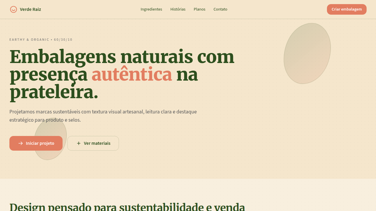
Design an earthy and organic interface with 60/30/10 palette discipline. Ideal for design de embalagens, marcas orgânicas, cosméticos naturais, alimentos artesanais, produtos eco-friendly. AI-ready template.
Use case: Design de packaging, Brands orgânicas, Cosméticos naturais, Alimentos artesanais, Products eco-friendly
Historical Context
Earthy palettes didn't emerge from a trend deck — they came from dirt. Literally. The Arts & Crafts movement rejected industrial color in favor of pigments you could pull from clay, bark, and stone. William Morris understood that natural dyes carried an honesty that synthetic anilines never could. That philosophy resurfaced in the 1970s back-to-land movement, then again in the early 2000s when organic food branding needed to visually separate itself from the hyperchrome of processed goods. What's interesting now is how earthy tones have shed their granola-aisle connotations. Aesop proved you could pair raw umber with typographic sophistication and command luxury pricing. Patagonia showed that muted sage and worn ochre could signal activism without shouting. The current wave isn't about looking 'natural' in a naive sense — it's about communicating material honesty. These palettes reference real substances: terracotta, undyed linen, oxidized copper. They carry weight because they reference the physical world in an increasingly dematerialized design landscape. The sustainability sector adopted these tones not just for aesthetics but for trust. Consumers learned to distrust greenwashing wrapped in electric green gradients. Earthy palettes signal restraint, and restraint signals sincerity.
When to Use
Reach for earthy palettes when the brand's promise is rooted in material reality — actual ingredients, physical processes, tangible impact. They work when you need to communicate credibility without corporate coldness. Ideal for sustainability brands that want to avoid the cliché leaf-green trap, organic products competing against clinical pharmaceutical aesthetics, and natural cosmetics that need to feel luxurious rather than homemade. Skip this direction if the product is purely digital with no physical-world connection — earthy tones will feel like costume rather than conviction.
Design Principles
- Ground every color choice in a real material reference — terracotta, sandstone, lichen, raw wool — never pick 'warm brown' from a generic palette
- Pair muted organic tones with sharp typography and generous whitespace; earthiness without structure reads as amateur, not artisanal
- Let texture do the heavy lifting over color variety — limit your palette to 3-4 tones maximum and introduce depth through grain, paper stock, or subtle noise
- Resist the urge to add green as a sustainability signifier; ochre, clay, and charcoal communicate ecological intent without the greenwashing baggage
- Design for aging gracefully — earthy palettes should feel like they've existed for decades, so avoid trendy treatments that will date the work within two years
DESIGN.md
---
version: "alpha"
name: "Earthy & Organic"
description: "Design an earthy and organic interface with 60/30/10 palette discipline. Ideal for design de embalagens, marcas orgânicas, cosméticos naturais, alimentos artesanais, produtos eco-friendly. AI-ready template."
colors:
  primary: "#F5E6CC"
  secondary: "#2D4F1E"
  tertiary: "#4A4A4A"
typography:
  h1:
    fontFamily: System UI stack
    fontSize: 2.25rem
    fontWeight: 700
  body-md:
    fontFamily: System UI stack
    fontSize: 1rem
    fontWeight: 400
  label-caps:
    fontFamily: System UI stack
    fontSize: 0.75rem
    fontWeight: 500
components:
  button-primary:
    backgroundColor: "{colors.primary}"
    padding: 12px
---

## Overview

Design an earthy and organic interface with 60/30/10 palette discipline. Ideal for design de embalagens, marcas orgânicas, cosméticos naturais, alimentos artesanais, produtos eco-friendly. AI-ready template. Earthy palettes didn't emerge from a trend deck — they came from dirt. Literally. The Arts & Crafts movement rejected industrial color in favor of pigments you could pull from clay, bark, and stone. William Morris understood that natural dyes carried an honesty that synthetic anilines never could. That philosophy resurfaced in the 1970s back-to-land movement, then again in the early 2000s when organic food branding needed to visually separate itself from the hyperchrome of processed goods.

What's interesting now is how earthy tones have shed their granola-aisle connotations. Aesop proved you could pair raw umber with typographic sophistication and command luxury pricing. Patagonia showed that muted sage and worn ochre could signal activism without shouting. The current wave isn't about looking 'natural' in a naive sense — it's about communicating material honesty. These palettes reference real substances: terracotta, undyed linen, oxidized copper. They carry weight because they reference the physical world in an increasingly dematerialized design landscape.

The sustainability sector adopted these tones not just for aesthetics but for trust. Consumers learned to distrust greenwashing wrapped in electric green gradients. Earthy palettes signal restraint, and restraint signals sincerity.

- Density: 5/10 — Balanced
- Variance: 8/10 — Expressive
- Motion: 4/10 — Subtle

- **Style:** Natural, Warm, Sustainable, Authentic
- **Keywords:** organic, earthy, sustainable, packaging, natural, eco-friendly, handcrafted, botanical, warm, calm
- **Era:** Contemporary Sustainable Design
- **Light/Dark:** ✓ Full / ◐ Partial

## Colors

- **Warm Beige** (#F5E6CC) — Primary surface or dominant color
- **Forest Green** (#2D4F1E) — Success states, positive indicators
- **e Slate Grey** (#4A4A4A) — Secondary text, borders, muted elements


## Typography

- **Display / Hero:** System UI stack (-apple-system, sans-serif) — Weight 700, tight tracking, used for headline impact
- **Body:** System UI stack (-apple-system, sans-serif) — Weight 400, 16px/1.6 line-height, max 72ch per line
- **UI Labels / Captions:** System UI stack (-apple-system, sans-serif) — 0.875rem, weight 500, slight letter-spacing
- **Monospace:** JetBrains Mono — Used for code, metadata, and technical values

Scale:
- Hero: clamp(2.5rem, 5vw, 4rem)
- H1: 2.25rem
- H2: 1.5rem
- Body: 1rem / 1.6
- Small: 0.875rem


## Layout

- **Grid:** CSS Grid primary. Max-width containment: 1280px centered with 1.5rem side padding.
- **Spacing rhythm:** Balanced. Base unit: 0.5rem (8px).
- **Section vertical gaps:** clamp(4rem, 8vw, 8rem).
- **Hero layout:** Asymmetric composition.
- **Feature sections:** Asymmetric grid with varied card sizes. No 3-equal-columns.
- **Mobile collapse:** All multi-column layouts collapse below 768px. No horizontal overflow.
- **z-index contract:** base (0) / sticky-nav (100) / overlay (200) / modal (300) / toast (500).


## Elevation & Depth

10%: Terracotta #E27D60 para selos, chamadas e destaque de produto; textura sutil de papel reciclado, bordas orgânicas e microanimações suaves (220-280ms)

- **Physics:** Ease-out curves, 200-300ms duration. Smooth and predictable.
- **Entry animations:** Fade + translate-Y (16px → 0) over 420ms ease-out. Staggered cascades for lists: 80ms between items.
- **Hover states:** Subtle color shift + shadow adjustment over 200ms.
- **Page transitions:** Fade only (200ms).
- **Performance:** Only transform and opacity animated. No layout-triggering properties.


## Shapes

Base corner radius: 8px. See rounded tokens in front matter for the full scale.


## Components

- **Primary Button:** Subtly rounded (0.5rem) shape. Accent color fill. Hover: 8% darken + subtle lift shadow. Active: -1px translate tactile press. Font weight 600. No outer glows.
- **Secondary / Ghost Button:** Outline variant. 1.5px border in muted color. Text in primary color. Hover: subtle background fill.
- **Cards:** Subtly rounded (0.5rem) corners. Surface background. Subtle shadow (0 2px 12px rgba(0,0,0,0.06)). 1px border stroke.
- **Inputs:** Label above input. 1px border stroke. Focus ring: 2px accent color offset 2px. Error text below in semantic red. No floating labels.
- **Navigation:** Primary surface background. Active item: accent color indicator. Font weight 500 when active.
- **Skeletons:** Shimmer animation matching component dimensions. No circular spinners.
- **Empty States:** Icon-based composition with descriptive text and action button.


## Do's and Don'ts

- No emojis in UI — use icon system only (Lucide, Heroicons)
- No pure black (#000000) — use off-black or charcoal variants
- No oversaturated accent colors (saturation cap: 80%)
- No 3-column equal-width feature layouts — use zig-zag or asymmetric grid
- No `h-screen` — use `min-h-[100dvh]`
- No AI copywriting clichés: "Elevate", "Seamless", "Unleash", "Next-Gen"
- No broken external image links — use picsum.photos or inline SVG
- No generic lorem ipsum in demos

- Do Warm Beige dominante (60%)
- Do Forest Green e Slate Grey em 30%
- Do Terracotta controlado em 10%
- Do Aparência natural e sustentável
- Do Boa legibilidade em rótulos/textos
- Do Layout responsivo


## Use Case

Design de packaging, Brands orgânicas, Cosméticos naturais, Alimentos artesanais, Products eco-friendly
Technical Specs
CSS
background: #F5E6CC; color: #4A4A4A; --green: #2D4F1E; --terracotta: #E27D60; border: 1px solid rgba(45,79,30,0.18); box-shadow: 0 4px 14px rgba(74,74,74,0.12); background-image: radial-gradient(rgba(74,74,74,0.04) 1px, transparent 1px); background-size: 12px 12px;
Variables
--color-base-60: #F5E6CC; --color-support-30-green: #2D4F1E; --color-support-30-slate: #4A4A4A; --color-accent-10: #E27D60; --radius-organic: 12px; --texture-opacity: 0.04; --shadow-natural: 0 4px 14px rgba(74,74,74,0.12);
Checklist
☐ Warm Beige dominante (60%), ☐ Forest Green e Slate Grey em 30%, ☐ Terracotta controlado em 10%, ☐ Aparência natural e sustentável, ☐ Boa legibilidade em rótulos/textos, ☐ Layout responsivo
Colors
Primary
Secondary
Effects
10%: Terracotta #E27D60 para selos, chamadas e destaque de produto; textura sutil de papel reciclado, bordas orgânicas e microanimações suaves (220-280ms)
Light/Dark
✓ Full / ◐ Partial
AI Prompt
Act as a Senior Frontend Engineer and Expert UI Designer.
Your task is to code a complete Landing Page on the first attempt.
- Landing Page Theme: <INSERT THEME>
- Sections to add: <INSERT SECTIONS>

Generate the final code immediately following these definitions:

## Style

- **Name:** Earthy & Organic
- **Type:** Natural, Warm, Sustainable, Authentic
- **Keywords:** organic, earthy, sustainable, packaging, natural, eco-friendly, handcrafted, botanical, warm, calm
- **Era:** Contemporary Sustainable Design
- **Light/Dark:** ✓ Full / ◐ Partial

## Color Palette

- **Primary:** 60%: Warm Beige #F5E6CC como base neutra para fundos e superfícies de embalagem
- **Secondary:** 30%: Forest Green #2D4F1E e Slate Grey #4A4A4A para textos, ilustrações naturais e informações funcionais

## Visual Effects

10%: Terracotta #E27D60 para selos, chamadas e destaque de produto; textura sutil de papel reciclado, bordas orgânicas e microanimações suaves (220-280ms)

## AI Visual Direction

Design an earthy and organic interface with 60/30/10 palette discipline. Use 60% warm beige (#F5E6CC) for natural backgrounds, 30% forest green (#2D4F1E) plus slate grey (#4A4A4A) for structure and legible content, and 10% terracotta (#E27D60) for product highlights, badges, and key actions. Convey sustainability, authenticity, and handcrafted quality.

## CSS Technical

```css
background: #F5E6CC; color: #4A4A4A; --green: #2D4F1E; --terracotta: #E27D60; border: 1px solid rgba(45,79,30,0.18); box-shadow: 0 4px 14px rgba(74,74,74,0.12); background-image: radial-gradient(rgba(74,74,74,0.04) 1px, transparent 1px); background-size: 12px 12px;
```

## Design System Variables

```css
--color-base-60: #F5E6CC; --color-support-30-green: #2D4F1E; --color-support-30-slate: #4A4A4A; --color-accent-10: #E27D60; --radius-organic: 12px; --texture-opacity: 0.04; --shadow-natural: 0 4px 14px rgba(74,74,74,0.12);
```

## Implementation Checklist

- ☐ Warm Beige dominante (60%)
- ☐ Forest Green e Slate Grey em 30%
- ☐ Terracotta controlado em 10%
- ☐ Aparência natural e sustentável
- ☐ Boa legibilidade em rótulos/textos
- ☐ Layout responsivo

## Execution Rules

1. Strictly follow the defined visual style.
2. Use high-quality inline SVG icons (Heroicons or Lucide style) — NEVER use emojis as icons.
3. Add `cursor-pointer` and smooth `hover` states (transition-all) on all interactive elements.
4. Required Page Structure:
   - Navbar (Logo + Links + CTA)
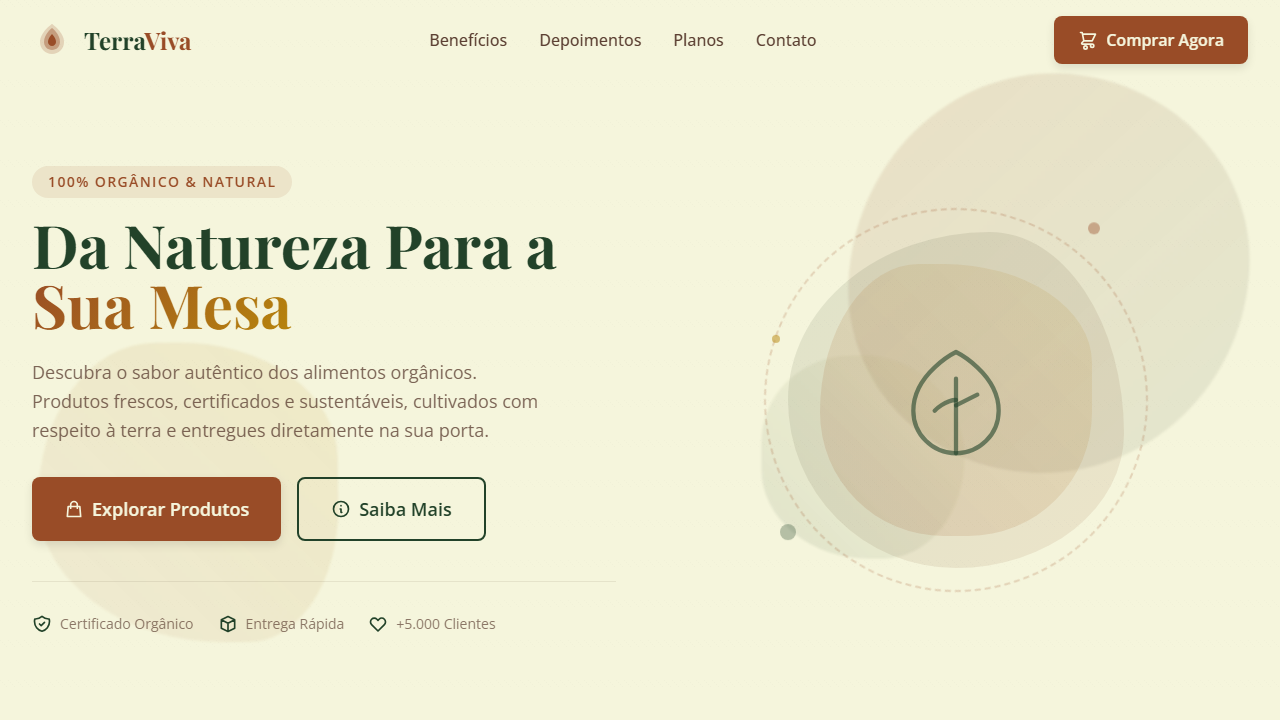
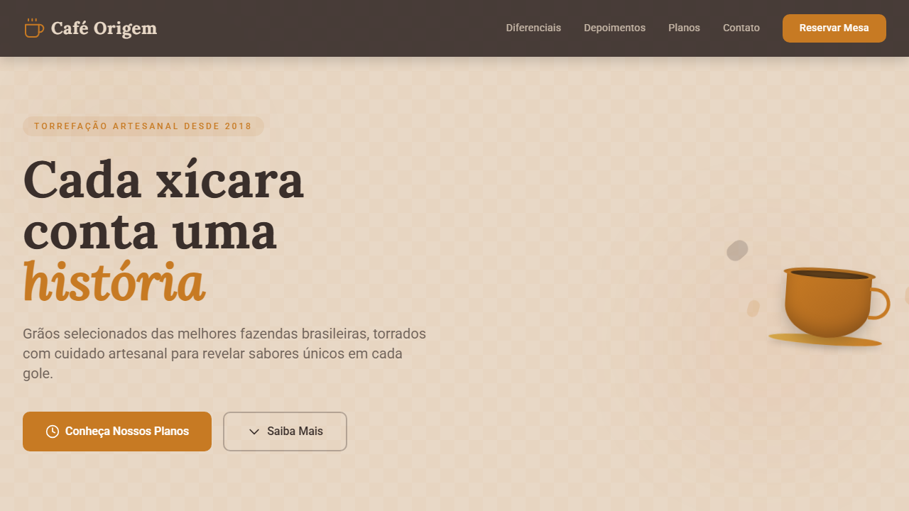
   - Hero Section (Impactful Headline + Subtitle + 2 buttons + 3D/Abstract visual element via CSS)
   - Features (3 cards with icons)
   - Testimonials (3 cards)
   - Pricing (3 tiers, highlight the middle one)
   - Final CTA
   - Full Footer with social links, privacy policy, terms of use, contact and SEO links.
5. All text content must be in English.
6. The visual must be CLEARLY distinct — do not create a "default Bootstrap" design. Force the use of the provided design system variables.
7. Use `<style>` tags in the head for custom classes (especially for complex backdrop-filter effects and animations) that Tailwind CDN doesn't cover.
8. Full Responsiveness: Layout must adapt perfectly to Mobile, Tablet and Desktop (vertical stack on mobile).
9. Include basic SEO, Viewport and Open Graph meta tags in `<head>`.
10. Footer must contain: Copyright 2026, Secondary navigation links and Social media icons.
11. Make the creative decisions needed to deliver the complete, functional result now.
Related
Last synced: 4/1/2026