Dark SaaS Hero with Liquid Glass
Dark SaaS landing page hero section. Ideal for b2b saas, ai tools, plataformas de desenvolvedores, landing pages tech, startups, apis e sdks. AI-ready template.
Use case: B2B SaaS, AI tools, Platforms de desenvolvedores, Tech landing pages, Startups, APIs e SDKs
Historical Context
The dark SaaS hero didn't emerge from nowhere — it's the logical endpoint of a decade-long shift away from the friendly, white-space-heavy interfaces that dominated early SaaS. When Stripe went dark in 2018, it signaled that developer tools could look like luxury goods. The rest of the industry followed. Dark backgrounds became shorthand for technical sophistication. Liquid glass is the latest evolution of this lineage. It borrows from Apple's visionOS material language and the frosted-glass experiments that Figma and Linear popularized, but pushes further — introducing refraction, caustics, and fluid distortion that make UI elements feel physically present. The video background underneath isn't decorative; it's structural. It provides the light source that makes the glass effect legible. What makes this pattern distinct from generic glassmorphism is intentionality. The glass isn't slapped on a gradient. It reacts to content beneath it, creating depth hierarchy without relying on drop shadows or borders. It's a post-flat, post-neumorphic approach that finally treats the screen as a volumetric space rather than a stack of cards.
When to Use
Deploy this when your product needs to communicate cutting-edge credibility before the user reads a single word. AI platforms, enterprise security tools, developer infrastructure, fintech dashboards — anything where perceived technical sophistication directly correlates with trust. Skip it for consumer apps targeting non-technical audiences, anything requiring WCAG AAA compliance out of the box, or products where warmth and approachability matter more than authority. The video background demands fast CDN delivery and graceful fallbacks.
Design Principles
- Depth through refraction, not shadow — let the glass distort what's behind it rather than floating above it with artificial elevation
- Video as light source — the background isn't ambiance, it's the optical engine that makes glass materials readable and dynamic
- Contrast hierarchy is non-negotiable — dark interfaces fail when text competes with effects; lock your type at 7:1 minimum against the darkest glass state
- Motion earns attention, stillness earns trust — animate the glass subtly on scroll or hover, but keep CTAs and navigation rock-solid
- Performance is a design decision — if the glass effect drops below 60fps on mid-range hardware, simplify it; a janky premium effect is worse than no effect
DESIGN.md
---
version: "alpha"
name: "Dark SaaS Hero with Liquid Glass"
description: "Dark SaaS landing page hero section. Ideal for b2b saas, ai tools, plataformas de desenvolvedores, landing pages tech, startups, apis e sdks. AI-ready template."
colors:
  primary: "#87FB89"
typography:
  h1:
    fontFamily: Geist Sans
    fontSize: 2.5rem
    fontWeight: 700
  body-md:
    fontFamily: Geist Sans
    fontSize: 1rem
    fontWeight: 400
components:
  button-primary:
    backgroundColor: "{colors.primary}"
    padding: 12px
---

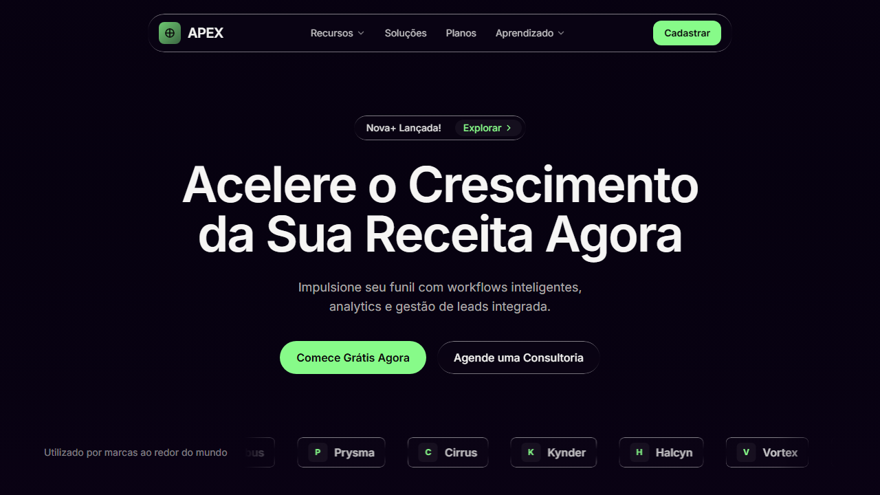
## Overview

Dark SaaS landing page hero section. Ideal for b2b saas, ai tools, plataformas de desenvolvedores, landing pages tech, startups, apis e sdks. AI-ready template. The dark SaaS hero didn't emerge from nowhere — it's the logical endpoint of a decade-long shift away from the friendly, white-space-heavy interfaces that dominated early SaaS. When Stripe went dark in 2018, it signaled that developer tools could look like luxury goods. The rest of the industry followed. Dark backgrounds became shorthand for technical sophistication.

Liquid glass is the latest evolution of this lineage. It borrows from Apple's visionOS material language and the frosted-glass experiments that Figma and Linear popularized, but pushes further — introducing refraction, caustics, and fluid distortion that make UI elements feel physically present. The video background underneath isn't decorative; it's structural. It provides the light source that makes the glass effect legible.

What makes this pattern distinct from generic glassmorphism is intentionality. The glass isn't slapped on a gradient. It reacts to content beneath it, creating depth hierarchy without relying on drop shadows or borders. It's a post-flat, post-neumorphic approach that finally treats the screen as a volumetric space rather than a stack of cards.

- Density: 5/10 — Balanced
- Variance: 4/10 — Moderate
- Motion: 8/10 — Cinematic

- **Style:** Dark SaaS, Liquid Glass, Video Background, Marquee Social Proof
- **Keywords:** dark SaaS, liquid glass, video background, hero section, marquee, social proof, green accent, backdrop blur, glass morphism, navbar pill, announcement badge, CTA buttons
- **Era:** 2025-2026 SaaS/AI Startup
- **Light/Dark:** ✗ None / ✓ Full

## Colors

- **Primary** (#87FB89) — Primary accent, CTAs and interactive elements


## Typography

- **Display / Hero:** Geist Sans — Weight 700, tight tracking, used for headline impact
- **Body:** Geist Sans — Weight 400, 16px/1.6 line-height, max 72ch per line
- **UI Labels / Captions:** Geist Sans — 0.875rem, weight 500, slight letter-spacing
- **Monospace:** JetBrains Mono — Used for code, metadata, and technical values

Scale:
- Hero: clamp(2.5rem, 5vw, 4rem)
- H1: 2.25rem
- H2: 1.5rem
- Body: 1rem / 1.6
- Small: 0.875rem


## Layout

- **Grid:** CSS Grid primary. Max-width containment: 1280px centered with 1.5rem side padding.
- **Spacing rhythm:** Balanced. Base unit: 0.5rem (8px).
- **Section vertical gaps:** clamp(4rem, 8vw, 8rem).
- **Hero layout:** Split-screen (text left, visual right).
- **Feature sections:** Zig-zag alternating text+image rows. No 3-equal-columns.
- **Mobile collapse:** All multi-column layouts collapse below 768px. No horizontal overflow.
- **z-index contract:** base (0) / sticky-nav (100) / overlay (200) / modal (300) / toast (500).


## Elevation & Depth

Liquid glass com backdrop-filter blur(4px) e pseudo-element gradient border via mask-composite, video background full-screen (Terra rotacionando do espaço) com autoPlay loop muted playsInline object-cover absolute inset-0, marquee horizontal infinito translateX(0%) a translateX(-50%) em 20s linear infinite, hover suave em botões e links (200ms transition)

- **Physics:** Spring — stiffness 120, damping 20. Confident, weighted transitions.
- **Entry animations:** Fade + translate-Y (16px → 0) over 540ms ease-out. Staggered cascades for lists: 120ms between items.
- **Hover states:** Scale(1.03) + shadow lift over 200ms.
- **Page transitions:** Fade + slide (300ms).
- **Performance:** Only transform and opacity animated. No layout-triggering properties.


## Shapes

Base corner radius: 9999px. See rounded tokens in front matter for the full scale.


## Components

- **Primary Button:** Pill-shaped (9999px) shape. Accent color fill. Hover: 8% darken + subtle lift shadow. Active: -1px translate tactile press. Font weight 600. No outer glows.
- **Secondary / Ghost Button:** Outline variant. 1.5px border in muted color. Text in primary color. Hover: subtle background fill.
- **Cards:** Pill-shaped (9999px) corners. Surface background. Subtle shadow (0 2px 12px rgba(0,0,0,0.06)). 1px border stroke.
- **Inputs:** Label above input. 1px border stroke. Focus ring: 2px accent color offset 2px. Error text below in semantic red. No floating labels.
- **Navigation:** Primary surface background. Active item: accent color indicator. Font weight 500 when active.
- **Skeletons:** Shimmer animation matching component dimensions. No circular spinners.
- **Empty States:** Icon-based composition with descriptive text and action button.


## Do's and Don'ts

- No emojis in UI — use icon system only (Lucide, Heroicons)
- No pure white (#FFFFFF) backgrounds — use off-white or dark surfaces
- No oversaturated accent colors (saturation cap: 80%)
- No 3-column equal-width feature layouts — use zig-zag or asymmetric grid
- No `h-screen` — use `min-h-[100dvh]`
- No AI copywriting clichés: "Elevate", "Seamless", "Unleash", "Next-Gen"
- No broken external image links — use picsum.photos or inline SVG
- No generic lorem ipsum in demos

- Do Fundo escuro hsl(260,87%,3%) com leve tom roxo
- Do Vídeo background full-screen da Terra do espaço
- Do Classe .liquid-glass reutilizável com backdrop-filter e pseudo-element gradient border
- Do Navbar pill centralizada liquid-glass com logo + nav items + CTA verde
- Do Badge de anúncio liquid-glass rounded-full
- Do Heading text-7xl semibold tracking-tight
- Do Dois botões CTA (verde primary + liquid-glass secondary)
- Do Marquee social proof com 6 marcas em loop infinito 20s
- Do Fonte Geist Sans 400-700
- Do Cor primária verde #87FB89


## Use Case

B2B SaaS, AI tools, Platforms de desenvolvedores, Tech landing pages, Startups, APIs e SDKs
Technical Specs
CSS
font-family: 'Geist Sans', sans-serif; background: hsl(260,87%,3%); color: hsl(40,6%,95%); .liquid-glass { background: rgba(255,255,255,0.01); background-blend-mode: luminosity; backdrop-filter: blur(4px); border: none; box-shadow: inset 0 1px 1px rgba(255,255,255,0.1); overflow: hidden; position: relative; } .liquid-glass::before { content:''; position:absolute; inset:0; padding:1.4px; background: linear-gradient(180deg, rgba(255,255,255,0.45) 0%, rgba(255,255,255,0.15) 20%, rgba(255,255,255,0) 40%, rgba(255,255,255,0) 60%, rgba(255,255,255,0.15) 80%, rgba(255,255,255,0.45) 100%); border-radius:inherit; -webkit-mask: linear-gradient(#fff 0 0) content-box, linear-gradient(#fff 0 0); -webkit-mask-composite: xor; mask-composite: exclude; pointer-events:none; } @keyframes marquee { 0%{transform:translateX(0%)} 100%{transform:translateX(-50%)} } .marquee-track { animation: marquee 20s linear infinite; }Variables
--background: hsl(260,87%,3%); --foreground: hsl(40,6%,95%); --primary: hsl(121,95%,76%); --primary-foreground: hsl(0,0%,5%); --hero-heading: hsl(40,10%,96%); --hero-sub: hsl(40,6%,82%); --secondary: hsl(240,4%,16%); --muted: hsl(240,4%,16%); --border: hsl(240,4%,20%); --font-primary: 'Geist Sans', sans-serif; --border-radius-full: 9999px; --border-radius-3xl: 1.5rem; --border-radius-xl: 0.75rem; --border-radius-lg: 0.5rem
Checklist
☐ Fundo escuro hsl(260,87%,3%) com leve tom roxo, ☐ Vídeo background full-screen da Terra do espaço, ☐ Classe .liquid-glass reutilizável com backdrop-filter e pseudo-element gradient border, ☐ Navbar pill centralizada liquid-glass com logo + nav items + CTA verde, ☐ Badge de anúncio liquid-glass rounded-full, ☐ Heading text-7xl semibold tracking-tight, ☐ Dois botões CTA (verde primary + liquid-glass secondary), ☐ Marquee social proof com 6 marcas em loop infinito 20s, ☐ Fonte Geist Sans 400-700, ☐ Cor primária verde #87FB89
Colors
Primary
Effects
Liquid glass com backdrop-filter blur(4px) e pseudo-element gradient border via mask-composite, video background full-screen (Terra rotacionando do espaço) com autoPlay loop muted playsInline object-cover absolute inset-0, marquee horizontal infinito translateX(0%) a translateX(-50%) em 20s linear infinite, hover suave em botões e links (200ms transition)
Light/Dark
✗ None / ✓ Full
AI Prompt
Act as a Senior Frontend Engineer and Expert UI Designer.
Your task is to code a complete Landing Page on the first attempt.
- Landing Page Theme: <INSERT THEME>
- Sections to add: <INSERT SECTIONS>

Generate the final code immediately following these definitions:

## Style

- **Name:** Dark SaaS Hero with Liquid Glass
- **Type:** Dark SaaS, Liquid Glass, Video Background, Marquee Social Proof
- **Keywords:** dark SaaS, liquid glass, video background, hero section, marquee, social proof, green accent, backdrop blur, glass morphism, navbar pill, announcement badge, CTA buttons
- **Era:** 2025-2026 SaaS/AI Startup
- **Light/Dark:** ✗ None / ✓ Full

## Color Palette

- **Primary:** Background hsl(260,87%,3%), Foreground hsl(40,6%,95%), Primary #87FB89 hsl(121,95%,76%)
- **Secondary:** Primary-foreground hsl(0,0%,5%), Hero-heading hsl(40,10%,96%), Hero-sub hsl(40,6%,82%), Secondary hsl(240,4%,16%), Muted hsl(240,4%,16%), Border hsl(240,4%,20%)

## Visual Effects

Liquid glass com backdrop-filter blur(4px) e pseudo-element gradient border via mask-composite, video background full-screen (Terra rotacionando do espaço) com autoPlay loop muted playsInline object-cover absolute inset-0, marquee horizontal infinito translateX(0%) a translateX(-50%) em 20s linear infinite, hover suave em botões e links (200ms transition)

## AI Visual Direction

Create a dark SaaS landing page hero section. Font: Geist Sans (400-700). Background: near-black with slight purple hsl(260,87%,3%). Foreground: warm off-white hsl(40,6%,95%). Primary accent: bright green #87FB89 hsl(121,95%,76%). Full-screen background VIDEO of rotating Earth from space (autoPlay, loop, muted, playsInline, object-cover, absolute inset-0) covering entire hero. Liquid Glass effect as reusable .liquid-glass class: background rgba(255,255,255,0.01), background-blend-mode luminosity, backdrop-filter blur(4px), no border, box-shadow inset 0 1px 1px rgba(255,255,255,0.1), overflow hidden, plus ::before pseudo-element with vertical gradient border using mask-composite (padding 1.4px, gradient from white 0.45 to transparent to white 0.45, webkit-mask-composite xor, mask-composite exclude). Layout top-to-bottom centered over video: (1) Navbar liquid-glass pill rounded-3xl max-w-850px with logo gradient square + crosshair SVG + APEX text, nav items Features/Solutions/Plans/Learning, Sign Up green CTA. (2) Announcement badge liquid-glass rounded-full pill 'Nova+ Launched!' with Explore chip + ChevronRight. (3) Heading text-7xl font-semibold tracking-tight 'Accelerate Your Revenue Growth Now'. (4) Subheading text-lg opacity-80. (5) Two CTA buttons: 'Start Free Right Now' green primary rounded-full, 'Schedule a Consult' liquid-glass rounded-full. (6) Social proof marquee at bottom with brand names Vortex/Nimbus/Prysma/Cirrus/Kynder/Halcyn scrolling horizontally, duplicated for seamless loop, 20s linear infinite animation.

## CSS Technical

```css
font-family: 'Geist Sans', sans-serif; background: hsl(260,87%,3%); color: hsl(40,6%,95%); .liquid-glass { background: rgba(255,255,255,0.01); background-blend-mode: luminosity; backdrop-filter: blur(4px); border: none; box-shadow: inset 0 1px 1px rgba(255,255,255,0.1); overflow: hidden; position: relative; } .liquid-glass::before { content:''; position:absolute; inset:0; padding:1.4px; background: linear-gradient(180deg, rgba(255,255,255,0.45) 0%, rgba(255,255,255,0.15) 20%, rgba(255,255,255,0) 40%, rgba(255,255,255,0) 60%, rgba(255,255,255,0.15) 80%, rgba(255,255,255,0.45) 100%); border-radius:inherit; -webkit-mask: linear-gradient(#fff 0 0) content-box, linear-gradient(#fff 0 0); -webkit-mask-composite: xor; mask-composite: exclude; pointer-events:none; } @keyframes marquee { 0%{transform:translateX(0%)} 100%{transform:translateX(-50%)} } .marquee-track { animation: marquee 20s linear infinite; }
```

## Design System Variables

```css
--background: hsl(260,87%,3%); --foreground: hsl(40,6%,95%); --primary: hsl(121,95%,76%); --primary-foreground: hsl(0,0%,5%); --hero-heading: hsl(40,10%,96%); --hero-sub: hsl(40,6%,82%); --secondary: hsl(240,4%,16%); --muted: hsl(240,4%,16%); --border: hsl(240,4%,20%); --font-primary: 'Geist Sans', sans-serif; --border-radius-full: 9999px; --border-radius-3xl: 1.5rem; --border-radius-xl: 0.75rem; --border-radius-lg: 0.5rem
```

## Implementation Checklist

- ☐ Fundo escuro hsl(260,87%,3%) com leve tom roxo
- ☐ Vídeo background full-screen da Terra do espaço
- ☐ Classe .liquid-glass reutilizável com backdrop-filter e pseudo-element gradient border
- ☐ Navbar pill centralizada liquid-glass com logo + nav items + CTA verde
- ☐ Badge de anúncio liquid-glass rounded-full
- ☐ Heading text-7xl semibold tracking-tight
- ☐ Dois botões CTA (verde primary + liquid-glass secondary)
- ☐ Marquee social proof com 6 marcas em loop infinito 20s
- ☐ Fonte Geist Sans 400-700
- ☐ Cor primária verde #87FB89

## Execution Rules

1. Strictly follow the defined visual style.
2. Use high-quality inline SVG icons (Heroicons or Lucide style) — NEVER use emojis as icons.
3. Add `cursor-pointer` and smooth `hover` states (transition-all) on all interactive elements.
4. Required Page Structure:
   - Navbar (Logo + Links + CTA)
   - Hero Section (Impactful Headline + Subtitle + 2 buttons + 3D/Abstract visual element via CSS)
   - Features (3 cards with icons)
   - Testimonials (3 cards)
   - Pricing (3 tiers, highlight the middle one)
   - Final CTA
   - Full Footer with social links, privacy policy, terms of use, contact and SEO links.
5. All text content must be in English.
6. The visual must be CLEARLY distinct — do not create a "default Bootstrap" design. Force the use of the provided design system variables.
7. Use `<style>` tags in the head for custom classes (especially for complex backdrop-filter effects and animations) that Tailwind CDN doesn't cover.
8. Full Responsiveness: Layout must adapt perfectly to Mobile, Tablet and Desktop (vertical stack on mobile).
9. Include basic SEO, Viewport and Open Graph meta tags in `<head>`.
10. Footer must contain: Copyright 2026, Secondary navigation links and Social media icons.
11. Make the creative decisions needed to deliver the complete, functional result now.Related
Last synced: 4/1/2026