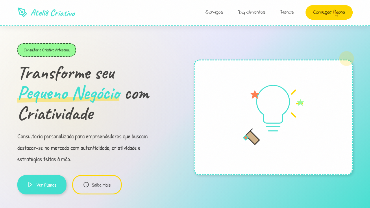
Criatividade Artesanal e Pessoal
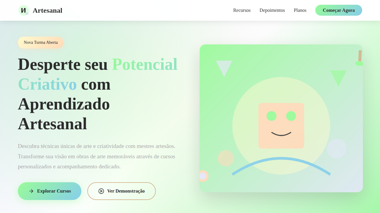
Personal and creative hand-drawn landing page for a small business creative consulting firm. Ideal for landing pages, modern websites. AI-ready template.
Use case: Landing pages, Modern websites
Historical Context
Before Canva templates and brand-in-a-box kits flattened everything into the same geometric sans-serif grid, freelancers owned their visual identity through craft. Hand-lettered logos, risograph textures, ink splatter borders — these weren't aesthetic choices, they were survival tactics. When you're competing against agencies with six-figure brand budgets, the one thing they cannot replicate is your hand. The artisanal branding movement traces back to the early 2010s letterpress revival and Etsy-era maker culture, but its roots run deeper — into zine communities, sign painting traditions, and the DIY punk ethic that said 'rough edges are the point.' Freelance illustrators and creative consultants adopted these codes not out of nostalgia but necessity. A wobbly baseline or a scanned paper texture signals something corporate design cannot: that a single human made this, deliberately, with intent. Today the tension is sharper than ever. AI-generated assets push visual homogeneity further. The handmade mark — imperfect, personal, unrepeatable — becomes the clearest signal of authorship a small creative practice can deploy.
When to Use
When the brand IS the person. Solo consultants, illustrators selling their eye, small studios where the founder's taste is the product. Deploy when differentiation depends on visible craft rather than scalable systems — portfolio sites, proposal decks, social presence for creatives who need to feel singular, not templated. Avoid for anything requiring multi-designer consistency at scale; this approach trades repeatability for personality on purpose.
Design Principles
- Visible hand — preserve evidence of human process: scanned textures, brush strokes, tool marks, irregular edges that prove a person was here
- Constraint as signature — limit your palette, your tools, your grid deliberately; the restrictions you choose become recognizable faster than any logo
- Warmth over precision — favor optical alignment over mathematical alignment, organic rhythm over rigid repetition, breath over density
- Material honesty — if it references print, ink, or paper, ground it in real material behavior; fake textures read as decoration, real ones read as craft
- Personal mythology — build a visual language from your actual references, obsessions, and working methods rather than borrowing trending aesthetics wholesale
DESIGN.md
---
version: "alpha"
name: "Criatividade Artesanal e Pessoal"
description: "Personal and creative hand-drawn landing page for a small business creative consulting firm. Ideal for landing pages, modern websites. AI-ready template."
colors:
  primary: "#40E0D0"
  secondary: "#FFD700"
  tertiary: "#FFFFFF"
  neutral: "#F0F0F0"
  surface: "#FF7F50"
  accent: "#98FB98"
typography:
  h1:
    fontFamily: Indie Flower
    fontSize: 2.5rem
    fontWeight: 700
  body-md:
    fontFamily: Indie Flower
    fontSize: 1rem
    fontWeight: 400
components:
  button-primary:
    backgroundColor: "{colors.primary}"
    textColor: "{colors.neutral}"
    padding: 12px
---

## Overview

Personal and creative hand-drawn landing page for a small business creative consulting firm. Ideal for landing pages, modern websites. AI-ready template. Before Canva templates and brand-in-a-box kits flattened everything into the same geometric sans-serif grid, freelancers owned their visual identity through craft. Hand-lettered logos, risograph textures, ink splatter borders — these weren't aesthetic choices, they were survival tactics. When you're competing against agencies with six-figure brand budgets, the one thing they cannot replicate is your hand.

The artisanal branding movement traces back to the early 2010s letterpress revival and Etsy-era maker culture, but its roots run deeper — into zine communities, sign painting traditions, and the DIY punk ethic that said 'rough edges are the point.' Freelance illustrators and creative consultants adopted these codes not out of nostalgia but necessity. A wobbly baseline or a scanned paper texture signals something corporate design cannot: that a single human made this, deliberately, with intent.

Today the tension is sharper than ever. AI-generated assets push visual homogeneity further. The handmade mark — imperfect, personal, unrepeatable — becomes the clearest signal of authorship a small creative practice can deploy.

- Density: 5/10 — Balanced
- Variance: 7/10 — Dynamic
- Motion: 4/10 — Subtle

- **Style:** Personal, Creative, Approachable
- **Keywords:** creative consulting, small business, marketing, personal, creative, approachable, unique, friendly, bespoke, authentic
- **Era:** 2026+ Toque Humano Digital
- **Light/Dark:** ✓ Full / ✗ No

## Colors

- **Azul Turquesa** (#40E0D0) — Accent highlight, links and focus states
- **Amarelo Mostarda** (#FFD700) — Warning states, attention indicators
- **Branco** (#FFFFFF) — Light surface, card backgrounds
- **Cinza Claro** (#F0F0F0) — Secondary text, borders, muted elements
- **Rosa Coral** (#FF7F50) — Decorative accent, highlight elements
- **Verde Menta** (#98FB98) — Success states, positive indicators
- **Roxo Lavanda** (#E6E6FA) — Accent color, emphasis elements
- **Marrom Claro** (#D2B48C) — Extended palette, decorative use


## Typography

- **Display / Hero:** Indie Flower — Weight 700, tight tracking, used for headline impact
- **Body:** Indie Flower — Weight 400, 16px/1.6 line-height, max 72ch per line
- **UI Labels / Captions:** Indie Flower — 0.875rem, weight 500, slight letter-spacing
- **Monospace:** JetBrains Mono — Used for code, metadata, and technical values

Scale:
- Hero: clamp(2.5rem, 5vw, 4rem)
- H1: 2.25rem
- H2: 1.5rem
- Body: 1rem / 1.6
- Small: 0.875rem


## Layout

- **Grid:** CSS Grid primary. Max-width containment: 1280px centered with 1.5rem side padding.
- **Spacing rhythm:** Balanced. Base unit: 0.5rem (8px).
- **Section vertical gaps:** clamp(4rem, 8vw, 8rem).
- **Hero layout:** Asymmetric composition.
- **Feature sections:** Asymmetric grid with varied card sizes. No 3-equal-columns.
- **Mobile collapse:** All multi-column layouts collapse below 768px. No horizontal overflow.
- **z-index contract:** base (0) / sticky-nav (100) / overlay (200) / modal (300) / toast (500).


## Elevation & Depth

Ilustrações de ícones desenhados à mão, tipografia que simula escrita em diário, texturas de papel amassado, bordas com efeito de lápis, micro-interações de hover com efeito de "desenho" progressivo, transições de seção com efeito de "rascunho".

- **Physics:** Ease-out curves, 200-300ms duration. Smooth and predictable.
- **Entry animations:** Fade + translate-Y (16px → 0) over 420ms ease-out. Staggered cascades for lists: 80ms between items.
- **Hover states:** Subtle color shift + shadow adjustment over 200ms.
- **Page transitions:** Fade only (200ms).
- **Performance:** Only transform and opacity animated. No layout-triggering properties.


## Shapes

Base corner radius: 8px. See rounded tokens in front matter for the full scale.


## Components

- **Primary Button:** Subtly rounded (0.5rem) shape. Accent color fill. Hover: 8% darken + subtle lift shadow. Active: -1px translate tactile press. Font weight 600. No outer glows.
- **Secondary / Ghost Button:** Outline variant. 1.5px border in muted color. Text in primary color. Hover: subtle background fill.
- **Cards:** Subtly rounded (0.5rem) corners. Surface background. Subtle shadow (0 2px 12px rgba(0,0,0,0.06)). 1px border stroke.
- **Inputs:** Label above input. 1px border stroke. Focus ring: 2px accent color offset 2px. Error text below in semantic red. No floating labels.
- **Navigation:** Primary surface background. Active item: accent color indicator. Font weight 500 when active.
- **Skeletons:** Shimmer animation matching component dimensions. No circular spinners.
- **Empty States:** Icon-based composition with descriptive text and action button.


## Do's and Don'ts

- No emojis in UI — use icon system only (Lucide, Heroicons)
- No pure black (#000000) — use off-black or charcoal variants
- No oversaturated accent colors (saturation cap: 80%)
- No 3-column equal-width feature layouts — use zig-zag or asymmetric grid
- No `h-screen` — use `min-h-[100dvh]`
- No AI copywriting clichés: "Elevate", "Seamless", "Unleash", "Next-Gen"
- No broken external image links — use picsum.photos or inline SVG
- No generic lorem ipsum in demos

- Do Ícones desenhados à mão
- Do Tipografia de diário
- Do Texturas de papel amassado
- Do Bordas com efeito de lápis
- Do Micro-interações de "desenho"
- Do Transições de "rascunho".


## Use Case

Landing pages, Modern websites
Technical Specs
CSS
background: #FFFFFF, color: #333333, border: 1px solid #D2B48C, font-family: "Indie Flower, cursive", transition: all 0.6s ease-in-out, .hand-drawn-icon, .journal-text, .crumpled-paper-bg.
Variables
--turquoise-blue: #40E0D0, --mustard-yellow: #FFD700, --white-bg: #FFFFFF, --light-grey-bg: #F0F0F0, --font-journal: "Indie Flower, cursive", --crumpled-paper-bg: url('crumpled-paper.png'), --pencil-border: 1px solid #D2B48C.Checklist
☐ Ícones desenhados à mão, ☐ Tipografia de diário, ☐ Texturas de papel amassado, ☐ Bordas com efeito de lápis, ☐ Micro-interações de "desenho", ☐ Transições de "rascunho".
Colors
Primary
Secondary
Effects
Ilustrações de ícones desenhados à mão, tipografia que simula escrita em diário, texturas de papel amassado, bordas com efeito de lápis, micro-interações de hover com efeito de "desenho" progressivo, transições de seção com efeito de "rascunho".
Light/Dark
✓ Full / ✗ No
AI Prompt
Act as a Senior Frontend Engineer and Expert UI Designer.
Your task is to code a complete Landing Page on the first attempt.
- Landing Page Theme: <INSERT THEME>
- Sections to add: <INSERT SECTIONS>

Generate the final code immediately following these definitions:

## Style

- **Name:** Criatividade Artesanal e Pessoal
- **Type:** Personal, Creative, Approachable
- **Keywords:** creative consulting, small business, marketing, personal, creative, approachable, unique, friendly, bespoke, authentic
- **Era:** 2026+ Toque Humano Digital
- **Light/Dark:** ✓ Full / ✗ No

## Color Palette

- **Primary:** Azul Turquesa #40E0D0, Amarelo Mostarda #FFD700, Branco #FFFFFF, Cinza Claro #F0F0F0
- **Secondary:** Rosa Coral #FF7F50, Verde Menta #98FB98, Roxo Lavanda #E6E6FA, Marrom Claro #D2B48C

## Visual Effects

Ilustrações de ícones desenhados à mão, tipografia que simula escrita em diário, texturas de papel amassado, bordas com efeito de lápis, micro-interações de hover com efeito de "desenho" progressivo, transições de seção com efeito de "rascunho".

## AI Visual Direction

Design a personal and creative hand-drawn landing page for a small business creative consulting firm. Use: hand-drawn icon illustrations, journal-style typography, crumpled paper textures, pencil-effect borders, progressive "drawing" hover micro-interactions, "sketch" effect section transitions, turquoise and mustard yellow accents, approachable and authentic feel.

## CSS Technical

```css
background: #FFFFFF, color: #333333, border: 1px solid #D2B48C, font-family: "Indie Flower, cursive", transition: all 0.6s ease-in-out, .hand-drawn-icon, .journal-text, .crumpled-paper-bg.
```

## Design System Variables

```css
--turquoise-blue: #40E0D0, --mustard-yellow: #FFD700, --white-bg: #FFFFFF, --light-grey-bg: #F0F0F0, --font-journal: "Indie Flower, cursive", --crumpled-paper-bg: url('crumpled-paper.png'), --pencil-border: 1px solid #D2B48C.
```

## Implementation Checklist

- ☐ Ícones desenhados à mão
- ☐ Tipografia de diário
- ☐ Texturas de papel amassado
- ☐ Bordas com efeito de lápis
- ☐ Micro-interações de "desenho"
- ☐ Transições de "rascunho".

## Execution Rules

1. Strictly follow the defined visual style.
2. Use high-quality inline SVG icons (Heroicons or Lucide style) — NEVER use emojis as icons.
3. Add `cursor-pointer` and smooth `hover` states (transition-all) on all interactive elements.
4. Required Page Structure:
   - Navbar (Logo + Links + CTA)
   - Hero Section (Impactful Headline + Subtitle + 2 buttons + 3D/Abstract visual element via CSS)
   - Features (3 cards with icons)
   - Testimonials (3 cards)
   - Pricing (3 tiers, highlight the middle one)
   - Final CTA
   - Full Footer with social links, privacy policy, terms of use, contact and SEO links.
5. All text content must be in English.
6. The visual must be CLEARLY distinct — do not create a "default Bootstrap" design. Force the use of the provided design system variables.
7. Use `<style>` tags in the head for custom classes (especially for complex backdrop-filter effects and animations) that Tailwind CDN doesn't cover.
8. Full Responsiveness: Layout must adapt perfectly to Mobile, Tablet and Desktop (vertical stack on mobile).
9. Include basic SEO, Viewport and Open Graph meta tags in `<head>`.
10. Footer must contain: Copyright 2026, Secondary navigation links and Social media icons.
11. Make the creative decisions needed to deliver the complete, functional result now.Related
Last synced: 4/1/2026