Coastal Studio
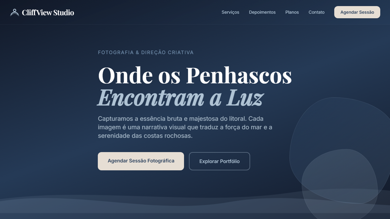
Creative studio landing page inspired by rocky coastal cliffs, using deep navy, slate blue, and ocean pearl overlays. Ideal for portfólios de fotografia, estúdios criativos, agências de branding, arquitetura costeira. AI-ready template.
Use case: Portfolios de fotografia, Studios criativos, Agencies de branding, Arquitetura costeira
Historical Context
The relationship between photography and the coast has always been one of tension — the camera trying to hold still what refuses to stay. Early coastal studios in California and Cornwall understood this. They didn't fight the light; they let it blow out edges, wash over surfaces, turn architecture into atmosphere. The best ones felt like walking into a photograph before it was taken. Coastal Studio picks up that thread. The photographic hero isn't decoration — it's the entire thesis statement. Full-bleed imagery does the heavy lifting while editorial typography sits on top with the confidence of a magazine masthead. There's no grid fighting the ocean; the layout breathes horizontally the way shorelines do. What separates this from generic photography templates is restraint in the wrong places and excess in the right ones. The type is oversized but never competes. The whitespace is generous but never empty. It's a template that trusts the photographer's work enough to get out of the way — which, frankly, most templates are too insecure to do.
When to Use
Reach for Coastal Studio when the photography is strong enough to carry the page alone. If your client has a portfolio of atmospheric, high-contrast work — surf photography, architectural shots with natural light, lifestyle editorial — this is the frame that won't diminish it. Works beautifully for creative agencies who want to signal taste without over-designing. Also fits coastal hospitality brands where the sense of place matters more than feature lists. Skip it if the imagery is mediocre; this layout will expose weak photography immediately.
Design Principles
- Photography as architecture — the hero image isn't content, it's the structural foundation everything else rests on
- Editorial type hierarchy borrowed from print magazines: oversized display faces paired with restrained body text, never competing with imagery
- Horizontal rhythm over vertical stacking — layouts that breathe laterally, mimicking the way eyes scan a coastline
- Deliberate negative space that reads as confidence rather than emptiness, giving each element room to resonate
- Muted interface chrome — navigation, buttons, and UI elements recede so the photographic work remains the undisputed focal point
DESIGN.md
---
version: "alpha"
name: "Coastal Studio"
description: "Creative studio landing page inspired by rocky coastal cliffs, using deep navy, slate blue, and ocean pearl overlays. Ideal for portfólios de fotografia, estúdios criativos, agências de branding, arquitetura costeira. AI-ready template."
colors:
  primary: "#263C59"
  secondary: "#6D89A6"
  tertiary: "#AFC3D4"
  neutral: "#C8D9E6"
  surface: "#E6DED4"
  accent: "#111827"
typography:
  h1:
    fontFamily: System UI stack
    fontSize: 2.25rem
    fontWeight: 700
  body-md:
    fontFamily: System UI stack
    fontSize: 1rem
    fontWeight: 400
  label-caps:
    fontFamily: System UI stack
    fontSize: 0.75rem
    fontWeight: 500
rounded:
  sm: 20px
  md: 40px
  lg: 60px
components:
  button-primary:
    backgroundColor: "{colors.primary}"
    textColor: "{colors.neutral}"
    rounded: "{rounded.sm}"
    padding: 12px
---

## Overview

Creative studio landing page inspired by rocky coastal cliffs, using deep navy, slate blue, and ocean pearl overlays. Ideal for portfólios de fotografia, estúdios criativos, agências de branding, arquitetura costeira. AI-ready template. The relationship between photography and the coast has always been one of tension — the camera trying to hold still what refuses to stay. Early coastal studios in California and Cornwall understood this. They didn't fight the light; they let it blow out edges, wash over surfaces, turn architecture into atmosphere. The best ones felt like walking into a photograph before it was taken.

Coastal Studio picks up that thread. The photographic hero isn't decoration — it's the entire thesis statement. Full-bleed imagery does the heavy lifting while editorial typography sits on top with the confidence of a magazine masthead. There's no grid fighting the ocean; the layout breathes horizontally the way shorelines do.

What separates this from generic photography templates is restraint in the wrong places and excess in the right ones. The type is oversized but never competes. The whitespace is generous but never empty. It's a template that trusts the photographer's work enough to get out of the way — which, frankly, most templates are too insecure to do.

- Density: 5/10 — Balanced
- Variance: 4/10 — Moderate
- Motion: 4/10 — Subtle

- **Style:** General
- **Keywords:** estúdio criativo costeiro, hero fotográfico, tipografia editorial, blocos semi-transparentes, clima de penhascos e mar
- **Era:** Coastal Creative Studio
- **Light/Dark:** ◐ Partial

## Colors

- **Deep Current** (#263C59) — Primary surface or dominant color
- **Coastal Slate** (#6D89A6) — Secondary surface or text color
- **Ocean Pearl** (#AFC3D4) — Supporting palette color
- **Seafoam Cloud** (#C8D9E6) — Extended palette, decorative use
- **Driftwood Pale** (#E6DED4) — Extended palette, decorative use
- **Preto suave** (#111827) — Deep contrast surface


## Typography

- **Display / Hero:** System UI stack (-apple-system, sans-serif) — Weight 700, tight tracking, used for headline impact
- **Body:** System UI stack (-apple-system, sans-serif) — Weight 400, 16px/1.6 line-height, max 72ch per line
- **UI Labels / Captions:** System UI stack (-apple-system, sans-serif) — 0.875rem, weight 500, slight letter-spacing
- **Monospace:** JetBrains Mono — Used for code, metadata, and technical values

Scale:
- Hero: clamp(2.5rem, 5vw, 4rem)
- H1: 2.25rem
- H2: 1.5rem
- Body: 1rem / 1.6
- Small: 0.875rem


## Layout

- **Grid:** CSS Grid primary. Max-width containment: 1280px centered with 1.5rem side padding.
- **Spacing rhythm:** Balanced. Base unit: 0.5rem (8px).
- **Section vertical gaps:** clamp(4rem, 8vw, 8rem).
- **Hero layout:** Split-screen (text left, visual right).
- **Feature sections:** Zig-zag alternating text+image rows. No 3-equal-columns.
- **Mobile collapse:** All multi-column layouts collapse below 768px. No horizontal overflow.
- **z-index contract:** base (0) / sticky-nav (100) / overlay (200) / modal (300) / toast (500).


## Elevation & Depth

Hero com foto de costa rochosa, overlays semi-transparentes em Coastal Slate, títulos serif grandes, textos em branco sobre navy, botões em Driftwood Pale com texto em Deep Current

- **Physics:** Ease-out curves, 200-300ms duration. Smooth and predictable.
- **Entry animations:** Fade + translate-Y (16px → 0) over 420ms ease-out. Staggered cascades for lists: 80ms between items.
- **Hover states:** Subtle color shift + shadow adjustment over 200ms.
- **Page transitions:** Fade only (200ms).
- **Performance:** Only transform and opacity animated. No layout-triggering properties.


## Shapes

Base corner radius: 20px. See rounded tokens in front matter for the full scale.


## Components

- **Primary Button:** Rounded (20px) shape. Accent color fill. Hover: 8% darken + subtle lift shadow. Active: -1px translate tactile press. Font weight 600. No outer glows.
- **Secondary / Ghost Button:** Outline variant. 1.5px border in muted color. Text in primary color. Hover: subtle background fill.
- **Cards:** Rounded (20px) corners. Surface background. Subtle shadow (0 2px 12px rgba(0,0,0,0.06)). 1px border stroke.
- **Inputs:** Label above input. 1px border stroke. Focus ring: 2px accent color offset 2px. Error text below in semantic red. No floating labels.
- **Navigation:** Primary surface background. Active item: accent color indicator. Font weight 500 when active.
- **Skeletons:** Shimmer animation matching component dimensions. No circular spinners.
- **Empty States:** Icon-based composition with descriptive text and action button.


## Do's and Don'ts

- No emojis in UI — use icon system only (Lucide, Heroicons)
- No pure black (#000000) — use off-black or charcoal variants
- No oversaturated accent colors (saturation cap: 80%)
- No 3-column equal-width feature layouts — use zig-zag or asymmetric grid
- No `h-screen` — use `min-h-[100dvh]`
- No AI copywriting clichés: "Elevate", "Seamless", "Unleash", "Next-Gen"
- No broken external image links — use picsum.photos or inline SVG
- No generic lorem ipsum in demos

- Do Hero com foto costeira em tela cheia
- Do Painéis semi-transparentes em Coastal Slate/Ocean Pearl
- Do Títulos serif grandes em branco
- Do Botões em Driftwood Pale com texto em Deep Current
- Do Layout que balanceia fotografia forte com UI minimal


## Use Case

Portfolios de fotografia, Studios criativos, Agencies de branding, Arquitetura costeira
Technical Specs
CSS
border-radius: 20px; box-shadow: 0 22px 60px rgba(0,0,0,0.35); background: linear-gradient(160deg, rgba(17,24,39,0.95), rgba(38,60,89,0.9)); backdrop-filter: blur(12px);
Variables
--radius-panel: 20px; --color-overlay-dark: rgba(17,24,39,0.95); --color-slate: #6D89A6; --color-ocean: #AFC3D4; --shadow-hero: 0 22px 60px rgba(0,0,0,0.35);
Checklist
☐ Hero com foto costeira em tela cheia, ☐ Painéis semi-transparentes em Coastal Slate/Ocean Pearl, ☐ Títulos serif grandes em branco, ☐ Botões em Driftwood Pale com texto em Deep Current, ☐ Layout que balanceia fotografia forte com UI minimal
Colors
Primary
Secondary
Effects
Hero com foto de costa rochosa, overlays semi-transparentes em Coastal Slate, títulos serif grandes, textos em branco sobre navy, botões em Driftwood Pale com texto em Deep Current
Light/Dark
◐ Partial
AI Prompt
Act as a Senior Frontend Engineer and Expert UI Designer.
Your task is to code a complete Landing Page on the first attempt.
- Landing Page Theme: <INSERT THEME>
- Sections to add: <INSERT SECTIONS>

Generate the final code immediately following these definitions:

## Style

- **Name:** Coastal Studio
- **Type:** General
- **Keywords:** estúdio criativo costeiro, hero fotográfico, tipografia editorial, blocos semi-transparentes, clima de penhascos e mar
- **Era:** Coastal Creative Studio
- **Light/Dark:** ◐ Partial

## Color Palette

- **Primary:** Deep Current #263C59, Coastal Slate #6D89A6, Ocean Pearl #AFC3D4
- **Secondary:** Seafoam Cloud #C8D9E6, Driftwood Pale #E6DED4, Preto suave #111827

## Visual Effects

Hero com foto de costa rochosa, overlays semi-transparentes em Coastal Slate, títulos serif grandes, textos em branco sobre navy, botões em Driftwood Pale com texto em Deep Current

## AI Visual Direction

Design a creative studio landing page inspired by rocky coastal cliffs, using deep navy, slate blue, and ocean pearl overlays. Combine large editorial serif headlines with soft translucent panels.

## CSS Technical

```css
border-radius: 20px; box-shadow: 0 22px 60px rgba(0,0,0,0.35); background: linear-gradient(160deg, rgba(17,24,39,0.95), rgba(38,60,89,0.9)); backdrop-filter: blur(12px);
```

## Design System Variables

```css
--radius-panel: 20px; --color-overlay-dark: rgba(17,24,39,0.95); --color-slate: #6D89A6; --color-ocean: #AFC3D4; --shadow-hero: 0 22px 60px rgba(0,0,0,0.35);
```

## Implementation Checklist

- ☐ Hero com foto costeira em tela cheia
- ☐ Painéis semi-transparentes em Coastal Slate/Ocean Pearl
- ☐ Títulos serif grandes em branco
- ☐ Botões em Driftwood Pale com texto em Deep Current
- ☐ Layout que balanceia fotografia forte com UI minimal

## Execution Rules

1. Strictly follow the defined visual style.
2. Use high-quality inline SVG icons (Heroicons or Lucide style) — NEVER use emojis as icons.
3. Add `cursor-pointer` and smooth `hover` states (transition-all) on all interactive elements.
4. Required Page Structure:
   - Navbar (Logo + Links + CTA)
   - Hero Section (Impactful Headline + Subtitle + 2 buttons + 3D/Abstract visual element via CSS)
   - Features (3 cards with icons)
   - Testimonials (3 cards)
   - Pricing (3 tiers, highlight the middle one)
   - Final CTA
   - Full Footer with social links, privacy policy, terms of use, contact and SEO links.
5. All text content must be in English.
6. The visual must be CLEARLY distinct — do not create a "default Bootstrap" design. Force the use of the provided design system variables.
7. Use `<style>` tags in the head for custom classes (especially for complex backdrop-filter effects and animations) that Tailwind CDN doesn't cover.
8. Full Responsiveness: Layout must adapt perfectly to Mobile, Tablet and Desktop (vertical stack on mobile).
9. Include basic SEO, Viewport and Open Graph meta tags in `<head>`.
10. Footer must contain: Copyright 2026, Secondary navigation links and Social media icons.
11. Make the creative decisions needed to deliver the complete, functional result now.
Related
Last synced: 4/1/2026