Cartazista de Supermercado
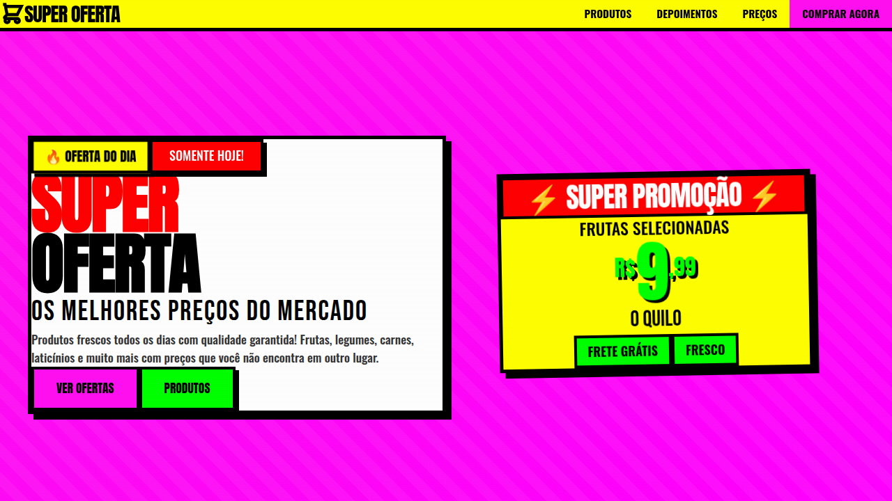
Brazilian supermarket cartazista (sign maker) style landing page. Ideal for landing pages, saas. AI-ready template.
Use case: Landing pages, SaaS
Historical Context
Walk into any Brazilian supermarket — not the polished chains, the real ones — and you'll find them. Cartaz after cartaz, hand-painted price signs screaming offers in fluorescent tempera on cardboard. The cartazista is the person behind them. No formal training. No grid system. Just muscle memory, a brush, and an intuitive understanding of hierarchy that most design school graduates struggle to articulate. For decades, this was invisible labor. Background noise. Then sometime in the 2010s, Brazilian designers started paying attention. Exhibitions happened. Instagram accounts archived the work. Typographers like Crystian Cruz began documenting letterforms that had evolved entirely outside academic tradition — condensed, high-contrast, built for speed and legibility at distance. The cartazista wasn't copying type design. They'd invented their own, in parallel, optimized for a completely different set of constraints: cost, speed, and the chaos of a retail floor. What makes cartazista work resonate now is precisely its refusal to be polished. In an era of Canva templates and corporate sanitization, these signs carry an authenticity that cannot be faked. They smell like a real place. They belong to a specific economy — popular commerce, informal markets, the Brazil that actually feeds people. That roughness isn't a bug. It's the entire point.
When to Use
When a project needs to feel grounded in real commerce rather than aspirational branding. Works for popular retail, local business identity, food markets, price-forward communication, and any context where polish would read as dishonest. Particularly effective when you want to signal accessibility, affordability, and community roots — the opposite of premium minimalism. Also useful as a counterweight in projects that risk feeling too corporate or too global.
Design Principles
- Speed over precision — letterforms are built for rapid execution, not optical perfection. Embrace the wobble.
- Hierarchy through scale and color, never through subtlety. The biggest number wins. Fluorescent demands attention before you've decided to look.
- Material honesty — cardboard, tempera, marker. The substrate is part of the message. Don't simulate luxury materials.
- Condensed proportions by necessity — vertical space is cheap, horizontal space costs money. Letters stack tall and narrow.
- Anti-consistency as system — no two signs are identical even from the same hand. Variation is the signature, not the flaw.
DESIGN.md
---
version: "alpha"
name: "Cartazista de Supermercado"
description: "Brazilian supermarket cartazista (sign maker) style landing page. Ideal for landing pages, saas. AI-ready template."
colors:
  primary: "#FF10F0"
  secondary: "#FFFF00"
  tertiary: "#00FF00"
  neutral: "#FF6600"
  surface: "#000000"
  accent: "#0066CC"
typography:
  h1:
    fontFamily: Impact
    fontSize: 2.5rem
    fontWeight: 700
  body-md:
    fontFamily: Impact
    fontSize: 1rem
    fontWeight: 400
components:
  button-primary:
    backgroundColor: "{colors.primary}"
    textColor: "{colors.neutral}"
    padding: 12px
---

## Overview

Brazilian supermarket cartazista (sign maker) style landing page. Ideal for landing pages, saas. AI-ready template. Walk into any Brazilian supermarket — not the polished chains, the real ones — and you'll find them. Cartaz after cartaz, hand-painted price signs screaming offers in fluorescent tempera on cardboard. The cartazista is the person behind them. No formal training. No grid system. Just muscle memory, a brush, and an intuitive understanding of hierarchy that most design school graduates struggle to articulate.

For decades, this was invisible labor. Background noise. Then sometime in the 2010s, Brazilian designers started paying attention. Exhibitions happened. Instagram accounts archived the work. Typographers like Crystian Cruz began documenting letterforms that had evolved entirely outside academic tradition — condensed, high-contrast, built for speed and legibility at distance. The cartazista wasn't copying type design. They'd invented their own, in parallel, optimized for a completely different set of constraints: cost, speed, and the chaos of a retail floor.

What makes cartazista work resonate now is precisely its refusal to be polished. In an era of Canva templates and corporate sanitization, these signs carry an authenticity that cannot be faked. They smell like a real place. They belong to a specific economy — popular commerce, informal markets, the Brazil that actually feeds people. That roughness isn't a bug. It's the entire point.

- Density: 5/10 — Balanced
- Variance: 7/10 — Dynamic
- Motion: 4/10 — Subtle

- **Style:** Popular, Artesanal, Colorido, Brasileiro
- **Keywords:** vernacular, supermarket, cartazista, manual, handmade, fluorescent, neon, commercial, retail, offer, price, Brazilian popular, fitas crepon, letras garrafais, pincel atômico
- **Era:** Varejo Popular Brasileiro Contemporâneo
- **Light/Dark:** ✓ Full / ✗ No

## Colors

- **Rosa Neon** (#FF10F0) — Decorative accent, highlight elements
- **Amarelo Neon** (#FFFF00) — Warning states, attention indicators
- **Verde Neon** (#00FF00) — Supporting palette color
- **Laranja** (#FF6600) — Warm accent, call-to-action secondary
- **Preto** (#000000) — Dark surface, primary background
- **Azul Fosco** (#0066CC) — Secondary accent
- **Vermelho** (#FF0000) — Error states, destructive actions
- **Roxo Neon** (#FF00FF) — Accent color, emphasis elements
- **Branco** (#FFFFFF) — Secondary surface


## Typography

- **Display / Hero:** Impact — Weight 700, tight tracking, used for headline impact
- **Accent:** Anton — Used for decorative or emphasis text
- **Body:** Impact — Weight 400, 16px/1.6 line-height, max 72ch per line
- **UI Labels / Captions:** Impact — 0.875rem, weight 500, slight letter-spacing
- **Monospace:** JetBrains Mono — Used for code, metadata, and technical values

Scale:
- Hero: clamp(2.5rem, 5vw, 4rem)
- H1: 2.25rem
- H2: 1.5rem
- Body: 1rem / 1.6
- Small: 0.875rem


## Layout

- **Grid:** CSS Grid primary. Max-width containment: 1280px centered with 1.5rem side padding.
- **Spacing rhythm:** Balanced. Base unit: 0.5rem (8px).
- **Section vertical gaps:** clamp(4rem, 8vw, 8rem).
- **Hero layout:** Asymmetric composition.
- **Feature sections:** Asymmetric grid with varied card sizes. No 3-equal-columns.
- **Mobile collapse:** All multi-column layouts collapse below 768px. No horizontal overflow.
- **z-index contract:** base (0) / sticky-nav (100) / overlay (200) / modal (300) / toast (500).


## Elevation & Depth

Tipografia vernacular manual, letras garrafais condensadas e arredondadas, cores fluorescentes de alto impacto, fitas de preço em destaque, layouts densos e informativos, bordas marcadas com pincel, sombras duras, elementos de 'OFERTA' e 'PREÇO' em destaque visual, texturas de papel cartaz, sobreposições de cores vibrantes

- **Physics:** Ease-out curves, 200-300ms duration. Smooth and predictable.
- **Entry animations:** Fade + translate-Y (16px → 0) over 420ms ease-out. Staggered cascades for lists: 80ms between items.
- **Hover states:** Subtle color shift + shadow adjustment over 200ms.
- **Page transitions:** Fade only (200ms).
- **Performance:** Only transform and opacity animated. No layout-triggering properties.


## Shapes

Base corner radius: 8px. See rounded tokens in front matter for the full scale.


## Components

- **Primary Button:** Subtly rounded (0.5rem) shape. Accent color fill. Hover: 8% darken + subtle lift shadow. Active: -1px translate tactile press. Font weight 600. No outer glows.
- **Secondary / Ghost Button:** Outline variant. 1.5px border in muted color. Text in primary color. Hover: subtle background fill.
- **Cards:** Subtly rounded (0.5rem) corners. Surface background. Subtle shadow (0 2px 12px rgba(0,0,0,0.06)). 1px border stroke.
- **Inputs:** Label above input. 1px border stroke. Focus ring: 2px accent color offset 2px. Error text below in semantic red. No floating labels.
- **Navigation:** Primary surface background. Active item: accent color indicator. Font weight 500 when active.
- **Skeletons:** Shimmer animation matching component dimensions. No circular spinners.
- **Empty States:** Icon-based composition with descriptive text and action button.


## Do's and Don'ts

- No emojis in UI — use icon system only (Lucide, Heroicons)
- No pure white (#FFFFFF) backgrounds — use off-white or dark surfaces
- No oversaturated accent colors (saturation cap: 80%)
- No 3-column equal-width feature layouts — use zig-zag or asymmetric grid
- No `h-screen` — use `min-h-[100dvh]`
- No AI copywriting clichés: "Elevate", "Seamless", "Unleash", "Next-Gen"
- No broken external image links — use picsum.photos or inline SVG
- No generic lorem ipsum in demos

- Do Tipografia condensada/vernacular
- Do Cores fluorescentes (rosa
- Do amarelo
- Do verde neon)
- Do Fitas de preço em destaque
- Do Bordas grossas 4-5px
- Do Layout denso informativo
- Do Sombras duras sem blur
- Do Elementos de OFERTA/PREÇO destacados


## Use Case

Landing pages, SaaS
Technical Specs
CSS
font-family: 'Impact', 'Anton', 'Oswald', or condensed display fonts, font-weight: 900, text-transform: uppercase, letter-spacing: -0.5px for tight fit, color: fluorescent pink #FF10F0, yellow #FFFF00, green #00FF00, orange #FF6600, border: 4-5px solid black, box-shadow: 5px 5px 0px #000 (hard shadow), text-shadow: 2px 2px 0px rgba(0,0,0,0.2), background: white or cream paper tones
Variables
--color-pink-neon: #FF10F0, --color-yellow-neon: #FFFF00, --color-green-neon: #00FF00, --color-orange: #FF6600, --color-black: #000000, --color-blue: #0066CC, --font-condensed: 'Impact', 'Anton', sans-serif, --font-weight-heavy: 900, --border-thick: 5px solid #000, --shadow-hard: 5px 5px 0px #000
Checklist
☐ Tipografia condensada/vernacular, ☐ Cores fluorescentes (rosa, amarelo, verde neon), ☐ Fitas de preço em destaque, ☐ Bordas grossas 4-5px, ☐ Layout denso informativo, ☐ Sombras duras sem blur, ☐ Elementos de OFERTA/PREÇO destacados
Colors
Primary
Secondary
Effects
Tipografia vernacular manual, letras garrafais condensadas e arredondadas, cores fluorescentes de alto impacto, fitas de preço em destaque, layouts densos e informativos, bordas marcadas com pincel, sombras duras, elementos de 'OFERTA' e 'PREÇO' em destaque visual, texturas de papel cartaz, sobreposições de cores vibrantes
Light/Dark
✓ Full / ✗ No
AI Prompt
Act as a Senior Frontend Engineer and Expert UI Designer.
Your task is to code a complete Landing Page on the first attempt.
- Landing Page Theme: <INSERT THEME>
- Sections to add: <INSERT SECTIONS>

Generate the final code immediately following these definitions:

## Style

- **Name:** Cartazista de Supermercado
- **Type:** Popular, Artesanal, Colorido, Brasileiro
- **Keywords:** vernacular, supermarket, cartazista, manual, handmade, fluorescent, neon, commercial, retail, offer, price, Brazilian popular, fitas crepon, letras garrafais, pincel atômico
- **Era:** Varejo Popular Brasileiro Contemporâneo
- **Light/Dark:** ✓ Full / ✗ No

## Color Palette

- **Primary:** Rosa Neon #FF10F0, Amarelo Neon #FFFF00, Verde Neon #00FF00, Laranja #FF6600, Preto #000000
- **Secondary:** Azul Fosco #0066CC, Vermelho #FF0000, Roxo Neon #FF00FF, Branco #FFFFFF

## Visual Effects

Tipografia vernacular manual, letras garrafais condensadas e arredondadas, cores fluorescentes de alto impacto, fitas de preço em destaque, layouts densos e informativos, bordas marcadas com pincel, sombras duras, elementos de 'OFERTA' e 'PREÇO' em destaque visual, texturas de papel cartaz, sobreposições de cores vibrantes

## AI Visual Direction

Design a Brazilian supermarket cartazista (sign maker) style landing page. Use: vernacular handmade typography with bold condensed lettering, fluorescent neon colors (pink #FF10F0, yellow #FFFF00, green #00FF00, orange #FF6600), price tag ribbons prominently displayed, dense information layouts typical of 'OFERTA' signs, visible marker-style borders, high contrast retail visibility, manual aesthetic with brush strokes, paper texture backgrounds, promotional messaging style.

## CSS Technical

```css
font-family: 'Impact', 'Anton', 'Oswald', or condensed display fonts, font-weight: 900, text-transform: uppercase, letter-spacing: -0.5px for tight fit, color: fluorescent pink #FF10F0, yellow #FFFF00, green #00FF00, orange #FF6600, border: 4-5px solid black, box-shadow: 5px 5px 0px #000 (hard shadow), text-shadow: 2px 2px 0px rgba(0,0,0,0.2), background: white or cream paper tones
```

## Design System Variables

```css
--color-pink-neon: #FF10F0, --color-yellow-neon: #FFFF00, --color-green-neon: #00FF00, --color-orange: #FF6600, --color-black: #000000, --color-blue: #0066CC, --font-condensed: 'Impact', 'Anton', sans-serif, --font-weight-heavy: 900, --border-thick: 5px solid #000, --shadow-hard: 5px 5px 0px #000
```

## Implementation Checklist

- ☐ Tipografia condensada/vernacular
- ☐ Cores fluorescentes (rosa
- amarelo
- verde neon)
- ☐ Fitas de preço em destaque
- ☐ Bordas grossas 4-5px
- ☐ Layout denso informativo
- ☐ Sombras duras sem blur
- ☐ Elementos de OFERTA/PREÇO destacados

## Execution Rules

1. Strictly follow the defined visual style.
2. Use high-quality inline SVG icons (Heroicons or Lucide style) — NEVER use emojis as icons.
3. Add `cursor-pointer` and smooth `hover` states (transition-all) on all interactive elements.
4. Required Page Structure:
   - Navbar (Logo + Links + CTA)
   - Hero Section (Impactful Headline + Subtitle + 2 buttons + 3D/Abstract visual element via CSS)
   - Features (3 cards with icons)
   - Testimonials (3 cards)
   - Pricing (3 tiers, highlight the middle one)
   - Final CTA
   - Full Footer with social links, privacy policy, terms of use, contact and SEO links.
5. All text content must be in English.
6. The visual must be CLEARLY distinct — do not create a "default Bootstrap" design. Force the use of the provided design system variables.
7. Use `<style>` tags in the head for custom classes (especially for complex backdrop-filter effects and animations) that Tailwind CDN doesn't cover.
8. Full Responsiveness: Layout must adapt perfectly to Mobile, Tablet and Desktop (vertical stack on mobile).
9. Include basic SEO, Viewport and Open Graph meta tags in `<head>`.
10. Footer must contain: Copyright 2026, Secondary navigation links and Social media icons.
11. Make the creative decisions needed to deliver the complete, functional result now.
Related
Last synced: 4/1/2026