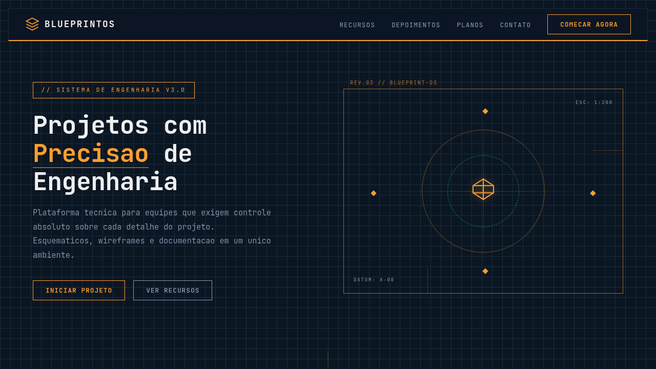
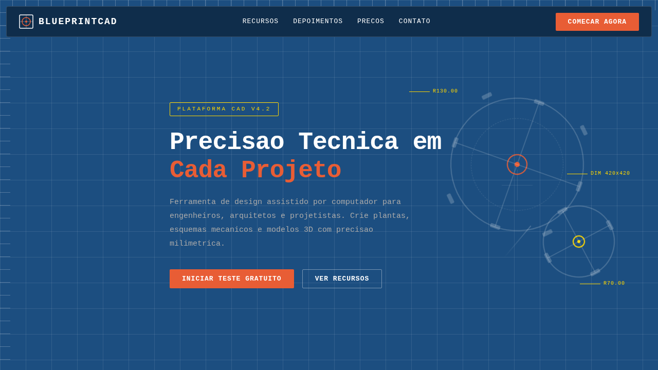
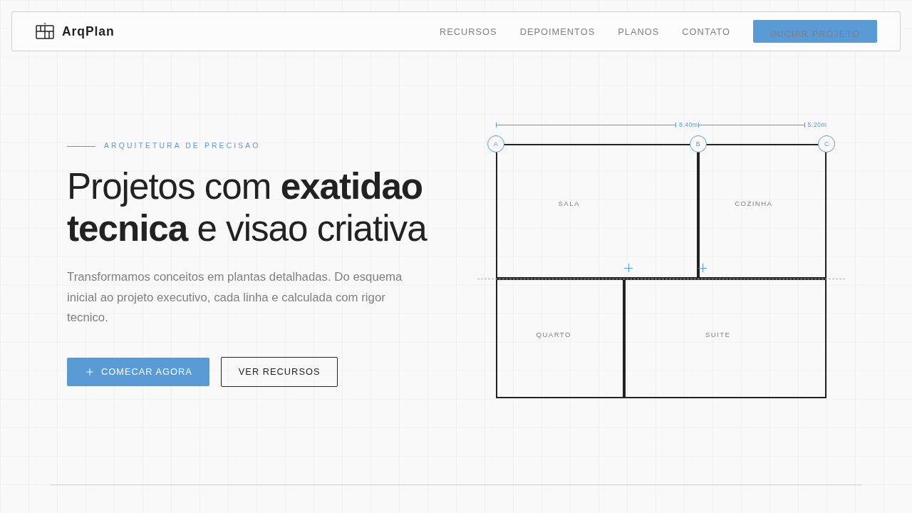
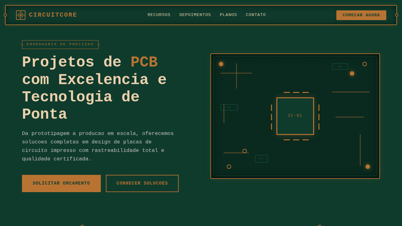
Engineering Blueprint Schematic
Engineering landing page, blueprint style, schematic design, technical precision, dark blue background, cyan lines, industrial aesthetic, wireframe graphics. Ideal for landing pages, modern websites. AI-ready template.
Use case: Landing pages, Modern websites
Historical Context
Blueprint aesthetics carry a specific weight in digital design that few other visual languages can match. The original cyanotype process — white lines on deep blue — was never meant to be beautiful. It was functional. Engineers needed cheap, reproducible copies of technical drawings. But somewhere between the drafting table and the screen, that stark precision became a signifier of competence itself. Digital designers started borrowing the language in the early 2010s, mostly in tech branding and startup landing pages. The appeal was obvious: show the wireframe, show the grid, show the construction lines — and suddenly your product feels engineered rather than decorated. Process-visible design tells the viewer you sweat the details before the paint dries. What makes schematic aesthetics endure is their honesty. There's no ornamentation pretending to be structure. Every line serves a purpose, every annotation explains a decision. In an era of glossy gradients and AI-generated fluff, a well-executed blueprint layout feels almost radical in its restraint. It says: we build things, and we're not afraid to show you how.
When to Use
Reach for blueprint schematic design when your brand needs to communicate technical authority without resorting to corporate sterility. Engineering firms, hardware startups, maker brands, technical documentation — anywhere the audience respects precision over polish. It works beautifully for product breakdowns, spec sheets, onboarding flows that explain complex systems, or any context where showing construction builds trust. Avoid it for warm, consumer-facing contexts. This aesthetic is cold by nature. Lean into that.
Design Principles
- Every line must justify its existence — decorative strokes break the illusion of engineering rigor instantly.
- Use monospaced or technical typefaces exclusively; humanist fonts contradict the entire premise.
- Maintain a strict grid with visible construction lines — the grid IS the design, not a hidden scaffold.
- Limit your palette to two or three colors maximum; blueprints derive power from constraint, not variety.
- Annotations and callouts should feel functional, not styled — think dimension lines, not marketing badges.
Technical Specs
Colors
Primary
Secondary
Effects
Exploded view wireframes, angular leader lines, drafting grid background, technical iconography, neon-like line visibility.
Light/Dark
✗ No / ✓ Full
Related
Last synced: 4/1/2026