Aurora
Design an aurora-inspired landing page with dreamy multi-color gradients mimicking the northern lights. Ideal for branding moderno, ui/ux, web design, digital art, temas cósmicos e mágicos. AI-ready template.
Use case: Branding moderno, UI/UX, Web design, Digital art, Temas cósmicos e mágicos
Historical Context
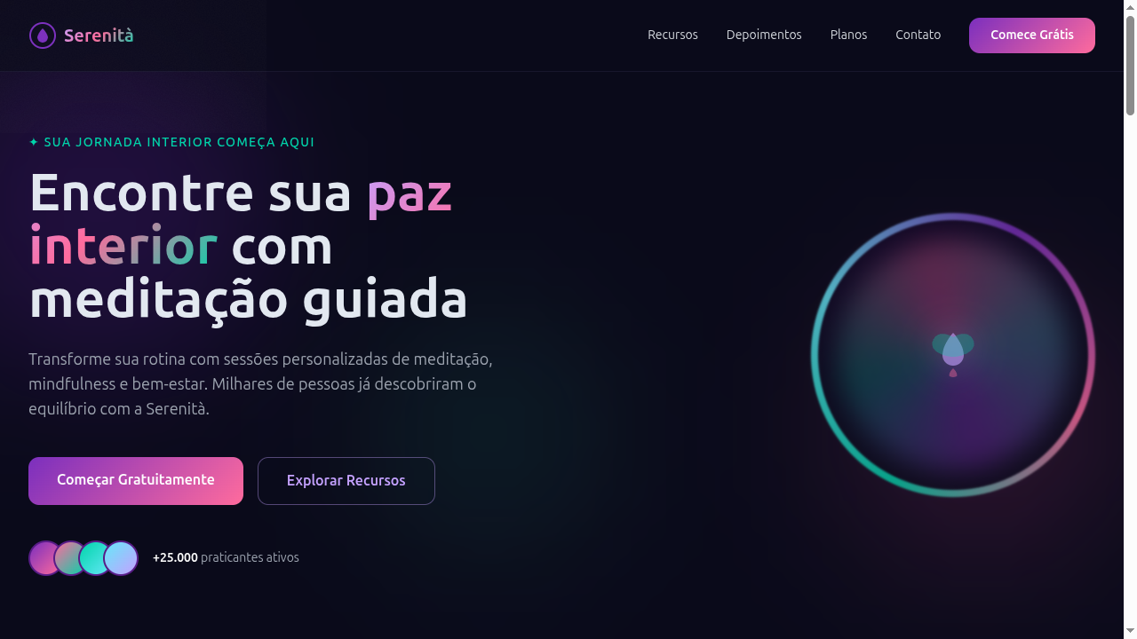
The aurora borealis has captivated humans for millennia — Norse mythology attributed it to the Bifrost bridge, the Sámi people read it as ancestral spirits. But its entry into visual design is surprisingly recent. It wasn't until the late 2010s that gradient-heavy aesthetics moved beyond vaporwave irony into something genuinely aspirational. Apple's iOS 7 flattening opened the door, but it was the convergence of OLED screens and HDR-capable displays that made luminous, multi-hue gradients actually viable as a design language rather than a gimmick. What makes aurora-inspired palettes distinct from generic gradient trends is their atmospheric quality — colors don't just blend, they glow from within. The best implementations reference how actual auroral light works: charged particles exciting atmospheric gases at different altitudes produce distinct bands of green, violet, and pink that never feel random. There's an underlying physics to it that separates considered aurora palettes from someone dragging a gradient slider around in Figma. The Nordic design tradition — already minimal, already comfortable with negative space and quiet confidence — adopted this naturally. When Scandinavian brands started using aurora references, it wasn't decoration. It was identity.
When to Use
Aurora works when you need to signal premium without resorting to gold and black clichés. It's ideal for products that deal in the intangible — meditation, sleep, focus, space exploration, climate data visualization. The palette demands dark backgrounds and generous breathing room; cramming aurora gradients into a busy SaaS dashboard is a fast path to visual noise. Use it when your brand can afford restraint everywhere else. The luminosity only reads as special when surrounded by silence.
Design Principles
- Gradients must feel atmospheric, not decorative — reference real light physics where colors transition through specific wavelengths rather than arbitrary hue jumps
- Dark backgrounds are non-negotiable; aurora palettes collapse into muddy pastels on white surfaces and lose all luminous quality
- Restrain the glow to focal points — when everything glows, nothing does. Treat luminosity as emphasis, not wallpaper
- Motion should be glacial and continuous, mimicking the slow undulation of actual auroral curtains rather than snappy UI transitions
- Typography stays neutral and lightweight; the palette is already doing heavy emotional lifting, so type should recede into functional clarity
Technical Specs
Colors
Primary
Secondary
Effects
Multi-stop gradients (3-5 colors), backdrop-filter blur (15-25px), subtle grain overlay via SVG filter, fluid color transitions (600ms), glow effects on hover, radial gradient backgrounds
Light/Dark
◐ Partial / ✓ Full
Related
Last synced: 4/1/2026