Agency Viral Videos & Reels Hero
High-impact full-screen hero section for a viral video agency. Ideal for agências de vídeo, produtoras de conteúdo, marketing de reels, creative agencies, social media agencies. AI-ready template.
Use case: Video agencies, Content production studios, Reels marketing, Creative agencies, Social media agencies
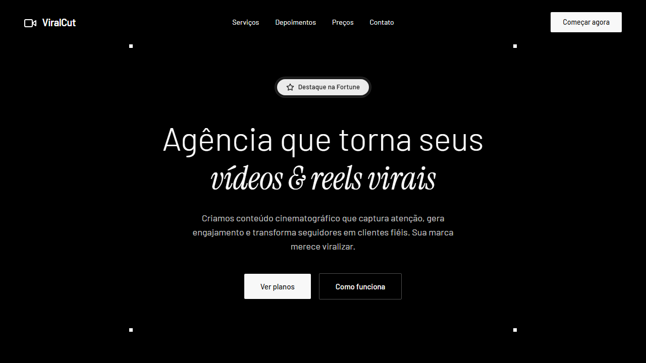
Historical Context
The agency hero section for viral video production sits at a fascinating intersection of motion graphics culture and startup landing page conventions. Early social media agencies borrowed heavily from broadcast television aesthetics — dark backgrounds, neon accents, kinetic typography — because that's what "professional video" looked like to clients writing checks. The visual language was inherited, not invented. Around 2020-2022, as TikTok and Reels exploded, agency sites started reflecting the content they produced: vertical aspect ratios in hero mockups, looping background clips, glitch effects borrowed from transition packs. The futuristic tech aesthetic became shorthand for "we understand algorithms." It's a credibility signal dressed as a design choice. What's interesting now is the tension between looking cutting-edge and actually converting. The best implementations treat the hero as a 3-second pitch — the same constraint their clients face in-feed. The worst ones are overproduced showreels that tank Core Web Vitals and say nothing about results.
When to Use
Deploy this pattern when the agency's primary value proposition is volume and virality — not boutique storytelling or brand films. It works for teams selling packages, fast turnarounds, and platform-native content. If your client roster is DTC brands chasing UGC-style ads or startups needing founder content at scale, this hero communicates speed and technical fluency immediately. Skip it if the agency does long-form documentary or cinema work — the aesthetic will attract the wrong leads.
Design Principles
- Treat autoplay video as typography — it should reinforce the headline's message, not compete with it for attention
- Dark mode isn't optional here; it's structural. Light backgrounds kill the perceived production value and make embedded video previews look washed out
- Constrain the color palette to two accent colors maximum. Neon gradients age fast — use them as highlights on interactive elements, never as backgrounds
- Design for thumb-stop the same way the content does: the hero must communicate the offer within 3 seconds of page load, before any scroll
- Performance is part of the aesthetic. A video agency hero that scores below 70 on Lighthouse is an anti-portfolio piece — compress aggressively, lazy-load below the fold, use poster frames
DESIGN.md
---
version: "alpha"
name: "Agency Viral Videos & Reels Hero"
description: "High-impact full-screen hero section for a viral video agency. Ideal for agências de vídeo, produtoras de conteúdo, marketing de reels, creative agencies, social media agencies. AI-ready template."
colors:
  primary: "#FFFFFF"
  secondary: "#f8f8f8"
  tertiary: "#171717"
typography:
  h1:
    fontFamily: Barlow
    fontSize: 2.5rem
    fontWeight: 700
  body-md:
    fontFamily: Barlow
    fontSize: 1rem
    fontWeight: 400
rounded:
  sm: 2px
  md: 4px
  lg: 8px
components:
  button-primary:
    backgroundColor: "{colors.primary}"
    rounded: "{rounded.sm}"
    padding: 12px
---

## Overview

High-impact full-screen hero section for a viral video agency. Ideal for agências de vídeo, produtoras de conteúdo, marketing de reels, creative agencies, social media agencies. AI-ready template. The agency hero section for viral video production sits at a fascinating intersection of motion graphics culture and startup landing page conventions. Early social media agencies borrowed heavily from broadcast television aesthetics — dark backgrounds, neon accents, kinetic typography — because that's what "professional video" looked like to clients writing checks. The visual language was inherited, not invented.

Around 2020-2022, as TikTok and Reels exploded, agency sites started reflecting the content they produced: vertical aspect ratios in hero mockups, looping background clips, glitch effects borrowed from transition packs. The futuristic tech aesthetic became shorthand for "we understand algorithms." It's a credibility signal dressed as a design choice.

What's interesting now is the tension between looking cutting-edge and actually converting. The best implementations treat the hero as a 3-second pitch — the same constraint their clients face in-feed. The worst ones are overproduced showreels that tank Core Web Vitals and say nothing about results.

- Density: 5/10 — Balanced
- Variance: 4/10 — Moderate
- Motion: 8/10 — Cinematic

- **Style:** Full-Screen Video, Transparent Nav, Liquid Glass Badge, Corner Accents, Sharp CTA
- **Keywords:** agency, viral videos, reels, full-screen video, transparent navbar, liquid glass badge, corner accents, sharp buttons, Barlow, Instrument Serif, cinematic hero, video background, glowing rays
- **Era:** 2025-2026 Agency/Creative
- **Light/Dark:** ✗ None / ✓ Full

## Colors

- **Branco Puro** (#FFFFFF) — Light surface, card backgrounds
- **Off-White CTA** (#f8f8f8) — Light surface, card backgrounds
- **Preto Texto** (#171717) — Dark surface, primary background
- **** (rgba(255,255,255,0.75)) — Supporting palette color
- **10** (rgba(255,255,255,0.1)) — Extended palette, decorative use
- **90** (rgba(255,255,255,0.9)) — Extended palette, decorative use


## Typography

- **Display / Hero:** Barlow — Weight 700, tight tracking, used for headline impact
- **Accent:** Instrument Serif — Used for decorative or emphasis text
- **Body:** Barlow — Weight 400, 16px/1.6 line-height, max 72ch per line
- **UI Labels / Captions:** Barlow — 0.875rem, weight 500, slight letter-spacing
- **Monospace:** JetBrains Mono — Used for code, metadata, and technical values

Scale:
- Hero: clamp(2.5rem, 5vw, 4rem)
- H1: 2.25rem
- H2: 1.5rem
- Body: 1rem / 1.6
- Small: 0.875rem


## Layout

- **Grid:** CSS Grid primary. Max-width containment: 1280px centered with 1.5rem side padding.
- **Spacing rhythm:** Balanced. Base unit: 0.5rem (8px).
- **Section vertical gaps:** clamp(4rem, 8vw, 8rem).
- **Hero layout:** Split-screen (text left, visual right).
- **Feature sections:** Zig-zag alternating text+image rows. No 3-equal-columns.
- **Mobile collapse:** All multi-column layouts collapse below 768px. No horizontal overflow.
- **z-index contract:** base (0) / sticky-nav (100) / overlay (200) / modal (300) / toast (500).


## Elevation & Depth

Video background full-screen sem overlay (object-cover, autoplay, loop, muted, playsInline), navbar totalmente transparente sem borda, badge Featured in Fortune com efeito liquid glass (white/10 backdrop-blur-sm outer + white/90 backdrop-blur-md inner pill), headline dinâmica com duas fontes (Barlow light 64px + Instrument Serif italic 64px), botões retangulares com border-radius 2px e bg #f8f8f8, quatro quadrados brancos 7x7px nos cantos do container hero, hover suave transition-colors em todos interativos, 250px bottom padding no conteúdo principal

- **Physics:** Spring — stiffness 120, damping 20. Confident, weighted transitions.
- **Entry animations:** Fade + translate-Y (16px → 0) over 540ms ease-out. Staggered cascades for lists: 120ms between items.
- **Hover states:** Scale(1.03) + shadow lift over 200ms.
- **Page transitions:** Fade + slide (300ms).
- **Performance:** Only transform and opacity animated. No layout-triggering properties.


## Shapes

Base corner radius: 2px. See rounded tokens in front matter for the full scale.


## Components

- **Primary Button:** Sharp edges (0px) shape. Accent color fill. Hover: 8% darken + subtle lift shadow. Active: -1px translate tactile press. Font weight 600. No outer glows.
- **Secondary / Ghost Button:** Outline variant. 1.5px border in muted color. Text in primary color. Hover: subtle background fill.
- **Cards:** Sharp edges (0px) corners. Surface background. Subtle shadow (0 2px 12px rgba(0,0,0,0.06)). 1px border stroke.
- **Inputs:** Label above input. 1px border stroke. Focus ring: 2px accent color offset 2px. Error text below in semantic red. No floating labels.
- **Navigation:** Primary surface background. Active item: accent color indicator. Font weight 500 when active.
- **Skeletons:** Shimmer animation matching component dimensions. No circular spinners.
- **Empty States:** Icon-based composition with descriptive text and action button.


## Do's and Don'ts

- No emojis in UI — use icon system only (Lucide, Heroicons)
- No pure black (#000000) — use off-black or charcoal variants
- No oversaturated accent colors (saturation cap: 80%)
- No 3-column equal-width feature layouts — use zig-zag or asymmetric grid
- No `h-screen` — use `min-h-[100dvh]`
- No AI copywriting clichés: "Elevate", "Seamless", "Unleash", "Next-Gen"
- No broken external image links — use picsum.photos or inline SVG
- No generic lorem ipsum in demos

- Do Vídeo full-screen sem overlay cobrindo viewport inteiro
- Do Navbar transparente sem background nem borda
- Do Badge liquid glass com dois níveis de blur
- Do Headline dinâmica com Barlow light + Instrument Serif italic
- Do Botões retangulares border-radius 2px com bg #f8f8f8
- Do Quatro quadrados 7x7px brancos nos cantos do container
- Do 250px bottom padding no conteúdo
- Do Hover transition-colors suave em todos interativos
- Do Texto branco puro e branco 75% opacity
- Do Fontes Barlow e Instrument Serif carregadas


## Use Case

Video agencies, Content production studios, Reels marketing, Creative agencies, Social media agencies
Technical Specs
CSS
font-family: 'Barlow', sans-serif; .accent-font { font-family: 'Instrument Serif', serif; font-style: italic; } video { position: absolute; inset: 0; width: 100%; height: 100%; object-fit: cover; } nav { background: transparent; border: none; } .badge-outer { background: rgba(255,255,255,0.1); backdrop-filter: blur(4px); } .badge-inner { background: rgba(255,255,255,0.9); backdrop-filter: blur(8px); } .btn-cta { background: #f8f8f8; color: #171717; border-radius: 2px; } .btn-cta:hover { background: #ffffff; } .corner-accent { width: 7px; height: 7px; background: #ffffff; position: absolute; } padding-bottom: 250px on hero contentVariables
--color-white: #FFFFFF; --color-white-75: rgba(255,255,255,0.75); --color-offwhite: #f8f8f8; --color-dark: #171717; --color-white-10: rgba(255,255,255,0.1); --color-white-90: rgba(255,255,255,0.9); --font-primary: 'Barlow', sans-serif; --font-accent: 'Instrument Serif', serif; --btn-radius: 2px; --corner-size: 7px; --hero-padding-bottom: 250px
Checklist
☐ Vídeo full-screen sem overlay cobrindo viewport inteiro, ☐ Navbar transparente sem background nem borda, ☐ Badge liquid glass com dois níveis de blur, ☐ Headline dinâmica com Barlow light + Instrument Serif italic, ☐ Botões retangulares border-radius 2px com bg #f8f8f8, ☐ Quatro quadrados 7x7px brancos nos cantos do container, ☐ 250px bottom padding no conteúdo, ☐ Hover transition-colors suave em todos interativos, ☐ Texto branco puro e branco 75% opacity, ☐ Fontes Barlow e Instrument Serif carregadas
Colors
Primary
Effects
Video background full-screen sem overlay (object-cover, autoplay, loop, muted, playsInline), navbar totalmente transparente sem borda, badge Featured in Fortune com efeito liquid glass (white/10 backdrop-blur-sm outer + white/90 backdrop-blur-md inner pill), headline dinâmica com duas fontes (Barlow light 64px + Instrument Serif italic 64px), botões retangulares com border-radius 2px e bg #f8f8f8, quatro quadrados brancos 7x7px nos cantos do container hero, hover suave transition-colors em todos interativos, 250px bottom padding no conteúdo principal
Light/Dark
✗ None / ✓ Full
AI Prompt
Act as a Senior Frontend Engineer and Expert UI Designer.
Your task is to code a complete Landing Page on the first attempt.
- Landing Page Theme: <INSERT THEME>
- Sections to add: <INSERT SECTIONS>

Generate the final code immediately following these definitions:

## Style

- **Name:** Agency Viral Videos & Reels Hero
- **Type:** Full-Screen Video, Transparent Nav, Liquid Glass Badge, Corner Accents, Sharp CTA
- **Keywords:** agency, viral videos, reels, full-screen video, transparent navbar, liquid glass badge, corner accents, sharp buttons, Barlow, Instrument Serif, cinematic hero, video background, glowing rays
- **Era:** 2025-2026 Agency/Creative
- **Light/Dark:** ✗ None / ✓ Full

## Color Palette

- **Primary:** Branco Puro #FFFFFF, Branco 75% rgba(255,255,255,0.75), Off-White CTA #f8f8f8, Preto Texto #171717
- **Secondary:** Branco/10 rgba(255,255,255,0.1), Branco/90 rgba(255,255,255,0.9), Transparente para navbar e overlays

## Visual Effects

Video background full-screen sem overlay (object-cover, autoplay, loop, muted, playsInline), navbar totalmente transparente sem borda, badge Featured in Fortune com efeito liquid glass (white/10 backdrop-blur-sm outer + white/90 backdrop-blur-md inner pill), headline dinâmica com duas fontes (Barlow light 64px + Instrument Serif italic 64px), botões retangulares com border-radius 2px e bg #f8f8f8, quatro quadrados brancos 7x7px nos cantos do container hero, hover suave transition-colors em todos interativos, 250px bottom padding no conteúdo principal

## AI Visual Direction

Build a high-impact full-screen hero section for a viral video agency. Background: Full-screen looping video of glowing rays emanating from center bottom like blurry lasers (use a stock video URL). Video settings: autoplay, loop, muted, playsInline, object-cover, NO color overlays or filters. Content has 250px bottom padding. Typography: Primary font Barlow (sans-serif) for UI/body, accent font Instrument Serif (italic) for poetic emphasis. Colors: primary text pure white #FFFFFF or white at 75% opacity, CTA buttons and badges use off-white #f8f8f8. Transparent Navigation: floating navbar with NO background fill, NO border strokes, all links and logo white. Featured Badge: 'Featured in Fortune' centered at top with liquid glass effect (white/10 bg + backdrop-blur-sm outer ring, white/90 + backdrop-blur-md inner pill). Dynamic Headline: Line 1 'Agency that makes your' (Barlow font-light 64px white), Line 2 'videos & reels viral' (Instrument Serif italic 64px white). Sub-headline: max-width paragraph Barlow white/75 opacity. Buttons: rectangular with 2px border-radius, #f8f8f8 background, #171717 medium Barlow text. Corner Accents: four 7x7px solid white squares at the four corners of the hero content container. Interactions: smooth transition-colors on hover, buttons shift #f8f8f8 to white on hover, nav items get white/10 bg on hover.

## CSS Technical

```css
font-family: 'Barlow', sans-serif; .accent-font { font-family: 'Instrument Serif', serif; font-style: italic; } video { position: absolute; inset: 0; width: 100%; height: 100%; object-fit: cover; } nav { background: transparent; border: none; } .badge-outer { background: rgba(255,255,255,0.1); backdrop-filter: blur(4px); } .badge-inner { background: rgba(255,255,255,0.9); backdrop-filter: blur(8px); } .btn-cta { background: #f8f8f8; color: #171717; border-radius: 2px; } .btn-cta:hover { background: #ffffff; } .corner-accent { width: 7px; height: 7px; background: #ffffff; position: absolute; } padding-bottom: 250px on hero content
```

## Design System Variables

```css
--color-white: #FFFFFF; --color-white-75: rgba(255,255,255,0.75); --color-offwhite: #f8f8f8; --color-dark: #171717; --color-white-10: rgba(255,255,255,0.1); --color-white-90: rgba(255,255,255,0.9); --font-primary: 'Barlow', sans-serif; --font-accent: 'Instrument Serif', serif; --btn-radius: 2px; --corner-size: 7px; --hero-padding-bottom: 250px
```

## Implementation Checklist

- ☐ Vídeo full-screen sem overlay cobrindo viewport inteiro
- ☐ Navbar transparente sem background nem borda
- ☐ Badge liquid glass com dois níveis de blur
- ☐ Headline dinâmica com Barlow light + Instrument Serif italic
- ☐ Botões retangulares border-radius 2px com bg #f8f8f8
- ☐ Quatro quadrados 7x7px brancos nos cantos do container
- ☐ 250px bottom padding no conteúdo
- ☐ Hover transition-colors suave em todos interativos
- ☐ Texto branco puro e branco 75% opacity
- ☐ Fontes Barlow e Instrument Serif carregadas

## Execution Rules

1. Strictly follow the defined visual style.
2. Use high-quality inline SVG icons (Heroicons or Lucide style) — NEVER use emojis as icons.
3. Add `cursor-pointer` and smooth `hover` states (transition-all) on all interactive elements.
4. Required Page Structure:
   - Navbar (Logo + Links + CTA)
   - Hero Section (Impactful Headline + Subtitle + 2 buttons + 3D/Abstract visual element via CSS)
   - Features (3 cards with icons)
   - Testimonials (3 cards)
   - Pricing (3 tiers, highlight the middle one)
   - Final CTA
   - Full Footer with social links, privacy policy, terms of use, contact and SEO links.
5. All text content must be in English.
6. The visual must be CLEARLY distinct — do not create a "default Bootstrap" design. Force the use of the provided design system variables.
7. Use `<style>` tags in the head for custom classes (especially for complex backdrop-filter effects and animations) that Tailwind CDN doesn't cover.
8. Full Responsiveness: Layout must adapt perfectly to Mobile, Tablet and Desktop (vertical stack on mobile).
9. Include basic SEO, Viewport and Open Graph meta tags in `<head>`.
10. Footer must contain: Copyright 2026, Secondary navigation links and Social media icons.
11. Make the creative decisions needed to deliver the complete, functional result now.Related
Last synced: 4/1/2026