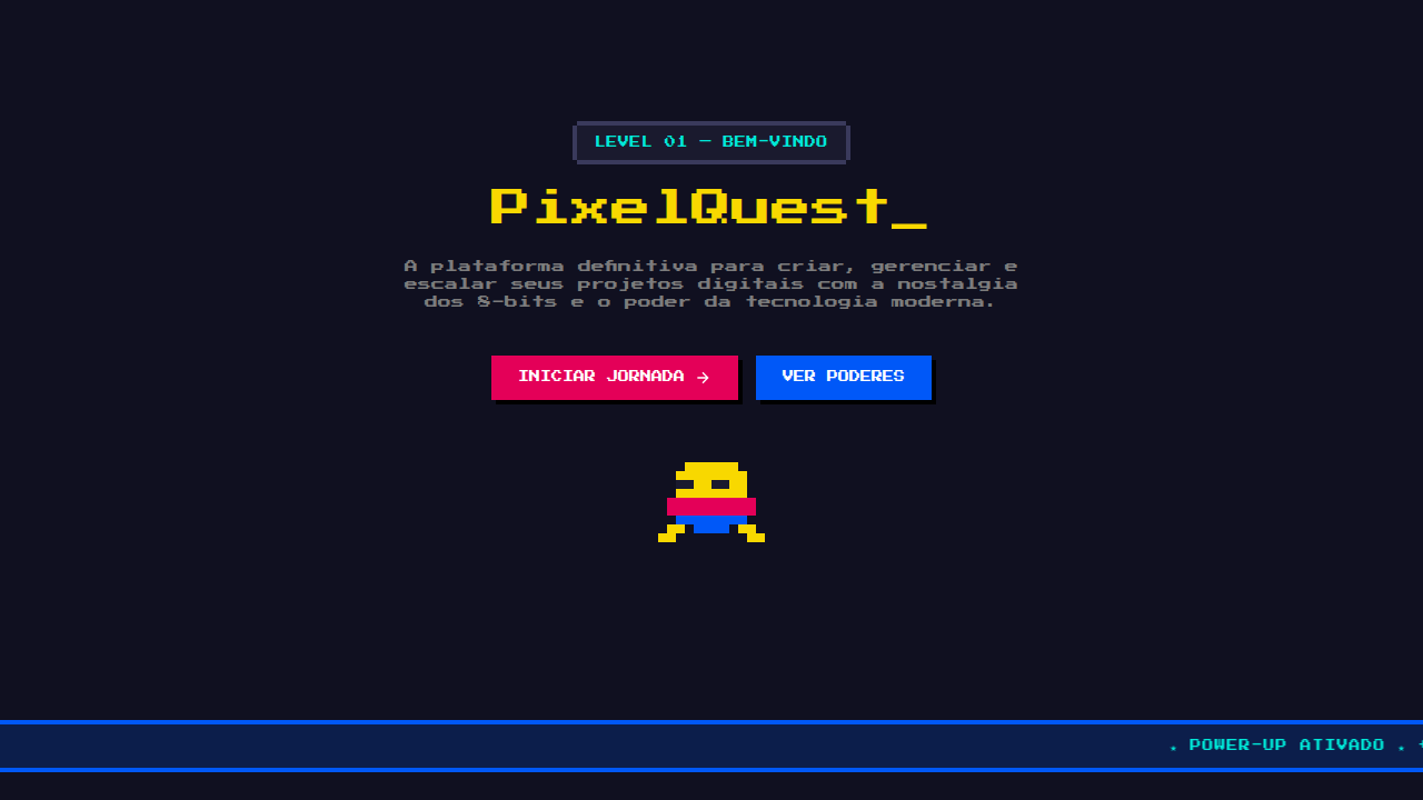
8-Bit Orbit
8-Bit Orbit — Pixel-art neon arcade aesthetic on a deep navy void. Tektur typography. deep navy/black void with neon pink, cyan, and yellow pops. Best for gaming pitch, hackathon demo, web3 / crypto deck. AI-ready design system.
Use case: gaming pitch, hackathon demo, web3 / crypto deck, indie product launch, developer tools, synthwave brand
Historical Context
The pixel aesthetic we now romanticize was born from brutal hardware constraints. Early arcade cabinets and home consoles like the Atari 2600 rendered everything in chunky, addressable blocks — not because designers wanted to, but because memory was measured in bytes, not gigabytes. Space games were the perfect fit: black backgrounds meant fewer pixels to push, and the cosmic void forgave the limitations of 8-bit color palettes. By the mid-1980s, CRT phosphor glow and scanline gaps became inseparable from the experience itself. The hardware's imperfections — the bleeding neon edges, the slight flicker between frames — created an atmosphere that no clean LCD could replicate. Games like Galaga and Asteroids didn't just use space as a theme; they used the screen's own physics as a design material. The revival started in the late 2000s with indie developers who grew up feeding quarters into cabinets. They understood that pixel art isn't low-effort — it's a discipline of economy. Every single pixel carries weight when you only have 16×16 to communicate a character.
When to Use
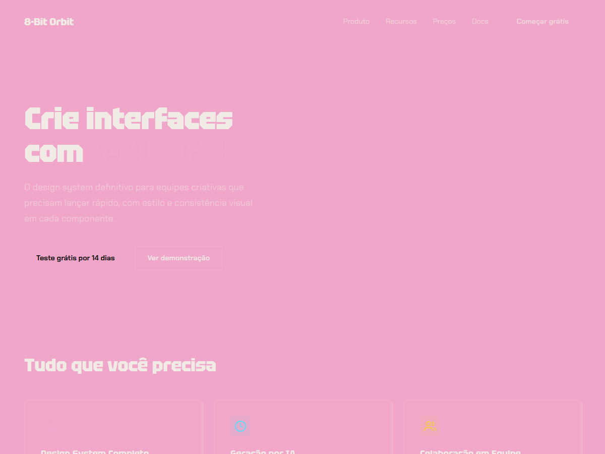
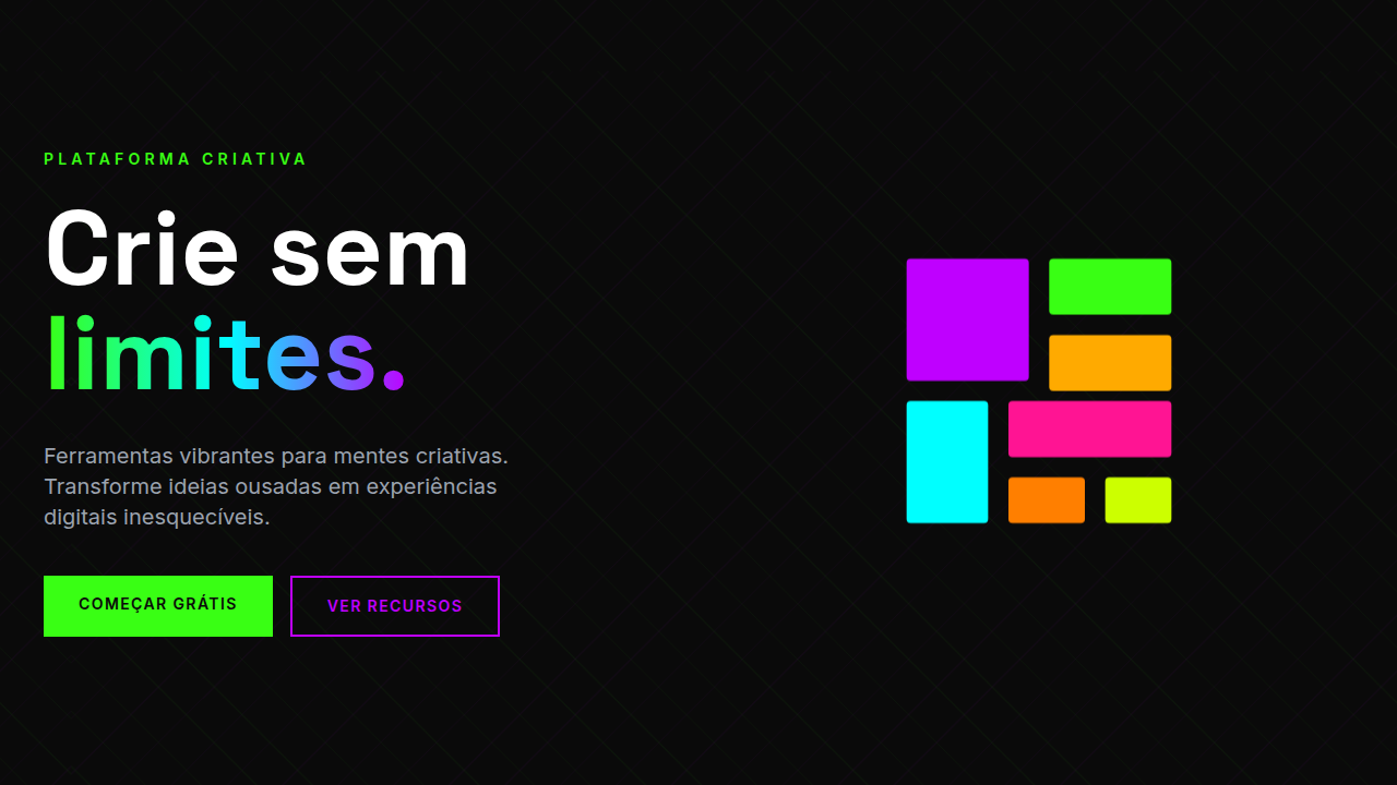
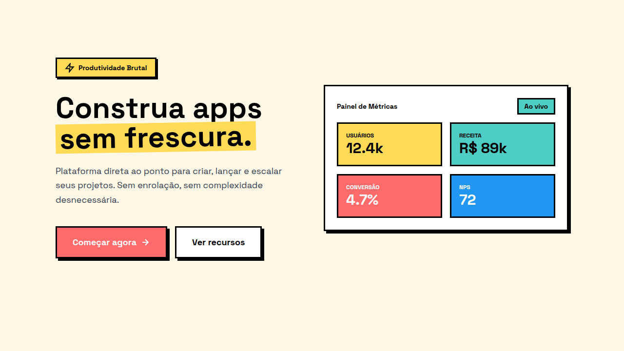
Reach for 8-Bit Orbit when your product needs to feel handcrafted and unapologetically nostalgic without being ironic about it. It works best for indie game interfaces, retro-themed product launches, arcade-style dashboards, and anything targeting players who remember blowing on cartridges. Avoid it for corporate software or contexts where accessibility demands high-contrast text rendering — CRT effects and scanlines actively fight readability at small sizes. This system rewards boldness: commit fully or don't bother.
Design Principles
- Every pixel is intentional — treat your grid as a canvas with zero wasted cells, because at low resolution there's nowhere to hide sloppy decisions
- Neon glow is structural, not decorative — use bloom and color bleed to establish hierarchy and draw the eye, the way arcade cabinets used lit bezels to frame gameplay
- Embrace CRT imperfection as texture — scanlines, chromatic aberration, and phosphor persistence aren't filters to slap on; they're atmospheric tools that create depth on flat surfaces
- Black space is active negative space — the void isn't empty, it's the stage that makes your neon elements pop; protect it aggressively from clutter
- Animation follows frame-rate logic — movement should feel stepped and deliberate like sprite animation, not smoothly tweened; the charm lives in the constraint
Technical Specs
Colors
Primary
Secondary
Effects
display font Tektur for hero headlines, bold hover color shift (150ms), high-contrast active states, dark canvas with glow/shadow accents, CRT scanlines overlay, pixel border decorations, neon glow (text-shadow 0 0 8px)
Light/Dark
✗ None / ✓ Full
Related
Last synced: 5/6/2026