Y2K
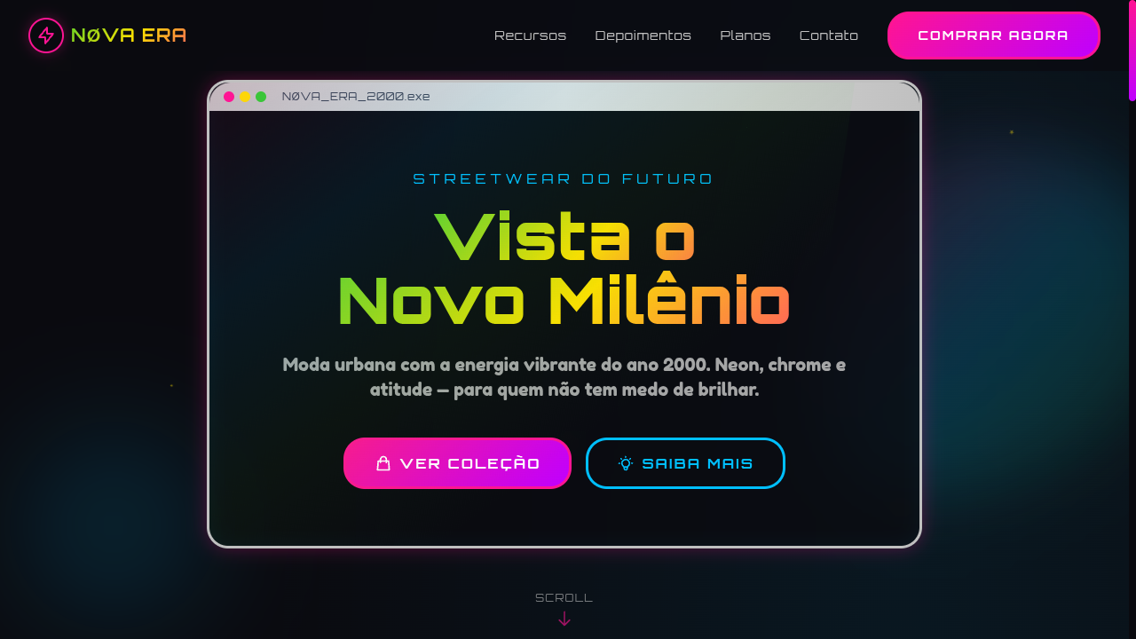
Y2K landing page with vibrant neon colors and early 2000s tech optimism. Ideal for editoriais de moda, colagens digitais, campanhas de streetwear, social networks. AI-ready template.
Use case: Editoriais de moda, Colagens digitais, Campanhas de streetwear, Social networks
Historical Context
Y2K design didn't emerge from a vacuum — it was the visual language of a generation that genuinely believed the future had arrived. Between 1997 and 2003, every surface got the treatment: inflatable chrome typography, translucent plastics lifted straight from iMac G3 casings, and color palettes that looked like someone liquefied a rave flyer. Designers were drunk on optimism and Macromedia Flash. The aesthetic pulled from multiple streams simultaneously. Japanese street fashion, early internet culture, Britney-era pop maximalism, and the literal Y2K anxiety that made everything feel urgent and temporary. Nothing was subtle because subtlety felt like a waste when the millennium was turning over. What makes Y2K interesting now isn't nostalgia alone — it's that the original movement was already referencing futures that never happened. We're nostalgic for an imagined tomorrow. That recursive quality gives contemporary Y2K revival its strange depth. It's not retro in the traditional sense. It's speculative fiction wearing lip gloss.
When to Use
Y2K works when your audience already lives in visual excess and you need to match their energy rather than fight it. Gen Z fashion brands, social apps targeting 16-24 demographics, music platforms, and anything adjacent to club culture or internet subculture. It's effective for limited drops, campaign microsites, and brand moments where restraint would read as boring. Avoid it for anything requiring trust signals — fintech, healthcare, enterprise. The aesthetic screams fun, not reliability.
Design Principles
- Chrome and iridescence over flat color — every surface should feel like it could reflect light or warp under pressure
- Bubble geometry dominates structure: rounded corners pushed to extremes, inflated forms, soft blobs as containers rather than sharp rectangles
- Neon accents function as punctuation, not background — electric pink, acid green, and UV purple used sparingly against metallic or translucent bases
- Typography goes liquid or hyper-geometric: stretched, warped, outlined, or rendered in 3D with visible specularity — never just set in a clean sans-serif
- Translucency and layering create depth — glassmorphism is Y2K's grandchild, so lean into frosted panels, overlapping transparent elements, and visible z-depth
DESIGN.md
---
version: "alpha"
name: "Y2K"
description: "Y2K landing page with vibrant neon colors and early 2000s tech optimism. Ideal for editoriais de moda, colagens digitais, campanhas de streetwear, social networks. AI-ready template."
colors:
  primary: "#FF1493"
  secondary: "#00BFFF"
  tertiary: "#32CD32"
  neutral: "#C0C0C0"
  surface: "#BF00FF"
  accent: "#F0F0FF"
typography:
  h1:
    fontFamily: Orbitron
    fontSize: 2.5rem
    fontWeight: 700
  body-md:
    fontFamily: Orbitron
    fontSize: 1rem
    fontWeight: 400
rounded:
  sm: 24px
  md: 48px
  lg: 72px
spacing:
  sm: 1.5rem
  md: 3.0rem
  lg: 6.0rem
components:
  button-primary:
    backgroundColor: "{colors.primary}"
    textColor: "{colors.neutral}"
    rounded: "{rounded.sm}"
    padding: 12px
---

## Overview

Y2K landing page with vibrant neon colors and early 2000s tech optimism. Ideal for editoriais de moda, colagens digitais, campanhas de streetwear, social networks. AI-ready template. Y2K design didn't emerge from a vacuum — it was the visual language of a generation that genuinely believed the future had arrived. Between 1997 and 2003, every surface got the treatment: inflatable chrome typography, translucent plastics lifted straight from iMac G3 casings, and color palettes that looked like someone liquefied a rave flyer. Designers were drunk on optimism and Macromedia Flash.

The aesthetic pulled from multiple streams simultaneously. Japanese street fashion, early internet culture, Britney-era pop maximalism, and the literal Y2K anxiety that made everything feel urgent and temporary. Nothing was subtle because subtlety felt like a waste when the millennium was turning over.

What makes Y2K interesting now isn't nostalgia alone — it's that the original movement was already referencing futures that never happened. We're nostalgic for an imagined tomorrow. That recursive quality gives contemporary Y2K revival its strange depth. It's not retro in the traditional sense. It's speculative fiction wearing lip gloss.

- Density: 5/10 — Balanced
- Variance: 8/10 — Expressive
- Motion: 4/10 — Subtle

- **Style:** Neon, Grunge, Bubbly, Tech-Optimism
- **Keywords:** Y2K, year 2000, neon vibrant, grunge textures, bubbly typography, futuristic, tech optimism, millennium, chrome, iridescent
- **Era:** Late 1990s - Early 2000s
- **Light/Dark:** ✓ Full / ✓ Full

## Colors

- **Hot Pink** (#FF1493) — Primary text color
- **Electric Blue** (#00BFFF) — Accent highlight, links and focus states
- **Lime Green** (#32CD32) — Supporting palette color
- **Chrome Silver** (#C0C0C0) — Supporting palette color
- **Neon Purple** (#BF00FF) — Accent color, emphasis elements
- **Iridescent White** (#F0F0FF) — Secondary surface
- **Cyber Yellow** (#FFE000) — Warning states, attention indicators
- **Bubblegum** (#FF69B4) — Extended palette, decorative use


## Typography

- **Display / Hero:** Orbitron — Weight 700, tight tracking, used for headline impact
- **Accent:** Fredoka One — Used for decorative or emphasis text
- **Body:** Orbitron — Weight 400, 16px/1.6 line-height, max 72ch per line
- **UI Labels / Captions:** Orbitron — 0.875rem, weight 500, slight letter-spacing
- **Monospace:** JetBrains Mono — Used for code, metadata, and technical values

Scale:
- Hero: clamp(2.5rem, 5vw, 4rem)
- H1: 2.25rem
- H2: 1.5rem
- Body: 1rem / 1.6
- Small: 0.875rem


## Layout

- **Grid:** CSS Grid primary. Max-width containment: 1280px centered with 1.5rem side padding.
- **Spacing rhythm:** Balanced. Base unit: 0.5rem (8px).
- **Section vertical gaps:** clamp(4rem, 8vw, 8rem).
- **Hero layout:** Asymmetric composition.
- **Feature sections:** Asymmetric grid with varied card sizes. No 3-equal-columns.
- **Mobile collapse:** All multi-column layouts collapse below 768px. No horizontal overflow.
- **z-index contract:** base (0) / sticky-nav (100) / overlay (200) / modal (300) / toast (500).


## Elevation & Depth

Chrome/metallic text effects (background-clip: text with gradient), iridescent shimmer overlays, grunge texture backgrounds, bubbly rounded shapes (24px+), star/sparkle decorations, glitch-like hover effects, Y2K-style window frames

- **Physics:** Ease-out curves, 200-300ms duration. Smooth and predictable.
- **Entry animations:** Fade + translate-Y (16px → 0) over 420ms ease-out. Staggered cascades for lists: 80ms between items.
- **Hover states:** Subtle color shift + shadow adjustment over 200ms.
- **Page transitions:** Fade only (200ms).
- **Performance:** Only transform and opacity animated. No layout-triggering properties.


## Shapes

Base corner radius: 24px. See rounded tokens in front matter for the full scale.


## Components

- **Primary Button:** Generously rounded (1.5rem) shape. Accent color fill. Hover: 8% darken + subtle lift shadow. Active: -1px translate tactile press. Font weight 600. No outer glows.
- **Secondary / Ghost Button:** Outline variant. 1.5px border in muted color. Text in primary color. Hover: subtle background fill.
- **Cards:** Generously rounded (1.5rem) corners. Surface background. Subtle shadow (0 2px 12px rgba(0,0,0,0.06)). 1px border stroke.
- **Inputs:** Label above input. 1px border stroke. Focus ring: 2px accent color offset 2px. Error text below in semantic red. No floating labels.
- **Navigation:** Primary surface background. Active item: accent color indicator. Font weight 500 when active.
- **Skeletons:** Shimmer animation matching component dimensions. No circular spinners.
- **Empty States:** Icon-based composition with descriptive text and action button.


## Do's and Don'ts

- No emojis in UI — use icon system only (Lucide, Heroicons)
- No pure white (#FFFFFF) backgrounds — use off-white or dark surfaces
- No oversaturated accent colors (saturation cap: 80%)
- No 3-column equal-width feature layouts — use zig-zag or asymmetric grid
- No `h-screen` — use `min-h-[100dvh]`
- No AI copywriting clichés: "Elevate", "Seamless", "Unleash", "Next-Gen"
- No broken external image links — use picsum.photos or inline SVG
- No generic lorem ipsum in demos

- Do Vibrant neon color palette
- Do Chrome/metallic text effects
- Do Iridescent shimmer overlays
- Do Bubbly rounded shapes (24px+)
- Do Star/sparkle decorations
- Do Grunge texture accents
- Do Tech-optimistic millennium energy
- Do Responsive with maintained vibrancy


## Use Case

Editoriais de moda, Colagens digitais, Campanhas de streetwear, Social networks
Technical Specs
CSS
font-family: 'Orbitron', 'Fredoka One', sans-serif, background: linear-gradient(135deg, #FF1493, #00BFFF, #32CD32), -webkit-background-clip: text for chrome effect, color: #FF1493, border: 3px solid #C0C0C0, border-radius: 24px, box-shadow: 0 0 20px rgba(255,20,147,0.3), filter: hue-rotate() on hover
Variables
--color-pink: #FF1493, --color-blue: #00BFFF, --color-lime: #32CD32, --color-chrome: #C0C0C0, --font-display: 'Orbitron', --font-bubbly: 'Fredoka One', --border-radius: 24px, --glow: rgba(255,20,147,0.3), --spacing: 1.5rem
Checklist
☐ Vibrant neon color palette, ☐ Chrome/metallic text effects, ☐ Iridescent shimmer overlays, ☐ Bubbly rounded shapes (24px+), ☐ Star/sparkle decorations, ☐ Grunge texture accents, ☐ Tech-optimistic millennium energy, ☐ Responsive with maintained vibrancy
Colors
Primary
Secondary
Effects
Chrome/metallic text effects (background-clip: text with gradient), iridescent shimmer overlays, grunge texture backgrounds, bubbly rounded shapes (24px+), star/sparkle decorations, glitch-like hover effects, Y2K-style window frames
Light/Dark
✓ Full / ✓ Full
AI Prompt
Act as a Senior Frontend Engineer and Expert UI Designer.
Your task is to code a complete Landing Page on the first attempt.
- Landing Page Theme: <INSERT THEME>
- Sections to add: <INSERT SECTIONS>

Generate the final code immediately following these definitions:

## Style

- **Name:** Y2K
- **Type:** Neon, Grunge, Bubbly, Tech-Optimism
- **Keywords:** Y2K, year 2000, neon vibrant, grunge textures, bubbly typography, futuristic, tech optimism, millennium, chrome, iridescent
- **Era:** Late 1990s - Early 2000s
- **Light/Dark:** ✓ Full / ✓ Full

## Color Palette

- **Primary:** Hot Pink #FF1493, Electric Blue #00BFFF, Lime Green #32CD32, Chrome Silver #C0C0C0
- **Secondary:** Neon Purple #BF00FF, Iridescent White #F0F0FF, Cyber Yellow #FFE000, Bubblegum #FF69B4

## Visual Effects

Chrome/metallic text effects (background-clip: text with gradient), iridescent shimmer overlays, grunge texture backgrounds, bubbly rounded shapes (24px+), star/sparkle decorations, glitch-like hover effects, Y2K-style window frames

## AI Visual Direction

Design a Y2K landing page with vibrant neon colors and early 2000s tech optimism. Use hot pink, electric blue, lime green, chrome silver. Apply chrome metallic text effects, iridescent shimmer overlays, grunge textures, bubbly rounded shapes, star/sparkle decorations. Typography should be bubbly or futuristic. Millennium-era digital collage aesthetic with tech-optimistic energy.

## CSS Technical

```css
font-family: 'Orbitron', 'Fredoka One', sans-serif, background: linear-gradient(135deg, #FF1493, #00BFFF, #32CD32), -webkit-background-clip: text for chrome effect, color: #FF1493, border: 3px solid #C0C0C0, border-radius: 24px, box-shadow: 0 0 20px rgba(255,20,147,0.3), filter: hue-rotate() on hover
```

## Design System Variables

```css
--color-pink: #FF1493, --color-blue: #00BFFF, --color-lime: #32CD32, --color-chrome: #C0C0C0, --font-display: 'Orbitron', --font-bubbly: 'Fredoka One', --border-radius: 24px, --glow: rgba(255,20,147,0.3), --spacing: 1.5rem
```

## Implementation Checklist

- ☐ Vibrant neon color palette
- ☐ Chrome/metallic text effects
- ☐ Iridescent shimmer overlays
- ☐ Bubbly rounded shapes (24px+)
- ☐ Star/sparkle decorations
- ☐ Grunge texture accents
- ☐ Tech-optimistic millennium energy
- ☐ Responsive with maintained vibrancy

## Execution Rules

1. Strictly follow the defined visual style.
2. Use high-quality inline SVG icons (Heroicons or Lucide style) — NEVER use emojis as icons.
3. Add `cursor-pointer` and smooth `hover` states (transition-all) on all interactive elements.
4. Required Page Structure:
   - Navbar (Logo + Links + CTA)
   - Hero Section (Impactful Headline + Subtitle + 2 buttons + 3D/Abstract visual element via CSS)
   - Features (3 cards with icons)
   - Testimonials (3 cards)
   - Pricing (3 tiers, highlight the middle one)
   - Final CTA
   - Full Footer with social links, privacy policy, terms of use, contact and SEO links.
5. All text content must be in English.
6. The visual must be CLEARLY distinct — do not create a "default Bootstrap" design. Force the use of the provided design system variables.
7. Use `<style>` tags in the head for custom classes (especially for complex backdrop-filter effects and animations) that Tailwind CDN doesn't cover.
8. Full Responsiveness: Layout must adapt perfectly to Mobile, Tablet and Desktop (vertical stack on mobile).
9. Include basic SEO, Viewport and Open Graph meta tags in `<head>`.
10. Footer must contain: Copyright 2026, Secondary navigation links and Social media icons.
11. Make the creative decisions needed to deliver the complete, functional result now.
Related
Last synced: 4/1/2026