Vaporwave Aesthetic
Vaporwave aesthetic interface. Ideal for landing pages, saas. AI-ready template.
Use case: Landing pages, SaaS
Historical Context
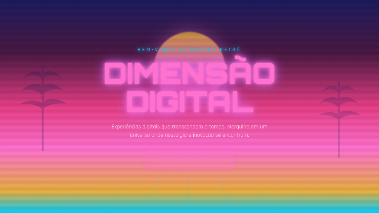
Before vaporwave had a name, it had a cover. Macintosh Plus's "Floral Shoppe" (2011) dropped a chopped-and-screwed Diana Ross track over a Greek bust rendered in that specific shade of pink-purple that CRT monitors never quite got right. That image — marble sculpture, Japanese text, checkerboard floor fading into nothing — became the entire genre's visual thesis. Not the glitchy, VHS-tracking side. The dreamy one. The side that whispers rather than stutters. The aesthetic pulled from a very particular technological moment: Windows 95 startup screens, early web clip art, those 3D-rendered palm trees that populated every shareware screensaver. But it recontextualized them through a haze of nostalgia for something most of its audience never actually experienced. That's the surreal quality — mourning a past that was always already fictional. Greek statues weren't references to classicism. They were references to the mall fountain you walked past as a kid, rendered in 256 colors. This dreamlike branch diverged sharply from synthwave's neon aggression and glitch art's deliberate corruption. Where those styles attack, vaporwave's surreal side floats. It became internet shorthand for a specific emotional register: melancholy wrapped in pastel, capitalism critiqued through its own abandoned aesthetics, nostalgia as both comfort and trap.
When to Use
Reach for this when a project needs to feel like a half-remembered dream from 1996. Music releases, art zines, retro gaming interfaces, brands that want to signal internet-native nostalgia without the harshness of glitch or the aggression of synthwave. It works when you want viewers to feel something soft and slightly sad — not energized, not disturbed. If your project needs to evoke longing for digital spaces that no longer exist (or never did), this is your palette.
Design Principles
- Soft gradients over hard edges — pink bleeds into purple bleeds into teal. Nothing starts or stops cleanly. Transitions should feel like fading memories, not UI boundaries.
- Classical fragments, never whole — a bust cropped at the shoulders, a column with no building. Completeness breaks the spell. Everything implies something larger that's been lost.
- Depth through haze, not contrast — layers exist but they're separated by fog, not shadow. Reduce opacity before reaching for drop shadows. The atmosphere IS the hierarchy.
- Typography as texture — Japanese characters you can't read, early-internet system fonts at unexpected scales. Text communicates mood before meaning.
- Deliberate emptiness — negative space isn't unused space, it's the void between remembered things. Let compositions breathe with the same silence between slowed-down samples.
DESIGN.md
---
version: "alpha"
name: "Vaporwave Aesthetic"
description: "Vaporwave aesthetic interface. Ideal for landing pages, saas. AI-ready template."
colors:
  primary: "#FF71CE"
  secondary: "#1C1C5E"
  tertiary: "#E63E85"
  neutral: "#E8AF3F"
  surface: "#01CDFE"
  accent: "#B967FF"
typography:
  h1:
    fontFamily: System UI stack
    fontSize: 2.25rem
    fontWeight: 700
  body-md:
    fontFamily: System UI stack
    fontSize: 1rem
    fontWeight: 400
  label-caps:
    fontFamily: System UI stack
    fontSize: 0.75rem
    fontWeight: 500
components:
  button-primary:
    backgroundColor: "{colors.primary}"
    textColor: "{colors.neutral}"
    padding: 12px
---

## Overview

Vaporwave aesthetic interface. Ideal for landing pages, saas. AI-ready template. Before vaporwave had a name, it had a cover. Macintosh Plus's "Floral Shoppe" (2011) dropped a chopped-and-screwed Diana Ross track over a Greek bust rendered in that specific shade of pink-purple that CRT monitors never quite got right. That image — marble sculpture, Japanese text, checkerboard floor fading into nothing — became the entire genre's visual thesis. Not the glitchy, VHS-tracking side. The dreamy one. The side that whispers rather than stutters.

The aesthetic pulled from a very particular technological moment: Windows 95 startup screens, early web clip art, those 3D-rendered palm trees that populated every shareware screensaver. But it recontextualized them through a haze of nostalgia for something most of its audience never actually experienced. That's the surreal quality — mourning a past that was always already fictional. Greek statues weren't references to classicism. They were references to the mall fountain you walked past as a kid, rendered in 256 colors.

This dreamlike branch diverged sharply from synthwave's neon aggression and glitch art's deliberate corruption. Where those styles attack, vaporwave's surreal side floats. It became internet shorthand for a specific emotional register: melancholy wrapped in pastel, capitalism critiqued through its own abandoned aesthetics, nostalgia as both comfort and trap.

- Density: 5/10 — Balanced
- Variance: 8/10 — Expressive
- Motion: 6/10 — Expressive

- **Style:** Surreal, Pastel, Digital, Nostalgic
- **Keywords:** Dreamy, nostalgic, surreal, digital, glitch effects, Greek sculptures, palm trees, sunset gradients, neon pink/purple, ethereal, 90s internet
- **Era:** 1990s Internet Aesthetic
- **Light/Dark:** ✓ Full / ✓ Dark focused

## Colors

- **Hot Pink** (#FF71CE) — Primary text color
- **Deep Blue** (#1C1C5E) — Accent highlight, links and focus states
- **Magenta** (#E63E85) — Decorative accent, highlight elements
- **Gold** (#E8AF3F) — Premium accent, decorative highlights
- **Cyan** (#01CDFE) — Secondary accent
- **Purple** (#B967FF) — Accent color, emphasis elements
- **Mint** (#05FFA1) — Extended palette, decorative use


## Typography

- **Display / Hero:** System UI stack (-apple-system, sans-serif) — Weight 700, tight tracking, used for headline impact
- **Body:** System UI stack (-apple-system, sans-serif) — Weight 400, 16px/1.6 line-height, max 72ch per line
- **UI Labels / Captions:** System UI stack (-apple-system, sans-serif) — 0.875rem, weight 500, slight letter-spacing
- **Monospace:** JetBrains Mono — Used for code, metadata, and technical values

Scale:
- Hero: clamp(2.5rem, 5vw, 4rem)
- H1: 2.25rem
- H2: 1.5rem
- Body: 1rem / 1.6
- Small: 0.875rem


## Layout

- **Grid:** CSS Grid primary. Max-width containment: 1280px centered with 1.5rem side padding.
- **Spacing rhythm:** Balanced. Base unit: 0.5rem (8px).
- **Section vertical gaps:** clamp(4rem, 8vw, 8rem).
- **Hero layout:** Asymmetric composition.
- **Feature sections:** Asymmetric grid with varied card sizes. No 3-equal-columns.
- **Mobile collapse:** All multi-column layouts collapse below 768px. No horizontal overflow.
- **z-index contract:** base (0) / sticky-nav (100) / overlay (200) / modal (300) / toast (500).


## Elevation & Depth

Neon pink/purple gradient glow, glitch effects, VHS scan lines, ethereal floating animations, surreal transitions, retro grid perspective

- **Physics:** Spring — stiffness 120, damping 20. Confident, weighted transitions.
- **Entry animations:** Fade + translate-Y (16px → 0) over 480ms ease-out. Staggered cascades for lists: 100ms between items.
- **Hover states:** Scale(1.03) + shadow lift over 200ms.
- **Page transitions:** Fade + slide (300ms).
- **Performance:** Only transform and opacity animated. No layout-triggering properties.


## Shapes

Base corner radius: 8px. See rounded tokens in front matter for the full scale.


## Components

- **Primary Button:** Subtly rounded (0.5rem) shape. Accent color fill. Hover: 8% darken + subtle lift shadow. Active: -1px translate tactile press. Font weight 600. No outer glows.
- **Secondary / Ghost Button:** Outline variant. 1.5px border in muted color. Text in primary color. Hover: subtle background fill.
- **Cards:** Subtly rounded (0.5rem) corners. Surface background. Subtle shadow (0 2px 12px rgba(0,0,0,0.06)). 1px border stroke.
- **Inputs:** Label above input. 1px border stroke. Focus ring: 2px accent color offset 2px. Error text below in semantic red. No floating labels.
- **Navigation:** Primary surface background. Active item: accent color indicator. Font weight 500 when active.
- **Skeletons:** Shimmer animation matching component dimensions. No circular spinners.
- **Empty States:** Icon-based composition with descriptive text and action button.


## Do's and Don'ts

- No emojis in UI — use icon system only (Lucide, Heroicons)
- No pure white (#FFFFFF) backgrounds — use off-white or dark surfaces
- No oversaturated accent colors (saturation cap: 80%)
- No 3-column equal-width feature layouts — use zig-zag or asymmetric grid
- No `h-screen` — use `min-h-[100dvh]`
- No AI copywriting clichés: "Elevate", "Seamless", "Unleash", "Next-Gen"
- No broken external image links — use picsum.photos or inline SVG
- No generic lorem ipsum in demos

- Do Sunset gradient present
- Do Neon glow applied
- Do Retro grid visible
- Do Glitch effects subtle
- Do Ethereal atmosphere
- Do 90s nostalgia feel


## Use Case

Landing pages, SaaS
Technical Specs
CSS
background: linear-gradient(180deg, #FF71CE, #01CDFE, #B967FF), filter: hue-rotate(), text-shadow: neon glow, perspective grid (linear-gradient + perspective), VHS scanlines overlay, glitch animation
Variables
--vapor-pink: #FF71CE, --vapor-blue: #1C1C5E, --vapor-cyan: #01CDFE, --vapor-purple: #B967FF, --vapor-mint: #05FFA1, --grid-perspective: 500px
Checklist
☐ Sunset gradient present, ☐ Neon glow applied, ☐ Retro grid visible, ☐ Glitch effects subtle, ☐ Ethereal atmosphere, ☐ 90s nostalgia feel
Colors
Primary
Secondary
Effects
Neon pink/purple gradient glow, glitch effects, VHS scan lines, ethereal floating animations, surreal transitions, retro grid perspective
Light/Dark
✓ Full / ✓ Dark focused
AI Prompt
Act as a Senior Frontend Engineer and Expert UI Designer.
Your task is to code a complete Landing Page on the first attempt.
- Landing Page Theme: <INSERT THEME>
- Sections to add: <INSERT SECTIONS>

Generate the final code immediately following these definitions:

## Style

- **Name:** Vaporwave Aesthetic
- **Type:** Surreal, Pastel, Digital, Nostalgic
- **Keywords:** Dreamy, nostalgic, surreal, digital, glitch effects, Greek sculptures, palm trees, sunset gradients, neon pink/purple, ethereal, 90s internet
- **Era:** 1990s Internet Aesthetic
- **Light/Dark:** ✓ Full / ✓ Dark focused

## Color Palette

- **Primary:** Hot Pink #FF71CE, Deep Blue #1C1C5E, Magenta #E63E85, Gold #E8AF3F
- **Secondary:** Cyan #01CDFE, Purple #B967FF, Mint #05FFA1, VHS artifacts, pixelation effects

## Visual Effects

Neon pink/purple gradient glow, glitch effects, VHS scan lines, ethereal floating animations, surreal transitions, retro grid perspective

## AI Visual Direction

Design a vaporwave aesthetic interface. Use: neon pink/cyan/purple gradients, Greek sculpture imagery, palm tree silhouettes, sunset gradient backgrounds, glitch effects, VHS artifacts, geometric grids with perspective, ethereal glow, 90s internet nostalgia.

## CSS Technical

```css
background: linear-gradient(180deg, #FF71CE, #01CDFE, #B967FF), filter: hue-rotate(), text-shadow: neon glow, perspective grid (linear-gradient + perspective), VHS scanlines overlay, glitch animation
```

## Design System Variables

```css
--vapor-pink: #FF71CE, --vapor-blue: #1C1C5E, --vapor-cyan: #01CDFE, --vapor-purple: #B967FF, --vapor-mint: #05FFA1, --grid-perspective: 500px
```

## Implementation Checklist

- ☐ Sunset gradient present
- ☐ Neon glow applied
- ☐ Retro grid visible
- ☐ Glitch effects subtle
- ☐ Ethereal atmosphere
- ☐ 90s nostalgia feel

## Execution Rules

1. Strictly follow the defined visual style.
2. Use high-quality inline SVG icons (Heroicons or Lucide style) — NEVER use emojis as icons.
3. Add `cursor-pointer` and smooth `hover` states (transition-all) on all interactive elements.
4. Required Page Structure:
   - Navbar (Logo + Links + CTA)
   - Hero Section (Impactful Headline + Subtitle + 2 buttons + 3D/Abstract visual element via CSS)
   - Features (3 cards with icons)
   - Testimonials (3 cards)
   - Pricing (3 tiers, highlight the middle one)
   - Final CTA
   - Full Footer with social links, privacy policy, terms of use, contact and SEO links.
5. All text content must be in English.
6. The visual must be CLEARLY distinct — do not create a "default Bootstrap" design. Force the use of the provided design system variables.
7. Use `<style>` tags in the head for custom classes (especially for complex backdrop-filter effects and animations) that Tailwind CDN doesn't cover.
8. Full Responsiveness: Layout must adapt perfectly to Mobile, Tablet and Desktop (vertical stack on mobile).
9. Include basic SEO, Viewport and Open Graph meta tags in `<head>`.
10. Footer must contain: Copyright 2026, Secondary navigation links and Social media icons.
11. Make the creative decisions needed to deliver the complete, functional result now.
Related
Last synced: 4/1/2026