Vaporwave
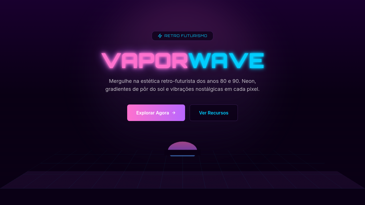
Vaporwave aesthetic interface. Ideal for landing pages, saas. AI-ready template.
Use case: Landing pages, SaaS
Historical Context
Vaporwave didn't start as a design movement. It started as a joke — or maybe a critique disguised as one. Around 2010-2012, anonymous producers on Bandcamp and Reddit began chopping up forgotten muzak, Japanese city pop, and late-night infomercial audio into something deliberately uncanny. The visuals followed: Roman busts, Windows 95 dialogs, dead mall interiors, all rendered in that signature pink-purple haze. Tumblr ran with it. Hard. The thing is, beneath the irony sat a genuine observation about consumer culture. Vaporwave was sampling the aesthetic residue of hypercapitalism — the smooth jazz of hold music, the empty promises of 80s advertising, the hollow optimism of early digital interfaces. It asked: what happens when you strip commercial media of its intent and just... stare at it? What nobody expected was longevity. By the mid-2010s, vaporwave's palette and spatial language had migrated into legitimate brand work, album art, indie games, and UI experiments. The meme became a vocabulary. Designers who'd never heard of Macintosh Plus were pulling from its color theory — those saturated cyans against deep magentas, the deliberate digital decay. It proved that internet subcultures could produce lasting visual frameworks, not just disposable trends.
When to Use
Reach for vaporwave when the project needs to feel like a memory you're not sure you actually have. Music platforms, gaming interfaces, art-adjacent brands — anywhere nostalgia is the product, not just decoration. It works beautifully for projects that want emotional texture without taking themselves too seriously. Avoid it for anything requiring trust signals or corporate credibility. This aesthetic whispers "late night" and "personal" — it falls apart under fluorescent boardroom lighting.
Design Principles
- Chromatic saturation as emotion — pink, purple, and cyan aren't decorative, they're structural. The palette carries the entire mood; remove it and the design collapses.
- Deliberate digital decay — glitch artifacts, scan lines, and compression noise are compositional tools, not afterthoughts. Place them with the same intention you'd place typography.
- Spatial emptiness borrowed from dead commerce — vaporwave breathes through negative space that feels abandoned rather than minimal. Think empty mall atrium, not Swiss grid.
- Temporal layering — mix era-specific artifacts freely. A 3D chrome logo next to a VHS timestamp next to a pixel-art palm tree. The anachronism is the point.
- Sincerity through irony — the aesthetic only works when there's genuine affection underneath the pastiche. Pure mockery reads hollow. Pure nostalgia reads naive. The tension between them is where vaporwave lives.
DESIGN.md
---
version: "alpha"
name: "Vaporwave"
description: "Vaporwave aesthetic interface. Ideal for landing pages, saas. AI-ready template."
colors:
  primary: "#FF71CE"
  secondary: "#01CDFE"
  tertiary: "#05FFA1"
  neutral: "#000000"
typography:
  h1:
    fontFamily: System UI stack
    fontSize: 2.25rem
    fontWeight: 700
  body-md:
    fontFamily: System UI stack
    fontSize: 1rem
    fontWeight: 400
  label-caps:
    fontFamily: System UI stack
    fontSize: 0.75rem
    fontWeight: 500
components:
  button-primary:
    backgroundColor: "{colors.primary}"
    textColor: "{colors.neutral}"
    padding: 12px
---

## Overview

Vaporwave aesthetic interface. Ideal for landing pages, saas. AI-ready template. Vaporwave didn't start as a design movement. It started as a joke — or maybe a critique disguised as one. Around 2010-2012, anonymous producers on Bandcamp and Reddit began chopping up forgotten muzak, Japanese city pop, and late-night infomercial audio into something deliberately uncanny. The visuals followed: Roman busts, Windows 95 dialogs, dead mall interiors, all rendered in that signature pink-purple haze. Tumblr ran with it. Hard.

The thing is, beneath the irony sat a genuine observation about consumer culture. Vaporwave was sampling the aesthetic residue of hypercapitalism — the smooth jazz of hold music, the empty promises of 80s advertising, the hollow optimism of early digital interfaces. It asked: what happens when you strip commercial media of its intent and just... stare at it?

What nobody expected was longevity. By the mid-2010s, vaporwave's palette and spatial language had migrated into legitimate brand work, album art, indie games, and UI experiments. The meme became a vocabulary. Designers who'd never heard of Macintosh Plus were pulling from its color theory — those saturated cyans against deep magentas, the deliberate digital decay. It proved that internet subcultures could produce lasting visual frameworks, not just disposable trends.

- Density: 5/10 — Balanced
- Variance: 8/10 — Expressive
- Motion: 6/10 — Expressive

- **Style:** Nostalgic, Pastel, Surreal, Digital
- **Keywords:** Synthwave, retro-futuristic, 80s-90s, neon, glitch, nostalgic, sunset gradient, dreamy, aesthetic
- **Era:** 1980s-90s Retro
- **Light/Dark:** ✓ Full / ✓ Dark focused

## Colors

- **#FF71CE** (#FF71CE) — Primary surface or dominant color
- **#01CDFE** (#01CDFE) — Secondary surface or text color
- **#05FFA1** (#05FFA1) — Supporting palette color
- **#B967FF** (#B967FF) — Supporting palette color


## Typography

- **Display / Hero:** System UI stack (-apple-system, sans-serif) — Weight 700, tight tracking, used for headline impact
- **Body:** System UI stack (-apple-system, sans-serif) — Weight 400, 16px/1.6 line-height, max 72ch per line
- **UI Labels / Captions:** System UI stack (-apple-system, sans-serif) — 0.875rem, weight 500, slight letter-spacing
- **Monospace:** JetBrains Mono — Used for code, metadata, and technical values

Scale:
- Hero: clamp(2.5rem, 5vw, 4rem)
- H1: 2.25rem
- H2: 1.5rem
- Body: 1rem / 1.6
- Small: 0.875rem


## Layout

- **Grid:** CSS Grid primary. Max-width containment: 1280px centered with 1.5rem side padding.
- **Spacing rhythm:** Balanced. Base unit: 0.5rem (8px).
- **Section vertical gaps:** clamp(4rem, 8vw, 8rem).
- **Hero layout:** Asymmetric composition.
- **Feature sections:** Asymmetric grid with varied card sizes. No 3-equal-columns.
- **Mobile collapse:** All multi-column layouts collapse below 768px. No horizontal overflow.
- **z-index contract:** base (0) / sticky-nav (100) / overlay (200) / modal (300) / toast (500).


## Elevation & Depth

text-shadow glow, linear-gradient, filter: hue-rotate(), glitch animations, retro scan lines

- **Physics:** Spring — stiffness 120, damping 20. Confident, weighted transitions.
- **Entry animations:** Fade + translate-Y (16px → 0) over 480ms ease-out. Staggered cascades for lists: 100ms between items.
- **Hover states:** Scale(1.03) + shadow lift over 200ms.
- **Page transitions:** Fade + slide (300ms).
- **Performance:** Only transform and opacity animated. No layout-triggering properties.


## Shapes

Base corner radius: 8px. See rounded tokens in front matter for the full scale.


## Components

- **Primary Button:** Subtly rounded (0.5rem) shape. Accent color fill. Hover: 8% darken + subtle lift shadow. Active: -1px translate tactile press. Font weight 600. No outer glows.
- **Secondary / Ghost Button:** Outline variant. 1.5px border in muted color. Text in primary color. Hover: subtle background fill.
- **Cards:** Subtly rounded (0.5rem) corners. Surface background. Subtle shadow (0 2px 12px rgba(0,0,0,0.06)). 1px border stroke.
- **Inputs:** Label above input. 1px border stroke. Focus ring: 2px accent color offset 2px. Error text below in semantic red. No floating labels.
- **Navigation:** Primary surface background. Active item: accent color indicator. Font weight 500 when active.
- **Skeletons:** Shimmer animation matching component dimensions. No circular spinners.
- **Empty States:** Icon-based composition with descriptive text and action button.


## Do's and Don'ts

- No emojis in UI — use icon system only (Lucide, Heroicons)
- No pure white (#FFFFFF) backgrounds — use off-white or dark surfaces
- No oversaturated accent colors (saturation cap: 80%)
- No 3-column equal-width feature layouts — use zig-zag or asymmetric grid
- No `h-screen` — use `min-h-[100dvh]`
- No AI copywriting clichés: "Elevate", "Seamless", "Unleash", "Next-Gen"
- No broken external image links — use picsum.photos or inline SVG
- No generic lorem ipsum in demos

- Do Sunset gradient present
- Do Neon glow applied
- Do Retro grid visible
- Do Glitch effects subtle
- Do Dreamy atmosphere
- Do 80s-90s aesthetic


## Use Case

Landing pages, SaaS
Technical Specs
CSS
background: linear-gradient(180deg, #FF71CE, #01CDFE, #B967FF), filter: hue-rotate(), text-shadow: neon glow, retro grid (perspective + linear-gradient), VHS scanlines
Variables
--vapor-pink: #FF71CE, --vapor-cyan: #01CDFE, --vapor-mint: #05FFA1, --vapor-purple: #B967FF, --grid-color: rgba(255,255,255,0.1), --glow-intensity: 15px
Checklist
☐ Sunset gradient present, ☐ Neon glow applied, ☐ Retro grid visible, ☐ Glitch effects subtle, ☐ Dreamy atmosphere, ☐ 80s-90s aesthetic
Colors
Primary
Effects
text-shadow glow, linear-gradient, filter: hue-rotate(), glitch animations, retro scan lines
Light/Dark
✓ Full / ✓ Dark focused
AI Prompt
Act as a Senior Frontend Engineer and Expert UI Designer.
Your task is to code a complete Landing Page on the first attempt.
- Landing Page Theme: <INSERT THEME>
- Sections to add: <INSERT SECTIONS>

Generate the final code immediately following these definitions:

## Style

- **Name:** Vaporwave
- **Type:** Nostalgic, Pastel, Surreal, Digital
- **Keywords:** Synthwave, retro-futuristic, 80s-90s, neon, glitch, nostalgic, sunset gradient, dreamy, aesthetic
- **Era:** 1980s-90s Retro
- **Light/Dark:** ✓ Full / ✓ Dark focused

## Color Palette

- **Primary:** #FF71CE (Pink), #01CDFE (Cyan), #05FFA1 (Mint), #B967FF (Purple)
- **Secondary:** Sunset gradients, glitch overlays, VHS effects, neon accents, pastel variations

## Visual Effects

text-shadow glow, linear-gradient, filter: hue-rotate(), glitch animations, retro scan lines

## AI Visual Direction

Design a vaporwave aesthetic interface. Use: sunset gradients (pink/cyan/purple), 80s-90s nostalgia, glitch effects, Greek statue imagery, palm trees, grid patterns, neon glow, retro-futuristic feel, dreamy atmosphere.

## CSS Technical

```css
background: linear-gradient(180deg, #FF71CE, #01CDFE, #B967FF), filter: hue-rotate(), text-shadow: neon glow, retro grid (perspective + linear-gradient), VHS scanlines
```

## Design System Variables

```css
--vapor-pink: #FF71CE, --vapor-cyan: #01CDFE, --vapor-mint: #05FFA1, --vapor-purple: #B967FF, --grid-color: rgba(255,255,255,0.1), --glow-intensity: 15px
```

## Implementation Checklist

- ☐ Sunset gradient present
- ☐ Neon glow applied
- ☐ Retro grid visible
- ☐ Glitch effects subtle
- ☐ Dreamy atmosphere
- ☐ 80s-90s aesthetic

## Execution Rules

1. Strictly follow the defined visual style.
2. Use high-quality inline SVG icons (Heroicons or Lucide style) — NEVER use emojis as icons.
3. Add `cursor-pointer` and smooth `hover` states (transition-all) on all interactive elements.
4. Required Page Structure:
   - Navbar (Logo + Links + CTA)
   - Hero Section (Impactful Headline + Subtitle + 2 buttons + 3D/Abstract visual element via CSS)
   - Features (3 cards with icons)
   - Testimonials (3 cards)
   - Pricing (3 tiers, highlight the middle one)
   - Final CTA
   - Full Footer with social links, privacy policy, terms of use, contact and SEO links.
5. All text content must be in English.
6. The visual must be CLEARLY distinct — do not create a "default Bootstrap" design. Force the use of the provided design system variables.
7. Use `<style>` tags in the head for custom classes (especially for complex backdrop-filter effects and animations) that Tailwind CDN doesn't cover.
8. Full Responsiveness: Layout must adapt perfectly to Mobile, Tablet and Desktop (vertical stack on mobile).
9. Include basic SEO, Viewport and Open Graph meta tags in `<head>`.
10. Footer must contain: Copyright 2026, Secondary navigation links and Social media icons.
11. Make the creative decisions needed to deliver the complete, functional result now.
Related
Last synced: 4/1/2026