Vaporwave
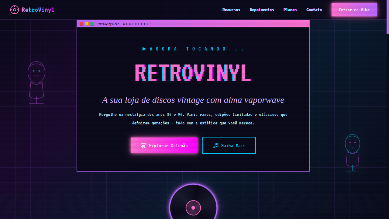
Vaporwave landing page with intense neon colors and satirical 80s/90s nostalgia. Ideal for capas de álbuns, colagens digitais, anúncios experimentais, arte de internet. AI-ready template.
Use case: Capas de álbuns, Colagens digitais, Anúncios experimentais, Arte de internet
Historical Context
Vaporwave emerged around 2010-2011 from the internet's underbelly — a bastard child of chopped-and-screwed muzak, dead mall aesthetics, and the collective hangover of late capitalism. Artists like Macintosh Plus and Floral Shoppe didn't just sample 80s smooth jazz and corporate elevator music — they weaponized it. The slowed-down, pitch-shifted loops became a mirror held up to consumer culture's empty promises, turning forgotten hold music into something genuinely haunting. What makes vaporwave fascinating as a design movement is that it was never supposed to be one. It started as album art on Bandcamp — Roman busts, Windows 95 interfaces, Japanese text nobody could read, and that specific shade of pink-purple that now triggers instant recognition. The aesthetic spread because it filled a void: a visual language for digital alienation that was simultaneously ironic and sincere. You could laugh at the absurdity of a marble bust floating in a neon grid void while also feeling something real about the disposability of digital culture. By 2015, the aesthetic had been absorbed into mainstream design — which is either its ultimate victory or its final irony, depending on how committed you are to the bit.
When to Use
Deploy vaporwave when you need to signal cultural awareness without taking yourself seriously. It works for music projects, art installations, internet-native brands that understand their audience lives chronically online, and anything that benefits from a layer of ironic distance. It's perfect when your brief says 'nostalgic but not earnest' or 'critique capitalism while selling something.' Avoid it for anything requiring trust or authority — banks, hospitals, legal firms. This aesthetic has a shelf life in commercial contexts, so use it knowing it's a statement, not a system.
Design Principles
- Chromatic excess over restraint — stack neon pinks, teals, and purples without apology. The palette should feel like a CRT monitor bleeding color at 3am.
- Temporal collision — mix eras aggressively. Greek sculpture next to Windows dialogs next to Japanese kanji next to palm trees. The anachronism IS the point.
- Degradation as texture — glitch artifacts, scan lines, JPEG compression, VHS tracking errors. Perfection is the enemy here; entropy is your co-designer.
- Spatial surrealism — grids that dissolve into infinity, checkerboard floors vanishing into fog, objects floating without physics. Reject naturalism entirely.
- Sincerity through irony — the aesthetic only works when there's genuine feeling underneath the layers of reference. Pure pastiche is dead on arrival.
DESIGN.md
---
version: "alpha"
name: "Vaporwave"
description: "Vaporwave landing page with intense neon colors and satirical 80s/90s nostalgia. Ideal for capas de álbuns, colagens digitais, anúncios experimentais, arte de internet. AI-ready template."
colors:
  primary: "#FF71CE"
  secondary: "#01CDFE"
  tertiary: "#B967FF"
  neutral: "#FF00FF"
  surface: "#FFB3DE"
  accent: "#AEEFFF"
typography:
  h1:
    fontFamily: VT323
    fontSize: 2.5rem
    fontWeight: 700
  body-md:
    fontFamily: VT323
    fontSize: 1rem
    fontWeight: 400
rounded:
  sm: 2px
  md: 4px
  lg: 8px
spacing:
  sm: 1.5rem
  md: 3.0rem
  lg: 6.0rem
components:
  button-primary:
    backgroundColor: "{colors.primary}"
    textColor: "{colors.neutral}"
    rounded: "{rounded.sm}"
    padding: 12px
---

## Overview

Vaporwave landing page with intense neon colors and satirical 80s/90s nostalgia. Ideal for capas de álbuns, colagens digitais, anúncios experimentais, arte de internet. AI-ready template. Vaporwave emerged around 2010-2011 from the internet's underbelly — a bastard child of chopped-and-screwed muzak, dead mall aesthetics, and the collective hangover of late capitalism. Artists like Macintosh Plus and Floral Shoppe didn't just sample 80s smooth jazz and corporate elevator music — they weaponized it. The slowed-down, pitch-shifted loops became a mirror held up to consumer culture's empty promises, turning forgotten hold music into something genuinely haunting.

What makes vaporwave fascinating as a design movement is that it was never supposed to be one. It started as album art on Bandcamp — Roman busts, Windows 95 interfaces, Japanese text nobody could read, and that specific shade of pink-purple that now triggers instant recognition. The aesthetic spread because it filled a void: a visual language for digital alienation that was simultaneously ironic and sincere. You could laugh at the absurdity of a marble bust floating in a neon grid void while also feeling something real about the disposability of digital culture.

By 2015, the aesthetic had been absorbed into mainstream design — which is either its ultimate victory or its final irony, depending on how committed you are to the bit.

- Density: 5/10 — Balanced
- Variance: 8/10 — Expressive
- Motion: 6/10 — Expressive

- **Style:** Neon Intense, Glitch, Satirical, Nostalgic-Consumerism
- **Keywords:** Vaporwave, neon intense, glitch effects, Greek busts, old computer graphics, satirical, nostalgic, 80s/90s consumerism, retro tech, aesthetic
- **Era:** 2010s Internet Subculture (referencing 80s/90s)
- **Light/Dark:** ◐ Partial / ✓ Full

## Colors

- **Neon Pink** (#FF71CE) — Primary text color
- **Neon Cyan** (#01CDFE) — Accent highlight, links and focus states
- **Neon Purple** (#B967FF) — Accent color, emphasis elements
- **Hot Magenta** (#FF00FF) — Decorative accent, highlight elements
- **Pastel Pink** (#FFB3DE) — Primary text color
- **Pastel Blue** (#AEEFFF) — Secondary accent
- **Lavender** (#D9B3FF) — Extended palette, decorative use
- **Dark Teal** (#005F73) — Deep contrast surface


## Typography

- **Display / Hero:** VT323 — Weight 700, tight tracking, used for headline impact
- **Body:** VT323 — Weight 400, 16px/1.6 line-height, max 72ch per line
- **UI Labels / Captions:** VT323 — 0.875rem, weight 500, slight letter-spacing
- **Monospace:** JetBrains Mono — Used for code, metadata, and technical values

Scale:
- Hero: clamp(2.5rem, 5vw, 4rem)
- H1: 2.25rem
- H2: 1.5rem
- Body: 1rem / 1.6
- Small: 0.875rem


## Layout

- **Grid:** CSS Grid primary. Max-width containment: 1280px centered with 1.5rem side padding.
- **Spacing rhythm:** Balanced. Base unit: 0.5rem (8px).
- **Section vertical gaps:** clamp(4rem, 8vw, 8rem).
- **Hero layout:** Asymmetric composition.
- **Feature sections:** Asymmetric grid with varied card sizes. No 3-equal-columns.
- **Mobile collapse:** All multi-column layouts collapse below 768px. No horizontal overflow.
- **z-index contract:** base (0) / sticky-nav (100) / overlay (200) / modal (300) / toast (500).


## Elevation & Depth

Glitch animation effects (clip-path + translate jitter), VHS scanline overlays, chromatic aberration via text-shadow offsets, Greek bust/statue SVG decorations, old Windows/Mac OS UI elements, checkerboard floor perspective, neon gradient text

- **Physics:** Spring — stiffness 120, damping 20. Confident, weighted transitions.
- **Entry animations:** Fade + translate-Y (16px → 0) over 480ms ease-out. Staggered cascades for lists: 100ms between items.
- **Hover states:** Scale(1.03) + shadow lift over 200ms.
- **Page transitions:** Fade + slide (300ms).
- **Performance:** Only transform and opacity animated. No layout-triggering properties.


## Shapes

Base corner radius: 0px. See rounded tokens in front matter for the full scale.


## Components

- **Primary Button:** Sharp edges (0px) shape. Accent color fill. Hover: 8% darken + subtle lift shadow. Active: -1px translate tactile press. Font weight 600. No outer glows.
- **Secondary / Ghost Button:** Outline variant. 1.5px border in muted color. Text in primary color. Hover: subtle background fill.
- **Cards:** Sharp edges (0px) corners. Surface background. Subtle shadow (0 2px 12px rgba(0,0,0,0.06)). 1px border stroke.
- **Inputs:** Label above input. 1px border stroke. Focus ring: 2px accent color offset 2px. Error text below in semantic red. No floating labels.
- **Navigation:** Primary surface background. Active item: accent color indicator. Font weight 500 when active.
- **Skeletons:** Shimmer animation matching component dimensions. No circular spinners.
- **Empty States:** Icon-based composition with descriptive text and action button.


## Do's and Don'ts

- No emojis in UI — use icon system only (Lucide, Heroicons)
- No pure white (#FFFFFF) backgrounds — use off-white or dark surfaces
- No oversaturated accent colors (saturation cap: 80%)
- No 3-column equal-width feature layouts — use zig-zag or asymmetric grid
- No `h-screen` — use `min-h-[100dvh]`
- No AI copywriting clichés: "Elevate", "Seamless", "Unleash", "Next-Gen"
- No broken external image links — use picsum.photos or inline SVG
- No generic lorem ipsum in demos

- Do Intense neon color palette
- Do Glitch animation effects
- Do VHS scanline overlays
- Do Chromatic aberration text
- Do Greek bust/statue decorations
- Do Old OS UI elements
- Do Retro computer aesthetic
- Do Satirical nostalgic atmosphere
- Do Responsive with maintained vaporwave vibe


## Use Case

Capas de álbuns, Colagens digitais, Anúncios experimentais, Arte de internet
Technical Specs
CSS
font-family: 'VT323', monospace mixed with serif for contrast, background: linear-gradient(135deg, #FF71CE, #01CDFE, #B967FF), color: #FF71CE or #01CDFE, text-shadow: 2px 0 #FF00FF, -2px 0 #01CDFE for chromatic aberration, animation: glitch with clip-path, filter: saturate(1.5) hue-rotate()
Variables
--color-pink: #FF71CE, --color-cyan: #01CDFE, --color-purple: #B967FF, --color-magenta: #FF00FF, --font-retro: 'VT323', --glitch-offset: 2px, --scanline-opacity: 0.05, --spacing: 1.5rem, --border-radius: 0px
Checklist
☐ Intense neon color palette, ☐ Glitch animation effects, ☐ VHS scanline overlays, ☐ Chromatic aberration text, ☐ Greek bust/statue decorations, ☐ Old OS UI elements, ☐ Retro computer aesthetic, ☐ Satirical nostalgic atmosphere, ☐ Responsive with maintained vaporwave vibe
Colors
Primary
Secondary
Effects
Glitch animation effects (clip-path + translate jitter), VHS scanline overlays, chromatic aberration via text-shadow offsets, Greek bust/statue SVG decorations, old Windows/Mac OS UI elements, checkerboard floor perspective, neon gradient text
Light/Dark
◐ Partial / ✓ Full
AI Prompt
Act as a Senior Frontend Engineer and Expert UI Designer.
Your task is to code a complete Landing Page on the first attempt.
- Landing Page Theme: <INSERT THEME>
- Sections to add: <INSERT SECTIONS>

Generate the final code immediately following these definitions:

## Style

- **Name:** Vaporwave
- **Type:** Neon Intense, Glitch, Satirical, Nostalgic-Consumerism
- **Keywords:** Vaporwave, neon intense, glitch effects, Greek busts, old computer graphics, satirical, nostalgic, 80s/90s consumerism, retro tech, aesthetic
- **Era:** 2010s Internet Subculture (referencing 80s/90s)
- **Light/Dark:** ◐ Partial / ✓ Full

## Color Palette

- **Primary:** Neon Pink #FF71CE, Neon Cyan #01CDFE, Neon Purple #B967FF, Hot Magenta #FF00FF
- **Secondary:** Pastel Pink #FFB3DE, Pastel Blue #AEEFFF, Lavender #D9B3FF, Dark Teal #005F73

## Visual Effects

Glitch animation effects (clip-path + translate jitter), VHS scanline overlays, chromatic aberration via text-shadow offsets, Greek bust/statue SVG decorations, old Windows/Mac OS UI elements, checkerboard floor perspective, neon gradient text

## AI Visual Direction

Design a vaporwave landing page with intense neon colors and satirical 80s/90s nostalgia. Use neon pink, cyan, purple, magenta. Apply glitch effects, VHS scanlines, chromatic aberration, Greek bust SVG decorations, old OS-style UI elements, checkerboard perspective floors, neon gradient text. Mix retro computer graphics with classical statues. Satirical, dreamy, anti-consumerist aesthetic.

## CSS Technical

```css
font-family: 'VT323', monospace mixed with serif for contrast, background: linear-gradient(135deg, #FF71CE, #01CDFE, #B967FF), color: #FF71CE or #01CDFE, text-shadow: 2px 0 #FF00FF, -2px 0 #01CDFE for chromatic aberration, animation: glitch with clip-path, filter: saturate(1.5) hue-rotate()
```

## Design System Variables

```css
--color-pink: #FF71CE, --color-cyan: #01CDFE, --color-purple: #B967FF, --color-magenta: #FF00FF, --font-retro: 'VT323', --glitch-offset: 2px, --scanline-opacity: 0.05, --spacing: 1.5rem, --border-radius: 0px
```

## Implementation Checklist

- ☐ Intense neon color palette
- ☐ Glitch animation effects
- ☐ VHS scanline overlays
- ☐ Chromatic aberration text
- ☐ Greek bust/statue decorations
- ☐ Old OS UI elements
- ☐ Retro computer aesthetic
- ☐ Satirical nostalgic atmosphere
- ☐ Responsive with maintained vaporwave vibe

## Execution Rules

1. Strictly follow the defined visual style.
2. Use high-quality inline SVG icons (Heroicons or Lucide style) — NEVER use emojis as icons.
3. Add `cursor-pointer` and smooth `hover` states (transition-all) on all interactive elements.
4. Required Page Structure:
   - Navbar (Logo + Links + CTA)
   - Hero Section (Impactful Headline + Subtitle + 2 buttons + 3D/Abstract visual element via CSS)
   - Features (3 cards with icons)
   - Testimonials (3 cards)
   - Pricing (3 tiers, highlight the middle one)
   - Final CTA
   - Full Footer with social links, privacy policy, terms of use, contact and SEO links.
5. All text content must be in English.
6. The visual must be CLEARLY distinct — do not create a "default Bootstrap" design. Force the use of the provided design system variables.
7. Use `<style>` tags in the head for custom classes (especially for complex backdrop-filter effects and animations) that Tailwind CDN doesn't cover.
8. Full Responsiveness: Layout must adapt perfectly to Mobile, Tablet and Desktop (vertical stack on mobile).
9. Include basic SEO, Viewport and Open Graph meta tags in `<head>`.
10. Footer must contain: Copyright 2026, Secondary navigation links and Social media icons.
11. Make the creative decisions needed to deliver the complete, functional result now.
Related
Last synced: 4/1/2026