Tropicalismo Indígena Autêntico
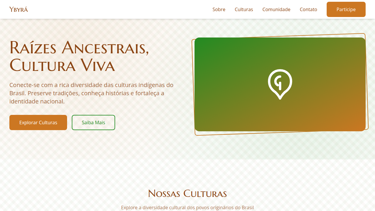
Design an authentic and cultural landing page for a Brazilian indigenous culture platform, inspired by tropicalism and indigenous art. Ideal for landing pages, saas. AI-ready template.
Use case: Landing pages, SaaS
Historical Context
Indigenous Brazilian visual culture carries thousands of years of encoded meaning. The geometric patterns of the Kadiwéu, the body painting traditions of the Kayapó, the intricate basketry of the Baniwa — these aren't decorative. They're language. Kinship systems, cosmological maps, territorial markers. Every line has jurisdiction. Digital design has a terrible track record here. Flattening sacred geometry into background textures. Stripping urucum reds and jenipapo blacks from their ceremonial context to sell wellness brands. The problem isn't reference — it's extraction without relationship. You cannot download a culture. The path forward requires collaboration, not inspiration boards. Work with indigenous designers and communities directly. Credit specific peoples, not a monolithic 'indigenous aesthetic.' Pay for consultation. Understand that some patterns are not yours to use — period. The visual richness is undeniable, but access is not a right. It's a negotiation.
When to Use
Cultural preservation platforms built with indigenous communities. Museum digital experiences where provenance and attribution are baked into the interface, not footnoted. Educational tools developed in partnership with indigenous educators. Heritage documentation projects led by the communities themselves. Never for aesthetic borrowing. Never for 'inspired by' mood boards that flatten living cultures into static assets. The use case is always collaborative or it doesn't exist.
Design Principles
- Attribution is architecture, not afterthought — credit specific peoples and artists in the design system itself, not buried in legal pages
- Restrict the palette to what's offered — if a community hasn't explicitly shared a pattern or motif for external use, it stays out of your component library
- Earth pigment color systems over digital approximations — work from actual urucum, jenipapo, and tabatinga values rather than 'inspired' hex codes
- Negative space as respect — not every surface needs filling; restraint signals that you understand boundaries exist
- Living documentation over frozen assets — indigenous cultures are contemporary and evolving; your design system must version alongside community input, not snapshot a moment in time
DESIGN.md
---
version: "alpha"
name: "Tropicalismo Indígena Autêntico"
description: "Design an authentic and cultural landing page for a Brazilian indigenous culture platform, inspired by tropicalism and indigenous art. Ideal for landing pages, saas. AI-ready template."
colors:
  primary: "#8B4513"
  secondary: "#228B22"
  tertiary: "#CC7722"
  neutral: "#FFFFFF"
  surface: "#4682B4"
  accent: "#FFD700"
typography:
  h1:
    fontFamily: Marcellus SC
    fontSize: 2.5rem
    fontWeight: 700
  body-md:
    fontFamily: Marcellus SC
    fontSize: 1rem
    fontWeight: 400
rounded:
  sm: 8px
  md: 16px
  lg: 24px
components:
  button-primary:
    backgroundColor: "{colors.primary}"
    textColor: "{colors.neutral}"
    rounded: "{rounded.sm}"
    padding: 12px
---

## Overview

Design an authentic and cultural landing page for a Brazilian indigenous culture platform, inspired by tropicalism and indigenous art. Ideal for landing pages, saas. AI-ready template. Indigenous Brazilian visual culture carries thousands of years of encoded meaning. The geometric patterns of the Kadiwéu, the body painting traditions of the Kayapó, the intricate basketry of the Baniwa — these aren't decorative. They're language. Kinship systems, cosmological maps, territorial markers. Every line has jurisdiction.

Digital design has a terrible track record here. Flattening sacred geometry into background textures. Stripping urucum reds and jenipapo blacks from their ceremonial context to sell wellness brands. The problem isn't reference — it's extraction without relationship. You cannot download a culture.

The path forward requires collaboration, not inspiration boards. Work with indigenous designers and communities directly. Credit specific peoples, not a monolithic 'indigenous aesthetic.' Pay for consultation. Understand that some patterns are not yours to use — period. The visual richness is undeniable, but access is not a right. It's a negotiation.

- Density: 5/10 — Balanced
- Variance: 8/10 — Expressive
- Motion: 4/10 — Subtle

- **Style:** Authentic, Cultural, Organic, Respectful
- **Keywords:** indigenous culture, Brazilian, preservation, authentic, cultural, organic, traditional, storytelling, immersive, respectful
- **Era:** 2026+ Conexão Ancestral
- **Light/Dark:** ✓ Full / ✗ No

## Colors

- **Marrom Terra** (#8B4513) — Primary surface or dominant color
- **Verde Floresta** (#228B22) — Secondary surface or text color
- **Vermelho Ocre** (#CC7722) — Error states, destructive actions
- **Branco** (#FFFFFF) — Light surface, card backgrounds
- **Azul Rio** (#4682B4) — Secondary accent
- **Amarelo Sol** (#FFD700) — Warning states, attention indicators
- **Laranja Queimado** (#CC5500) — Warm accent, call-to-action secondary
- **Preto** (#000000) — Deep contrast surface


## Typography

- **Display / Hero:** Marcellus SC — Weight 700, tight tracking, used for headline impact
- **Body:** Marcellus SC — Weight 400, 16px/1.6 line-height, max 72ch per line
- **UI Labels / Captions:** Marcellus SC — 0.875rem, weight 500, slight letter-spacing
- **Monospace:** JetBrains Mono — Used for code, metadata, and technical values

Scale:
- Hero: clamp(2.5rem, 5vw, 4rem)
- H1: 2.25rem
- H2: 1.5rem
- Body: 1rem / 1.6
- Small: 0.875rem


## Layout

- **Grid:** CSS Grid primary. Max-width containment: 1280px centered with 1.5rem side padding.
- **Spacing rhythm:** Balanced. Base unit: 0.5rem (8px).
- **Section vertical gaps:** clamp(4rem, 8vw, 8rem).
- **Hero layout:** Asymmetric composition.
- **Feature sections:** Asymmetric grid with varied card sizes. No 3-equal-columns.
- **Mobile collapse:** All multi-column layouts collapse below 768px. No horizontal overflow.
- **z-index contract:** base (0) / sticky-nav (100) / overlay (200) / modal (300) / toast (500).


## Elevation & Depth

Padrões e grafismos indígenas em elementos de UI, tipografia que remete a manuscritos antigos ou caligrafia, ilustrações de fauna e flora nativas, texturas de argila e madeira, micro-interações de hover com efeito de "revelação" de significado cultural, transições de seção suaves e com elementos gráficos que se entrelaçam.

- **Physics:** Ease-out curves, 200-300ms duration. Smooth and predictable.
- **Entry animations:** Fade + translate-Y (16px → 0) over 420ms ease-out. Staggered cascades for lists: 80ms between items.
- **Hover states:** Subtle color shift + shadow adjustment over 200ms.
- **Page transitions:** Fade only (200ms).
- **Performance:** Only transform and opacity animated. No layout-triggering properties.


## Shapes

Base corner radius: 8px. See rounded tokens in front matter for the full scale.


## Components

- **Primary Button:** Rounded (8px) shape. Accent color fill. Hover: 8% darken + subtle lift shadow. Active: -1px translate tactile press. Font weight 600. No outer glows.
- **Secondary / Ghost Button:** Outline variant. 1.5px border in muted color. Text in primary color. Hover: subtle background fill.
- **Cards:** Rounded (8px) corners. Surface background. Subtle shadow (0 2px 12px rgba(0,0,0,0.06)). 1px border stroke.
- **Inputs:** Label above input. 1px border stroke. Focus ring: 2px accent color offset 2px. Error text below in semantic red. No floating labels.
- **Navigation:** Primary surface background. Active item: accent color indicator. Font weight 500 when active.
- **Skeletons:** Shimmer animation matching component dimensions. No circular spinners.
- **Empty States:** Icon-based composition with descriptive text and action button.


## Do's and Don'ts

- No emojis in UI — use icon system only (Lucide, Heroicons)
- No pure black (#000000) — use off-black or charcoal variants
- No oversaturated accent colors (saturation cap: 80%)
- No 3-column equal-width feature layouts — use zig-zag or asymmetric grid
- No `h-screen` — use `min-h-[100dvh]`
- No AI copywriting clichés: "Elevate", "Seamless", "Unleash", "Next-Gen"
- No broken external image links — use picsum.photos or inline SVG
- No generic lorem ipsum in demos

- Do Paleta de cores brasileira verificada
- Do Elementos orgânicos/naturais presentes
- Do Autenticidade cultural brasileira verificada
- Do Tipografia hierárquica clara
- Do Responsividade mobile verificada
- Do Contraste WCAG AA verificado
- Do Conteúdo em PT-BR verificado


## Use Case

Landing pages, SaaS
Technical Specs
CSS
background: #FFFFFF, color: #8B4513, border: 2px solid #CC7722, border-radius: 8px, font-family: "Marcellus SC, serif", transition: all 0.7s ease-in-out, .indigenous-pattern-bg, .native-illustration, .cultural-reveal-hover.
Variables
--earth-brown: #8B4513, --forest-green: #228B22, --ochre-red: #CC7722, --white-bg: #FFFFFF, --border-cultural: 2px solid #CC7722, --font-traditional: "Marcellus SC, serif", --clay-texture-bg: url("clay-texture.png"), --intertwining-transition: all 0.7s ease-in-out.Checklist
☐ Paleta de cores brasileira verificada, ☐ Elementos orgânicos/naturais presentes, ☐ Autenticidade cultural brasileira verificada, ☐ Tipografia hierárquica clara, ☐ Responsividade mobile verificada, ☐ Contraste WCAG AA verificado, ☐ Conteúdo em PT-BR verificado
Colors
Primary
Secondary
Effects
Padrões e grafismos indígenas em elementos de UI, tipografia que remete a manuscritos antigos ou caligrafia, ilustrações de fauna e flora nativas, texturas de argila e madeira, micro-interações de hover com efeito de "revelação" de significado cultural, transições de seção suaves e com elementos gráficos que se entrelaçam.
Light/Dark
✓ Full / ✗ No
AI Prompt
Act as a Senior Frontend Engineer and Expert UI Designer.
Your task is to code a complete Landing Page on the first attempt.
- Landing Page Theme: <INSERT THEME>
- Sections to add: <INSERT SECTIONS>

Generate the final code immediately following these definitions:

## Style

- **Name:** Tropicalismo Indígena Autêntico
- **Type:** Authentic, Cultural, Organic, Respectful
- **Keywords:** indigenous culture, Brazilian, preservation, authentic, cultural, organic, traditional, storytelling, immersive, respectful
- **Era:** 2026+ Conexão Ancestral
- **Light/Dark:** ✓ Full / ✗ No

## Color Palette

- **Primary:** Marrom Terra #8B4513, Verde Floresta #228B22, Vermelho Ocre #CC7722, Branco #FFFFFF
- **Secondary:** Azul Rio #4682B4, Amarelo Sol #FFD700, Laranja Queimado #CC5500, Preto #000000

## Visual Effects

Padrões e grafismos indígenas em elementos de UI, tipografia que remete a manuscritos antigos ou caligrafia, ilustrações de fauna e flora nativas, texturas de argila e madeira, micro-interações de hover com efeito de "revelação" de significado cultural, transições de seção suaves e com elementos gráficos que se entrelaçam.

## AI Visual Direction

Design an authentic and cultural landing page for a Brazilian indigenous culture platform, inspired by tropicalism and indigenous art. Use: indigenous patterns and graphics in UI elements, ancient manuscript/calligraphy-style typography, native fauna/flora illustrations, clay and wood textures, cultural meaning "reveal" hover micro-interactions, smooth section transitions with intertwining graphic elements, earthy brown and forest green accents, respectful and immersive feel.

## CSS Technical

```css
background: #FFFFFF, color: #8B4513, border: 2px solid #CC7722, border-radius: 8px, font-family: "Marcellus SC, serif", transition: all 0.7s ease-in-out, .indigenous-pattern-bg, .native-illustration, .cultural-reveal-hover.
```

## Design System Variables

```css
--earth-brown: #8B4513, --forest-green: #228B22, --ochre-red: #CC7722, --white-bg: #FFFFFF, --border-cultural: 2px solid #CC7722, --font-traditional: "Marcellus SC, serif", --clay-texture-bg: url("clay-texture.png"), --intertwining-transition: all 0.7s ease-in-out.
```

## Implementation Checklist

- ☐ Paleta de cores brasileira verificada
- ☐ Elementos orgânicos/naturais presentes
- ☐ Autenticidade cultural brasileira verificada
- ☐ Tipografia hierárquica clara
- ☐ Responsividade mobile verificada
- ☐ Contraste WCAG AA verificado
- ☐ Conteúdo em PT-BR verificado

## Execution Rules

1. Strictly follow the defined visual style.
2. Use high-quality inline SVG icons (Heroicons or Lucide style) — NEVER use emojis as icons.
3. Add `cursor-pointer` and smooth `hover` states (transition-all) on all interactive elements.
4. Required Page Structure:
   - Navbar (Logo + Links + CTA)
   - Hero Section (Impactful Headline + Subtitle + 2 buttons + 3D/Abstract visual element via CSS)
   - Features (3 cards with icons)
   - Testimonials (3 cards)
   - Pricing (3 tiers, highlight the middle one)
   - Final CTA
   - Full Footer with social links, privacy policy, terms of use, contact and SEO links.
5. All text content must be in English.
6. The visual must be CLEARLY distinct — do not create a "default Bootstrap" design. Force the use of the provided design system variables.
7. Use `<style>` tags in the head for custom classes (especially for complex backdrop-filter effects and animations) that Tailwind CDN doesn't cover.
8. Full Responsiveness: Layout must adapt perfectly to Mobile, Tablet and Desktop (vertical stack on mobile).
9. Include basic SEO, Viewport and Open Graph meta tags in `<head>`.
10. Footer must contain: Copyright 2026, Secondary navigation links and Social media icons.
11. Make the creative decisions needed to deliver the complete, functional result now.Related
Last synced: 4/1/2026