Tropicalismo Aventureiro Natural
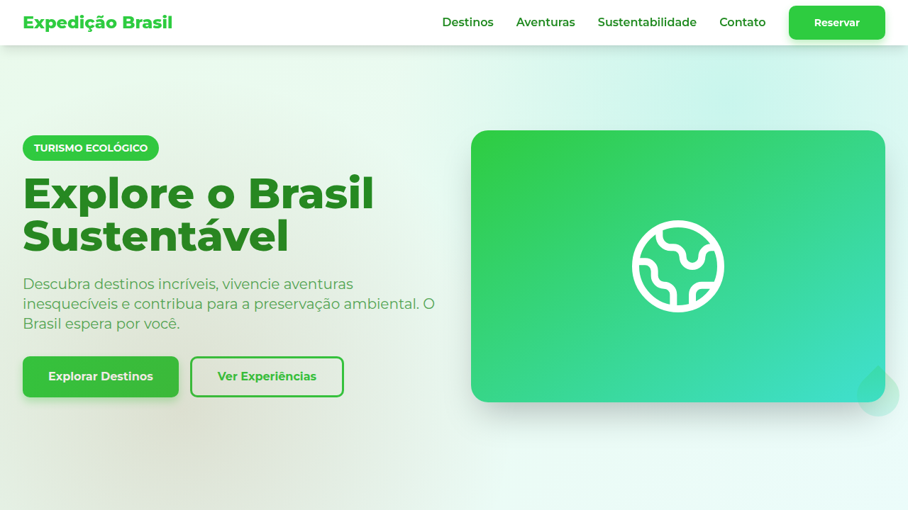
Design an adventurous and natural landing page for an ecotourism travel agency in Brazil, inspired by tropicalism. Ideal for landing pages, saas. AI-ready template.
Use case: Landing pages, SaaS
Historical Context
Brazilian ecotourism design didn't emerge from boardrooms. It crawled out of the Pantanal wetlands, salt-crusted from Fernando de Noronha tides, carrying red clay under its fingernails. The country's absurd biodiversity — 60,000 plant species, the Amazon basin alone holding 10% of Earth's creatures — forced designers to abandon the sanitized resort aesthetic that dominated travel marketing for decades. You can't reduce the Cerrado to a stock photo gradient. What emerged instead was a visual language rooted in texture and imperfection. Cracked earth palettes. The specific green of bromeliad leaves catching filtered canopy light. Typography that breathes like humid air — loose tracking, organic weight distribution. Fernando de Noronha's volcanic geology introduced sharp angular contrasts against soft oceanic blues. The Pantanal brought golden-hour warmth and the patience of slow water. This isn't decoration. It's a design philosophy that says: the wilderness is the product. Every layout choice serves immersion over polish, presence over performance.
When to Use
Deploy this system when the brand promise is transformation through nature — not relaxation, not luxury escapism, but genuine encounter with wild ecosystems. Works for ecotourism operators, conservation-focused travel agencies, sustainable adventure outfitters, and environmental education platforms. Particularly effective when your audience has already rejected the all-inclusive resort model and seeks authenticity. Not appropriate for urban tourism, nightlife-forward travel, or budget backpacker brands where grit reads differently.
Design Principles
- Texture over cleanliness — use organic noise, grain, and natural material photography that preserves imperfection rather than airbrushing it away
- Chromatic restraint from ecosystems — pull palettes directly from specific biomes (Pantanal gold-green, Atlantic Forest deep emerald, Caatinga terracotta) rather than generic tropical saturation
- Typographic humidity — favor generous spacing, soft weights, and letterforms that suggest organic growth over mechanical precision
- Immersive hierarchy — let landscape photography dominate; UI elements recede into the environment rather than floating above it
- Sustainable pacing — design for slow scrolling and contemplation, rejecting the urgency patterns of commercial travel sites in favor of rhythms that mirror nature's tempo
DESIGN.md
---
version: "alpha"
name: "Tropicalismo Aventureiro Natural"
description: "Design an adventurous and natural landing page for an ecotourism travel agency in Brazil, inspired by tropicalism. Ideal for landing pages, saas. AI-ready template."
colors:
  primary: "#2ECC40"
  secondary: "#40E0D0"
  tertiary: "#8B4513"
  neutral: "#FFD700"
  surface: "#CC5500"
  accent: "#FF6F61"
typography:
  h1:
    fontFamily: Montserrat
    fontSize: 2.5rem
    fontWeight: 700
  body-md:
    fontFamily: Montserrat
    fontSize: 1rem
    fontWeight: 400
rounded:
  sm: 10px
  md: 20px
  lg: 30px
components:
  button-primary:
    backgroundColor: "{colors.primary}"
    textColor: "{colors.neutral}"
    rounded: "{rounded.sm}"
    padding: 12px
---

## Overview

Design an adventurous and natural landing page for an ecotourism travel agency in Brazil, inspired by tropicalism. Ideal for landing pages, saas. AI-ready template. Brazilian ecotourism design didn't emerge from boardrooms. It crawled out of the Pantanal wetlands, salt-crusted from Fernando de Noronha tides, carrying red clay under its fingernails. The country's absurd biodiversity — 60,000 plant species, the Amazon basin alone holding 10% of Earth's creatures — forced designers to abandon the sanitized resort aesthetic that dominated travel marketing for decades. You can't reduce the Cerrado to a stock photo gradient.

What emerged instead was a visual language rooted in texture and imperfection. Cracked earth palettes. The specific green of bromeliad leaves catching filtered canopy light. Typography that breathes like humid air — loose tracking, organic weight distribution. Fernando de Noronha's volcanic geology introduced sharp angular contrasts against soft oceanic blues. The Pantanal brought golden-hour warmth and the patience of slow water.

This isn't decoration. It's a design philosophy that says: the wilderness is the product. Every layout choice serves immersion over polish, presence over performance.

- Density: 5/10 — Balanced
- Variance: 4/10 — Moderate
- Motion: 4/10 — Subtle

- **Style:** Adventurous, Natural, Engaging, Sustainable
- **Keywords:** ecotourism, travel agency, Brazil, adventurous, natural, engaging, sustainable, immersive, exploration, vibrant
- **Era:** 2026+ Aventura Sustentável
- **Light/Dark:** ✓ Full / ✗ No

## Colors

- **Verde Esmeralda** (#2ECC40) — Primary surface or dominant color
- **Azul Turquesa** (#40E0D0) — Accent highlight, links and focus states
- **Marrom Terra** (#8B4513) — Supporting palette color
- **Amarelo Sol** (#FFD700) — Warning states, attention indicators
- **Laranja Queimado** (#CC5500) — Warm accent, call-to-action secondary
- **Vermelho Coral** (#FF6F61) — Error states, destructive actions
- **Bege Areia** (#F5DEB3) — Extended palette, decorative use
- **Branco** (#FFFFFF) — Secondary surface


## Typography

- **Display / Hero:** Montserrat — Weight 700, tight tracking, used for headline impact
- **Body:** Montserrat — Weight 400, 16px/1.6 line-height, max 72ch per line
- **UI Labels / Captions:** Montserrat — 0.875rem, weight 500, slight letter-spacing
- **Monospace:** JetBrains Mono — Used for code, metadata, and technical values

Scale:
- Hero: clamp(2.5rem, 5vw, 4rem)
- H1: 2.25rem
- H2: 1.5rem
- Body: 1rem / 1.6
- Small: 0.875rem


## Layout

- **Grid:** CSS Grid primary. Max-width containment: 1280px centered with 1.5rem side padding.
- **Spacing rhythm:** Balanced. Base unit: 0.5rem (8px).
- **Section vertical gaps:** clamp(4rem, 8vw, 8rem).
- **Hero layout:** Split-screen (text left, visual right).
- **Feature sections:** Zig-zag alternating text+image rows. No 3-equal-columns.
- **Mobile collapse:** All multi-column layouts collapse below 768px. No horizontal overflow.
- **z-index contract:** base (0) / sticky-nav (100) / overlay (200) / modal (300) / toast (500).


## Elevation & Depth

Imagens de paisagens naturais brasileiras em tela cheia, tipografia sans-serif que transmite aventura, elementos de UI com formas de folhas e montanhas, micro-interações de hover com efeito de "descoberta" de detalhes da paisagem, transições de seção com efeito de "exploração" ou "zoom" em mapas.

- **Physics:** Ease-out curves, 200-300ms duration. Smooth and predictable.
- **Entry animations:** Fade + translate-Y (16px → 0) over 420ms ease-out. Staggered cascades for lists: 80ms between items.
- **Hover states:** Subtle color shift + shadow adjustment over 200ms.
- **Page transitions:** Fade only (200ms).
- **Performance:** Only transform and opacity animated. No layout-triggering properties.


## Shapes

Base corner radius: 10px. See rounded tokens in front matter for the full scale.


## Components

- **Primary Button:** Rounded (10px) shape. Accent color fill. Hover: 8% darken + subtle lift shadow. Active: -1px translate tactile press. Font weight 600. No outer glows.
- **Secondary / Ghost Button:** Outline variant. 1.5px border in muted color. Text in primary color. Hover: subtle background fill.
- **Cards:** Rounded (10px) corners. Surface background. Subtle shadow (0 2px 12px rgba(0,0,0,0.06)). 1px border stroke.
- **Inputs:** Label above input. 1px border stroke. Focus ring: 2px accent color offset 2px. Error text below in semantic red. No floating labels.
- **Navigation:** Primary surface background. Active item: accent color indicator. Font weight 500 when active.
- **Skeletons:** Shimmer animation matching component dimensions. No circular spinners.
- **Empty States:** Icon-based composition with descriptive text and action button.


## Do's and Don'ts

- No emojis in UI — use icon system only (Lucide, Heroicons)
- No pure black (#000000) — use off-black or charcoal variants
- No oversaturated accent colors (saturation cap: 80%)
- No 3-column equal-width feature layouts — use zig-zag or asymmetric grid
- No `h-screen` — use `min-h-[100dvh]`
- No AI copywriting clichés: "Elevate", "Seamless", "Unleash", "Next-Gen"
- No broken external image links — use picsum.photos or inline SVG
- No generic lorem ipsum in demos

- Do Paleta de cores brasileira verificada
- Do Elementos orgânicos/naturais presentes
- Do Cores vibrantes aplicadas corretamente
- Do Elementos de sustentabilidade presentes
- Do Tipografia hierárquica clara
- Do Responsividade mobile verificada
- Do Contraste WCAG AA verificado
- Do Conteúdo em PT-BR verificado


## Use Case

Landing pages, SaaS
Technical Specs
CSS
background: #FFFFFF, color: #228B22, border-radius: 10px, box-shadow: 0 6px 12px rgba(0,0,0,0.1), font-family: "Montserrat, sans-serif", transition: all 0.6s ease-in-out, .landscape-hero, .leaf-mountain-element, .discovery-hover-effect.
Variables
--emerald-green: #2ECC40, --turquoise-blue: #40E0D0, --earth-brown: #8B4513, --sun-yellow: #FFD700, --border-radius-md: 10px, --shadow-adventure: 0 6px 12px rgba(0,0,0,0.1), --font-main: "Montserrat, sans-serif", --exploration-transition: all 0.6s ease-in-out.
Checklist
☐ Paleta de cores brasileira verificada, ☐ Elementos orgânicos/naturais presentes, ☐ Cores vibrantes aplicadas corretamente, ☐ Elementos de sustentabilidade presentes, ☐ Tipografia hierárquica clara, ☐ Responsividade mobile verificada, ☐ Contraste WCAG AA verificado, ☐ Conteúdo em PT-BR verificado
Colors
Primary
Secondary
Effects
Imagens de paisagens naturais brasileiras em tela cheia, tipografia sans-serif que transmite aventura, elementos de UI com formas de folhas e montanhas, micro-interações de hover com efeito de "descoberta" de detalhes da paisagem, transições de seção com efeito de "exploração" ou "zoom" em mapas.
Light/Dark
✓ Full / ✗ No
AI Prompt
Act as a Senior Frontend Engineer and Expert UI Designer.
Your task is to code a complete Landing Page on the first attempt.
- Landing Page Theme: <INSERT THEME>
- Sections to add: <INSERT SECTIONS>

Generate the final code immediately following these definitions:

## Style

- **Name:** Tropicalismo Aventureiro Natural
- **Type:** Adventurous, Natural, Engaging, Sustainable
- **Keywords:** ecotourism, travel agency, Brazil, adventurous, natural, engaging, sustainable, immersive, exploration, vibrant
- **Era:** 2026+ Aventura Sustentável
- **Light/Dark:** ✓ Full / ✗ No

## Color Palette

- **Primary:** Verde Esmeralda #2ECC40, Azul Turquesa #40E0D0, Marrom Terra #8B4513, Amarelo Sol #FFD700
- **Secondary:** Laranja Queimado #CC5500, Vermelho Coral #FF6F61, Bege Areia #F5DEB3, Branco #FFFFFF

## Visual Effects

Imagens de paisagens naturais brasileiras em tela cheia, tipografia sans-serif que transmite aventura, elementos de UI com formas de folhas e montanhas, micro-interações de hover com efeito de "descoberta" de detalhes da paisagem, transições de seção com efeito de "exploração" ou "zoom" em mapas.

## AI Visual Direction

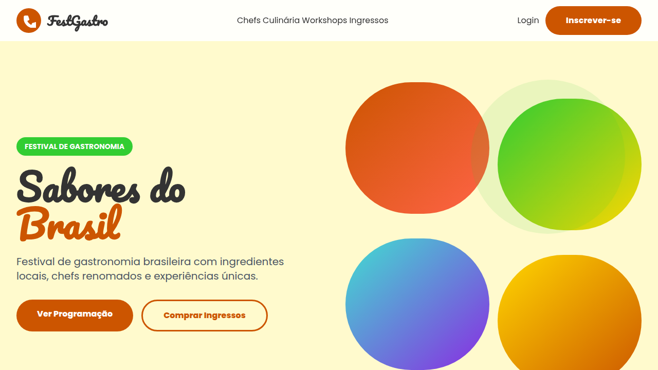
Design an adventurous and natural landing page for an ecotourism travel agency in Brazil, inspired by tropicalism. Use: full-screen Brazilian natural landscape images, adventure-themed sans-serif typography, leaf and mountain shaped UI elements, landscape detail "discovery" hover micro-interactions, map "exploration" or "zoom" section transitions, emerald green and turquoise blue accents, immersive and sustainable feel.

## CSS Technical

```css
background: #FFFFFF, color: #228B22, border-radius: 10px, box-shadow: 0 6px 12px rgba(0,0,0,0.1), font-family: "Montserrat, sans-serif", transition: all 0.6s ease-in-out, .landscape-hero, .leaf-mountain-element, .discovery-hover-effect.
```

## Design System Variables

```css
--emerald-green: #2ECC40, --turquoise-blue: #40E0D0, --earth-brown: #8B4513, --sun-yellow: #FFD700, --border-radius-md: 10px, --shadow-adventure: 0 6px 12px rgba(0,0,0,0.1), --font-main: "Montserrat, sans-serif", --exploration-transition: all 0.6s ease-in-out.
```

## Implementation Checklist

- ☐ Paleta de cores brasileira verificada
- ☐ Elementos orgânicos/naturais presentes
- ☐ Cores vibrantes aplicadas corretamente
- ☐ Elementos de sustentabilidade presentes
- ☐ Tipografia hierárquica clara
- ☐ Responsividade mobile verificada
- ☐ Contraste WCAG AA verificado
- ☐ Conteúdo em PT-BR verificado

## Execution Rules

1. Strictly follow the defined visual style.
2. Use high-quality inline SVG icons (Heroicons or Lucide style) — NEVER use emojis as icons.
3. Add `cursor-pointer` and smooth `hover` states (transition-all) on all interactive elements.
4. Required Page Structure:
   - Navbar (Logo + Links + CTA)
   - Hero Section (Impactful Headline + Subtitle + 2 buttons + 3D/Abstract visual element via CSS)
   - Features (3 cards with icons)
   - Testimonials (3 cards)
   - Pricing (3 tiers, highlight the middle one)
   - Final CTA
   - Full Footer with social links, privacy policy, terms of use, contact and SEO links.
5. All text content must be in English.
6. The visual must be CLEARLY distinct — do not create a "default Bootstrap" design. Force the use of the provided design system variables.
7. Use `<style>` tags in the head for custom classes (especially for complex backdrop-filter effects and animations) that Tailwind CDN doesn't cover.
8. Full Responsiveness: Layout must adapt perfectly to Mobile, Tablet and Desktop (vertical stack on mobile).
9. Include basic SEO, Viewport and Open Graph meta tags in `<head>`.
10. Footer must contain: Copyright 2026, Secondary navigation links and Social media icons.
11. Make the creative decisions needed to deliver the complete, functional result now.
Related
Last synced: 4/1/2026