Together Pastel Cloud
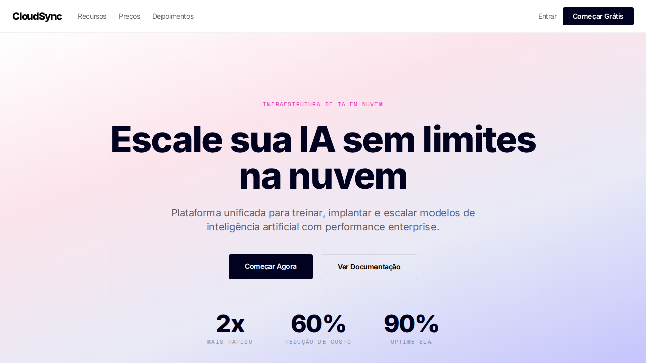
Together AI-inspired pastel cloud landing page. Ideal for infraestrutura ai, cloud computing, plataformas de modelos, gpu clusters. AI-ready template.
Use case: Infraestrutura AI, Cloud computing, Platforms de modelos, GPU clusters
Historical Context
The pastel cloud aesthetic in tech branding didn't emerge from nowhere — it's a direct descendant of the vaporwave-to-corporate pipeline that dominated 2018-2021, filtered through the lens of AI companies desperate to appear approachable. Together's visual identity sits at an interesting inflection point: infrastructure companies historically defaulted to dark themes, terminal greens, and brutalist grids to signal seriousness. Together broke from that orthodoxy by embracing soft gradients and ethereal cloud forms, essentially saying 'yes, we run GPU clusters, but we're not going to make you feel like you need a PhD to use them.' The pastel palette specifically borrows from illustration traditions — watercolor washes, risograph printing, and the Japanese kawaii aesthetic that infiltrated Western design through apps like Notion and Linear. What makes Together's approach distinct is the tension between the softness of the palette and the industrial scale of what they actually do. It's a deliberate misdirection, and honestly, it works. The cloud motif does double duty: literal (cloud computing) and atmospheric (dreamy, boundless possibility). That duality is rare in infrastructure branding, where most competitors still lean on circuit-board metaphors that stopped feeling fresh around 2015.
When to Use
Reach for this palette when you're designing interfaces or brand materials for technical products that need to feel inviting rather than intimidating. It works exceptionally well for onboarding flows, documentation sites, and developer portals where reducing cognitive friction matters more than signaling raw power. Avoid it for monitoring dashboards or anything where data density demands high contrast. Best deployed when your audience includes both technical and non-technical stakeholders — the softness gives permission to explore without feeling lost.
Design Principles
- Contrast through softness — let the pastel palette do the heavy lifting of approachability while typography and structure maintain hierarchy and seriousness
- Cloud forms should feel volumetric, not flat — use subtle inner shadows and gradient shifts to imply depth without resorting to skeuomorphism
- Limit your pastel range to 3-4 hues maximum; too many soft colors collapse into visual noise faster than saturated palettes do
- Reserve high-saturation accents exclusively for interactive elements and status indicators — they'll pop dramatically against the muted field
- White space is structural, not decorative — in pastel systems, generous spacing prevents the palette from reading as 'baby shower invitation' rather than 'serious infrastructure'
DESIGN.md
---
version: "alpha"
name: "Together Pastel Cloud"
description: "Together AI-inspired pastel cloud landing page. Ideal for infraestrutura ai, cloud computing, plataformas de modelos, gpu clusters. AI-ready template."
colors:
  primary: "#ffffff"
  secondary: "#000000"
  tertiary: "#010120"
  neutral: "#ef2cc1"
  surface: "#fc4c02"
  accent: "#bdbbff"
typography:
  h1:
    fontFamily: The Future
    fontSize: 2.25rem
    fontWeight: 700
  body-md:
    fontFamily: The Future
    fontSize: 1rem
    fontWeight: 400
  label-caps:
    fontFamily: The Future
    fontSize: 0.75rem
    fontWeight: 500
rounded:
  sm: 4px
  md: 8px
  lg: 12px
components:
  button-primary:
    backgroundColor: "{colors.primary}"
    textColor: "{colors.neutral}"
    rounded: "{rounded.sm}"
    padding: 12px
---

## Overview

Together AI-inspired pastel cloud landing page. Ideal for infraestrutura ai, cloud computing, plataformas de modelos, gpu clusters. AI-ready template. The pastel cloud aesthetic in tech branding didn't emerge from nowhere — it's a direct descendant of the vaporwave-to-corporate pipeline that dominated 2018-2021, filtered through the lens of AI companies desperate to appear approachable. Together's visual identity sits at an interesting inflection point: infrastructure companies historically defaulted to dark themes, terminal greens, and brutalist grids to signal seriousness. Together broke from that orthodoxy by embracing soft gradients and ethereal cloud forms, essentially saying 'yes, we run GPU clusters, but we're not going to make you feel like you need a PhD to use them.'

The pastel palette specifically borrows from illustration traditions — watercolor washes, risograph printing, and the Japanese kawaii aesthetic that infiltrated Western design through apps like Notion and Linear. What makes Together's approach distinct is the tension between the softness of the palette and the industrial scale of what they actually do. It's a deliberate misdirection, and honestly, it works. The cloud motif does double duty: literal (cloud computing) and atmospheric (dreamy, boundless possibility). That duality is rare in infrastructure branding, where most competitors still lean on circuit-board metaphors that stopped feeling fresh around 2015.

- Density: 5/10 — Balanced
- Variance: 4/10 — Moderate
- Motion: 4/10 — Subtle

- **Style:** Pastel Gradients, Midnight Blue Dark, The Future Font, Sharp Geometry, Enterprise Stats
- **Keywords:** together, pastel, cloud, midnight blue, The Future font, sharp geometry, enterprise stats, PP Neue Montreal Mono, lavender, infrastructure
- **Era:** 2024-2026 AI Infrastructure Cloud
- **Light/Dark:** ✓ Full / ✓ Full

## Colors

- **Branco** (#ffffff) — Light surface, card backgrounds
- **Preto** (#000000) — Dark surface, primary background
- **Midnight Blue** (#010120) — Dark surface, primary background
- **Magenta** (#ef2cc1) — Decorative accent, highlight elements
- **Laranja** (#fc4c02) — Warm accent, call-to-action secondary
- **Lavanda** (#bdbbff) — Extended palette, decorative use
- **Vidro** (rgba(255,255,255,0.12)) — Extended palette, decorative use
- **Borda** (rgba(0,0,0,0.08)) — Extended palette, decorative use


## Typography

- **Display / Hero:** The Future — Weight 700, tight tracking, used for headline impact
- **Accent:** system-ui — Used for decorative or emphasis text
- **Body:** The Future — Weight 400, 16px/1.6 line-height, max 72ch per line
- **UI Labels / Captions:** The Future — 0.875rem, weight 500, slight letter-spacing
- **Monospace:** JetBrains Mono — Used for code, metadata, and technical values

Scale:
- Hero: clamp(2.5rem, 5vw, 4rem)
- H1: 2.25rem
- H2: 1.5rem
- Body: 1rem / 1.6
- Small: 0.875rem


## Layout

- **Grid:** CSS Grid primary. Max-width containment: 1280px centered with 1.5rem side padding.
- **Spacing rhythm:** Balanced. Base unit: 0.5rem (8px).
- **Section vertical gaps:** clamp(4rem, 8vw, 8rem).
- **Hero layout:** Split-screen (text left, visual right).
- **Feature sections:** Zig-zag alternating text+image rows. No 3-equal-columns.
- **Mobile collapse:** All multi-column layouts collapse below 768px. No horizontal overflow.
- **z-index contract:** base (0) / sticky-nav (100) / overlay (200) / modal (300) / toast (500).


## Elevation & Depth

Gradientes pastel suaves (rosa, azul, lavanda) contra canvas branco. Seções dark em midnight blue (#010120 — não cinza-preto). Font 'The Future' com tracking negativo em todo tamanho (-0.16px a -1.92px). PP Neue Montreal Mono uppercase para labels técnicos. Geometria sharp (4px, 8px radius). Magenta (#ef2cc1) e laranja (#fc4c02) apenas em ilustrações. Stats enterprise proeminentes (2x, 60%, 90%). Sombras blue-tinted (rgba(1,1,32,0.1)).

- **Physics:** Ease-out curves, 200-300ms duration. Smooth and predictable.
- **Entry animations:** Fade + translate-Y (16px → 0) over 420ms ease-out. Staggered cascades for lists: 80ms between items.
- **Hover states:** Subtle color shift + shadow adjustment over 200ms.
- **Page transitions:** Fade only (200ms).
- **Performance:** Only transform and opacity animated. No layout-triggering properties.


## Shapes

Base corner radius: 4px. See rounded tokens in front matter for the full scale.


## Components

- **Primary Button:** Sharp edges (0px) shape. Accent color fill. Hover: 8% darken + subtle lift shadow. Active: -1px translate tactile press. Font weight 600. No outer glows.
- **Secondary / Ghost Button:** Outline variant. 1.5px border in muted color. Text in primary color. Hover: subtle background fill.
- **Cards:** Sharp edges (0px) corners. Surface background. Subtle shadow (0 2px 12px rgba(0,0,0,0.06)). 1px border stroke.
- **Inputs:** Label above input. 1px border stroke. Focus ring: 2px accent color offset 2px. Error text below in semantic red. No floating labels.
- **Navigation:** Primary surface background. Active item: accent color indicator. Font weight 500 when active.
- **Skeletons:** Shimmer animation matching component dimensions. No circular spinners.
- **Empty States:** Icon-based composition with descriptive text and action button.


## Do's and Don'ts

- No emojis in UI — use icon system only (Lucide, Heroicons)
- No pure black (#000000) — use off-black or charcoal variants
- No oversaturated accent colors (saturation cap: 80%)
- No 3-column equal-width feature layouts — use zig-zag or asymmetric grid
- No `h-screen` — use `min-h-[100dvh]`
- No AI copywriting clichés: "Elevate", "Seamless", "Unleash", "Next-Gen"
- No broken external image links — use picsum.photos or inline SVG
- No generic lorem ipsum in demos

- Do Gradientes pastel suaves
- Do Dark sections midnight blue
- Do Tracking negativo em tudo
- Do Mono uppercase labels
- Do Geometria sharp 4-8px
- Do Stats enterprise
- Do Sombras blue-tinted
- Do Responsivo


## Use Case

Infraestrutura AI, Cloud computing, Platforms de modelos, GPU clusters
Technical Specs
CSS
background:#ffffff dark:#010120;color:#000000;accent:#ef2cc1;box-shadow:rgba(1,1,32,0.1) 0px 4px 10px;border-radius:4px badges,8px containers;font-family:system-ui;letter-spacing:-1.92px at 64px;border:1px solid rgba(0,0,0,0.08)
Variables
--bg-light:#ffffff;--bg-dark:#010120;--text-light:#000000;--text-dark:#ffffff;--magenta:#ef2cc1;--orange:#fc4c02;--lavender:#bdbbff;--glass:rgba(255,255,255,0.12);--border-light:rgba(0,0,0,0.08);--shadow:rgba(1,1,32,0.1)
Checklist
☐ Gradientes pastel suaves, ☐ Dark sections midnight blue, ☐ Tracking negativo em tudo, ☐ Mono uppercase labels, ☐ Geometria sharp 4-8px, ☐ Stats enterprise, ☐ Sombras blue-tinted, ☐ Responsivo
Colors
Primary
Secondary
Effects
Gradientes pastel suaves (rosa, azul, lavanda) contra canvas branco. Seções dark em midnight blue (#010120 — não cinza-preto). Font 'The Future' com tracking negativo em todo tamanho (-0.16px a -1.92px). PP Neue Montreal Mono uppercase para labels técnicos. Geometria sharp (4px, 8px radius). Magenta (#ef2cc1) e laranja (#fc4c02) apenas em ilustrações. Stats enterprise proeminentes (2x, 60%, 90%). Sombras blue-tinted (rgba(1,1,32,0.1)).
Light/Dark
✓ Full / ✓ Full
AI Prompt
Act as a Senior Frontend Engineer and Expert UI Designer.
Your task is to code a complete Landing Page on the first attempt.
- Landing Page Theme: <INSERT THEME>
- Sections to add: <INSERT SECTIONS>

Generate the final code immediately following these definitions:

## Style

- **Name:** Together Pastel Cloud
- **Type:** Pastel Gradients, Midnight Blue Dark, The Future Font, Sharp Geometry, Enterprise Stats
- **Keywords:** together, pastel, cloud, midnight blue, The Future font, sharp geometry, enterprise stats, PP Neue Montreal Mono, lavender, infrastructure
- **Era:** 2024-2026 AI Infrastructure Cloud
- **Light/Dark:** ✓ Full / ✓ Full

## Color Palette

- **Primary:** Branco #ffffff, Preto #000000, Midnight Blue #010120, Magenta #ef2cc1
- **Secondary:** Laranja #fc4c02, Lavanda #bdbbff, Vidro rgba(255,255,255,0.12), Borda rgba(0,0,0,0.08)

## Visual Effects

Gradientes pastel suaves (rosa, azul, lavanda) contra canvas branco. Seções dark em midnight blue (#010120 — não cinza-preto). Font 'The Future' com tracking negativo em todo tamanho (-0.16px a -1.92px). PP Neue Montreal Mono uppercase para labels técnicos. Geometria sharp (4px, 8px radius). Magenta (#ef2cc1) e laranja (#fc4c02) apenas em ilustrações. Stats enterprise proeminentes (2x, 60%, 90%). Sombras blue-tinted (rgba(1,1,32,0.1)).

## AI Visual Direction

Design a Together AI-inspired pastel cloud landing page. Soft pastel gradients (pink, blue, lavender) against white canvas. Dark sections in midnight blue (#010120). Custom font with negative letter-spacing throughout (-0.16px to -1.92px). Monospace uppercase labels. Sharp geometry (4px-8px radius). Magenta (#ef2cc1) and orange (#fc4c02) in illustrations only. Prominent enterprise stats. Blue-tinted shadows (rgba(1,1,32,0.1)). Glass buttons on dark sections.

## CSS Technical

```css
background:#ffffff dark:#010120;color:#000000;accent:#ef2cc1;box-shadow:rgba(1,1,32,0.1) 0px 4px 10px;border-radius:4px badges,8px containers;font-family:system-ui;letter-spacing:-1.92px at 64px;border:1px solid rgba(0,0,0,0.08)
```

## Design System Variables

```css
--bg-light:#ffffff;--bg-dark:#010120;--text-light:#000000;--text-dark:#ffffff;--magenta:#ef2cc1;--orange:#fc4c02;--lavender:#bdbbff;--glass:rgba(255,255,255,0.12);--border-light:rgba(0,0,0,0.08);--shadow:rgba(1,1,32,0.1)
```

## Implementation Checklist

- ☐ Gradientes pastel suaves
- ☐ Dark sections midnight blue
- ☐ Tracking negativo em tudo
- ☐ Mono uppercase labels
- ☐ Geometria sharp 4-8px
- ☐ Stats enterprise
- ☐ Sombras blue-tinted
- ☐ Responsivo

## Execution Rules

1. Strictly follow the defined visual style.
2. Use high-quality inline SVG icons (Heroicons or Lucide style) — NEVER use emojis as icons.
3. Add `cursor-pointer` and smooth `hover` states (transition-all) on all interactive elements.
4. Required Page Structure:
   - Navbar (Logo + Links + CTA)
   - Hero Section (Impactful Headline + Subtitle + 2 buttons + 3D/Abstract visual element via CSS)
   - Features (3 cards with icons)
   - Testimonials (3 cards)
   - Pricing (3 tiers, highlight the middle one)
   - Final CTA
   - Full Footer with social links, privacy policy, terms of use, contact and SEO links.
5. All text content must be in English.
6. The visual must be CLEARLY distinct — do not create a "default Bootstrap" design. Force the use of the provided design system variables.
7. Use `<style>` tags in the head for custom classes (especially for complex backdrop-filter effects and animations) that Tailwind CDN doesn't cover.
8. Full Responsiveness: Layout must adapt perfectly to Mobile, Tablet and Desktop (vertical stack on mobile).
9. Include basic SEO, Viewport and Open Graph meta tags in `<head>`.
10. Footer must contain: Copyright 2026, Secondary navigation links and Social media icons.
11. Make the creative decisions needed to deliver the complete, functional result now.
Related
Last synced: 4/1/2026