Símbolos Regionais Brasileiros
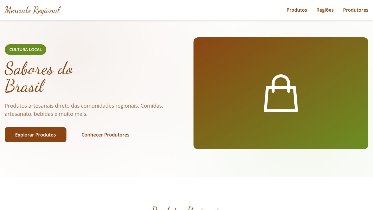
Design an authentic and diverse landing page for an online store of Brazilian regional products, inspired by graphic symbolism and regional identity. Ideal for landing pages, saas. AI-ready template.
Use case: Landing pages, SaaS
Historical Context
Brazil doesn't have one visual identity. It has dozens, layered over centuries of migration, climate, and improvisation. The Northeast built its graphic language from woodcut cordel literature, sun-bleached earth tones, and the geometry of ceramic tiles brought by the Portuguese — then remixed through African textile traditions. It's loud, dense, unapologetic. The South tells a different story. German and Italian colonies left behind blackletter typography, structured grids, and a cooler palette that echoes wool and basalt. Gaucho culture added leather tooling patterns and a certain stoic minimalism. Meanwhile, the Amazon operates on an entirely separate axis — curvilinear forms pulled from indigenous basketry, saturated greens and ochres, organic shapes that reject the straight edge. The visual grammar there is biological, not architectural. The Southeast industrialized first, so its regional symbols carry the tension between rural craft (Minas Gerais soapstone, São Paulo Japanese-immigrant ceramics) and urban modernism. Each region's design vocabulary is a living document — not folklore frozen in amber, but an ongoing negotiation between place, people, and material.
When to Use
Reach for regional Brazilian symbols when a product needs to feel rooted rather than generic. Artisan marketplaces, local food brands, cultural tourism, regional cooperatives — anywhere provenance is the value proposition. They work beautifully for packaging that needs shelf differentiation without looking corporate. Also strong for editorial design celebrating Brazilian diversity. Avoid flattening multiple regions into one 'Brazilian style' — that defeats the entire point. Pick a region. Commit to its specificity.
Design Principles
- Specificity over generalization — one region's visual language per project, never a pan-Brazilian pastiche
- Material honesty — let the textures of local craft (woodcut grain, woven fiber, hammered metal) inform digital surfaces
- Chromatic geography — derive palettes from the actual landscape: caatinga ochres, Atlantic Forest greens, pampa grays, cerrado golds
- Typographic heritage — reference regional lettering traditions (cordel woodtype, colonial signage, immigrant-community scripts) rather than defaulting to neutral sans-serifs
- Structural rhythm from craft — borrow compositional logic from local making: the repetition of lace bilros, the asymmetry of marajoara pottery, the grid of azulejo
DESIGN.md
---
version: "alpha"
name: "Símbolos Regionais Brasileiros"
description: "Design an authentic and diverse landing page for an online store of Brazilian regional products, inspired by graphic symbolism and regional identity. Ideal for landing pages, saas. AI-ready template."
colors:
  primary: "#8B4513"
  secondary: "#6B8E23"
  tertiary: "#CC5500"
  neutral: "#F5DEB3"
  surface: "#87CEEB"
  accent: "#FF6F61"
typography:
  h1:
    fontFamily: Dancing Script
    fontSize: 2.5rem
    fontWeight: 700
  body-md:
    fontFamily: Dancing Script
    fontSize: 1rem
    fontWeight: 400
components:
  button-primary:
    backgroundColor: "{colors.primary}"
    textColor: "{colors.neutral}"
    padding: 12px
---

## Overview

Design an authentic and diverse landing page for an online store of Brazilian regional products, inspired by graphic symbolism and regional identity. Ideal for landing pages, saas. AI-ready template. Brazil doesn't have one visual identity. It has dozens, layered over centuries of migration, climate, and improvisation. The Northeast built its graphic language from woodcut cordel literature, sun-bleached earth tones, and the geometry of ceramic tiles brought by the Portuguese — then remixed through African textile traditions. It's loud, dense, unapologetic.

The South tells a different story. German and Italian colonies left behind blackletter typography, structured grids, and a cooler palette that echoes wool and basalt. Gaucho culture added leather tooling patterns and a certain stoic minimalism. Meanwhile, the Amazon operates on an entirely separate axis — curvilinear forms pulled from indigenous basketry, saturated greens and ochres, organic shapes that reject the straight edge. The visual grammar there is biological, not architectural.

The Southeast industrialized first, so its regional symbols carry the tension between rural craft (Minas Gerais soapstone, São Paulo Japanese-immigrant ceramics) and urban modernism. Each region's design vocabulary is a living document — not folklore frozen in amber, but an ongoing negotiation between place, people, and material.

- Density: 5/10 — Balanced
- Variance: 4/10 — Moderate
- Motion: 4/10 — Subtle

- **Style:** Authentic, Diverse, Crafted, Engaging
- **Keywords:** regional products, Brazilian, handmade, food, clothing, authentic, diverse, crafted, unique, local
- **Era:** 2026+ Valorização Regional
- **Light/Dark:** ✓ Full / ✗ No

## Colors

- **Marrom Terra** (#8B4513) — Primary surface or dominant color
- **Verde Oliva** (#6B8E23) — Secondary surface or text color
- **Laranja Queimado** (#CC5500) — Warm accent, call-to-action secondary
- **Bege Areia** (#F5DEB3) — Supporting palette color
- **Azul Céu** (#87CEEB) — Secondary accent
- **Vermelho Coral** (#FF6F61) — Error states, destructive actions
- **Amarelo Ocre** (#CC7722) — Warning states, attention indicators
- **Branco** (#FFFFFF) — Secondary surface


## Typography

- **Display / Hero:** Dancing Script — Weight 700, tight tracking, used for headline impact
- **Body:** Dancing Script — Weight 400, 16px/1.6 line-height, max 72ch per line
- **UI Labels / Captions:** Dancing Script — 0.875rem, weight 500, slight letter-spacing
- **Monospace:** JetBrains Mono — Used for code, metadata, and technical values

Scale:
- Hero: clamp(2.5rem, 5vw, 4rem)
- H1: 2.25rem
- H2: 1.5rem
- Body: 1rem / 1.6
- Small: 0.875rem


## Layout

- **Grid:** CSS Grid primary. Max-width containment: 1280px centered with 1.5rem side padding.
- **Spacing rhythm:** Balanced. Base unit: 0.5rem (8px).
- **Section vertical gaps:** clamp(4rem, 8vw, 8rem).
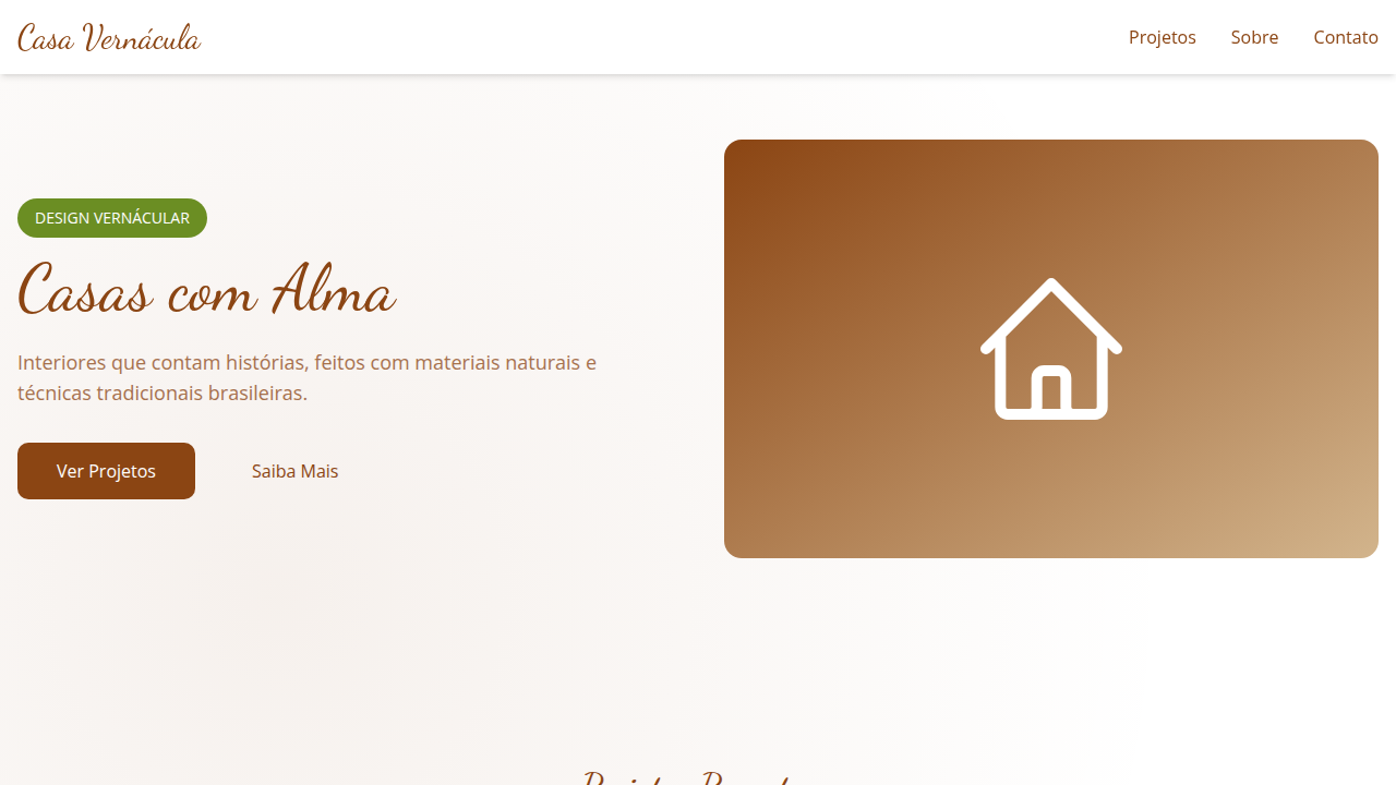
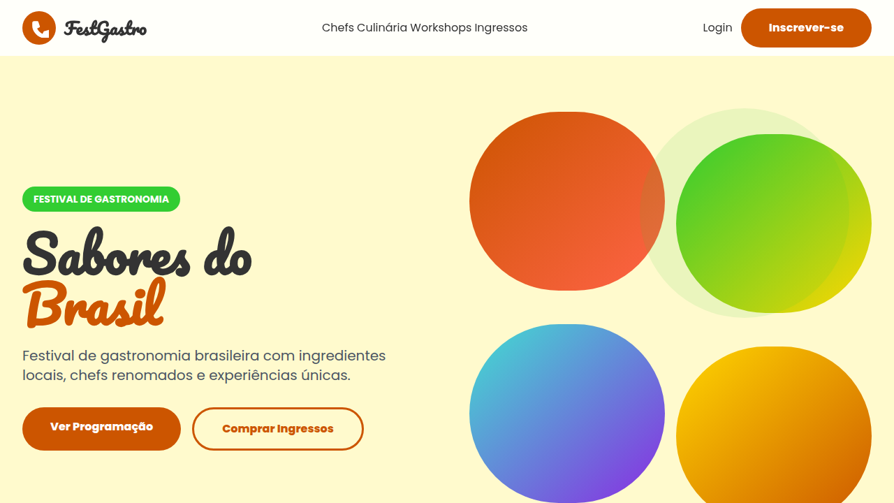
- **Hero layout:** Split-screen (text left, visual right).
- **Feature sections:** Zig-zag alternating text+image rows. No 3-equal-columns.
- **Mobile collapse:** All multi-column layouts collapse below 768px. No horizontal overflow.
- **z-index contract:** base (0) / sticky-nav (100) / overlay (200) / modal (300) / toast (500).


## Elevation & Depth

Mosaicos de imagens de produtos e elementos regionais, tipografia que remete a caligrafia ou fontes vernaculares, ícones que representam a cultura de cada região, micro-interações de hover com destaque de origem ou história do produto, transições de seção com efeito de "colagem" ou "montagem" de elementos regionais.

- **Physics:** Ease-out curves, 200-300ms duration. Smooth and predictable.
- **Entry animations:** Fade + translate-Y (16px → 0) over 420ms ease-out. Staggered cascades for lists: 80ms between items.
- **Hover states:** Subtle color shift + shadow adjustment over 200ms.
- **Page transitions:** Fade only (200ms).
- **Performance:** Only transform and opacity animated. No layout-triggering properties.


## Shapes

Base corner radius: 8px. See rounded tokens in front matter for the full scale.


## Components

- **Primary Button:** Subtly rounded (0.5rem) shape. Accent color fill. Hover: 8% darken + subtle lift shadow. Active: -1px translate tactile press. Font weight 600. No outer glows.
- **Secondary / Ghost Button:** Outline variant. 1.5px border in muted color. Text in primary color. Hover: subtle background fill.
- **Cards:** Subtly rounded (0.5rem) corners. Surface background. Subtle shadow (0 2px 12px rgba(0,0,0,0.06)). 1px border stroke.
- **Inputs:** Label above input. 1px border stroke. Focus ring: 2px accent color offset 2px. Error text below in semantic red. No floating labels.
- **Navigation:** Primary surface background. Active item: accent color indicator. Font weight 500 when active.
- **Skeletons:** Shimmer animation matching component dimensions. No circular spinners.
- **Empty States:** Icon-based composition with descriptive text and action button.


## Do's and Don'ts

- No emojis in UI — use icon system only (Lucide, Heroicons)
- No pure black (#000000) — use off-black or charcoal variants
- No oversaturated accent colors (saturation cap: 80%)
- No 3-column equal-width feature layouts — use zig-zag or asymmetric grid
- No `h-screen` — use `min-h-[100dvh]`
- No AI copywriting clichés: "Elevate", "Seamless", "Unleash", "Next-Gen"
- No broken external image links — use picsum.photos or inline SVG
- No generic lorem ipsum in demos

- Do Paleta de cores brasileira verificada
- Do Autenticidade cultural brasileira verificada
- Do Texturas artesanais/rústicas aplicadas
- Do Tipografia hierárquica clara
- Do Responsividade mobile verificada
- Do Contraste WCAG AA verificado
- Do Conteúdo em PT-BR verificado


## Use Case

Landing pages, SaaS
Technical Specs
CSS
background: #FFFFFF, color: #8B4513, border-bottom: 1px solid #CC5500, font-family: "Dancing Script, cursive", transition: all 0.7s ease-in-out, .regional-mosaic, .regional-icon, .collage-assembly-transition.
Variables
--earth-brown: #8B4513, --olive-green: #6B8E23, --burnt-orange: #CC5500, --straw-beige: #F5DEB3, --white-bg: #FFFFFF, --border-accent: 1px solid #CC5500, --font-calligraphy: "Dancing Script, cursive", --mosaic-duration: 0.7s.
Checklist
☐ Paleta de cores brasileira verificada, ☐ Autenticidade cultural brasileira verificada, ☐ Texturas artesanais/rústicas aplicadas, ☐ Tipografia hierárquica clara, ☐ Responsividade mobile verificada, ☐ Contraste WCAG AA verificado, ☐ Conteúdo em PT-BR verificado
Colors
Primary
Secondary
Effects
Mosaicos de imagens de produtos e elementos regionais, tipografia que remete a caligrafia ou fontes vernaculares, ícones que representam a cultura de cada região, micro-interações de hover com destaque de origem ou história do produto, transições de seção com efeito de "colagem" ou "montagem" de elementos regionais.
Light/Dark
✓ Full / ✗ No
AI Prompt
Act as a Senior Frontend Engineer and Expert UI Designer.
Your task is to code a complete Landing Page on the first attempt.
- Landing Page Theme: <INSERT THEME>
- Sections to add: <INSERT SECTIONS>

Generate the final code immediately following these definitions:

## Style

- **Name:** Símbolos Regionais Brasileiros
- **Type:** Authentic, Diverse, Crafted, Engaging
- **Keywords:** regional products, Brazilian, handmade, food, clothing, authentic, diverse, crafted, unique, local
- **Era:** 2026+ Valorização Regional
- **Light/Dark:** ✓ Full / ✗ No

## Color Palette

- **Primary:** Marrom Terra #8B4513, Verde Oliva #6B8E23, Laranja Queimado #CC5500, Bege Areia #F5DEB3
- **Secondary:** Azul Céu #87CEEB, Vermelho Coral #FF6F61, Amarelo Ocre #CC7722, Branco #FFFFFF

## Visual Effects

Mosaicos de imagens de produtos e elementos regionais, tipografia que remete a caligrafia ou fontes vernaculares, ícones que representam a cultura de cada região, micro-interações de hover com destaque de origem ou história do produto, transições de seção com efeito de "colagem" ou "montagem" de elementos regionais.

## AI Visual Direction

Design an authentic and diverse landing page for an online store of Brazilian regional products, inspired by graphic symbolism and regional identity. Use: mosaics of product images and regional elements, calligraphy/vernacular typography, icons representing each region's culture, product origin/story highlight hover micro-interactions, regional element "collage"/"assembly" section transitions, earthy brown and olive green accents, crafted and local feel.

## CSS Technical

```css
background: #FFFFFF, color: #8B4513, border-bottom: 1px solid #CC5500, font-family: "Dancing Script, cursive", transition: all 0.7s ease-in-out, .regional-mosaic, .regional-icon, .collage-assembly-transition.
```

## Design System Variables

```css
--earth-brown: #8B4513, --olive-green: #6B8E23, --burnt-orange: #CC5500, --straw-beige: #F5DEB3, --white-bg: #FFFFFF, --border-accent: 1px solid #CC5500, --font-calligraphy: "Dancing Script, cursive", --mosaic-duration: 0.7s.
```

## Implementation Checklist

- ☐ Paleta de cores brasileira verificada
- ☐ Autenticidade cultural brasileira verificada
- ☐ Texturas artesanais/rústicas aplicadas
- ☐ Tipografia hierárquica clara
- ☐ Responsividade mobile verificada
- ☐ Contraste WCAG AA verificado
- ☐ Conteúdo em PT-BR verificado

## Execution Rules

1. Strictly follow the defined visual style.
2. Use high-quality inline SVG icons (Heroicons or Lucide style) — NEVER use emojis as icons.
3. Add `cursor-pointer` and smooth `hover` states (transition-all) on all interactive elements.
4. Required Page Structure:
   - Navbar (Logo + Links + CTA)
   - Hero Section (Impactful Headline + Subtitle + 2 buttons + 3D/Abstract visual element via CSS)
   - Features (3 cards with icons)
   - Testimonials (3 cards)
   - Pricing (3 tiers, highlight the middle one)
   - Final CTA
   - Full Footer with social links, privacy policy, terms of use, contact and SEO links.
5. All text content must be in English.
6. The visual must be CLEARLY distinct — do not create a "default Bootstrap" design. Force the use of the provided design system variables.
7. Use `<style>` tags in the head for custom classes (especially for complex backdrop-filter effects and animations) that Tailwind CDN doesn't cover.
8. Full Responsiveness: Layout must adapt perfectly to Mobile, Tablet and Desktop (vertical stack on mobile).
9. Include basic SEO, Viewport and Open Graph meta tags in `<head>`.
10. Footer must contain: Copyright 2026, Secondary navigation links and Social media icons.
11. Make the creative decisions needed to deliver the complete, functional result now.
Related
Last synced: 4/1/2026