Símbolos Políticos Brasileiros
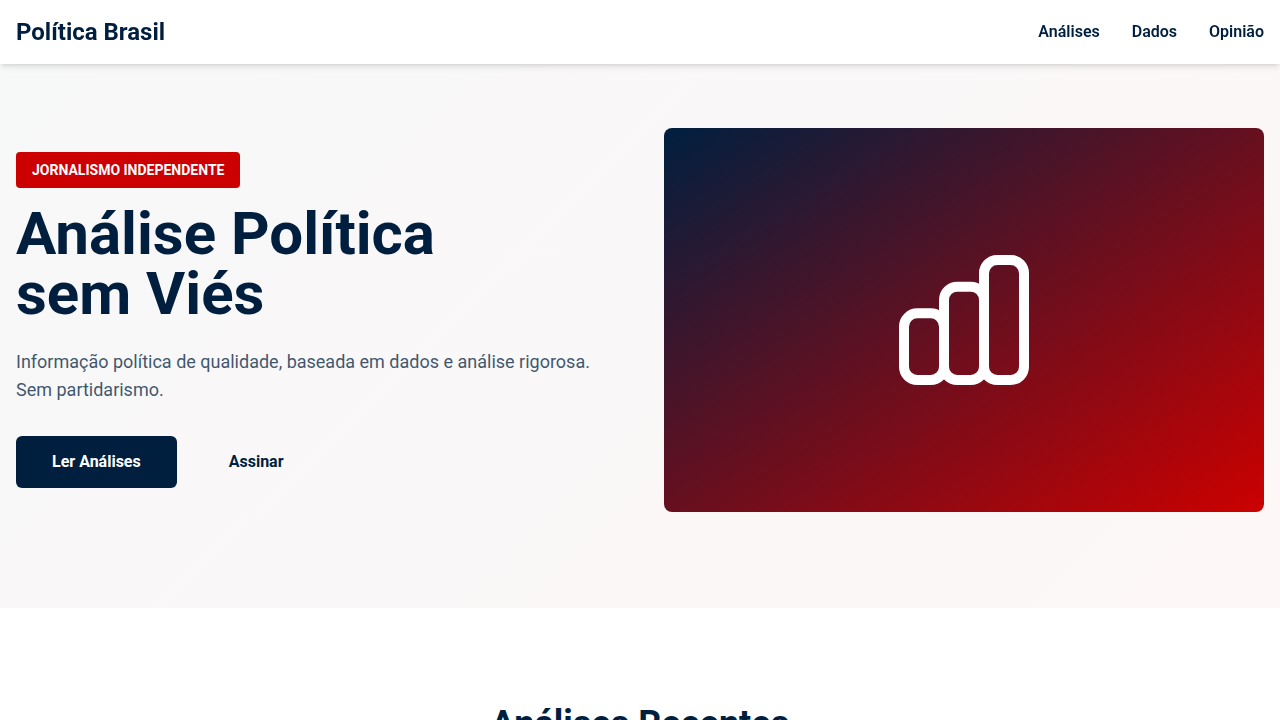
Design an informative and authoritative landing page for a Brazilian political news and analysis platform, inspired by graphic symbolism. Ideal for landing pages, saas. AI-ready template.
Use case: Landing pages, SaaS
Historical Context
Brazilian political design carries a weight that most editorial systems never have to reckon with. The country's democratic history is young — punctuated by military rule, re-democratization, and a media landscape that swings between fierce partisanship and performative neutrality. Designing for political journalism here means navigating a minefield where color alone can signal allegiance. Green-and-yellow, red, blue — every hue is claimed territory. The best Brazilian analysis platforms learned this the hard way. Folha's restraint, Nexo's deliberate coolness, Piauí's literary detachment — each found a different path to the same destination: authority without tribal signaling. The challenge isn't just aesthetic. It's epistemic. How do you visually communicate rigor when half your audience assumes you're already compromised? What emerged is a distinctly Brazilian editorial grammar. Heavy on typography, cautious with iconography, allergic to the flag-waving maximalism that dominates campaign material. The negative space does the work. Sobriety becomes the brand.
When to Use
When building platforms that cover Brazilian politics — news desks, think tank publications, civic tech tools, legislative trackers. Equally relevant for election dashboards, policy explainers, and any interface where perceived neutrality is a design requirement, not a nice-to-have. Reach for this when your users span the political spectrum and your credibility depends on none of them feeling targeted or pandered to.
Design Principles
- Chromatic neutrality as structural commitment — restrict palette to grays, deep navy, and muted earth tones; reserve saturated political colors exclusively for data encoding with explicit legends
- Typographic authority over symbolic shorthand — let serif headlines and generous whitespace establish gravitas instead of relying on crests, flags, or institutional iconography that carries partisan baggage
- Information density without editorial temperature — present complexity through layered data and clear hierarchy, never through visual urgency or alarm-state design patterns
- Deliberate asymmetry in comparative layouts — when showing opposing positions, resist mirrored structures that imply false equivalence; let content weight determine spatial allocation
- Institutional sobriety with human entry points — maintain the restraint of academic publishing but break it strategically with photojournalism, pull quotes, and narrative pacing that keeps civic engagement accessible
DESIGN.md
---
version: "alpha"
name: "Símbolos Políticos Brasileiros"
description: "Design an informative and authoritative landing page for a Brazilian political news and analysis platform, inspired by graphic symbolism. Ideal for landing pages, saas. AI-ready template."
colors:
  primary: "#001F3F"
  secondary: "#FFFFFF"
  tertiary: "#CC0000"
  neutral: "#36454F"
  surface: "#2ECC40"
  accent: "#FFD700"
typography:
  h1:
    fontFamily: Roboto
    fontSize: 2.5rem
    fontWeight: 700
  body-md:
    fontFamily: Roboto
    fontSize: 1rem
    fontWeight: 400
components:
  button-primary:
    backgroundColor: "{colors.primary}"
    textColor: "{colors.neutral}"
    padding: 12px
---

## Overview

Design an informative and authoritative landing page for a Brazilian political news and analysis platform, inspired by graphic symbolism. Ideal for landing pages, saas. AI-ready template. Brazilian political design carries a weight that most editorial systems never have to reckon with. The country's democratic history is young — punctuated by military rule, re-democratization, and a media landscape that swings between fierce partisanship and performative neutrality. Designing for political journalism here means navigating a minefield where color alone can signal allegiance. Green-and-yellow, red, blue — every hue is claimed territory.

The best Brazilian analysis platforms learned this the hard way. Folha's restraint, Nexo's deliberate coolness, Piauí's literary detachment — each found a different path to the same destination: authority without tribal signaling. The challenge isn't just aesthetic. It's epistemic. How do you visually communicate rigor when half your audience assumes you're already compromised?

What emerged is a distinctly Brazilian editorial grammar. Heavy on typography, cautious with iconography, allergic to the flag-waving maximalism that dominates campaign material. The negative space does the work. Sobriety becomes the brand.

- Density: 5/10 — Balanced
- Variance: 2/10 — Structured
- Motion: 4/10 — Subtle

- **Style:** Informative, Authoritative, Structured, Critical
- **Keywords:** political news, Brazilian analysis, authoritative, informative, structured, critical, modern, clear, impactful, unbiased
- **Era:** 2026+ Debate Político Digital
- **Light/Dark:** ✓ Full / ✗ No

## Colors

- **Azul Escuro** (#001F3F) — Dark surface, primary background
- **Branco** (#FFFFFF) — Light surface, card backgrounds
- **Vermelho Alerta** (#CC0000) — Error states, destructive actions
- **Cinza Chumbo** (#36454F) — Secondary text, borders, muted elements
- **Verde Esmeralda** (#2ECC40) — Success states, positive indicators
- **Amarelo Ouro** (#FFD700) — Warning states, attention indicators
- **Laranja Vibrante** (#FF8C00) — Warm accent, call-to-action secondary
- **Preto** (#000000) — Deep contrast surface


## Typography

- **Display / Hero:** Roboto — Weight 700, tight tracking, used for headline impact
- **Body:** Roboto — Weight 400, 16px/1.6 line-height, max 72ch per line
- **UI Labels / Captions:** Roboto — 0.875rem, weight 500, slight letter-spacing
- **Monospace:** JetBrains Mono — Used for code, metadata, and technical values

Scale:
- Hero: clamp(2.5rem, 5vw, 4rem)
- H1: 2.25rem
- H2: 1.5rem
- Body: 1rem / 1.6
- Small: 0.875rem


## Layout

- **Grid:** CSS Grid primary. Max-width containment: 1280px centered with 1.5rem side padding.
- **Spacing rhythm:** Balanced. Base unit: 0.5rem (8px).
- **Section vertical gaps:** clamp(4rem, 8vw, 8rem).
- **Hero layout:** Split-screen (text left, visual right).
- **Feature sections:** Zig-zag alternating text+image rows. No 3-equal-columns.
- **Mobile collapse:** All multi-column layouts collapse below 768px. No horizontal overflow.
- **z-index contract:** base (0) / sticky-nav (100) / overlay (200) / modal (300) / toast (500).


## Elevation & Depth

Gráficos abstratos e geométricos que representam dados políticos, tipografia sans-serif técnica e serifada para títulos, infográficos e visualizações de dados complexos, micro-interações de hover com destaque de estatísticas ou citações, transições de seção diretas e sem distrações.

- **Physics:** Ease-out curves, 200-300ms duration. Smooth and predictable.
- **Entry animations:** Fade + translate-Y (16px → 0) over 420ms ease-out. Staggered cascades for lists: 80ms between items.
- **Hover states:** Subtle color shift + shadow adjustment over 200ms.
- **Page transitions:** Fade only (200ms).
- **Performance:** Only transform and opacity animated. No layout-triggering properties.


## Shapes

Base corner radius: 8px. See rounded tokens in front matter for the full scale.


## Components

- **Primary Button:** Subtly rounded (0.5rem) shape. Accent color fill. Hover: 8% darken + subtle lift shadow. Active: -1px translate tactile press. Font weight 600. No outer glows.
- **Secondary / Ghost Button:** Outline variant. 1.5px border in muted color. Text in primary color. Hover: subtle background fill.
- **Cards:** Subtly rounded (0.5rem) corners. Surface background. Subtle shadow (0 2px 12px rgba(0,0,0,0.06)). 1px border stroke.
- **Inputs:** Label above input. 1px border stroke. Focus ring: 2px accent color offset 2px. Error text below in semantic red. No floating labels.
- **Navigation:** Primary surface background. Active item: accent color indicator. Font weight 500 when active.
- **Skeletons:** Shimmer animation matching component dimensions. No circular spinners.
- **Empty States:** Icon-based composition with descriptive text and action button.


## Do's and Don'ts

- No emojis in UI — use icon system only (Lucide, Heroicons)
- No pure black (#000000) — use off-black or charcoal variants
- No oversaturated accent colors (saturation cap: 80%)
- No 3-column equal-width feature layouts — use zig-zag or asymmetric grid
- No `h-screen` — use `min-h-[100dvh]`
- No AI copywriting clichés: "Elevate", "Seamless", "Unleash", "Next-Gen"
- No broken external image links — use picsum.photos or inline SVG
- No generic lorem ipsum in demos

- Do Paleta de cores brasileira verificada
- Do Tipografia hierárquica clara
- Do Responsividade mobile verificada
- Do Contraste WCAG AA verificado
- Do Conteúdo em PT-BR verificado


## Use Case

Landing pages, SaaS
Technical Specs
CSS
background: #FFFFFF, color: #001F3F, border-bottom: 2px solid #CC0000, font-family: "Roboto, sans-serif", transition: all 0.4s ease-in-out, .political-graphic, .data-visualization, .statistic-highlight-hover.
Variables
--dark-blue: #001F3F, --white-bg: #FFFFFF, --alert-red: #CC0000, --lead-grey: #36454F, --black-text: #000000, --border-accent: 2px solid #CC0000, --font-sans: "Roboto, sans-serif", --font-serif: "Merriweather, serif", --data-viz-duration: 0.4s.
Checklist
☐ Paleta de cores brasileira verificada, ☐ Tipografia hierárquica clara, ☐ Responsividade mobile verificada, ☐ Contraste WCAG AA verificado, ☐ Conteúdo em PT-BR verificado
Colors
Primary
Secondary
Effects
Gráficos abstratos e geométricos que representam dados políticos, tipografia sans-serif técnica e serifada para títulos, infográficos e visualizações de dados complexos, micro-interações de hover com destaque de estatísticas ou citações, transições de seção diretas e sem distrações.
Light/Dark
✓ Full / ✗ No
AI Prompt
Act as a Senior Frontend Engineer and Expert UI Designer.
Your task is to code a complete Landing Page on the first attempt.
- Landing Page Theme: <INSERT THEME>
- Sections to add: <INSERT SECTIONS>

Generate the final code immediately following these definitions:

## Style

- **Name:** Símbolos Políticos Brasileiros
- **Type:** Informative, Authoritative, Structured, Critical
- **Keywords:** political news, Brazilian analysis, authoritative, informative, structured, critical, modern, clear, impactful, unbiased
- **Era:** 2026+ Debate Político Digital
- **Light/Dark:** ✓ Full / ✗ No

## Color Palette

- **Primary:** Azul Escuro #001F3F, Branco #FFFFFF, Vermelho Alerta #CC0000, Cinza Chumbo #36454F
- **Secondary:** Verde Esmeralda #2ECC40, Amarelo Ouro #FFD700, Laranja Vibrante #FF8C00, Preto #000000

## Visual Effects

Gráficos abstratos e geométricos que representam dados políticos, tipografia sans-serif técnica e serifada para títulos, infográficos e visualizações de dados complexos, micro-interações de hover com destaque de estatísticas ou citações, transições de seção diretas e sem distrações.

## AI Visual Direction

Design an informative and authoritative landing page for a Brazilian political news and analysis platform, inspired by graphic symbolism. Use: abstract geometric graphics representing political data, technical sans-serif and serif typography for titles, complex infographics and data visualizations, statistics/quote highlight hover micro-interactions, direct distraction-free section transitions, dark blue and alert red accents, critical and unbiased feel.

## CSS Technical

```css
background: #FFFFFF, color: #001F3F, border-bottom: 2px solid #CC0000, font-family: "Roboto, sans-serif", transition: all 0.4s ease-in-out, .political-graphic, .data-visualization, .statistic-highlight-hover.
```

## Design System Variables

```css
--dark-blue: #001F3F, --white-bg: #FFFFFF, --alert-red: #CC0000, --lead-grey: #36454F, --black-text: #000000, --border-accent: 2px solid #CC0000, --font-sans: "Roboto, sans-serif", --font-serif: "Merriweather, serif", --data-viz-duration: 0.4s.
```

## Implementation Checklist

- ☐ Paleta de cores brasileira verificada
- ☐ Tipografia hierárquica clara
- ☐ Responsividade mobile verificada
- ☐ Contraste WCAG AA verificado
- ☐ Conteúdo em PT-BR verificado

## Execution Rules

1. Strictly follow the defined visual style.
2. Use high-quality inline SVG icons (Heroicons or Lucide style) — NEVER use emojis as icons.
3. Add `cursor-pointer` and smooth `hover` states (transition-all) on all interactive elements.
4. Required Page Structure:
   - Navbar (Logo + Links + CTA)
   - Hero Section (Impactful Headline + Subtitle + 2 buttons + 3D/Abstract visual element via CSS)
   - Features (3 cards with icons)
   - Testimonials (3 cards)
   - Pricing (3 tiers, highlight the middle one)
   - Final CTA
   - Full Footer with social links, privacy policy, terms of use, contact and SEO links.
5. All text content must be in English.
6. The visual must be CLEARLY distinct — do not create a "default Bootstrap" design. Force the use of the provided design system variables.
7. Use `<style>` tags in the head for custom classes (especially for complex backdrop-filter effects and animations) that Tailwind CDN doesn't cover.
8. Full Responsiveness: Layout must adapt perfectly to Mobile, Tablet and Desktop (vertical stack on mobile).
9. Include basic SEO, Viewport and Open Graph meta tags in `<head>`.
10. Footer must contain: Copyright 2026, Secondary navigation links and Social media icons.
11. Make the creative decisions needed to deliver the complete, functional result now.
Related
Last synced: 4/1/2026