Sentry Purple Debugger
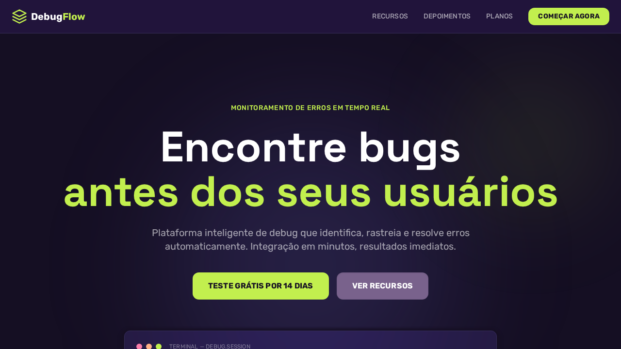
Sentry-inspired dark purple developer landing page. Ideal for monitoramento de erros, devops, ferramentas developer, observabilidade. AI-ready template.
Use case: Monitoramento de erros, DevOps, Tools developer, Observabilidade
Historical Context
Purple has always been the color of the liminal — the space between known and unknown. In debugging, that's exactly where you live. Sentry didn't stumble into purple by accident. Their brand evolution from generic error logging to full observability platform demanded a color that said 'we see what others miss.' The deep violet spectrum communicates both the technical depth of stack traces and the almost mystical act of finding a needle in a haystack of production logs. This palette draws from the lineage of terminal aesthetics meeting futurism. Think of the purple glow of CRT monitors at 3am, the neon signage of cyberpunk interfaces, the phosphor burn of a debugger stepping through memory. It's not decorative — it's functional mythology. The color carries meaning before a single word is read: something is being investigated, dissected, understood. The futuristic angle isn't about chrome and gradients. It's about the confidence that comes from tooling that actually works. Purple here is assertive, not playful. It says 'we caught the error before your users did.' That's the energy this system channels — vigilance dressed in violet.
When to Use
Reach for this when building interfaces where attention equals uptime. Error tracking dashboards, debugging tool UIs, observability platforms, incident response screens — anywhere the user needs to parse dense technical information without fatigue. The purple-dominant palette reduces cognitive load on repetitive scanning tasks while maintaining enough contrast to surface critical alerts. Avoid it for consumer-facing happy-path flows. This is a war room palette, not a welcome mat.
Design Principles
- Severity through saturation — reserve full-intensity purple for actionable errors, desaturate for resolved or informational states
- Dark canvas, bright signals — assume dark mode as default; the interface should feel like a control room, not a spreadsheet
- Typography carries hierarchy, not color alone — when everything is purple, type weight and spacing do the heavy lifting
- Motion implies state change — animate only when data transitions between states; stillness means stability
- Density is a feature — developers don't want whitespace therapy, they want information architecture that respects their expertise
DESIGN.md
---
version: "alpha"
name: "Sentry Purple Debugger"
description: "Sentry-inspired dark purple developer landing page. Ideal for monitoramento de erros, devops, ferramentas developer, observabilidade. AI-ready template."
colors:
  primary: "#1f1633"
  secondary: "#150f23"
  tertiary: "#ffffff"
  neutral: "#c2ef4e"
  surface: "#6a5fc1"
  accent: "#79628c"
typography:
  h1:
    fontFamily: Rubik
    fontSize: 2.5rem
    fontWeight: 700
  body-md:
    fontFamily: Rubik
    fontSize: 1rem
    fontWeight: 400
rounded:
  sm: 13px
  md: 26px
  lg: 39px
components:
  button-primary:
    backgroundColor: "{colors.primary}"
    textColor: "{colors.neutral}"
    rounded: "{rounded.sm}"
    padding: 12px
---

## Overview

Sentry-inspired dark purple developer landing page. Ideal for monitoramento de erros, devops, ferramentas developer, observabilidade. AI-ready template. Purple has always been the color of the liminal — the space between known and unknown. In debugging, that's exactly where you live. Sentry didn't stumble into purple by accident. Their brand evolution from generic error logging to full observability platform demanded a color that said 'we see what others miss.' The deep violet spectrum communicates both the technical depth of stack traces and the almost mystical act of finding a needle in a haystack of production logs.

This palette draws from the lineage of terminal aesthetics meeting futurism. Think of the purple glow of CRT monitors at 3am, the neon signage of cyberpunk interfaces, the phosphor burn of a debugger stepping through memory. It's not decorative — it's functional mythology. The color carries meaning before a single word is read: something is being investigated, dissected, understood.

The futuristic angle isn't about chrome and gradients. It's about the confidence that comes from tooling that actually works. Purple here is assertive, not playful. It says 'we caught the error before your users did.' That's the energy this system channels — vigilance dressed in violet.

- Density: 5/10 — Balanced
- Variance: 4/10 — Moderate
- Motion: 4/10 — Subtle

- **Style:** Dark Purple IDE, Lime-Green Accent, Inset Button Shadows, Frosted Glass, Dual Display Fonts
- **Keywords:** sentry, purple, debugger, dark IDE, lime green, inset shadows, frosted glass, Rubik, uppercase labels, ambient glow, developer tool
- **Era:** 2024-2026 Developer Error Monitoring
- **Light/Dark:** ✗ Not Recommended / ✓ Full

## Colors

- **Roxo Profundo** (#1f1633) — Primary background surface
- **Roxo Escuro** (#150f23) — Dark surface, primary background
- **Branco** (#ffffff) — Light surface, card backgrounds
- **Verde Lima** (#c2ef4e) — Supporting palette color
- **Roxo Sentry** (#6a5fc1) — Accent color, emphasis elements
- **Roxo Muted** (#79628c) — Secondary text, borders, muted elements
- **Coral** (#ffb287) — Extended palette, decorative use
- **Rosa** (#fa7faa) — Decorative accent, highlight elements


## Typography

- **Display / Hero:** Rubik — Weight 700, tight tracking, used for headline impact
- **Body:** Rubik — Weight 400, 16px/1.6 line-height, max 72ch per line
- **UI Labels / Captions:** Rubik — 0.875rem, weight 500, slight letter-spacing
- **Monospace:** JetBrains Mono — Used for code, metadata, and technical values

Scale:
- Hero: clamp(2.5rem, 5vw, 4rem)
- H1: 2.25rem
- H2: 1.5rem
- Body: 1rem / 1.6
- Small: 0.875rem


## Layout

- **Grid:** CSS Grid primary. Max-width containment: 1280px centered with 1.5rem side padding.
- **Spacing rhythm:** Balanced. Base unit: 0.5rem (8px).
- **Section vertical gaps:** clamp(4rem, 8vw, 8rem).
- **Hero layout:** Split-screen (text left, visual right).
- **Feature sections:** Zig-zag alternating text+image rows. No 3-equal-columns.
- **Mobile collapse:** All multi-column layouts collapse below 768px. No horizontal overflow.
- **z-index contract:** base (0) / sticky-nav (100) / overlay (200) / modal (300) / toast (500).


## Elevation & Depth

Fundos purple-black (#1f1633, #150f23) evocando sessões de debug noturnas. Verde lima (#c2ef4e) como acento de alta visibilidade — usado com parcimônia para máximo impacto. Botões com inset shadows (rgba(0,0,0,0.1) 0px 1px 3px inset) criando qualidade tátil. Efeitos frosted glass (blur(18px) saturate(180%)). Font display com personalidade para hero (88px weight 700). Rubik como font UI com sistema uppercase + letter-spacing 0.2px. Ambient glow roxo (rgba(22,15,36,0.9)).

- **Physics:** Ease-out curves, 200-300ms duration. Smooth and predictable.
- **Entry animations:** Fade + translate-Y (16px → 0) over 420ms ease-out. Staggered cascades for lists: 80ms between items.
- **Hover states:** Subtle color shift + shadow adjustment over 200ms.
- **Page transitions:** Fade only (200ms).
- **Performance:** Only transform and opacity animated. No layout-triggering properties.


## Shapes

Base corner radius: 13px. See rounded tokens in front matter for the full scale.


## Components

- **Primary Button:** Rounded (13px buttons) shape. Accent color fill. Hover: 8% darken + subtle lift shadow. Active: -1px translate tactile press. Font weight 600. No outer glows.
- **Secondary / Ghost Button:** Outline variant. 1.5px border in muted color. Text in primary color. Hover: subtle background fill.
- **Cards:** Rounded (13px buttons) corners. Surface background. Subtle shadow (0 2px 12px rgba(0,0,0,0.06)). 1px border stroke.
- **Inputs:** Label above input. 1px border stroke. Focus ring: 2px accent color offset 2px. Error text below in semantic red. No floating labels.
- **Navigation:** Primary surface background. Active item: accent color indicator. Font weight 500 when active.
- **Skeletons:** Shimmer animation matching component dimensions. No circular spinners.
- **Empty States:** Icon-based composition with descriptive text and action button.


## Do's and Don'ts

- No emojis in UI — use icon system only (Lucide, Heroicons)
- No pure white (#FFFFFF) backgrounds — use off-white or dark surfaces
- No oversaturated accent colors (saturation cap: 80%)
- No 3-column equal-width feature layouts — use zig-zag or asymmetric grid
- No `h-screen` — use `min-h-[100dvh]`
- No AI copywriting clichés: "Elevate", "Seamless", "Unleash", "Next-Gen"
- No broken external image links — use picsum.photos or inline SVG
- No generic lorem ipsum in demos

- Do Fundos purple-black
- Do Verde lima #c2ef4e sparingly
- Do Inset shadows em botões
- Do Frosted glass blur(18px)
- Do Display 88px weight 700
- Do Rubik UI com uppercase
- Do Ambient glow roxo
- Do Responsivo


## Use Case

Monitoramento de erros, DevOps, Tools developer, Observabilidade
Technical Specs
CSS
background:#1f1633;color:#ffffff;accent:#c2ef4e;button-bg:#79628c;box-shadow:rgba(0,0,0,0.1) 0px 1px 3px 0px inset;backdrop-filter:blur(18px) saturate(180%);font-family:Rubik,system-ui;border-radius:13px buttons,12px cards;letter-spacing:0.2px uppercase
Variables
--bg-primary:#1f1633;--bg-deep:#150f23;--text:#ffffff;--lime:#c2ef4e;--purple:#6a5fc1;--muted-purple:#79628c;--coral:#ffb287;--pink:#fa7faa;--border:#362d59;--radius-btn:13px;--radius-card:12px
Checklist
☐ Fundos purple-black, ☐ Verde lima #c2ef4e sparingly, ☐ Inset shadows em botões, ☐ Frosted glass blur(18px), ☐ Display 88px weight 700, ☐ Rubik UI com uppercase, ☐ Ambient glow roxo, ☐ Responsivo
Colors
Primary
Secondary
Effects
Fundos purple-black (#1f1633, #150f23) evocando sessões de debug noturnas. Verde lima (#c2ef4e) como acento de alta visibilidade — usado com parcimônia para máximo impacto. Botões com inset shadows (rgba(0,0,0,0.1) 0px 1px 3px inset) criando qualidade tátil. Efeitos frosted glass (blur(18px) saturate(180%)). Font display com personalidade para hero (88px weight 700). Rubik como font UI com sistema uppercase + letter-spacing 0.2px. Ambient glow roxo (rgba(22,15,36,0.9)).
Light/Dark
✗ Not Recommended / ✓ Full
AI Prompt
Act as a Senior Frontend Engineer and Expert UI Designer.
Your task is to code a complete Landing Page on the first attempt.
- Landing Page Theme: <INSERT THEME>
- Sections to add: <INSERT SECTIONS>

Generate the final code immediately following these definitions:

## Style

- **Name:** Sentry Purple Debugger
- **Type:** Dark Purple IDE, Lime-Green Accent, Inset Button Shadows, Frosted Glass, Dual Display Fonts
- **Keywords:** sentry, purple, debugger, dark IDE, lime green, inset shadows, frosted glass, Rubik, uppercase labels, ambient glow, developer tool
- **Era:** 2024-2026 Developer Error Monitoring
- **Light/Dark:** ✗ Not Recommended / ✓ Full

## Color Palette

- **Primary:** Roxo Profundo #1f1633, Roxo Escuro #150f23, Branco #ffffff, Verde Lima #c2ef4e
- **Secondary:** Roxo Sentry #6a5fc1, Roxo Muted #79628c, Coral #ffb287, Rosa #fa7faa

## Visual Effects

Fundos purple-black (#1f1633, #150f23) evocando sessões de debug noturnas. Verde lima (#c2ef4e) como acento de alta visibilidade — usado com parcimônia para máximo impacto. Botões com inset shadows (rgba(0,0,0,0.1) 0px 1px 3px inset) criando qualidade tátil. Efeitos frosted glass (blur(18px) saturate(180%)). Font display com personalidade para hero (88px weight 700). Rubik como font UI com sistema uppercase + letter-spacing 0.2px. Ambient glow roxo (rgba(22,15,36,0.9)).

## AI Visual Direction

Design a Sentry-inspired dark purple developer landing page. Deep purple-black backgrounds (#1f1633, #150f23) — never pure black. Lime-green accent (#c2ef4e) for high-visibility highlights. Muted purple buttons (#79628c) with inset shadow (rgba(0,0,0,0.1) 0px 1px 3px inset) for tactile feel. Frosted glass effects (backdrop-filter: blur(18px) saturate(180%)). Display font at 88px weight 700 for hero. Rubik for all UI text. Uppercase labels with 0.2px letter-spacing. Ambient purple glow (rgba(22,15,36,0.9) 0px 4px 4px 9px).

## CSS Technical

```css
background:#1f1633;color:#ffffff;accent:#c2ef4e;button-bg:#79628c;box-shadow:rgba(0,0,0,0.1) 0px 1px 3px 0px inset;backdrop-filter:blur(18px) saturate(180%);font-family:Rubik,system-ui;border-radius:13px buttons,12px cards;letter-spacing:0.2px uppercase
```

## Design System Variables

```css
--bg-primary:#1f1633;--bg-deep:#150f23;--text:#ffffff;--lime:#c2ef4e;--purple:#6a5fc1;--muted-purple:#79628c;--coral:#ffb287;--pink:#fa7faa;--border:#362d59;--radius-btn:13px;--radius-card:12px
```

## Implementation Checklist

- ☐ Fundos purple-black
- ☐ Verde lima #c2ef4e sparingly
- ☐ Inset shadows em botões
- ☐ Frosted glass blur(18px)
- ☐ Display 88px weight 700
- ☐ Rubik UI com uppercase
- ☐ Ambient glow roxo
- ☐ Responsivo

## Execution Rules

1. Strictly follow the defined visual style.
2. Use high-quality inline SVG icons (Heroicons or Lucide style) — NEVER use emojis as icons.
3. Add `cursor-pointer` and smooth `hover` states (transition-all) on all interactive elements.
4. Required Page Structure:
   - Navbar (Logo + Links + CTA)
   - Hero Section (Impactful Headline + Subtitle + 2 buttons + 3D/Abstract visual element via CSS)
   - Features (3 cards with icons)
   - Testimonials (3 cards)
   - Pricing (3 tiers, highlight the middle one)
   - Final CTA
   - Full Footer with social links, privacy policy, terms of use, contact and SEO links.
5. All text content must be in English.
6. The visual must be CLEARLY distinct — do not create a "default Bootstrap" design. Force the use of the provided design system variables.
7. Use `<style>` tags in the head for custom classes (especially for complex backdrop-filter effects and animations) that Tailwind CDN doesn't cover.
8. Full Responsiveness: Layout must adapt perfectly to Mobile, Tablet and Desktop (vertical stack on mobile).
9. Include basic SEO, Viewport and Open Graph meta tags in `<head>`.
10. Footer must contain: Copyright 2026, Secondary navigation links and Social media icons.
11. Make the creative decisions needed to deliver the complete, functional result now.
Related
Last synced: 4/1/2026