Retro Zine
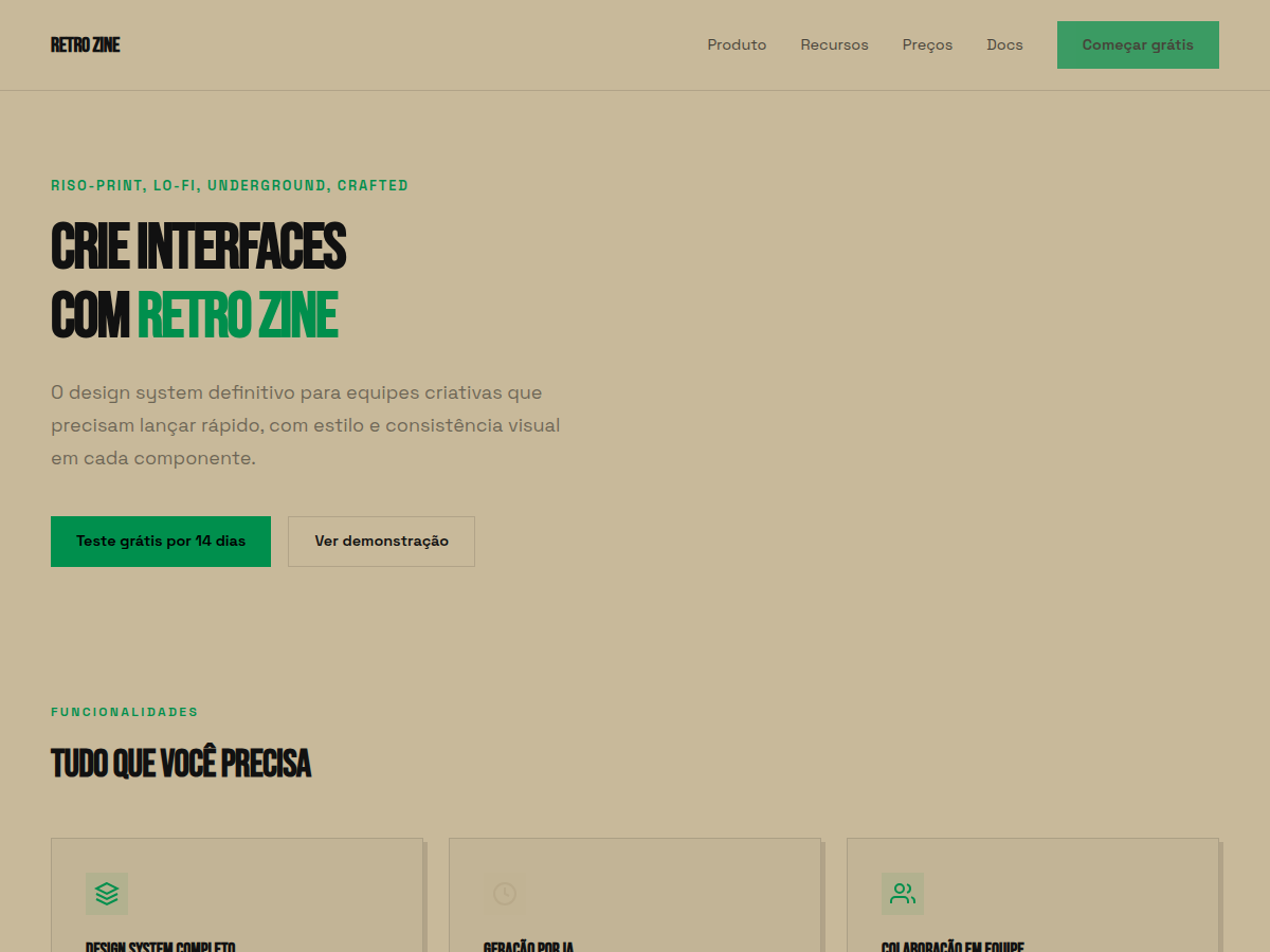
Retro Zine — Beige paper with green accent and Bebas Neue + Caveat: a riso-printed zine in HTML form. Bebas Neue typography. warm beige / khaki paper with one saturated forest green. Best for indie zine / publication, music or arts brand, creator portfolio. AI-ready design system.
Use case: indie zine / publication, music or arts brand, creator portfolio, small-batch / craft launch, cultural / community deck
Historical Context
Risograph printing wasn't supposed to become an aesthetic. It was a Japanese office duplicator from the 1980s — Riso Kagaku's answer to expensive offset runs. Churches printed bulletins on it. Schools cranked out worksheets. The machine was fast, cheap, and imperfect in ways nobody cared about because the output was disposable. Then zine makers got their hands on it. By the mid-2000s, independent publishers realized that the soy-based inks, the slight misregistration between color passes, the grain of the drum — all of it produced something that felt alive in a way laser printers never could. The limitations became the language. Beige uncoated stock wasn't a budget compromise anymore; it was a deliberate canvas that let spot colors sing differently than they would on bright white. The green accent specifically traces back to the fluorescent ink cartridges Riso offered — colors you literally cannot reproduce in CMYK. That constraint bred a whole visual culture: limited palettes, overprint surprises, happy accidents elevated to design decisions. It's print culture's answer to lo-fi music production.
When to Use
When your project needs to feel made by hands, not committees. Retro Zine works for indie publishers who want their digital presence to carry the same tactile energy as their printed output. It's right for art collectives announcing shows, DIY brands that reject corporate polish, and anyone whose audience reads "rough" as "authentic" rather than "unfinished." Avoid it for anything requiring institutional trust — banks, healthcare, legal. The aesthetic signals counterculture on purpose.
Design Principles
- Embrace misregistration — offset elements by 1-3px intentionally. Perfect alignment kills the entire premise.
- Limit your palette brutally. Two spot colors plus the paper tone. If you need a third color, get it through overprint, not a new swatch.
- Paper texture is structural, not decorative. The beige ground should influence every color choice — nothing exists in isolation from the stock.
- Typography should reference mechanical reproduction: typewriter faces, hand-lettered headers, or tight grotesks that nod to paste-up layout. Never use geometric sans-serifs that scream digital-native.
- Let ink coverage be uneven. Grain, halftone dots, and density variation are features. The moment everything looks uniformly smooth, you've lost the plot.
DESIGN.md
---
version: "alpha"
name: "Retro Zine"
description: "Retro Zine — Beige paper with green accent and Bebas Neue + Caveat: a riso-printed zine in HTML form. Bebas Neue typography. warm beige / khaki paper with one saturated forest green. Best for indie zine / publication, music or arts brand, creator portfolio. AI-ready design system."
colors:
  primary: "#C8B99A"
  secondary: "#B8A98A"
  tertiary: "#008F4D"
  neutral: "#00A85D"
  surface: "#1A1A1A"
  accent: "#F4EFE6"
typography:
  h1:
    fontFamily: Bebas Neue
    fontSize: 2.5rem
    fontWeight: 700
  body-md:
    fontFamily: Bebas Neue
    fontSize: 1rem
    fontWeight: 400
spacing:
  sm: 1.5rem
  md: 3.0rem
  lg: 6.0rem
components:
  button-primary:
    backgroundColor: "{colors.primary}"
    textColor: "{colors.neutral}"
    padding: 12px
---

## Overview

Retro Zine — Beige paper with green accent and Bebas Neue + Caveat: a riso-printed zine in HTML form. Bebas Neue typography. warm beige / khaki paper with one saturated forest green. Best for indie zine / publication, music or arts brand, creator portfolio. AI-ready design system. Risograph printing wasn't supposed to become an aesthetic. It was a Japanese office duplicator from the 1980s — Riso Kagaku's answer to expensive offset runs. Churches printed bulletins on it. Schools cranked out worksheets. The machine was fast, cheap, and imperfect in ways nobody cared about because the output was disposable.

Then zine makers got their hands on it. By the mid-2000s, independent publishers realized that the soy-based inks, the slight misregistration between color passes, the grain of the drum — all of it produced something that felt alive in a way laser printers never could. The limitations became the language. Beige uncoated stock wasn't a budget compromise anymore; it was a deliberate canvas that let spot colors sing differently than they would on bright white.

The green accent specifically traces back to the fluorescent ink cartridges Riso offered — colors you literally cannot reproduce in CMYK. That constraint bred a whole visual culture: limited palettes, overprint surprises, happy accidents elevated to design decisions. It's print culture's answer to lo-fi music production.

- Density: 5/10 — Balanced
- Variance: 5/10 — Moderate
- Motion: 4/10 — Subtle

- **Style:** Riso-Print, Lo-Fi, Underground, Crafted
- **Keywords:** Riso-print, beige paper, green accent, Bebas Neue, Caveat, lo-fi, underground, crafted
- **Era:** 1980s Retro
- **Light/Dark:** ✓ Full / ✗ None

## Colors

- **Bg** (#C8B99A) — Primary surface or dominant color
- **Bg Dark** (#B8A98A) — Accent highlight, links and focus states
- **Green** (#008F4D) — Secondary accent
- **Green Light** (#00A85D) — Accent color, emphasis elements
- **Black** (#1A1A1A) — Extended palette, decorative use
- **White** (#F4EFE6) — Background alternate


## Typography

- **Display / Hero:** Bebas Neue — Weight 700, tight tracking, used for headline impact
- **Body:** Space Grotesk — Weight 400, 16px/1.6 line-height, max 72ch per line
- **UI Labels / Captions:** Space Grotesk — 0.875rem, weight 500, slight letter-spacing
- **Monospace:** JetBrains Mono — Used for code, metadata, and technical values

Scale:
- Hero: clamp(2.5rem, 5vw, 4rem)
- H1: 2.25rem
- H2: 1.5rem
- Body: 1rem / 1.6
- Small: 0.875rem


## Layout

- **Grid:** CSS Grid primary. Max-width containment: 1280px centered with 1.5rem side padding.
- **Spacing rhythm:** Balanced. Base unit: 0.5rem (8px).
- **Section vertical gaps:** clamp(4rem, 8vw, 8rem).
- **Hero layout:** Split-screen (text left, visual right).
- **Feature sections:** Zig-zag alternating text+image rows. No 3-equal-columns.
- **Mobile collapse:** All multi-column layouts collapse below 768px. No horizontal overflow.
- **z-index contract:** base (0) / sticky-nav (100) / overlay (200) / modal (300) / toast (500).


## Elevation & Depth

display font Bebas Neue for hero headlines, smooth hover transitions (200-250ms), subtle lift shadows, riso-print grain texture, beige paper, green accent, Caveat handwriting

- **Physics:** Ease-out curves, 200-300ms duration. Smooth and predictable.
- **Entry animations:** Fade + translate-Y (16px → 0) over 420ms ease-out. Staggered cascades for lists: 80ms between items.
- **Hover states:** Subtle color shift + shadow adjustment over 200ms.
- **Page transitions:** Fade only (200ms).
- **Performance:** Only transform and opacity animated. No layout-triggering properties.


## Shapes

Base corner radius: 0px. See rounded tokens in front matter for the full scale.


## Components

- **Primary Button:** 0px border-radius. Accent color fill. Hover: 8% darken + subtle lift shadow. Active: -1px translate tactile press. Font weight 600. No outer glows.
- **Secondary / Ghost Button:** Outline variant. 1.5px border in muted color. Text in primary color. Hover: subtle background fill.
- **Cards:** 0px corners. Surface background. Subtle shadow (0 2px 12px rgba(0,0,0,0.06)). 1px border stroke.
- **Inputs:** Label above input. 1px border stroke. Focus ring: 2px accent color offset 2px. Error text below in semantic red. No floating labels.
- **Navigation:** Primary surface background. Active item: accent color indicator. Font weight 500 when active.
- **Skeletons:** Shimmer animation matching component dimensions. No circular spinners.
- **Empty States:** Icon-based composition with descriptive text and action button.


## Do's and Don'ts

- No emojis in UI — use icon system only (Lucide, Heroicons)
- No pure black (#000000) — use off-black or charcoal variants
- No oversaturated accent colors (saturation cap: 80%)
- No 3-column equal-width feature layouts — use zig-zag or asymmetric grid
- No `h-screen` — use `min-h-[100dvh]`
- No AI copywriting clichés: "Elevate", "Seamless", "Unleash", "Next-Gen"
- No broken external image links — use picsum.photos or inline SVG
- No generic lorem ipsum in demos

- Do Bebas Neue display font loaded via Google Fonts
- Do Color palette variables applied consistently
- Do Typography scale: hero clamp(2.5rem,5vw,4rem)
- Do H1 2.25rem
- Do body 1rem/1.6
- Do WCAG AA contrast ratio verified (4.5:1 body text)
- Do Mobile responsive layout (stack below 768px)


## Use Case

indie zine / publication, music or arts brand, creator portfolio, small-batch / craft launch, cultural / community deck
Technical Specs
CSS
font-family: 'Bebas Neue', sans-serif; background: #EDE5CC; color: #1A1A1A; --accent: #4A7A50; border: 2px solid #1A1A1A; font-size: clamp(2rem,5vw,4rem)
Variables
--bg: #C8B99A, --fg: #111111, --accent: #008F4D, --font-display: 'Bebas Neue', --font-body: 'Space Grotesk', --radius: 0px, --spacing: 1.5rem
Checklist
☐ Bebas Neue display font loaded via Google Fonts, ☐ Color palette variables applied consistently, ☐ Typography scale: hero clamp(2.5rem,5vw,4rem), H1 2.25rem, body 1rem/1.6, ☐ WCAG AA contrast ratio verified (4.5:1 body text), ☐ Mobile responsive layout (stack below 768px)
Colors
Primary
Secondary
Effects
display font Bebas Neue for hero headlines, smooth hover transitions (200-250ms), subtle lift shadows, riso-print grain texture, beige paper, green accent, Caveat handwriting
Light/Dark
✓ Full / ✗ None
AI Prompt
Act as a Senior Frontend Engineer and Expert UI Designer.
Your task is to code a complete Landing Page on the first attempt.
- Landing Page Theme: <INSERT THEME>
- Sections to add: <INSERT SECTIONS>

Generate the final code immediately following these definitions:

## Style

- **Name:** Retro Zine
- **Type:** Riso-Print, Lo-Fi, Underground, Crafted
- **Keywords:** Riso-print, beige paper, green accent, Bebas Neue, Caveat, lo-fi, underground, crafted
- **Era:** 1980s Retro
- **Light/Dark:** ✓ Full / ✗ None

## Color Palette

- **Primary:** Bg #C8B99A, Bg Dark #B8A98A, Green #008F4D
- **Secondary:** Green Light #00A85D, Black #1A1A1A, White #F4EFE6

## Visual Effects

display font Bebas Neue for hero headlines, smooth hover transitions (200-250ms), subtle lift shadows, riso-print grain texture, beige paper, green accent, Caveat handwriting

## AI Visual Direction

Design a riso-print zine editorial on beige paper (#EDE5CC). Use: forest green accent (#4A7A50) as ONLY accent, Bebas Neue for massive headlines, Caveat handwriting for subheads, 2px ink borders, grain/noise CSS texture overlay. Lo-fi and crafted.

## CSS Technical

```css
font-family: 'Bebas Neue', sans-serif; background: #EDE5CC; color: #1A1A1A; --accent: #4A7A50; border: 2px solid #1A1A1A; font-size: clamp(2rem,5vw,4rem)
```

## Design System Variables

```css
--bg: #C8B99A, --fg: #111111, --accent: #008F4D, --font-display: 'Bebas Neue', --font-body: 'Space Grotesk', --radius: 0px, --spacing: 1.5rem
```

## Implementation Checklist

- ☐ Bebas Neue display font loaded via Google Fonts
- ☐ Color palette variables applied consistently
- ☐ Typography scale: hero clamp(2.5rem,5vw,4rem)
- H1 2.25rem
- body 1rem/1.6
- ☐ WCAG AA contrast ratio verified (4.5:1 body text)
- ☐ Mobile responsive layout (stack below 768px)

## Execution Rules

1. Strictly follow the defined visual style.
2. Use high-quality inline SVG icons (Heroicons or Lucide style) — NEVER use emojis as icons.
3. Add `cursor-pointer` and smooth `hover` states (transition-all) on all interactive elements.
4. Required Page Structure:
   - Navbar (Logo + Links + CTA)
   - Hero Section (Impactful Headline + Subtitle + 2 buttons + 3D/Abstract visual element via CSS)
   - Features (3 cards with icons)
   - Testimonials (3 cards)
   - Pricing (3 tiers, highlight the middle one)
   - Final CTA
   - Full Footer with social links, privacy policy, terms of use, contact and SEO links.
5. All text content must be in English.
6. The visual must be CLEARLY distinct — do not create a "default Bootstrap" design. Force the use of the provided design system variables.
7. Use `<style>` tags in the head for custom classes (especially for complex backdrop-filter effects and animations) that Tailwind CDN doesn't cover.
8. Full Responsiveness: Layout must adapt perfectly to Mobile, Tablet and Desktop (vertical stack on mobile).
9. Include basic SEO, Viewport and Open Graph meta tags in `<head>`.
10. Footer must contain: Copyright 2026, Secondary navigation links and Social media icons.
11. Make the creative decisions needed to deliver the complete, functional result now.
Related
Last synced: 5/6/2026