Retro Windows
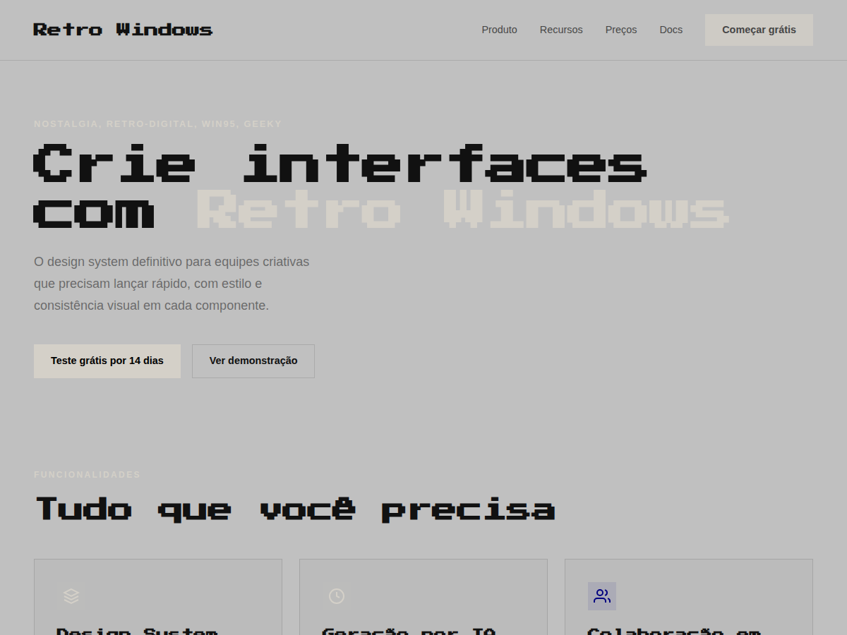
Retro Windows — Windows 95 chrome: gray title bars, MS Sans Serif, pixel typography, full nostalgia. Press Start 2P typography. Windows 95 system palette: 3D-button gray, navy title bars, pixel-perfect inset/. Best for retro gaming pitch, Y2K brand, creator portfolio (90s aesthetic). AI-ready design system.
Use case: retro gaming pitch, Y2K brand, creator portfolio (90s aesthetic), tech-history talk, shitpost-but-make-it-fancy deck
Historical Context
Windows 95 wasn't just an operating system — it was the entire visual vocabulary of personal computing for a decade. That grey chrome, those beveled buttons, the inset borders that made every panel feel like a physical object you could press. Microsoft's design team built a UI language rooted in skeuomorphism before we had a word for it: raised surfaces caught light from the top-left, depressed areas fell into shadow at the bottom-right. It was consistent, learnable, and brutally systematic. The aesthetic died slowly through XP's Fisher-Price curves and Vista's glass fetish, but it never fully disappeared from collective memory. Millennials who grew up dragging Solitaire cards and customizing Winamp skins carry this visual language in their bones. When developers put Windows 95 dialogs in their portfolio sites or indie games ship with pixel-perfect title bars, they're not just being ironic — they're tapping into a shared understanding of what "computer" looked like before everything went flat. Today the style functions as both genuine nostalgia and deliberate anti-design statement. It says: we remember when interfaces had texture, weight, and a 16-color palette that somehow felt like enough.
When to Use
Deploy this when your audience grew up defragmenting hard drives and knows what a .BMP is. It works for developer tools that want personality without pretension, indie games leaning into retro computing aesthetics, and millennial-targeted brands that want instant emotional recognition. Also effective for humor — error dialogs, fake BSOD screens, loading bars that never finish. Avoid if your users need to actually complete complex tasks efficiently; the chunky borders and system fonts eat screen real estate fast.
Design Principles
- Every surface needs a light source: top-left highlight, bottom-right shadow. No exceptions. The entire illusion collapses if you skip one border.
- System grey (#C0C0C0) is your canvas, not white. The background IS the material — buttons rise from it, wells sink into it.
- Borders do the heavy lifting. Outset for raised elements, inset for input fields and status bars. Two-pixel borders minimum or the 3D effect reads as a rendering glitch.
- Stick to bitmap-friendly type. MS Sans Serif, Tahoma, or their modern equivalents. Anti-aliased display fonts break the illusion immediately.
- Respect the grid of the era: 16px increments, hard pixel alignment, no sub-pixel anything. If it wouldn't render on a 640×480 CRT, reconsider.
DESIGN.md
---
version: "alpha"
name: "Retro Windows"
description: "Retro Windows — Windows 95 chrome: gray title bars, MS Sans Serif, pixel typography, full nostalgia. Press Start 2P typography. Windows 95 system palette: 3D-button gray, navy title bars, pixel-perfect inset/. Best for retro gaming pitch, Y2K brand, creator portfolio (90s aesthetic). AI-ready design system."
colors:
  primary: "#C0C0C0"
  secondary: "#D4D0C8"
  tertiary: "#000080"
  neutral: "#1084D0"
  surface: "#FFFFFF"
  accent: "#000000"
typography:
  h1:
    fontFamily: MS Sans Serif
    fontSize: 2.5rem
    fontWeight: 700
  body-md:
    fontFamily: MS Sans Serif
    fontSize: 1rem
    fontWeight: 400
spacing:
  sm: 1.5rem
  md: 3.0rem
  lg: 6.0rem
components:
  button-primary:
    backgroundColor: "{colors.primary}"
    textColor: "{colors.neutral}"
    padding: 12px
---

## Overview

Retro Windows — Windows 95 chrome: gray title bars, MS Sans Serif, pixel typography, full nostalgia. Press Start 2P typography. Windows 95 system palette: 3D-button gray, navy title bars, pixel-perfect inset/. Best for retro gaming pitch, Y2K brand, creator portfolio (90s aesthetic). AI-ready design system. Windows 95 wasn't just an operating system — it was the entire visual vocabulary of personal computing for a decade. That grey chrome, those beveled buttons, the inset borders that made every panel feel like a physical object you could press. Microsoft's design team built a UI language rooted in skeuomorphism before we had a word for it: raised surfaces caught light from the top-left, depressed areas fell into shadow at the bottom-right. It was consistent, learnable, and brutally systematic.

The aesthetic died slowly through XP's Fisher-Price curves and Vista's glass fetish, but it never fully disappeared from collective memory. Millennials who grew up dragging Solitaire cards and customizing Winamp skins carry this visual language in their bones. When developers put Windows 95 dialogs in their portfolio sites or indie games ship with pixel-perfect title bars, they're not just being ironic — they're tapping into a shared understanding of what "computer" looked like before everything went flat.

Today the style functions as both genuine nostalgia and deliberate anti-design statement. It says: we remember when interfaces had texture, weight, and a 16-color palette that somehow felt like enough.

- Density: 5/10 — Balanced
- Variance: 2/10 — Structured
- Motion: 4/10 — Subtle

- **Style:** Nostalgia, Retro-Digital, Win95, Geeky
- **Keywords:** Windows 95, grey chrome, 3D inset borders, MS Sans Serif, nostalgic, retro, pixelated, geeky
- **Era:** 1990s Digital
- **Light/Dark:** ✓ Full / ✗ None

## Colors

- **Bg Gray** (#C0C0C0) — Primary surface or dominant color
- **Bg Light** (#D4D0C8) — Accent highlight, links and focus states
- **Blue Navy** (#000080) — Secondary accent
- **Blue Light** (#1084D0) — Accent color, emphasis elements
- **White** (#FFFFFF) — Extended palette, decorative use
- **Black** (#000000) — Background alternate


## Typography

- **Display / Hero:** Press Start 2P — Weight 700, tight tracking, used for headline impact
- **Body:** MS Sans Serif — Weight 400, 16px/1.6 line-height, max 72ch per line
- **UI Labels / Captions:** MS Sans Serif — 0.875rem, weight 500, slight letter-spacing
- **Monospace:** VT323 — Used for code, metadata, and technical values

Scale:
- Hero: clamp(2.5rem, 5vw, 4rem)
- H1: 2.25rem
- H2: 1.5rem
- Body: 1rem / 1.6
- Small: 0.875rem


## Layout

- **Grid:** CSS Grid primary. Max-width containment: 1280px centered with 1.5rem side padding.
- **Spacing rhythm:** Balanced. Base unit: 0.5rem (8px).
- **Section vertical gaps:** clamp(4rem, 8vw, 8rem).
- **Hero layout:** Split-screen (text left, visual right).
- **Feature sections:** Zig-zag alternating text+image rows. No 3-equal-columns.
- **Mobile collapse:** All multi-column layouts collapse below 768px. No horizontal overflow.
- **z-index contract:** base (0) / sticky-nav (100) / overlay (200) / modal (300) / toast (500).


## Elevation & Depth

display font Press Start 2P for hero headlines, playful hover animations (scale 1.03, 200ms), bouncy click states, Win95 grey title bars, inset 3D borders (ridge/groove), MS Sans Serif

- **Physics:** Ease-out curves, 200-300ms duration. Smooth and predictable.
- **Entry animations:** Fade + translate-Y (16px → 0) over 420ms ease-out. Staggered cascades for lists: 80ms between items.
- **Hover states:** Subtle color shift + shadow adjustment over 200ms.
- **Page transitions:** Fade only (200ms).
- **Performance:** Only transform and opacity animated. No layout-triggering properties.


## Shapes

Base corner radius: 0px. See rounded tokens in front matter for the full scale.


## Components

- **Primary Button:** 0px border-radius. Accent color fill. Hover: 8% darken + subtle lift shadow. Active: -1px translate tactile press. Font weight 600. No outer glows.
- **Secondary / Ghost Button:** Outline variant. 1.5px border in muted color. Text in primary color. Hover: subtle background fill.
- **Cards:** 0px corners. Surface background. Subtle shadow (0 2px 12px rgba(0,0,0,0.06)). 1px border stroke.
- **Inputs:** Label above input. 1px border stroke. Focus ring: 2px accent color offset 2px. Error text below in semantic red. No floating labels.
- **Navigation:** Primary surface background. Active item: accent color indicator. Font weight 500 when active.
- **Skeletons:** Shimmer animation matching component dimensions. No circular spinners.
- **Empty States:** Icon-based composition with descriptive text and action button.


## Do's and Don'ts

- No emojis in UI — use icon system only (Lucide, Heroicons)
- No pure black (#000000) — use off-black or charcoal variants
- No oversaturated accent colors (saturation cap: 80%)
- No 3-column equal-width feature layouts — use zig-zag or asymmetric grid
- No `h-screen` — use `min-h-[100dvh]`
- No AI copywriting clichés: "Elevate", "Seamless", "Unleash", "Next-Gen"
- No broken external image links — use picsum.photos or inline SVG
- No generic lorem ipsum in demos

- Do Press Start 2P display font loaded via Google Fonts
- Do Color palette variables applied consistently
- Do Typography scale: hero clamp(2.5rem,5vw,4rem)
- Do H1 2.25rem
- Do body 1rem/1.6
- Do WCAG AA contrast ratio verified (4.5:1 body text)
- Do CRT / retro pixel decorations included
- Do Mobile responsive layout (stack below 768px)


## Use Case

retro gaming pitch, Y2K brand, creator portfolio (90s aesthetic), tech-history talk, shitpost-but-make-it-fancy deck
Technical Specs
CSS
font-family: 'MS Sans Serif', system-ui, sans-serif; background: #C0C0C0; color: #000000; border: 2px groove #ffffff; box-shadow: inset 1px 1px #dfdfdf, inset -1px -1px #808080
Variables
--bg: #C0C0C0, --fg: #111111, --accent: #D4D0C8, --font-display: 'Press Start 2P', --font-body: 'MS Sans Serif', --radius: 0px, --spacing: 1.5rem
Checklist
☐ Press Start 2P display font loaded via Google Fonts, ☐ Color palette variables applied consistently, ☐ Typography scale: hero clamp(2.5rem,5vw,4rem), H1 2.25rem, body 1rem/1.6, ☐ WCAG AA contrast ratio verified (4.5:1 body text), ☐ CRT / retro pixel decorations included, ☐ Mobile responsive layout (stack below 768px)
Colors
Primary
Secondary
Effects
display font Press Start 2P for hero headlines, playful hover animations (scale 1.03, 200ms), bouncy click states, Win95 grey title bars, inset 3D borders (ridge/groove), MS Sans Serif
Light/Dark
✓ Full / ✗ None
AI Prompt
Act as a Senior Frontend Engineer and Expert UI Designer.
Your task is to code a complete Landing Page on the first attempt.
- Landing Page Theme: <INSERT THEME>
- Sections to add: <INSERT SECTIONS>

Generate the final code immediately following these definitions:

## Style

- **Name:** Retro Windows
- **Type:** Nostalgia, Retro-Digital, Win95, Geeky
- **Keywords:** Windows 95, grey chrome, 3D inset borders, MS Sans Serif, nostalgic, retro, pixelated, geeky
- **Era:** 1990s Digital
- **Light/Dark:** ✓ Full / ✗ None

## Color Palette

- **Primary:** Bg Gray #C0C0C0, Bg Light #D4D0C8, Blue Navy #000080
- **Secondary:** Blue Light #1084D0, White #FFFFFF, Black #000000

## Visual Effects

display font Press Start 2P for hero headlines, playful hover animations (scale 1.03, 200ms), bouncy click states, Win95 grey title bars, inset 3D borders (ridge/groove), MS Sans Serif

## AI Visual Direction

Design a Windows 95 nostalgia interface. Use: #C0C0C0 grey chrome backgrounds, inset 3D borders (border: 2px groove), MS Sans Serif / system-ui at 11-13px, title bars with deep blue (#000080), pixelated icons, classic dialog box styling. Knowingly retro.

## CSS Technical

```css
font-family: 'MS Sans Serif', system-ui, sans-serif; background: #C0C0C0; color: #000000; border: 2px groove #ffffff; box-shadow: inset 1px 1px #dfdfdf, inset -1px -1px #808080
```

## Design System Variables

```css
--bg: #C0C0C0, --fg: #111111, --accent: #D4D0C8, --font-display: 'Press Start 2P', --font-body: 'MS Sans Serif', --radius: 0px, --spacing: 1.5rem
```

## Implementation Checklist

- ☐ Press Start 2P display font loaded via Google Fonts
- ☐ Color palette variables applied consistently
- ☐ Typography scale: hero clamp(2.5rem,5vw,4rem)
- H1 2.25rem
- body 1rem/1.6
- ☐ WCAG AA contrast ratio verified (4.5:1 body text)
- ☐ CRT / retro pixel decorations included
- ☐ Mobile responsive layout (stack below 768px)

## Execution Rules

1. Strictly follow the defined visual style.
2. Use high-quality inline SVG icons (Heroicons or Lucide style) — NEVER use emojis as icons.
3. Add `cursor-pointer` and smooth `hover` states (transition-all) on all interactive elements.
4. Required Page Structure:
   - Navbar (Logo + Links + CTA)
   - Hero Section (Impactful Headline + Subtitle + 2 buttons + 3D/Abstract visual element via CSS)
   - Features (3 cards with icons)
   - Testimonials (3 cards)
   - Pricing (3 tiers, highlight the middle one)
   - Final CTA
   - Full Footer with social links, privacy policy, terms of use, contact and SEO links.
5. All text content must be in English.
6. The visual must be CLEARLY distinct — do not create a "default Bootstrap" design. Force the use of the provided design system variables.
7. Use `<style>` tags in the head for custom classes (especially for complex backdrop-filter effects and animations) that Tailwind CDN doesn't cover.
8. Full Responsiveness: Layout must adapt perfectly to Mobile, Tablet and Desktop (vertical stack on mobile).
9. Include basic SEO, Viewport and Open Graph meta tags in `<head>`.
10. Footer must contain: Copyright 2026, Secondary navigation links and Social media icons.
11. Make the creative decisions needed to deliver the complete, functional result now.
Related
Last synced: 5/6/2026