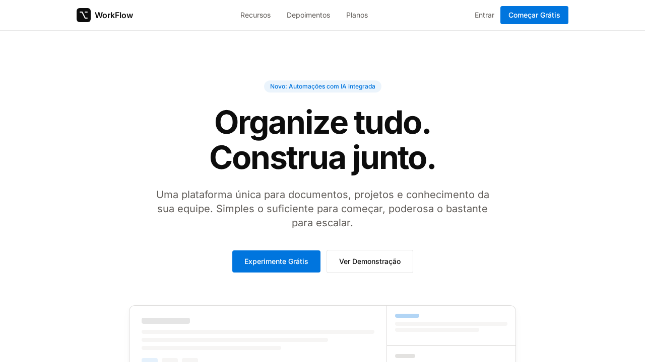
Notion Warm Workspace
Notion-inspired warm workspace landing page. Ideal for ferramentas de produtividade, workspaces colaborativos, gestão de conhecimento, wikis. AI-ready template.
Use case: Tools de produtividade, Workspaces colaborativos, Gestão de conhecimento, Wikis
Historical Context
Before Notion, productivity software lived in two camps: the cold precision of spreadsheets and the chaotic maximalism of project management tools drowning in color-coded labels. Notion quietly rejected both. They looked at Swiss design — the grids, the restraint, the typographic hierarchy — and asked what happens when you warm it up just enough to make a blank page feel like an invitation rather than an obligation. The genius was in what they didn't do. No harsh dividers — just whisper borders that suggest structure without imprisoning content. No aggressive brand colors screaming for attention — just enough warmth in the neutrals to feel like paper rather than a screen. The rounded corners aren't decorative; they're psychological. They tell your brain this tool won't bite. This approach fundamentally changed how we think about collaborative workspaces. Notion proved that productivity software doesn't need to look productive. It needs to look approachable. The warm minimalism became a permission slip: your workspace can be beautiful and functional, structured and human. Every team wiki and personal knowledge base built since owes something to that quiet revolution.
When to Use
Reach for this system when building tools people live inside daily — knowledge bases, collaborative workspaces, documentation platforms, internal wikis. It works when your users need to focus without feeling clinical, and collaborate without visual chaos. Ideal for products where content density is high but cognitive load must stay low. Skip it if your product needs urgency, bold brand expression, or high-energy consumer vibes.
Design Principles
- Whisper borders over hard dividers — suggest hierarchy through 1px lines at 8-12% opacity, never imprison content in boxes
- Warm neutrals as foundation — shift your grays toward cream and sand; screens should feel like quality paper, not backlit plastic
- Typography does the heavy lifting — use weight and size contrast for hierarchy instead of color or decoration; let the type system breathe
- Generous whitespace as a feature — empty space isn't wasted space, it's the product telling users their content matters more than the chrome
- Rounded corners with intent — use consistent, subtle radii (4-6px) to soften without becoming playful; this is calm confidence, not friendliness
DESIGN.md
---
version: "alpha"
name: "Notion Warm Workspace"
description: "Notion-inspired warm workspace landing page. Ideal for ferramentas de produtividade, workspaces colaborativos, gestão de conhecimento, wikis. AI-ready template."
colors:
  primary: "#ffffff"
  secondary: "#0075de"
  tertiary: "#f6f5f4"
  neutral: "#213183"
  surface: "#615d59"
  accent: "#a39e98"
typography:
  h1:
    fontFamily: Inter
    fontSize: 2.5rem
    fontWeight: 700
  body-md:
    fontFamily: Inter
    fontSize: 1rem
    fontWeight: 400
rounded:
  sm: 4px
  md: 8px
  lg: 12px
components:
  button-primary:
    backgroundColor: "{colors.primary}"
    textColor: "{colors.neutral}"
    rounded: "{rounded.sm}"
    padding: 12px
---

## Overview

Notion-inspired warm workspace landing page. Ideal for ferramentas de produtividade, workspaces colaborativos, gestão de conhecimento, wikis. AI-ready template. Before Notion, productivity software lived in two camps: the cold precision of spreadsheets and the chaotic maximalism of project management tools drowning in color-coded labels. Notion quietly rejected both. They looked at Swiss design — the grids, the restraint, the typographic hierarchy — and asked what happens when you warm it up just enough to make a blank page feel like an invitation rather than an obligation.

The genius was in what they didn't do. No harsh dividers — just whisper borders that suggest structure without imprisoning content. No aggressive brand colors screaming for attention — just enough warmth in the neutrals to feel like paper rather than a screen. The rounded corners aren't decorative; they're psychological. They tell your brain this tool won't bite.

This approach fundamentally changed how we think about collaborative workspaces. Notion proved that productivity software doesn't need to look productive. It needs to look approachable. The warm minimalism became a permission slip: your workspace can be beautiful and functional, structured and human. Every team wiki and personal knowledge base built since owes something to that quiet revolution.

- Density: 3/10 — Airy
- Variance: 2/10 — Structured
- Motion: 4/10 — Subtle

- **Style:** Warm Minimalism, Whisper Borders, NotionInter, Blue Accent
- **Keywords:** notion, warm minimalism, whisper borders, warm neutrals, NotionInter, blue accent, multi-layer shadows, workspace aesthetic
- **Era:** 2024-2026 Warm Workspace
- **Light/Dark:** ✓ Full / ✗ Not Recommended

## Colors

- **Branco** (#ffffff) — Light surface, card backgrounds
- **Azul Notion** (#0075de) — Accent highlight, links and focus states
- **Branco Quente** (#f6f5f4) — Light surface, card backgrounds
- **Quase Preto** (rgba(0,0,0,0.95)) — Dark surface, primary background
- **Navy** (#213183) — Extended palette, decorative use
- **Cinza Quente** (#615d59) — Secondary text, borders, muted elements
- **Cinza Claro** (#a39e98) — Secondary text, borders, muted elements
- **Borda** (rgba(0,0,0,0.1)) — Extended palette, decorative use


## Typography

- **Display / Hero:** Inter — Weight 700, tight tracking, used for headline impact
- **Body:** Inter — Weight 400, 16px/1.6 line-height, max 72ch per line
- **UI Labels / Captions:** Inter — 0.875rem, weight 500, slight letter-spacing
- **Monospace:** JetBrains Mono — Used for code, metadata, and technical values

Scale:
- Hero: clamp(2.5rem, 5vw, 4rem)
- H1: 2.25rem
- H2: 1.5rem
- Body: 1rem / 1.6
- Small: 0.875rem


## Layout

- **Grid:** CSS Grid primary. Max-width containment: 1280px centered with 1.5rem side padding.
- **Spacing rhythm:** Balanced. Base unit: 0.5rem (8px).
- **Section vertical gaps:** clamp(4rem, 8vw, 8rem).
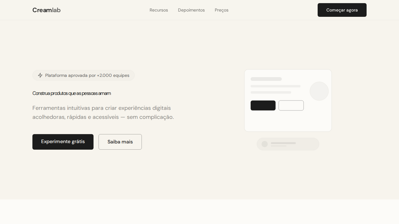
- **Hero layout:** Split-screen (text left, visual right).
- **Feature sections:** Zig-zag alternating text+image rows. No 3-equal-columns.
- **Mobile collapse:** All multi-column layouts collapse below 768px. No horizontal overflow.
- **z-index contract:** base (0) / sticky-nav (100) / overlay (200) / modal (300) / toast (500).


## Elevation & Depth

Canvas branco com texto near-black via rgba(0,0,0,0.95) — não preto puro. Paleta de cinzas quentes com subtom amarelo-marrom (#f6f5f4, #615d59, #a39e98). Bordas whisper: 1px solid rgba(0,0,0,0.1) ultra-finas. Sombras multi-camada com opacidade sub-0.05 para profundidade sutil. Azul Notion (#0075de) como único acento para CTAs. Seções alternando branco e branco quente (#f6f5f4). Pill badges (9999px) com fundo azul tintado.

- **Physics:** Ease-out curves, 200-300ms duration. Smooth and predictable.
- **Entry animations:** Fade + translate-Y (16px → 0) over 420ms ease-out. Staggered cascades for lists: 80ms between items.
- **Hover states:** Subtle color shift + shadow adjustment over 200ms.
- **Page transitions:** Fade only (200ms).
- **Performance:** Only transform and opacity animated. No layout-triggering properties.


## Shapes

Base corner radius: 4px. See rounded tokens in front matter for the full scale.


## Components

- **Primary Button:** Pill-shaped (9999px) shape. Accent color fill. Hover: 8% darken + subtle lift shadow. Active: -1px translate tactile press. Font weight 600. No outer glows.
- **Secondary / Ghost Button:** Outline variant. 1.5px border in muted color. Text in primary color. Hover: subtle background fill.
- **Cards:** Pill-shaped (9999px) corners. Surface background. Subtle shadow (0 2px 12px rgba(0,0,0,0.06)). 1px border stroke.
- **Inputs:** Label above input. 1px border stroke. Focus ring: 2px accent color offset 2px. Error text below in semantic red. No floating labels.
- **Navigation:** Primary surface background. Active item: accent color indicator. Font weight 500 when active.
- **Skeletons:** Shimmer animation matching component dimensions. No circular spinners.
- **Empty States:** Icon-based composition with descriptive text and action button.


## Do's and Don'ts

- No emojis in UI — use icon system only (Lucide, Heroicons)
- No decorative gradients — flat color only
- No shadows heavier than 0 2px 8px rgba(0,0,0,0.08)
- No pure black (#000000) — use off-black or charcoal variants
- No oversaturated accent colors (saturation cap: 80%)
- No 3-column equal-width feature layouts — use zig-zag or asymmetric grid
- No `h-screen` — use `min-h-[100dvh]`
- No AI copywriting clichés: "Elevate", "Seamless", "Unleash", "Next-Gen"
- No broken external image links — use picsum.photos or inline SVG
- No generic lorem ipsum in demos

- Do Canvas branco com texto rgba(0,0,0,0.95)
- Do Cinzas quentes com subtom amarelo
- Do Bordas whisper rgba(0,0,0,0.1)
- Do Sombras multi-camada sub-0.05
- Do Azul #0075de único acento
- Do Alternância branco/branco quente
- Do Responsivo


## Use Case

Tools de produtividade, Workspaces colaborativos, Gestão de conhecimento, Wikis
Technical Specs
CSS
background: #ffffff; color: rgba(0,0,0,0.95); accent: #0075de; border: 1px solid rgba(0,0,0,0.1); box-shadow: multi-layer sub-0.05 opacity; font-family: 'Inter', sans-serif; letter-spacing: -2.125px at 64px; border-radius: 4px buttons, 12px cards, 9999px badges
Variables
--bg: #ffffff; --bg-warm: #f6f5f4; --text: rgba(0,0,0,0.95); --accent: #0075de; --text-secondary: #615d59; --text-tertiary: #a39e98; --border: rgba(0,0,0,0.1); --radius-btn: 4px; --radius-card: 12px; --radius-pill: 9999px
Checklist
☐ Canvas branco com texto rgba(0,0,0,0.95), ☐ Cinzas quentes com subtom amarelo, ☐ Bordas whisper rgba(0,0,0,0.1), ☐ Sombras multi-camada sub-0.05, ☐ Azul #0075de único acento, ☐ Alternância branco/branco quente, ☐ Responsivo
Colors
Primary
Secondary
Effects
Canvas branco com texto near-black via rgba(0,0,0,0.95) — não preto puro. Paleta de cinzas quentes com subtom amarelo-marrom (#f6f5f4, #615d59, #a39e98). Bordas whisper: 1px solid rgba(0,0,0,0.1) ultra-finas. Sombras multi-camada com opacidade sub-0.05 para profundidade sutil. Azul Notion (#0075de) como único acento para CTAs. Seções alternando branco e branco quente (#f6f5f4). Pill badges (9999px) com fundo azul tintado.
Light/Dark
✓ Full / ✗ Not Recommended
AI Prompt
Act as a Senior Frontend Engineer and Expert UI Designer.
Your task is to code a complete Landing Page on the first attempt.
- Landing Page Theme: <INSERT THEME>
- Sections to add: <INSERT SECTIONS>

Generate the final code immediately following these definitions:

## Style

- **Name:** Notion Warm Workspace
- **Type:** Warm Minimalism, Whisper Borders, NotionInter, Blue Accent
- **Keywords:** notion, warm minimalism, whisper borders, warm neutrals, NotionInter, blue accent, multi-layer shadows, workspace aesthetic
- **Era:** 2024-2026 Warm Workspace
- **Light/Dark:** ✓ Full / ✗ Not Recommended

## Color Palette

- **Primary:** Branco #ffffff, Quase Preto rgba(0,0,0,0.95), Azul Notion #0075de, Branco Quente #f6f5f4
- **Secondary:** Navy #213183, Cinza Quente #615d59, Cinza Claro #a39e98, Borda rgba(0,0,0,0.1)

## Visual Effects

Canvas branco com texto near-black via rgba(0,0,0,0.95) — não preto puro. Paleta de cinzas quentes com subtom amarelo-marrom (#f6f5f4, #615d59, #a39e98). Bordas whisper: 1px solid rgba(0,0,0,0.1) ultra-finas. Sombras multi-camada com opacidade sub-0.05 para profundidade sutil. Azul Notion (#0075de) como único acento para CTAs. Seções alternando branco e branco quente (#f6f5f4). Pill badges (9999px) com fundo azul tintado.

## AI Visual Direction

Design a Notion-inspired warm workspace landing page. White canvas with near-black text via rgba(0,0,0,0.95). Warm gray scale with yellow-brown undertones (#f6f5f4, #615d59, #a39e98). Ultra-thin whisper borders: 1px solid rgba(0,0,0,0.1). Multi-layer shadows with sub-0.05 opacity. Notion Blue (#0075de) as singular accent for CTAs. Sections alternating white and warm white (#f6f5f4). Headlines at 64px weight 700 with -2.125px letter-spacing. Pill badges (9999px) with tinted blue backgrounds.

## CSS Technical

```css
background: #ffffff; color: rgba(0,0,0,0.95); accent: #0075de; border: 1px solid rgba(0,0,0,0.1); box-shadow: multi-layer sub-0.05 opacity; font-family: 'Inter', sans-serif; letter-spacing: -2.125px at 64px; border-radius: 4px buttons, 12px cards, 9999px badges
```

## Design System Variables

```css
--bg: #ffffff; --bg-warm: #f6f5f4; --text: rgba(0,0,0,0.95); --accent: #0075de; --text-secondary: #615d59; --text-tertiary: #a39e98; --border: rgba(0,0,0,0.1); --radius-btn: 4px; --radius-card: 12px; --radius-pill: 9999px
```

## Implementation Checklist

- ☐ Canvas branco com texto rgba(0,0,0,0.95)
- ☐ Cinzas quentes com subtom amarelo
- ☐ Bordas whisper rgba(0,0,0,0.1)
- ☐ Sombras multi-camada sub-0.05
- ☐ Azul #0075de único acento
- ☐ Alternância branco/branco quente
- ☐ Responsivo

## Execution Rules

1. Strictly follow the defined visual style.
2. Use high-quality inline SVG icons (Heroicons or Lucide style) — NEVER use emojis as icons.
3. Add `cursor-pointer` and smooth `hover` states (transition-all) on all interactive elements.
4. Required Page Structure:
   - Navbar (Logo + Links + CTA)
   - Hero Section (Impactful Headline + Subtitle + 2 buttons + 3D/Abstract visual element via CSS)
   - Features (3 cards with icons)
   - Testimonials (3 cards)
   - Pricing (3 tiers, highlight the middle one)
   - Final CTA
   - Full Footer with social links, privacy policy, terms of use, contact and SEO links.
5. All text content must be in English.
6. The visual must be CLEARLY distinct — do not create a "default Bootstrap" design. Force the use of the provided design system variables.
7. Use `<style>` tags in the head for custom classes (especially for complex backdrop-filter effects and animations) that Tailwind CDN doesn't cover.
8. Full Responsiveness: Layout must adapt perfectly to Mobile, Tablet and Desktop (vertical stack on mobile).
9. Include basic SEO, Viewport and Open Graph meta tags in `<head>`.
10. Footer must contain: Copyright 2026, Secondary navigation links and Social media icons.
11. Make the creative decisions needed to deliver the complete, functional result now.
Related
Last synced: 4/1/2026