New Era Bold Hero
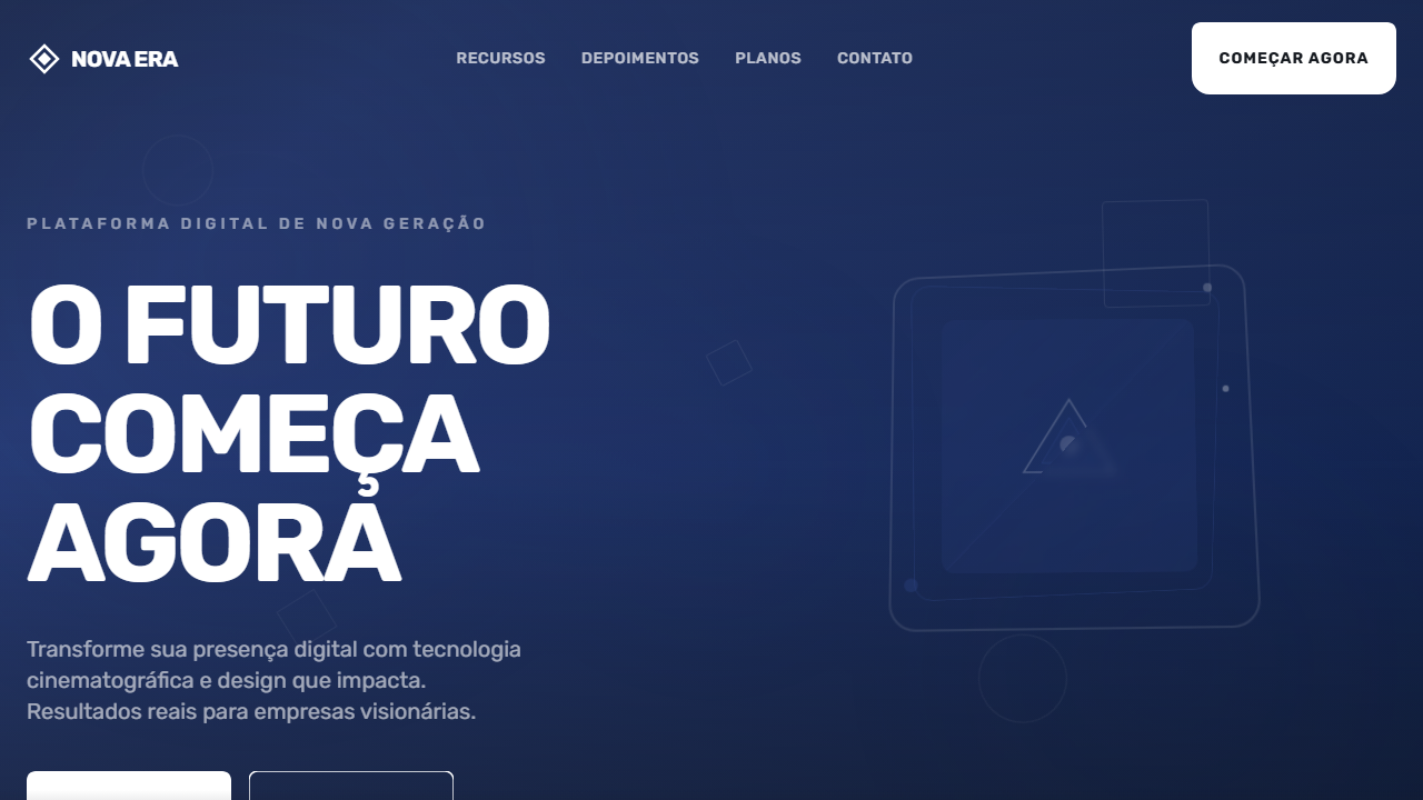
Bold cinematic hero with full-screen background video and dark blue fallback. Ideal for creative agencies, portfólios impactantes, landing pages editoriais, marcas de moda. AI-ready template.
Use case: Creative agencies, Portfolios impactantes, Landing pages editoriais, Brands de moda
Historical Context
The full-screen typographic hero didn't emerge from digital design — it came from protest posters, punk zines, and the raw energy of letterpress accidents. When Neville Brody blew type to the edges of The Face in the 1980s, he wasn't decorating; he was weaponizing letterforms. The idea that a single word, set massive and unapologetic, could carry more emotional weight than any photograph was radical then and remains potent now. This pattern crystallized in the early 2010s when agencies like Huge and Collins started stripping hero sections down to nothing but oversized uppercase type on solid backgrounds. No imagery, no gradients, no safety nets. The confidence required to let typography alone carry a brand's first impression separated serious studios from template-dependent shops. It was a direct rejection of the stock-photo-plus-overlay formula that had calcified web design into visual wallpaper. Today the bold hero persists because it works on a neurological level — large-scale type triggers immediate pattern recognition, demands a pause, and creates the kind of visceral gut reaction that no carousel or auto-playing video can replicate.
When to Use
Deploy when the message is the product. Brand manifestos, agency landing pages, album drops, fashion lookbooks, political campaigns — anywhere the words themselves need to hit like a billboard at 120km/h. This pattern demands conviction: if your headline needs a subtitle to make sense, you're not ready for it. Works best when paired with extreme whitespace or a single bold background color. Avoid if your brand voice is tentative, explanatory, or committee-approved. This is for statements, not descriptions.
Design Principles
- Scale is meaning — if the type doesn't feel uncomfortably large in your design tool, it's not large enough for the viewport
- Uppercase is a volume knob, not a default — earn it with words that deserve to be shouted
- Negative space is structural, not decorative — the emptiness around massive type is what gives it gravitational pull
- One typeface, one weight, zero apologies — mixing fonts here is cowardice disguised as variety
- Motion must serve legibility — if your entrance animation makes people wait to read the headline, you've prioritized spectacle over communication
DESIGN.md
---
version: "alpha"
name: "New Era Bold Hero"
description: "Bold cinematic hero with full-screen background video and dark blue fallback. Ideal for creative agencies, portfólios impactantes, landing pages editoriais, marcas de moda. AI-ready template."
colors:
  primary: "#21346e"
  secondary: "#FFFFFF"
  tertiary: "#161a20"
  neutral: "#1A1A1A"
  surface: "#2A4080"
  accent: "#CCCCCC"
typography:
  h1:
    fontFamily: Rubik
    fontSize: 2.5rem
    fontWeight: 700
  body-md:
    fontFamily: Rubik
    fontSize: 1rem
    fontWeight: 400
components:
  button-primary:
    backgroundColor: "{colors.primary}"
    textColor: "{colors.neutral}"
    padding: 12px
---

## Overview

Bold cinematic hero with full-screen background video and dark blue fallback. Ideal for creative agencies, portfólios impactantes, landing pages editoriais, marcas de moda. AI-ready template. The full-screen typographic hero didn't emerge from digital design — it came from protest posters, punk zines, and the raw energy of letterpress accidents. When Neville Brody blew type to the edges of The Face in the 1980s, he wasn't decorating; he was weaponizing letterforms. The idea that a single word, set massive and unapologetic, could carry more emotional weight than any photograph was radical then and remains potent now.

This pattern crystallized in the early 2010s when agencies like Huge and Collins started stripping hero sections down to nothing but oversized uppercase type on solid backgrounds. No imagery, no gradients, no safety nets. The confidence required to let typography alone carry a brand's first impression separated serious studios from template-dependent shops. It was a direct rejection of the stock-photo-plus-overlay formula that had calcified web design into visual wallpaper.

Today the bold hero persists because it works on a neurological level — large-scale type triggers immediate pattern recognition, demands a pause, and creates the kind of visceral gut reaction that no carousel or auto-playing video can replicate.

- Density: 5/10 — Balanced
- Variance: 4/10 — Moderate
- Motion: 8/10 — Cinematic

- **Style:** Bold, Uppercase, Cinematic, Video Background
- **Keywords:** bold, uppercase, cinematic, vídeo de fundo, tipografia massiva, Rubik, SVG button, dark blue, impactante, editorial
- **Era:** 2024-2026 Editorial Cinematic
- **Light/Dark:** ✗ Not Recommended / ✓ Full

## Colors

- **Azul Escuro** (#21346e) — Dark surface, primary background
- **Branco** (#FFFFFF) — Light surface, card backgrounds
- **Preto Escuro** (#161a20) — Dark surface, primary background
- **Cinza Escuro** (#1A1A1A) — Dark surface, primary background
- **Azul Médio** (#2A4080) — Secondary accent
- **Cinza Claro** (#CCCCCC) — Secondary text, borders, muted elements
- **Branco Suave** (#F5F5F5) — Secondary surface
- **Preto** (#000000) — Deep contrast surface


## Typography

- **Display / Hero:** Rubik — Weight 700, tight tracking, used for headline impact
- **Body:** Rubik — Weight 400, 16px/1.6 line-height, max 72ch per line
- **UI Labels / Captions:** Rubik — 0.875rem, weight 500, slight letter-spacing
- **Monospace:** JetBrains Mono — Used for code, metadata, and technical values

Scale:
- Hero: clamp(2.5rem, 5vw, 4rem)
- H1: 2.25rem
- H2: 1.5rem
- Body: 1rem / 1.6
- Small: 0.875rem


## Layout

- **Grid:** CSS Grid primary. Max-width containment: 1280px centered with 1.5rem side padding.
- **Spacing rhythm:** Balanced. Base unit: 0.5rem (8px).
- **Section vertical gaps:** clamp(4rem, 8vw, 8rem).
- **Hero layout:** Split-screen (text left, visual right).
- **Feature sections:** Zig-zag alternating text+image rows. No 3-equal-columns.
- **Mobile collapse:** All multi-column layouts collapse below 768px. No horizontal overflow.
- **z-index contract:** base (0) / sticky-nav (100) / overlay (200) / modal (300) / toast (500).


## Elevation & Depth

VÍDEO: Vídeo abstrato com movimento fluido e dinâmico em tons escuros azulados. Formas geométricas ou partículas em movimento criando sensação de energia e modernidade. Estilo cinematográfico com transições suaves, servindo como backdrop para tipografia bold oversized. Fallback azul escuro (#21346e) quando o vídeo não carrega. | EFEITOS CSS: Vídeo de fundo tela cheia (autoplay, loop, muted) com fallback azul escuro, tipografia massiva uppercase (text-6xl a text-[100px]) com line-height 0.98 e letter-spacing negativo (-2px a -4px), botão CTA com shape SVG customizado (184x65px, path branco, texto escuro), hover scale-105, active scale-95

- **Physics:** Spring — stiffness 120, damping 20. Confident, weighted transitions.
- **Entry animations:** Fade + translate-Y (16px → 0) over 540ms ease-out. Staggered cascades for lists: 120ms between items.
- **Hover states:** Scale(1.03) + shadow lift over 200ms.
- **Page transitions:** Fade + slide (300ms).
- **Performance:** Only transform and opacity animated. No layout-triggering properties.


## Shapes

Base corner radius: 8px. See rounded tokens in front matter for the full scale.


## Components

- **Primary Button:** Subtly rounded (0.5rem) shape. Accent color fill. Hover: 8% darken + subtle lift shadow. Active: -1px translate tactile press. Font weight 600. No outer glows.
- **Secondary / Ghost Button:** Outline variant. 1.5px border in muted color. Text in primary color. Hover: subtle background fill.
- **Cards:** Subtly rounded (0.5rem) corners. Surface background. Subtle shadow (0 2px 12px rgba(0,0,0,0.06)). 1px border stroke.
- **Inputs:** Label above input. 1px border stroke. Focus ring: 2px accent color offset 2px. Error text below in semantic red. No floating labels.
- **Navigation:** Primary surface background. Active item: accent color indicator. Font weight 500 when active.
- **Skeletons:** Shimmer animation matching component dimensions. No circular spinners.
- **Empty States:** Icon-based composition with descriptive text and action button.


## Do's and Don'ts

- No emojis in UI — use icon system only (Lucide, Heroicons)
- No pure white (#FFFFFF) backgrounds — use off-white or dark surfaces
- No oversaturated accent colors (saturation cap: 80%)
- No 3-column equal-width feature layouts — use zig-zag or asymmetric grid
- No `h-screen` — use `min-h-[100dvh]`
- No AI copywriting clichés: "Elevate", "Seamless", "Unleash", "Next-Gen"
- No broken external image links — use picsum.photos or inline SVG
- No generic lorem ipsum in demos

- Do Vídeo de fundo tela cheia com fallback azul escuro
- Do Tipografia massiva uppercase 3 linhas
- Do Font Rubik bold line-height 0.98
- Do Letter-spacing negativo
- Do Botão CTA com SVG path customizado
- Do Hover scale-105 active scale-95
- Do Conteúdo alinhado ao topo
- Do Responsivo com font-size adaptativo


## Use Case

Creative agencies, Portfolios impactantes, Landing pages editoriais, Brands de moda
Technical Specs
CSS
font-family: 'Rubik', sans-serif, font-weight: 700, text-transform: uppercase, font-size: clamp(3.5rem, 10vw, 100px), line-height: 0.98, letter-spacing: -4px, background: #21346e, video: autoplay loop muted object-cover, button: 184px x 65px SVG path, transition: transform 200ms
Variables
--bg-fallback: #21346e, --text-primary: #FFFFFF, --text-button: #161a20, --font-primary: 'Rubik', --font-weight: 700, --line-height: 0.98, --letter-spacing: -4px, --btn-w: 184px, --btn-h: 65px, --hover-scale: 1.05
Checklist
☐ Vídeo de fundo tela cheia com fallback azul escuro, ☐ Tipografia massiva uppercase 3 linhas, ☐ Font Rubik bold line-height 0.98, ☐ Letter-spacing negativo, ☐ Botão CTA com SVG path customizado, ☐ Hover scale-105 active scale-95, ☐ Conteúdo alinhado ao topo, ☐ Responsivo com font-size adaptativo
Colors
Primary
Secondary
Effects
VÍDEO: Vídeo abstrato com movimento fluido e dinâmico em tons escuros azulados. Formas geométricas ou partículas em movimento criando sensação de energia e modernidade. Estilo cinematográfico com transições suaves, servindo como backdrop para tipografia bold oversized. Fallback azul escuro (#21346e) quando o vídeo não carrega. | EFEITOS CSS: Vídeo de fundo tela cheia (autoplay, loop, muted) com fallback azul escuro, tipografia massiva uppercase (text-6xl a text-[100px]) com line-height 0.98 e letter-spacing negativo (-2px a -4px), botão CTA com shape SVG customizado (184x65px, path branco, texto escuro), hover scale-105, active scale-95
Light/Dark
✗ Not Recommended / ✓ Full
AI Prompt
Act as a Senior Frontend Engineer and Expert UI Designer.
Your task is to code a complete Landing Page on the first attempt.
- Landing Page Theme: <INSERT THEME>
- Sections to add: <INSERT SECTIONS>

Generate the final code immediately following these definitions:

## Style

- **Name:** New Era Bold Hero
- **Type:** Bold, Uppercase, Cinematic, Video Background
- **Keywords:** bold, uppercase, cinematic, vídeo de fundo, tipografia massiva, Rubik, SVG button, dark blue, impactante, editorial
- **Era:** 2024-2026 Editorial Cinematic
- **Light/Dark:** ✗ Not Recommended / ✓ Full

## Color Palette

- **Primary:** Azul Escuro #21346e, Branco #FFFFFF, Preto Escuro #161a20, Cinza Escuro #1A1A1A
- **Secondary:** Azul Médio #2A4080, Cinza Claro #CCCCCC, Branco Suave #F5F5F5, Preto #000000

## Visual Effects

VÍDEO: Vídeo abstrato com movimento fluido e dinâmico em tons escuros azulados. Formas geométricas ou partículas em movimento criando sensação de energia e modernidade. Estilo cinematográfico com transições suaves, servindo como backdrop para tipografia bold oversized. Fallback azul escuro (#21346e) quando o vídeo não carrega. | EFEITOS CSS: Vídeo de fundo tela cheia (autoplay, loop, muted) com fallback azul escuro, tipografia massiva uppercase (text-6xl a text-[100px]) com line-height 0.98 e letter-spacing negativo (-2px a -4px), botão CTA com shape SVG customizado (184x65px, path branco, texto escuro), hover scale-105, active scale-95

## AI Visual Direction

Design a bold cinematic hero with full-screen background video and dark blue fallback. Massive uppercase headline on three lines using Rubik font bold, tight line-height 0.98, negative letter-spacing. Custom CTA button with SVG path shape 184x65px, white fill, dark text, hover scale-105, active scale-95. Content aligned to top with significant top padding (pt-32 mobile, pt-48 desktop).

## CSS Technical

```css
font-family: 'Rubik', sans-serif, font-weight: 700, text-transform: uppercase, font-size: clamp(3.5rem, 10vw, 100px), line-height: 0.98, letter-spacing: -4px, background: #21346e, video: autoplay loop muted object-cover, button: 184px x 65px SVG path, transition: transform 200ms
```

## Design System Variables

```css
--bg-fallback: #21346e, --text-primary: #FFFFFF, --text-button: #161a20, --font-primary: 'Rubik', --font-weight: 700, --line-height: 0.98, --letter-spacing: -4px, --btn-w: 184px, --btn-h: 65px, --hover-scale: 1.05
```

## Implementation Checklist

- ☐ Vídeo de fundo tela cheia com fallback azul escuro
- ☐ Tipografia massiva uppercase 3 linhas
- ☐ Font Rubik bold line-height 0.98
- ☐ Letter-spacing negativo
- ☐ Botão CTA com SVG path customizado
- ☐ Hover scale-105 active scale-95
- ☐ Conteúdo alinhado ao topo
- ☐ Responsivo com font-size adaptativo

## Execution Rules

1. Strictly follow the defined visual style.
2. Use high-quality inline SVG icons (Heroicons or Lucide style) — NEVER use emojis as icons.
3. Add `cursor-pointer` and smooth `hover` states (transition-all) on all interactive elements.
4. Required Page Structure:
   - Navbar (Logo + Links + CTA)
   - Hero Section (Impactful Headline + Subtitle + 2 buttons + 3D/Abstract visual element via CSS)
   - Features (3 cards with icons)
   - Testimonials (3 cards)
   - Pricing (3 tiers, highlight the middle one)
   - Final CTA
   - Full Footer with social links, privacy policy, terms of use, contact and SEO links.
5. All text content must be in English.
6. The visual must be CLEARLY distinct — do not create a "default Bootstrap" design. Force the use of the provided design system variables.
7. Use `<style>` tags in the head for custom classes (especially for complex backdrop-filter effects and animations) that Tailwind CDN doesn't cover.
8. Full Responsiveness: Layout must adapt perfectly to Mobile, Tablet and Desktop (vertical stack on mobile).
9. Include basic SEO, Viewport and Open Graph meta tags in `<head>`.
10. Footer must contain: Copyright 2026, Secondary navigation links and Social media icons.
11. Make the creative decisions needed to deliver the complete, functional result now.
Related
Last synced: 4/1/2026