New Era Automotive Hero
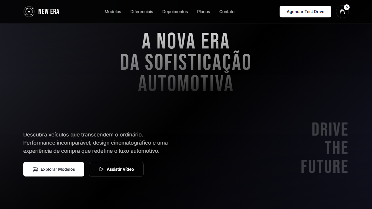
Design an automotive hero with full-viewport video (min 600px, max 965px). Ideal for concessionárias de carros, marketplaces automotivos, marcas de veículos, landing pages de lançamento. AI-ready template.
Use case: Car dealerships, Automotive marketplaces, Vehicle brands, Launch landing pages
Historical Context
The automotive hero section has always been about one thing: making metal feel alive. In the early web era, car brands relied on static photography with dramatic lighting — think BMW's early 2000s campaigns where a single hero shot carried the entire emotional weight. The shift to full-bleed video backgrounds around 2012-2014 changed everything. Suddenly you could communicate speed, engineering precision, and aspiration without a single word of copy. Tesla's website circa 2015 stripped the automotive hero down to its essence: cinematic video, minimal UI, one CTA. That restraint became the template. But what made it work wasn't the video itself — it was the confidence to let the product speak. Every EV startup since has tried to replicate this, most failing because they layer too much on top. The best automotive heroes today borrow from film direction: shallow depth of field, deliberate pacing, sound design that rewards unmuting. They treat the browser as a theater, not a billboard. The current generation pushes further with scroll-driven reveals and ambient motion that responds to cursor position, creating a sense of presence that static frames never achieved.
When to Use
When the vehicle IS the story. This pattern demands hero-tier footage — if you're working with B-roll or stock, walk away. Deploy for model launches, brand manifestos, and EV reveal pages where the first three seconds need to communicate engineering philosophy. Works best when the client has invested in proper film production and trusts you to let it breathe. Kill it if the brief requires dense information above the fold or if mobile bandwidth constraints mean your audience will see a frozen poster frame.
Design Principles
- Let the footage do the heavy lifting — if you need more than 8 words of overlay copy, your video isn't strong enough
- Design for the mute state first; sound is a reward, not a requirement
- Treat loading as choreography: poster frame selection matters as much as the video itself since that's what 60% of mobile users actually see
- Typography should whisper against cinematic backgrounds — ultra-light weights, generous tracking, high contrast placement in negative space
- Respect the scroll threshold: the hero is a moment, not a trap. Give clear visual cues that content exists below without breaking the theater
DESIGN.md
---
version: "alpha"
name: "New Era Automotive Hero"
description: "Design an automotive hero with full-viewport video (min 600px, max 965px). Ideal for concessionárias de carros, marketplaces automotivos, marcas de veículos, landing pages de lançamento. AI-ready template."
colors:
  primary: "#010101"
  secondary: "#FFFFFF"
  tertiary: "#FBFBFD"
  neutral: "#EEEFF2"
  surface: "#FFFFFF"
  accent: "#272835"
typography:
  h1:
    fontFamily: Inter
    fontSize: 2.5rem
    fontWeight: 700
  body-md:
    fontFamily: Inter
    fontSize: 1rem
    fontWeight: 400
components:
  button-primary:
    backgroundColor: "{colors.primary}"
    textColor: "{colors.neutral}"
    padding: 12px
---

## Overview

Design an automotive hero with full-viewport video (min 600px, max 965px). Ideal for concessionárias de carros, marketplaces automotivos, marcas de veículos, landing pages de lançamento. AI-ready template. The automotive hero section has always been about one thing: making metal feel alive. In the early web era, car brands relied on static photography with dramatic lighting — think BMW's early 2000s campaigns where a single hero shot carried the entire emotional weight. The shift to full-bleed video backgrounds around 2012-2014 changed everything. Suddenly you could communicate speed, engineering precision, and aspiration without a single word of copy.

Tesla's website circa 2015 stripped the automotive hero down to its essence: cinematic video, minimal UI, one CTA. That restraint became the template. But what made it work wasn't the video itself — it was the confidence to let the product speak. Every EV startup since has tried to replicate this, most failing because they layer too much on top. The best automotive heroes today borrow from film direction: shallow depth of field, deliberate pacing, sound design that rewards unmuting. They treat the browser as a theater, not a billboard.

The current generation pushes further with scroll-driven reveals and ambient motion that responds to cursor position, creating a sense of presence that static frames never achieved.

- Density: 5/10 — Balanced
- Variance: 4/10 — Moderate
- Motion: 8/10 — Cinematic

- **Style:** Automotive, Cinematic Video, Decorative Typography, Gradient Overlays
- **Keywords:** automotive, cinematic, vídeo de fundo, Bebas Neue, tipografia decorativa, gradient overlays, concessionária, carros, Inter font, dark premium
- **Era:** 2024-2026 Automotive Premium
- **Light/Dark:** ✗ Not Recommended / ✓ Full

## Colors

- **Preto** (#010101) — Dark surface, primary background
- **Branco** (#FFFFFF) — Light surface, card backgrounds
- **Branco Suave** (#FBFBFD) — Light surface, card backgrounds
- **Cinza Claro** (#EEEFF2) — Secondary text, borders, muted elements
- **Branco Botão** (#FFFFFF) — Secondary surface
- **Cinza Escuro** (#272835) — Deep contrast surface
- **Preto Overlay** (rgba(0,0,0,0.3)) — Deep contrast surface
- **Sombra Sutil** (rgba(0,0,0,0.1)) — Extended palette, decorative use


## Typography

- **Display / Hero:** Inter — Weight 700, tight tracking, used for headline impact
- **Accent:** Bebas Neue — Used for decorative or emphasis text
- **Body:** Inter — Weight 400, 16px/1.6 line-height, max 72ch per line
- **UI Labels / Captions:** Inter — 0.875rem, weight 500, slight letter-spacing
- **Monospace:** JetBrains Mono — Used for code, metadata, and technical values

Scale:
- Hero: clamp(2.5rem, 5vw, 4rem)
- H1: 2.25rem
- H2: 1.5rem
- Body: 1rem / 1.6
- Small: 0.875rem


## Layout

- **Grid:** CSS Grid primary. Max-width containment: 1280px centered with 1.5rem side padding.
- **Spacing rhythm:** Balanced. Base unit: 0.5rem (8px).
- **Section vertical gaps:** clamp(4rem, 8vw, 8rem).
- **Hero layout:** Split-screen (text left, visual right).
- **Feature sections:** Zig-zag alternating text+image rows. No 3-equal-columns.
- **Mobile collapse:** All multi-column layouts collapse below 768px. No horizontal overflow.
- **z-index contract:** base (0) / sticky-nav (100) / overlay (200) / modal (300) / toast (500).


## Elevation & Depth

VÍDEO: Vídeo cinematográfico automotivo com cenas de carros em movimento, estradas ou detalhes de veículos em tons escuros e elegantes. Filmagem em câmera lenta com iluminação dramática, transmitindo luxo e performance. Gradient overlays no topo e base (260px, from black/30 to transparent) garantem legibilidade do texto decorativo gigante sobreposto. | EFEITOS CSS: Vídeo de fundo tela cheia (min 600px, max 965px) com gradient overlays no topo e base (260px, from black/30 to transparent), texto decorativo gigante centralizado (75% largura) com gradient fill vertical (branco 83% opacity para 12%), navbar com logo spinner e botão Cart arredondado, CTA inferior com parágrafo + botão esquerda e tagline Bebas Neue 64px direita

- **Physics:** Spring — stiffness 120, damping 20. Confident, weighted transitions.
- **Entry animations:** Fade + translate-Y (16px → 0) over 540ms ease-out. Staggered cascades for lists: 120ms between items.
- **Hover states:** Scale(1.03) + shadow lift over 200ms.
- **Page transitions:** Fade + slide (300ms).
- **Performance:** Only transform and opacity animated. No layout-triggering properties.


## Shapes

Base corner radius: 12px. See rounded tokens in front matter for the full scale.


## Components

- **Primary Button:** Moderately rounded (0.75rem) shape. Accent color fill. Hover: 8% darken + subtle lift shadow. Active: -1px translate tactile press. Font weight 600. No outer glows.
- **Secondary / Ghost Button:** Outline variant. 1.5px border in muted color. Text in primary color. Hover: subtle background fill.
- **Cards:** Moderately rounded (0.75rem) corners. Surface background. Subtle shadow (0 2px 12px rgba(0,0,0,0.06)). 1px border stroke.
- **Inputs:** Label above input. 1px border stroke. Focus ring: 2px accent color offset 2px. Error text below in semantic red. No floating labels.
- **Navigation:** Primary surface background. Active item: accent color indicator. Font weight 500 when active.
- **Skeletons:** Shimmer animation matching component dimensions. No circular spinners.
- **Empty States:** Icon-based composition with descriptive text and action button.


## Do's and Don'ts

- No emojis in UI — use icon system only (Lucide, Heroicons)
- No pure white (#FFFFFF) backgrounds — use off-white or dark surfaces
- No oversaturated accent colors (saturation cap: 80%)
- No 3-column equal-width feature layouts — use zig-zag or asymmetric grid
- No `h-screen` — use `min-h-[100dvh]`
- No AI copywriting clichés: "Elevate", "Seamless", "Unleash", "Next-Gen"
- No broken external image links — use picsum.photos or inline SVG
- No generic lorem ipsum in demos

- Do Vídeo tela cheia min 600px max 965px
- Do Gradient overlays topo e base
- Do Texto decorativo gigante gradient fill
- Do Navbar com logo spinner e Cart
- Do CTA inferior split layout
- Do Bebas Neue 64px tagline
- Do Responsivo stack mobile
- Do Inter + Bebas Neue


## Use Case

Car dealerships, Automotive marketplaces, Vehicle brands, Launch landing pages
Technical Specs
CSS
font-family: 'Inter' / 'Bebas Neue', video: object-cover min-h-[600px] max-h-[965px], gradient: 260px from rgba(0,0,0,0.3) to transparent, decorative text: 75% width gradient fill, font-size: 64px tagline, button: rounded-lg bg-white, padding: 80px horizontal
Variables
--bg-primary: #010101, --text-primary: #FFFFFF, --text-button: #272835, --overlay: rgba(0,0,0,0.3), --overlay-height: 260px, --font-body: 'Inter', --font-display: 'Bebas Neue', --tagline-size: 64px, --padding-x: 80px
Checklist
☐ Vídeo tela cheia min 600px max 965px, ☐ Gradient overlays topo e base, ☐ Texto decorativo gigante gradient fill, ☐ Navbar com logo spinner e Cart, ☐ CTA inferior split layout, ☐ Bebas Neue 64px tagline, ☐ Responsivo stack mobile, ☐ Inter + Bebas Neue
Colors
Primary
Secondary
Effects
VÍDEO: Vídeo cinematográfico automotivo com cenas de carros em movimento, estradas ou detalhes de veículos em tons escuros e elegantes. Filmagem em câmera lenta com iluminação dramática, transmitindo luxo e performance. Gradient overlays no topo e base (260px, from black/30 to transparent) garantem legibilidade do texto decorativo gigante sobreposto. | EFEITOS CSS: Vídeo de fundo tela cheia (min 600px, max 965px) com gradient overlays no topo e base (260px, from black/30 to transparent), texto decorativo gigante centralizado (75% largura) com gradient fill vertical (branco 83% opacity para 12%), navbar com logo spinner e botão Cart arredondado, CTA inferior com parágrafo + botão esquerda e tagline Bebas Neue 64px direita
Light/Dark
✗ Not Recommended / ✓ Full
AI Prompt
Act as a Senior Frontend Engineer and Expert UI Designer.
Your task is to code a complete Landing Page on the first attempt.
- Landing Page Theme: <INSERT THEME>
- Sections to add: <INSERT SECTIONS>

Generate the final code immediately following these definitions:

## Style

- **Name:** New Era Automotive Hero
- **Type:** Automotive, Cinematic Video, Decorative Typography, Gradient Overlays
- **Keywords:** automotive, cinematic, vídeo de fundo, Bebas Neue, tipografia decorativa, gradient overlays, concessionária, carros, Inter font, dark premium
- **Era:** 2024-2026 Automotive Premium
- **Light/Dark:** ✗ Not Recommended / ✓ Full

## Color Palette

- **Primary:** Preto #010101, Branco #FFFFFF, Branco Suave #FBFBFD, Cinza Claro #EEEFF2
- **Secondary:** Preto Overlay rgba(0,0,0,0.3), Branco Botão #FFFFFF, Cinza Escuro #272835, Sombra Sutil rgba(0,0,0,0.1)

## Visual Effects

VÍDEO: Vídeo cinematográfico automotivo com cenas de carros em movimento, estradas ou detalhes de veículos em tons escuros e elegantes. Filmagem em câmera lenta com iluminação dramática, transmitindo luxo e performance. Gradient overlays no topo e base (260px, from black/30 to transparent) garantem legibilidade do texto decorativo gigante sobreposto. | EFEITOS CSS: Vídeo de fundo tela cheia (min 600px, max 965px) com gradient overlays no topo e base (260px, from black/30 to transparent), texto decorativo gigante centralizado (75% largura) com gradient fill vertical (branco 83% opacity para 12%), navbar com logo spinner e botão Cart arredondado, CTA inferior com parágrafo + botão esquerda e tagline Bebas Neue 64px direita

## AI Visual Direction

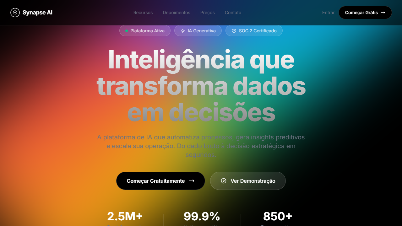
Design an automotive hero with full-viewport video (min 600px, max 965px). Top and bottom gradient overlays 260px. Large decorative text centered at 15% from top spanning 75% width with vertical gradient fill. Navbar with spinner logo and rounded Cart button. Bottom CTA: paragraph + Shop Now left, Bebas Neue 64px tagline right. Inter and Bebas Neue fonts.

## CSS Technical

```css
font-family: 'Inter' / 'Bebas Neue', video: object-cover min-h-[600px] max-h-[965px], gradient: 260px from rgba(0,0,0,0.3) to transparent, decorative text: 75% width gradient fill, font-size: 64px tagline, button: rounded-lg bg-white, padding: 80px horizontal
```

## Design System Variables

```css
--bg-primary: #010101, --text-primary: #FFFFFF, --text-button: #272835, --overlay: rgba(0,0,0,0.3), --overlay-height: 260px, --font-body: 'Inter', --font-display: 'Bebas Neue', --tagline-size: 64px, --padding-x: 80px
```

## Implementation Checklist

- ☐ Vídeo tela cheia min 600px max 965px
- ☐ Gradient overlays topo e base
- ☐ Texto decorativo gigante gradient fill
- ☐ Navbar com logo spinner e Cart
- ☐ CTA inferior split layout
- ☐ Bebas Neue 64px tagline
- ☐ Responsivo stack mobile
- ☐ Inter + Bebas Neue

## Execution Rules

1. Strictly follow the defined visual style.
2. Use high-quality inline SVG icons (Heroicons or Lucide style) — NEVER use emojis as icons.
3. Add `cursor-pointer` and smooth `hover` states (transition-all) on all interactive elements.
4. Required Page Structure:
   - Navbar (Logo + Links + CTA)
   - Hero Section (Impactful Headline + Subtitle + 2 buttons + 3D/Abstract visual element via CSS)
   - Features (3 cards with icons)
   - Testimonials (3 cards)
   - Pricing (3 tiers, highlight the middle one)
   - Final CTA
   - Full Footer with social links, privacy policy, terms of use, contact and SEO links.
5. All text content must be in English.
6. The visual must be CLEARLY distinct — do not create a "default Bootstrap" design. Force the use of the provided design system variables.
7. Use `<style>` tags in the head for custom classes (especially for complex backdrop-filter effects and animations) that Tailwind CDN doesn't cover.
8. Full Responsiveness: Layout must adapt perfectly to Mobile, Tablet and Desktop (vertical stack on mobile).
9. Include basic SEO, Viewport and Open Graph meta tags in `<head>`.
10. Footer must contain: Copyright 2026, Secondary navigation links and Social media icons.
11. Make the creative decisions needed to deliver the complete, functional result now.
Related

Last synced: 4/1/2026