Modern Minimalist
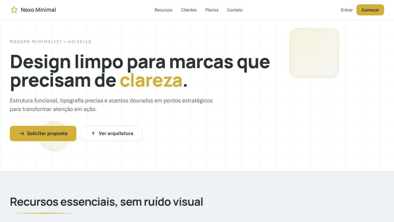
Modern minimalist landing page with strict 60/30/10 color balance. Ideal for design de logos minimalistas, landing pages corporativas, sites institucionais clean, produtos saas premium. AI-ready template.
Use case: Design de logos minimalist, Landing pages corporativas, Sites institucionais clean, Products SaaS premium
Historical Context
Modern Minimalism didn't emerge from nowhere — it's the direct descendant of the Swiss International Typographic Style that dominated Zurich and Basel in the 1950s. Josef Müller-Brockmann, Max Bill, and their contemporaries stripped design down to mathematical grids, objective typography, and ruthless clarity. They believed design should inform, not decorate. That conviction aged remarkably well. The digital translation happened gradually. Early web design couldn't resist ornament — gradients, bevels, textures everywhere. It took Apple's iOS 7 flat redesign in 2013 and Google's Material simplification to prove that restraint scales. Suddenly every SaaS product wanted to look like it was designed in Helvetica on a white canvas. Most failed because they confused emptiness with minimalism. Real minimalism is expensive. Every element earns its place through function. White space isn't absence — it's active composition. The best contemporary practitioners (Linear, Stripe, Vercel) understand this: they use space as a structural material, not leftover canvas. Typography does the heavy lifting. Color becomes punctuation, not wallpaper. The result feels inevitable, like nothing could be added or removed.
When to Use
Deploy this when your product's value proposition is clarity itself. SaaS dashboards drowning in features, professional services firms that need to signal competence over flash, corporate brands tired of looking like everyone else's Figma template. It works when your content is strong enough to stand alone — minimalism exposes weak copy and bad hierarchy instantly. If your product needs to feel trustworthy, precise, and contemporary without trying too hard, this is your system. Avoid it if your brand needs warmth or playfulness — minimalism can read as cold if you're not careful with tone.
Design Principles
- Every element must justify its existence — if it doesn't serve function or hierarchy, delete it without hesitation
- White space is structural, not decorative — use it to create rhythm, group relationships, and direct attention with the same intentionality as any visible element
- Typography carries the entire visual weight — invest in a precise type scale, consistent measure, and optical spacing rather than relying on color or imagery to create interest
- Reduce color to a functional system — one or two accent hues maximum, deployed only for interactive states and critical information, never for decoration
- Grid discipline is non-negotiable — align everything to a mathematical baseline grid and use consistent spatial units so the system feels engineered rather than arranged
DESIGN.md
---
version: "alpha"
name: "Modern Minimalist"
description: "Modern minimalist landing page with strict 60/30/10 color balance. Ideal for design de logos minimalistas, landing pages corporativas, sites institucionais clean, produtos saas premium. AI-ready template."
colors:
  primary: "#FFFFFF"
  secondary: "#DFE6E9"
  tertiary: "#2D3436"
typography:
  h1:
    fontFamily: Inter
    fontSize: 2.5rem
    fontWeight: 700
  body-md:
    fontFamily: Inter
    fontSize: 1rem
    fontWeight: 400
components:
  button-primary:
    backgroundColor: "{colors.primary}"
    padding: 12px
---

## Overview

Modern minimalist landing page with strict 60/30/10 color balance. Ideal for design de logos minimalistas, landing pages corporativas, sites institucionais clean, produtos saas premium. AI-ready template. Modern Minimalism didn't emerge from nowhere — it's the direct descendant of the Swiss International Typographic Style that dominated Zurich and Basel in the 1950s. Josef Müller-Brockmann, Max Bill, and their contemporaries stripped design down to mathematical grids, objective typography, and ruthless clarity. They believed design should inform, not decorate. That conviction aged remarkably well.

The digital translation happened gradually. Early web design couldn't resist ornament — gradients, bevels, textures everywhere. It took Apple's iOS 7 flat redesign in 2013 and Google's Material simplification to prove that restraint scales. Suddenly every SaaS product wanted to look like it was designed in Helvetica on a white canvas. Most failed because they confused emptiness with minimalism.

Real minimalism is expensive. Every element earns its place through function. White space isn't absence — it's active composition. The best contemporary practitioners (Linear, Stripe, Vercel) understand this: they use space as a structural material, not leftover canvas. Typography does the heavy lifting. Color becomes punctuation, not wallpaper. The result feels inevitable, like nothing could be added or removed.

- Density: 3/10 — Airy
- Variance: 2/10 — Structured
- Motion: 4/10 — Subtle

- **Style:** Clean, Refined, Minimal, High-Contrast
- **Keywords:** minimalist, clean, white space, geometric, refined, balanced, neutral, premium, editorial, simple, modern
- **Era:** Contemporary Minimal (2010s+)
- **Light/Dark:** ✓ Full / ◐ Partial

## Colors

- **Pure White** (#FFFFFF) — Light surface, card backgrounds
- **e Soft Grey** (#DFE6E9) — Secondary text, borders, muted elements
- **Deep Charcoal** (#2D3436) — Deep contrast surface


## Typography

- **Display / Hero:** Inter — Weight 700, tight tracking, used for headline impact
- **Body:** Inter — Weight 400, 16px/1.6 line-height, max 72ch per line
- **UI Labels / Captions:** Inter — 0.875rem, weight 500, slight letter-spacing
- **Monospace:** JetBrains Mono — Used for code, metadata, and technical values

Scale:
- Hero: clamp(2.5rem, 5vw, 4rem)
- H1: 2.25rem
- H2: 1.5rem
- Body: 1rem / 1.6
- Small: 0.875rem


## Layout

- **Grid:** CSS Grid primary. Max-width containment: 1280px centered with 1.5rem side padding.
- **Spacing rhythm:** Balanced. Base unit: 0.5rem (8px).
- **Section vertical gaps:** clamp(4rem, 8vw, 8rem).
- **Hero layout:** Split-screen (text left, visual right).
- **Feature sections:** Zig-zag alternating text+image rows. No 3-equal-columns.
- **Mobile collapse:** All multi-column layouts collapse below 768px. No horizontal overflow.
- **z-index contract:** base (0) / sticky-nav (100) / overlay (200) / modal (300) / toast (500).


## Elevation & Depth

10%: Accent Gold #D3B037 para CTAs, ícones-chave e microdetalhes; sombras sutis, bordas finas 1px, tipografia nítida e transições suaves (200-250ms)

- **Physics:** Ease-out curves, 200-300ms duration. Smooth and predictable.
- **Entry animations:** Fade + translate-Y (16px → 0) over 420ms ease-out. Staggered cascades for lists: 80ms between items.
- **Hover states:** Subtle color shift + shadow adjustment over 200ms.
- **Page transitions:** Fade only (200ms).
- **Performance:** Only transform and opacity animated. No layout-triggering properties.


## Shapes

Base corner radius: 12px. See rounded tokens in front matter for the full scale.


## Components

- **Primary Button:** Moderately rounded (0.75rem) shape. Accent color fill. Hover: 8% darken + subtle lift shadow. Active: -1px translate tactile press. Font weight 600. No outer glows.
- **Secondary / Ghost Button:** Outline variant. 1.5px border in muted color. Text in primary color. Hover: subtle background fill.
- **Cards:** Moderately rounded (0.75rem) corners. Surface background. Subtle shadow (0 2px 12px rgba(0,0,0,0.06)). 1px border stroke.
- **Inputs:** Label above input. 1px border stroke. Focus ring: 2px accent color offset 2px. Error text below in semantic red. No floating labels.
- **Navigation:** Primary surface background. Active item: accent color indicator. Font weight 500 when active.
- **Skeletons:** Shimmer animation matching component dimensions. No circular spinners.
- **Empty States:** Icon-based composition with descriptive text and action button.


## Do's and Don'ts

- No emojis in UI — use icon system only (Lucide, Heroicons)
- No decorative gradients — flat color only
- No shadows heavier than 0 2px 8px rgba(0,0,0,0.08)
- No pure black (#000000) — use off-black or charcoal variants
- No oversaturated accent colors (saturation cap: 80%)
- No 3-column equal-width feature layouts — use zig-zag or asymmetric grid
- No `h-screen` — use `min-h-[100dvh]`
- No AI copywriting clichés: "Elevate", "Seamless", "Unleash", "Next-Gen"
- No broken external image links — use picsum.photos or inline SVG
- No generic lorem ipsum in demos

- Do Proporção 60/30/10 respeitada
- Do Fundo limpo com #FFFFFF/#DFE6E9
- Do Tipografia em #2D3436 com contraste alto
- Do Destaques pontuais em #D3B037
- Do Espaço em branco generoso
- Do Layout responsivo


## Use Case

Design de logos minimalist, Landing pages corporativas, Sites institucionais clean, Products SaaS premium
Technical Specs
CSS
background: #FFFFFF; color: #2D3436; --surface-alt: #DFE6E9; --accent: #D3B037; border: 1px solid rgba(45,52,54,0.12); box-shadow: 0 2px 8px rgba(45,52,54,0.06); transition: all 0.25s ease; font-family: 'Inter', sans-serif;
Variables
--color-primary-60-a: #FFFFFF; --color-primary-60-b: #DFE6E9; --color-secondary-30: #2D3436; --color-accent-10: #D3B037; --radius-sm: 8px; --border-subtle: 1px solid rgba(45,52,54,0.12); --shadow-soft: 0 2px 8px rgba(45,52,54,0.06); --transition-fast: 250ms ease;
Checklist
☐ Proporção 60/30/10 respeitada, ☐ Fundo limpo com #FFFFFF/#DFE6E9, ☐ Tipografia em #2D3436 com contraste alto, ☐ Destaques pontuais em #D3B037, ☐ Espaço em branco generoso, ☐ Layout responsivo
Colors
Primary
Secondary
Effects
10%: Accent Gold #D3B037 para CTAs, ícones-chave e microdetalhes; sombras sutis, bordas finas 1px, tipografia nítida e transições suaves (200-250ms)
Light/Dark
✓ Full / ◐ Partial
AI Prompt
Act as a Senior Frontend Engineer and Expert UI Designer.
Your task is to code a complete Landing Page on the first attempt.
- Landing Page Theme: <INSERT THEME>
- Sections to add: <INSERT SECTIONS>

Generate the final code immediately following these definitions:

## Style

- **Name:** Modern Minimalist
- **Type:** Clean, Refined, Minimal, High-Contrast
- **Keywords:** minimalist, clean, white space, geometric, refined, balanced, neutral, premium, editorial, simple, modern
- **Era:** Contemporary Minimal (2010s+)
- **Light/Dark:** ✓ Full / ◐ Partial

## Color Palette

- **Primary:** 60%: Pure White #FFFFFF e Soft Grey #DFE6E9 para fundos amplos, áreas de respiro e superfícies principais
- **Secondary:** 30%: Deep Charcoal #2D3436 para tipografia, ícones, divisórias e estrutura visual

## Visual Effects

10%: Accent Gold #D3B037 para CTAs, ícones-chave e microdetalhes; sombras sutis, bordas finas 1px, tipografia nítida e transições suaves (200-250ms)

## AI Visual Direction

Create a modern minimalist landing page with strict 60/30/10 color balance. Use 60% pure white (#FFFFFF) and soft grey (#DFE6E9) for clean backgrounds and generous whitespace, 30% deep charcoal (#2D3436) for typography and structure, and 10% accent gold (#D3B037) for CTAs and key focal points. Keep the layout geometric, highly legible, and elegant. Avoid visual noise and heavy decoration.

## CSS Technical

```css
background: #FFFFFF; color: #2D3436; --surface-alt: #DFE6E9; --accent: #D3B037; border: 1px solid rgba(45,52,54,0.12); box-shadow: 0 2px 8px rgba(45,52,54,0.06); transition: all 0.25s ease; font-family: 'Inter', sans-serif;
```

## Design System Variables

```css
--color-primary-60-a: #FFFFFF; --color-primary-60-b: #DFE6E9; --color-secondary-30: #2D3436; --color-accent-10: #D3B037; --radius-sm: 8px; --border-subtle: 1px solid rgba(45,52,54,0.12); --shadow-soft: 0 2px 8px rgba(45,52,54,0.06); --transition-fast: 250ms ease;
```

## Implementation Checklist

- ☐ Proporção 60/30/10 respeitada
- ☐ Fundo limpo com #FFFFFF/#DFE6E9
- ☐ Tipografia em #2D3436 com contraste alto
- ☐ Destaques pontuais em #D3B037
- ☐ Espaço em branco generoso
- ☐ Layout responsivo

## Execution Rules

1. Strictly follow the defined visual style.
2. Use high-quality inline SVG icons (Heroicons or Lucide style) — NEVER use emojis as icons.
3. Add `cursor-pointer` and smooth `hover` states (transition-all) on all interactive elements.
4. Required Page Structure:
   - Navbar (Logo + Links + CTA)
   - Hero Section (Impactful Headline + Subtitle + 2 buttons + 3D/Abstract visual element via CSS)
   - Features (3 cards with icons)
   - Testimonials (3 cards)
   - Pricing (3 tiers, highlight the middle one)
   - Final CTA
   - Full Footer with social links, privacy policy, terms of use, contact and SEO links.
5. All text content must be in English.
6. The visual must be CLEARLY distinct — do not create a "default Bootstrap" design. Force the use of the provided design system variables.
7. Use `<style>` tags in the head for custom classes (especially for complex backdrop-filter effects and animations) that Tailwind CDN doesn't cover.
8. Full Responsiveness: Layout must adapt perfectly to Mobile, Tablet and Desktop (vertical stack on mobile).
9. Include basic SEO, Viewport and Open Graph meta tags in `<head>`.
10. Footer must contain: Copyright 2026, Secondary navigation links and Social media icons.
11. Make the creative decisions needed to deliver the complete, functional result now.
Related
Last synced: 4/1/2026