Minimalist React Hero with Motion
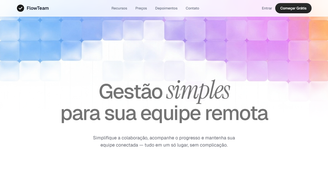
Minimalist, high-end React hero section using Tailwind CSS v4 and the Motion library. Ideal for saas landing pages, ferramentas de gestão remota, startups premium, produtos digitais high-end. AI-ready template.
Use case: SaaS landing pages, Tools de gestão remota, Startups premium, Products digitais high-end
Historical Context
The hero section spent decades screaming. Flash intros, auto-playing videos, parallax chaos — the web's above-the-fold real estate was a battleground of attention-grabbing excess. Then Swiss design thinking quietly re-entered the conversation through a new vector: component-based UI. React gave us composability; Framer Motion gave us choreography. Suddenly you could orchestrate a headline fade, a subtle y-axis shift, and a staggered reveal of supporting elements — all with the precision of a Müller-Brockmann grid but the fluidity of film. What changed wasn't the technology alone. It was the mindset. Framer Motion's declarative API made restraint easier than excess. You define an initial state, an animate state, and a transition curve. That's it. No timeline editors, no keyframe spaghetti. The constraint of the API nudged designers toward economy — toward heroes that breathe rather than shout. The result is a generation of SaaS landing pages where the hero does less but communicates more. A single headline animates in with 0.6s ease-out. A CTA appears 200ms later. Negative space does the heavy lifting. This is minimalism that actually earns the label — not empty, but intentional.
When to Use
Deploy this pattern when your product's value proposition is clear enough to stand alone — no carousel of features, no illustration crutch. It works best for developer tools, API products, and B2B SaaS where the audience respects restraint and reads fast. If your brand voice is confident and your typography is strong, this hero will outperform busier alternatives. Avoid it if you need to explain a complex concept visually or if your product lacks a sharp one-liner.
Design Principles
- Motion as punctuation, not decoration — every animation must reinforce reading order or hierarchy, never compete with content
- Typographic confidence over visual props — if your headline needs an illustration to make sense, the headline isn't ready
- Temporal hierarchy through stagger — elements enter in the order you want them read, with deliberate delays that create rhythm without drag
- Negative space is structural, not leftover — whitespace defines the grid as much as the elements do, treat it as a first-class design decision
- Transition curves carry brand personality — a 0.4s cubic-bezier says something different than a 0.8s spring; choose curves as deliberately as you choose typefaces
DESIGN.md
---
version: "alpha"
name: "Minimalist React Hero with Motion"
description: "Minimalist, high-end React hero section using Tailwind CSS v4 and the Motion library. Ideal for saas landing pages, ferramentas de gestão remota, startups premium, produtos digitais high-end. AI-ready template."
colors:
  primary: "#FFFFFF"
  secondary: "#373a46"
  tertiary: "#fcfcfc"
  neutral: "#1a1a1a"
  surface: "#2d2d2d"
typography:
  h1:
    fontFamily: Instrument Serif
    fontSize: 2.25rem
    fontWeight: 700
  body-md:
    fontFamily: Instrument Serif
    fontSize: 1rem
    fontWeight: 400
  label-caps:
    fontFamily: Instrument Serif
    fontSize: 0.75rem
    fontWeight: 500
components:
  button-primary:
    backgroundColor: "{colors.primary}"
    textColor: "{colors.neutral}"
    padding: 12px
---

## Overview

Minimalist, high-end React hero section using Tailwind CSS v4 and the Motion library. Ideal for saas landing pages, ferramentas de gestão remota, startups premium, produtos digitais high-end. AI-ready template. The hero section spent decades screaming. Flash intros, auto-playing videos, parallax chaos — the web's above-the-fold real estate was a battleground of attention-grabbing excess. Then Swiss design thinking quietly re-entered the conversation through a new vector: component-based UI. React gave us composability; Framer Motion gave us choreography. Suddenly you could orchestrate a headline fade, a subtle y-axis shift, and a staggered reveal of supporting elements — all with the precision of a Müller-Brockmann grid but the fluidity of film.

What changed wasn't the technology alone. It was the mindset. Framer Motion's declarative API made restraint easier than excess. You define an initial state, an animate state, and a transition curve. That's it. No timeline editors, no keyframe spaghetti. The constraint of the API nudged designers toward economy — toward heroes that breathe rather than shout.

The result is a generation of SaaS landing pages where the hero does less but communicates more. A single headline animates in with 0.6s ease-out. A CTA appears 200ms later. Negative space does the heavy lifting. This is minimalism that actually earns the label — not empty, but intentional.

- Density: 3/10 — Airy
- Variance: 2/10 — Structured
- Motion: 8/10 — Cinematic

- **Style:** Minimalist, High-End, Editorial, Spacious
- **Keywords:** minimalist, high-end, React, Tailwind CSS v4, Motion library, hero section, editorial, spacious, video background, staggered animation, social proof
- **Era:** 2020s Modern SaaS
- **Light/Dark:** ✓ Full / ✗ No

## Colors

- **White** (#FFFFFF) — Light surface, card backgrounds
- **Slate** (#373a46) — Secondary surface or text color
- **Background** (#fcfcfc) — Primary background surface
- **Dark Button Gradient** (#1a1a1a) — Deep contrast surface
- **to** (#2d2d2d) — Extended palette, decorative use
- **Soft Shadow** (rgba(194,194,194,0.25)) — Extended palette, decorative use
- **Border** (rgba(0,0,0,0.08)) — Extended palette, decorative use


## Typography

- **Display / Hero:** Instrument Serif — Weight 700, tight tracking, used for headline impact
- **Accent:** Geist — Used for decorative or emphasis text
- **Body:** Instrument Serif — Weight 400, 16px/1.6 line-height, max 72ch per line
- **UI Labels / Captions:** Instrument Serif — 0.875rem, weight 500, slight letter-spacing
- **Monospace:** JetBrains Mono — Used for code, metadata, and technical values

Scale:
- Hero: clamp(2.5rem, 5vw, 4rem)
- H1: 2.25rem
- H2: 1.5rem
- Body: 1rem / 1.6
- Small: 0.875rem


## Layout

- **Grid:** CSS Grid primary. Max-width containment: 1280px centered with 1.5rem side padding.
- **Spacing rhythm:** Balanced. Base unit: 0.5rem (8px).
- **Section vertical gaps:** clamp(4rem, 8vw, 8rem).
- **Hero layout:** Split-screen (text left, visual right).
- **Feature sections:** Zig-zag alternating text+image rows. No 3-equal-columns.
- **Mobile collapse:** All multi-column layouts collapse below 768px. No horizontal overflow.
- **z-index contract:** base (0) / sticky-nav (100) / overlay (200) / modal (300) / toast (500).


## Elevation & Depth

Vídeo de fundo invertido verticalmente (scaleY(-1)), gradiente branco sobreposto (from-[26.416%] to-[66.943%]), animações staggered fade-and-slide-up via Motion library, sombra multi-camada no botão CTA (inset shadows), input com sombra suave (0px 10px 40px 5px)

- **Physics:** Spring — stiffness 120, damping 20. Confident, weighted transitions.
- **Entry animations:** Fade + translate-Y (16px → 0) over 540ms ease-out. Staggered cascades for lists: 120ms between items.
- **Hover states:** Scale(1.03) + shadow lift over 200ms.
- **Page transitions:** Fade + slide (300ms).
- **Performance:** Only transform and opacity animated. No layout-triggering properties.


## Shapes

Base corner radius: 8px. See rounded tokens in front matter for the full scale.


## Components

- **Primary Button:** Subtly rounded (0.5rem) shape. Accent color fill. Hover: 8% darken + subtle lift shadow. Active: -1px translate tactile press. Font weight 600. No outer glows.
- **Secondary / Ghost Button:** Outline variant. 1.5px border in muted color. Text in primary color. Hover: subtle background fill.
- **Cards:** Subtly rounded (0.5rem) corners. Surface background. Subtle shadow (0 2px 12px rgba(0,0,0,0.06)). 1px border stroke.
- **Inputs:** Label above input. 1px border stroke. Focus ring: 2px accent color offset 2px. Error text below in semantic red. No floating labels.
- **Navigation:** Primary surface background. Active item: accent color indicator. Font weight 500 when active.
- **Skeletons:** Shimmer animation matching component dimensions. No circular spinners.
- **Empty States:** Icon-based composition with descriptive text and action button.


## Do's and Don'ts

- No emojis in UI — use icon system only (Lucide, Heroicons)
- No decorative gradients — flat color only
- No shadows heavier than 0 2px 8px rgba(0,0,0,0.08)
- No pure black (#000000) — use off-black or charcoal variants
- No oversaturated accent colors (saturation cap: 80%)
- No 3-column equal-width feature layouts — use zig-zag or asymmetric grid
- No `h-screen` — use `min-h-[100dvh]`
- No AI copywriting clichés: "Elevate", "Seamless", "Unleash", "Next-Gen"
- No broken external image links — use picsum.photos or inline SVG
- No generic lorem ipsum in demos

- Do Vídeo de fundo com scaleY(-1) e object-cover
- Do Gradiente branco sobreposto com stops corretos
- Do Tipografia Geist 80px + Instrument Serif italic 100px
- Do Input arredondado 40px com sombra suave
- Do Botão CTA com sombra inset multi-camada
- Do Animações staggered via Motion library
- Do Social proof com badge de reviews
- Do Padding-top 290px editorial
- Do Responsivo


## Use Case

SaaS landing pages, Tools de gestão remota, Startups premium, Products digitais high-end
Technical Specs
CSS
video: w-full h-full object-cover [transform:scaleY(-1)]; gradient overlay: absolute inset-0 bg-gradient-to-b from-[26.416%] from-[rgba(255,255,255,0)] to-[66.943%] to-white; heading: font-family Geist, font-weight 500, letter-spacing -0.04em, font-size 80px; accent word: font-family 'Instrument Serif', font-style italic, font-size 100px; input container: border-radius 40px, bg-[#fcfcfc], box-shadow 0px 10px 40px 5px rgba(194,194,194,0.25); CTA button: shadow-[inset_-4px_-6px_25px_0px_rgba(201,201,201,0.08),inset_4px_4px_10px_0px_rgba(29,29,29,0.24)]; content: pt-[290px] max-w-[1200px] gap-8
Variables
--font-heading: 'Geist', sans-serif; --font-accent: 'Instrument Serif', serif; --color-text: #373a46; --color-bg: #FFFFFF; --color-input-bg: #fcfcfc; --color-button-dark: #1a1a1a; --radius-input: 40px; --shadow-input: 0px 10px 40px 5px rgba(194,194,194,0.25); --shadow-button: inset -4px -6px 25px 0px rgba(201,201,201,0.08), inset 4px 4px 10px 0px rgba(29,29,29,0.24); --spacing-top: 290px; --max-width: 1200px
Checklist
☐ Vídeo de fundo com scaleY(-1) e object-cover, ☐ Gradiente branco sobreposto com stops corretos, ☐ Tipografia Geist 80px + Instrument Serif italic 100px, ☐ Input arredondado 40px com sombra suave, ☐ Botão CTA com sombra inset multi-camada, ☐ Animações staggered via Motion library, ☐ Social proof com badge de reviews, ☐ Padding-top 290px editorial, ☐ Responsivo
Colors
Primary
Secondary
Effects
Vídeo de fundo invertido verticalmente (scaleY(-1)), gradiente branco sobreposto (from-[26.416%] to-[66.943%]), animações staggered fade-and-slide-up via Motion library, sombra multi-camada no botão CTA (inset shadows), input com sombra suave (0px 10px 40px 5px)
Light/Dark
✓ Full / ✗ No
AI Prompt
Act as a Senior Frontend Engineer and Expert UI Designer.
Your task is to code a complete Landing Page on the first attempt.
- Landing Page Theme: <INSERT THEME>
- Sections to add: <INSERT SECTIONS>

Generate the final code immediately following these definitions:

## Style

- **Name:** Minimalist React Hero with Motion
- **Type:** Minimalist, High-End, Editorial, Spacious
- **Keywords:** minimalist, high-end, React, Tailwind CSS v4, Motion library, hero section, editorial, spacious, video background, staggered animation, social proof
- **Era:** 2020s Modern SaaS
- **Light/Dark:** ✓ Full / ✗ No

## Color Palette

- **Primary:** White #FFFFFF, Slate #373a46, Background #fcfcfc
- **Secondary:** Dark Button Gradient #1a1a1a to #2d2d2d, Soft Shadow rgba(194,194,194,0.25), Border rgba(0,0,0,0.08)

## Visual Effects

Vídeo de fundo invertido verticalmente (scaleY(-1)), gradiente branco sobreposto (from-[26.416%] to-[66.943%]), animações staggered fade-and-slide-up via Motion library, sombra multi-camada no botão CTA (inset shadows), input com sombra suave (0px 10px 40px 5px)

## AI Visual Direction

Create a minimalist, high-end React hero section using Tailwind CSS v4 and the Motion library. Layout: min-h-screen, centered, heavy top padding of exactly 290px, max-w-[1200px], vertical gap of 32px. Background: use video https://d8j0ntlcm91z4.cloudfront.net/user_38xzZboKViGWJOttwIXH07lWA1P/hf_20260302_085640_276ea93b-d7da-4418-a09b-2aa5b490e838.mp4 vertically flipped with scaleY(-1) and object-cover. Apply white gradient overlay from-[26.416%] from-[rgba(255,255,255,0)] to-[66.943%] to-white. Typography: Geist font medium weight tracking -0.04em for heading at 80px desktop, 'Instrument Serif' italic at 100px for the word 'management'. Description: Geist 18px 80% opacity slate #373a46 max-w-554px. Email input: rounded-[40px] bg-[#fcfcfc] thin border soft shadow. CTA button: dark multi-layered gradient with complex inner shadow. Social proof: '1,020+ Reviews' badge with star/brand icons. Animations: Motion staggered fade-and-slide-up for heading, description, and email input block.

## CSS Technical

```css
video: w-full h-full object-cover [transform:scaleY(-1)]; gradient overlay: absolute inset-0 bg-gradient-to-b from-[26.416%] from-[rgba(255,255,255,0)] to-[66.943%] to-white; heading: font-family Geist, font-weight 500, letter-spacing -0.04em, font-size 80px; accent word: font-family 'Instrument Serif', font-style italic, font-size 100px; input container: border-radius 40px, bg-[#fcfcfc], box-shadow 0px 10px 40px 5px rgba(194,194,194,0.25); CTA button: shadow-[inset_-4px_-6px_25px_0px_rgba(201,201,201,0.08),inset_4px_4px_10px_0px_rgba(29,29,29,0.24)]; content: pt-[290px] max-w-[1200px] gap-8
```

## Design System Variables

```css
--font-heading: 'Geist', sans-serif; --font-accent: 'Instrument Serif', serif; --color-text: #373a46; --color-bg: #FFFFFF; --color-input-bg: #fcfcfc; --color-button-dark: #1a1a1a; --radius-input: 40px; --shadow-input: 0px 10px 40px 5px rgba(194,194,194,0.25); --shadow-button: inset -4px -6px 25px 0px rgba(201,201,201,0.08), inset 4px 4px 10px 0px rgba(29,29,29,0.24); --spacing-top: 290px; --max-width: 1200px
```

## Implementation Checklist

- ☐ Vídeo de fundo com scaleY(-1) e object-cover
- ☐ Gradiente branco sobreposto com stops corretos
- ☐ Tipografia Geist 80px + Instrument Serif italic 100px
- ☐ Input arredondado 40px com sombra suave
- ☐ Botão CTA com sombra inset multi-camada
- ☐ Animações staggered via Motion library
- ☐ Social proof com badge de reviews
- ☐ Padding-top 290px editorial
- ☐ Responsivo

## Execution Rules

1. Strictly follow the defined visual style.
2. Use high-quality inline SVG icons (Heroicons or Lucide style) — NEVER use emojis as icons.
3. Add `cursor-pointer` and smooth `hover` states (transition-all) on all interactive elements.
4. Required Page Structure:
   - Navbar (Logo + Links + CTA)
   - Hero Section (Impactful Headline + Subtitle + 2 buttons + 3D/Abstract visual element via CSS)
   - Features (3 cards with icons)
   - Testimonials (3 cards)
   - Pricing (3 tiers, highlight the middle one)
   - Final CTA
   - Full Footer with social links, privacy policy, terms of use, contact and SEO links.
5. All text content must be in English.
6. The visual must be CLEARLY distinct — do not create a "default Bootstrap" design. Force the use of the provided design system variables.
7. Use `<style>` tags in the head for custom classes (especially for complex backdrop-filter effects and animations) that Tailwind CDN doesn't cover.
8. Full Responsiveness: Layout must adapt perfectly to Mobile, Tablet and Desktop (vertical stack on mobile).
9. Include basic SEO, Viewport and Open Graph meta tags in `<head>`.
10. Footer must contain: Copyright 2026, Secondary navigation links and Social media icons.
11. Make the creative decisions needed to deliver the complete, functional result now.
Related
Last synced: 4/1/2026