Memphis Design
Memphis style interface. Ideal for landing pages, saas. AI-ready template.
Use case: Landing pages, SaaS
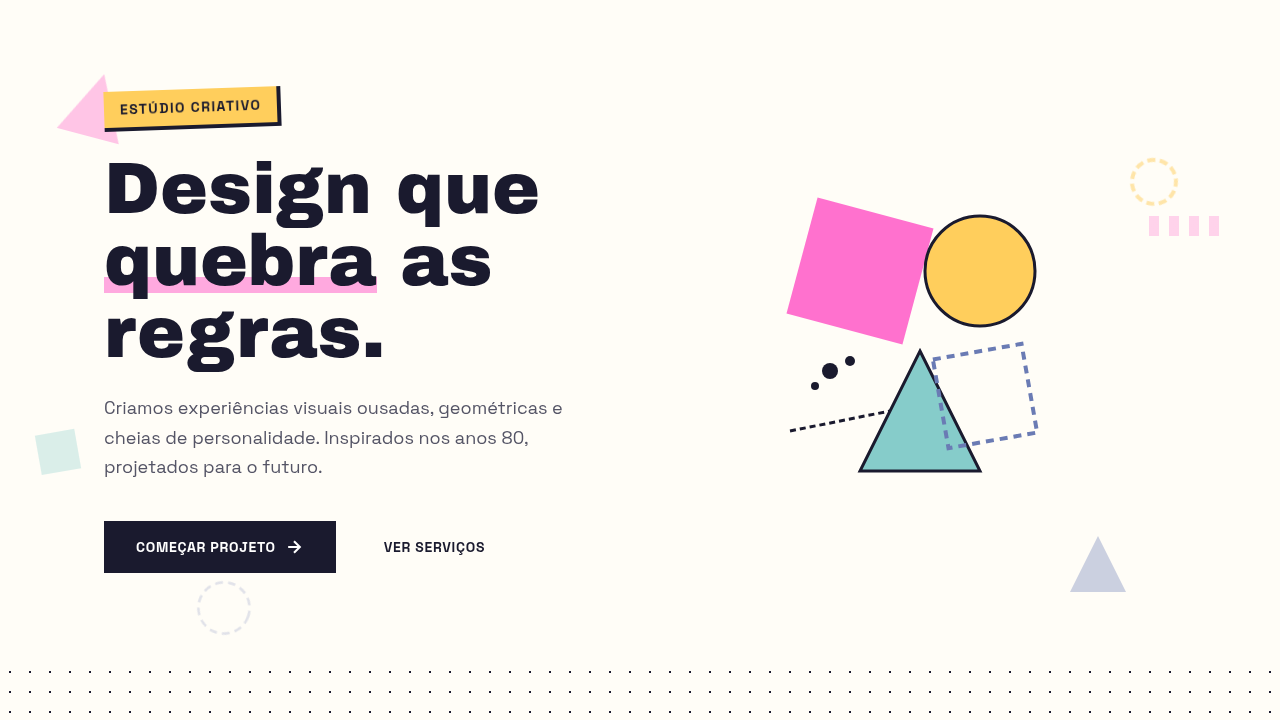
Historical Context
In 1981, Ettore Sottsass gathered a group of young architects and designers in his Milan apartment and basically told modernism to go to hell. The Memphis Group — named after a Bob Dylan song, not the city — exploded onto the design world with furniture and objects that were loud, clashing, and deliberately "ugly" by establishment standards. Laminate surfaces in garish colors. Geometric shapes stacked without logic. Squiggles treated as serious ornament. It was a middle finger to the beige rationalism that had dominated design for decades. The movement burned bright and fast — officially disbanding by 1987. But its DNA never really left. When web designers in the early 2020s started reaching for terrazzo patterns, scattered geometric confetti, and clashing pastels, they were channeling Memphis whether they knew it or not. The aesthetic hit perfectly: social media had primed audiences for visual maximalism, and the nostalgia cycle had rotated back to the 80s. Suddenly every creative agency landing page had floating shapes and zigzag dividers. What makes Memphis endure isn't the specific shapes — it's the permission it grants. Permission to be excessive, to reject good taste as a constraint, to treat the surface as playground rather than problem to solve.
When to Use
Memphis works when your brand has nothing to whisper about. Creative agencies, music festivals, streetwear drops, Gen-Z product launches — contexts where restraint reads as boring. It's ideal for short-lived campaigns and event sites where you want immediate visual impact over long-term sophistication. Fashion editorials, youth marketing, portfolio sites for illustrators who actually have personality. Avoid it for anything requiring trust signals — fintech, healthcare, enterprise SaaS. Memphis says "fun" not "reliable."
Design Principles
- Clash on purpose — combine colors that modernism would never allow in the same room. Pink against teal, yellow against violet. If it feels comfortable, push further.
- Geometry as decoration, not structure — circles, triangles, and squiggles exist for visual energy, not to organize content. Let them float, overlap, interrupt.
- Surface over depth — reject minimalist transparency. Embrace pattern, texture, and terrazzo fills. Every surface is an opportunity for visual noise.
- Asymmetry as default — nothing centers, nothing aligns perfectly. Layouts should feel composed but never grid-locked. Tension is the point.
- Scale without logic — a tiny triangle next to a massive circle. Oversized typography crashing into micro-elements. Hierarchy through contrast, not proportion.
DESIGN.md
---
version: "alpha"
name: "Memphis Design"
description: "Memphis style interface. Ideal for landing pages, saas. AI-ready template."
colors:
  primary: "#FF71CE"
  secondary: "#FFCE5C"
  tertiary: "#86CCCA"
  neutral: "#6A7BB4"
typography:
  h1:
    fontFamily: System UI stack
    fontSize: 2.25rem
    fontWeight: 700
  body-md:
    fontFamily: System UI stack
    fontSize: 1rem
    fontWeight: 400
  label-caps:
    fontFamily: System UI stack
    fontSize: 0.75rem
    fontWeight: 500
components:
  button-primary:
    backgroundColor: "{colors.primary}"
    textColor: "{colors.neutral}"
    padding: 12px
---

## Overview

Memphis style interface. Ideal for landing pages, saas. AI-ready template. In 1981, Ettore Sottsass gathered a group of young architects and designers in his Milan apartment and basically told modernism to go to hell. The Memphis Group — named after a Bob Dylan song, not the city — exploded onto the design world with furniture and objects that were loud, clashing, and deliberately "ugly" by establishment standards. Laminate surfaces in garish colors. Geometric shapes stacked without logic. Squiggles treated as serious ornament. It was a middle finger to the beige rationalism that had dominated design for decades.

The movement burned bright and fast — officially disbanding by 1987. But its DNA never really left. When web designers in the early 2020s started reaching for terrazzo patterns, scattered geometric confetti, and clashing pastels, they were channeling Memphis whether they knew it or not. The aesthetic hit perfectly: social media had primed audiences for visual maximalism, and the nostalgia cycle had rotated back to the 80s. Suddenly every creative agency landing page had floating shapes and zigzag dividers.

What makes Memphis endure isn't the specific shapes — it's the permission it grants. Permission to be excessive, to reject good taste as a constraint, to treat the surface as playground rather than problem to solve.

- Density: 5/10 — Balanced
- Variance: 7/10 — Dynamic
- Motion: 4/10 — Subtle

- **Style:** Postmodern, Colorful, Geometric, Playful
- **Keywords:** 80s, geometric, playful, postmodern, shapes, patterns, squiggles, triangles, neon, abstract, bold
- **Era:** 1980s Postmodern
- **Light/Dark:** ✓ Full / ✓ Full

## Colors

- **#FF71CE** (#FF71CE) — Primary surface or dominant color
- **#FFCE5C** (#FFCE5C) — Secondary surface or text color
- **#86CCCA** (#86CCCA) — Supporting palette color
- **#6A7BB4** (#6A7BB4) — Supporting palette color


## Typography

- **Display / Hero:** System UI stack (-apple-system, sans-serif) — Weight 700, tight tracking, used for headline impact
- **Body:** System UI stack (-apple-system, sans-serif) — Weight 400, 16px/1.6 line-height, max 72ch per line
- **UI Labels / Captions:** System UI stack (-apple-system, sans-serif) — 0.875rem, weight 500, slight letter-spacing
- **Monospace:** JetBrains Mono — Used for code, metadata, and technical values

Scale:
- Hero: clamp(2.5rem, 5vw, 4rem)
- H1: 2.25rem
- H2: 1.5rem
- Body: 1rem / 1.6
- Small: 0.875rem


## Layout

- **Grid:** CSS Grid primary. Max-width containment: 1280px centered with 1.5rem side padding.
- **Spacing rhythm:** Balanced. Base unit: 0.5rem (8px).
- **Section vertical gaps:** clamp(4rem, 8vw, 8rem).
- **Hero layout:** Asymmetric composition.
- **Feature sections:** Asymmetric grid with varied card sizes. No 3-equal-columns.
- **Mobile collapse:** All multi-column layouts collapse below 768px. No horizontal overflow.
- **z-index contract:** base (0) / sticky-nav (100) / overlay (200) / modal (300) / toast (500).


## Elevation & Depth

transform: rotate(), clip-path: polygon(), mix-blend-mode, repeating patterns, bold shapes

- **Physics:** Ease-out curves, 200-300ms duration. Smooth and predictable.
- **Entry animations:** Fade + translate-Y (16px → 0) over 420ms ease-out. Staggered cascades for lists: 80ms between items.
- **Hover states:** Subtle color shift + shadow adjustment over 200ms.
- **Page transitions:** Fade only (200ms).
- **Performance:** Only transform and opacity animated. No layout-triggering properties.


## Shapes

Base corner radius: 8px. See rounded tokens in front matter for the full scale.


## Components

- **Primary Button:** Subtly rounded (0.5rem) shape. Accent color fill. Hover: 8% darken + subtle lift shadow. Active: -1px translate tactile press. Font weight 600. No outer glows.
- **Secondary / Ghost Button:** Outline variant. 1.5px border in muted color. Text in primary color. Hover: subtle background fill.
- **Cards:** Subtly rounded (0.5rem) corners. Surface background. Subtle shadow (0 2px 12px rgba(0,0,0,0.06)). 1px border stroke.
- **Inputs:** Label above input. 1px border stroke. Focus ring: 2px accent color offset 2px. Error text below in semantic red. No floating labels.
- **Navigation:** Primary surface background. Active item: accent color indicator. Font weight 500 when active.
- **Skeletons:** Shimmer animation matching component dimensions. No circular spinners.
- **Empty States:** Icon-based composition with descriptive text and action button.


## Do's and Don'ts

- No emojis in UI — use icon system only (Lucide, Heroicons)
- No pure white (#FFFFFF) backgrounds — use off-white or dark surfaces
- No oversaturated accent colors (saturation cap: 80%)
- No 3-column equal-width feature layouts — use zig-zag or asymmetric grid
- No `h-screen` — use `min-h-[100dvh]`
- No AI copywriting clichés: "Elevate", "Seamless", "Unleash", "Next-Gen"
- No broken external image links — use picsum.photos or inline SVG
- No generic lorem ipsum in demos

- Do Geometric shapes visible
- Do Colors bold/clashing
- Do Patterns present
- Do Layout asymmetric
- Do Playful decorations
- Do 80s vibe achieved


## Use Case

Landing pages, SaaS
Technical Specs
CSS
clip-path: polygon() for shapes, background: repeating patterns, transform: rotate() for tilted elements, mix-blend-mode for overlays, border: dashed/dotted patterns, bold sans-serif
Variables
--memphis-pink: #FF71CE, --memphis-yellow: #FFCE5C, --memphis-teal: #86CCCA, --memphis-purple: #6A7BB4, --pattern-size: 20px, --shape-rotation: 15deg
Checklist
☐ Geometric shapes visible, ☐ Colors bold/clashing, ☐ Patterns present, ☐ Layout asymmetric, ☐ Playful decorations, ☐ 80s vibe achieved
Colors
Primary
Effects
transform: rotate(), clip-path: polygon(), mix-blend-mode, repeating patterns, bold shapes
Light/Dark
✓ Full / ✓ Full
AI Prompt
Act as a Senior Frontend Engineer and Expert UI Designer.
Your task is to code a complete Landing Page on the first attempt.
- Landing Page Theme: <INSERT THEME>
- Sections to add: <INSERT SECTIONS>

Generate the final code immediately following these definitions:

## Style

- **Name:** Memphis Design
- **Type:** Postmodern, Colorful, Geometric, Playful
- **Keywords:** 80s, geometric, playful, postmodern, shapes, patterns, squiggles, triangles, neon, abstract, bold
- **Era:** 1980s Postmodern
- **Light/Dark:** ✓ Full / ✓ Full

## Color Palette

- **Primary:** #FF71CE (Hot Pink), #FFCE5C (Yellow), #86CCCA (Teal), #6A7BB4 (Blue Purple)
- **Secondary:** Complementary geometric colors, pattern fills, contrasting accent shapes

## Visual Effects

transform: rotate(), clip-path: polygon(), mix-blend-mode, repeating patterns, bold shapes

## AI Visual Direction

Design a Memphis style interface. Use: bold geometric shapes (triangles, squiggles, circles), bright clashing colors, 80s postmodern aesthetic, playful patterns, dotted textures, asymmetric layouts, decorative elements.

## CSS Technical

```css
clip-path: polygon() for shapes, background: repeating patterns, transform: rotate() for tilted elements, mix-blend-mode for overlays, border: dashed/dotted patterns, bold sans-serif
```

## Design System Variables

```css
--memphis-pink: #FF71CE, --memphis-yellow: #FFCE5C, --memphis-teal: #86CCCA, --memphis-purple: #6A7BB4, --pattern-size: 20px, --shape-rotation: 15deg
```

## Implementation Checklist

- ☐ Geometric shapes visible
- ☐ Colors bold/clashing
- ☐ Patterns present
- ☐ Layout asymmetric
- ☐ Playful decorations
- ☐ 80s vibe achieved

## Execution Rules

1. Strictly follow the defined visual style.
2. Use high-quality inline SVG icons (Heroicons or Lucide style) — NEVER use emojis as icons.
3. Add `cursor-pointer` and smooth `hover` states (transition-all) on all interactive elements.
4. Required Page Structure:
   - Navbar (Logo + Links + CTA)
   - Hero Section (Impactful Headline + Subtitle + 2 buttons + 3D/Abstract visual element via CSS)
   - Features (3 cards with icons)
   - Testimonials (3 cards)
   - Pricing (3 tiers, highlight the middle one)
   - Final CTA
   - Full Footer with social links, privacy policy, terms of use, contact and SEO links.
5. All text content must be in English.
6. The visual must be CLEARLY distinct — do not create a "default Bootstrap" design. Force the use of the provided design system variables.
7. Use `<style>` tags in the head for custom classes (especially for complex backdrop-filter effects and animations) that Tailwind CDN doesn't cover.
8. Full Responsiveness: Layout must adapt perfectly to Mobile, Tablet and Desktop (vertical stack on mobile).
9. Include basic SEO, Viewport and Open Graph meta tags in `<head>`.
10. Footer must contain: Copyright 2026, Secondary navigation links and Social media icons.
11. Make the creative decisions needed to deliver the complete, functional result now.
Related
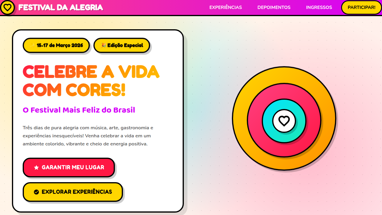
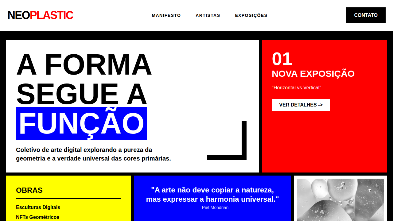
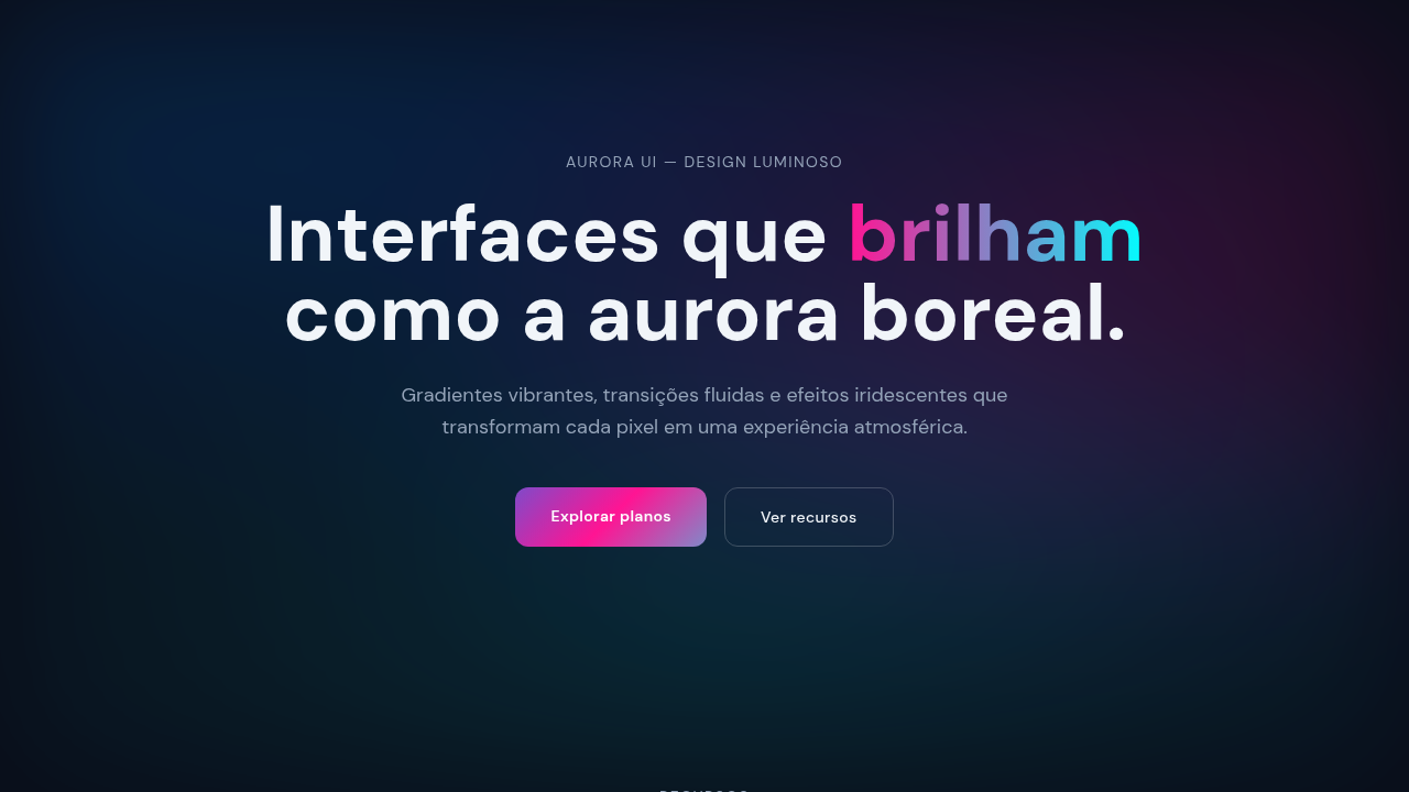
Last synced: 4/1/2026