Liquid Glass
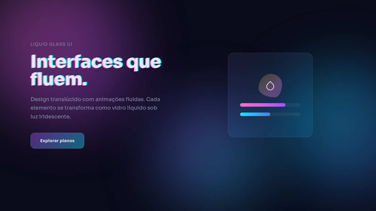
Premium liquid glass effect with morphing shapes, flowing animations, chromatic aberration, iridescent gradients, smooth 400-600ms transitions. Ideal for landing pages, saas. AI-ready template.
Use case: Landing pages, SaaS
Historical Context
Glassmorphism landed around 2020 as a static effect — frosted panels, backdrop-blur, maybe a subtle border. It looked gorgeous in Dribbble shots and fell apart in production. The blur was expensive, the layering was fragile, and honestly? It got stale fast. But the underlying idea — depth through translucency — had legs. Apple pushed it forward with visionOS in 2023. Their fluid materials weren't just blurred backgrounds; they morphed, responded to light, shifted with viewing angle. Suddenly glass wasn't a surface treatment, it was a living material. That changed the conversation entirely. Designers started asking: what if the glass itself moved? CSS @property and Houdini made it buildable. You could finally animate gradient stops, interpolate complex values, create organic shape transitions without JavaScript hammering the main thread. By 2025 the tooling caught up to the vision. Then Apple went all-in with iOS 26's Liquid Glass system-wide, and the pattern graduated from experimental to expected. In 2026, this is the premium default — not a trend, but infrastructure.
When to Use
Liquid glass earns its render cost when the product itself is about craft, premium positioning, or creative expression. SaaS dashboards where users spend hours? Skip it — they'll notice the GPU fan before the aesthetics. But a brand site that needs to communicate sophistication in three seconds? A portfolio that should feel alive? A luxury product page where the interface IS the experience? That's where fluid glass justifies every dropped frame. The rule is simple: if the motion serves the brand story, ship it. If it's decoration on top of utility, you're burning battery for ego.
Design Principles
- Motion follows intent — glass morphs in response to user interaction or scroll position, never autonomously looping without purpose
- Performance budget is non-negotiable — cap fluid effects at 2-3 simultaneous animated layers; composite on GPU, never trigger layout
- Iridescence is seasoning, not the meal — color shifts should be subtle enough that users feel them before they consciously notice them
- Organic shapes need mathematical backbone — use eased sine curves and golden-ratio proportions so fluid forms feel natural rather than random
- Degrade gracefully to static glass — every liquid effect must have a prefers-reduced-motion fallback that preserves hierarchy without animation
DESIGN.md
---
version: "alpha"
name: "Liquid Glass"
description: "Premium liquid glass effect with morphing shapes, flowing animations, chromatic aberration, iridescent gradients, smooth 400-600ms transitions. Ideal for landing pages, saas. AI-ready template."
colors:
  primary: "#1A1A1A"
  secondary: "#4A4A4A"
  tertiary: "#0066FF"
  neutral: "#FFFFFF"
typography:
  h1:
    fontFamily: System UI stack
    fontSize: 2.25rem
    fontWeight: 700
  body-md:
    fontFamily: System UI stack
    fontSize: 1rem
    fontWeight: 400
  label-caps:
    fontFamily: System UI stack
    fontSize: 0.75rem
    fontWeight: 500
---

## Overview

Premium liquid glass effect with morphing shapes, flowing animations, chromatic aberration, iridescent gradients, smooth 400-600ms transitions. Ideal for landing pages, saas. AI-ready template. Glassmorphism landed around 2020 as a static effect — frosted panels, backdrop-blur, maybe a subtle border. It looked gorgeous in Dribbble shots and fell apart in production. The blur was expensive, the layering was fragile, and honestly? It got stale fast. But the underlying idea — depth through translucency — had legs.

Apple pushed it forward with visionOS in 2023. Their fluid materials weren't just blurred backgrounds; they morphed, responded to light, shifted with viewing angle. Suddenly glass wasn't a surface treatment, it was a living material. That changed the conversation entirely. Designers started asking: what if the glass itself moved?

CSS @property and Houdini made it buildable. You could finally animate gradient stops, interpolate complex values, create organic shape transitions without JavaScript hammering the main thread. By 2025 the tooling caught up to the vision. Then Apple went all-in with iOS 26's Liquid Glass system-wide, and the pattern graduated from experimental to expected. In 2026, this is the premium default — not a trend, but infrastructure.

- Density: 5/10 — Balanced
- Variance: 4/10 — Moderate
- Motion: 6/10 — Expressive

- **Style:** Translucent, Fluid, Reflective, Modern
- **Keywords:** Flowing glass, morphing, smooth transitions, fluid effects, translucent, animated blur, iridescent, chromatic aberration
- **Era:** 2020s Modern
- **Light/Dark:** ✓ Full / ✓ Full

## Colors

- Palette derived from style keywords and era context


## Typography

- **Display / Hero:** System UI stack (-apple-system, sans-serif) — Weight 700, tight tracking, used for headline impact
- **Body:** System UI stack (-apple-system, sans-serif) — Weight 400, 16px/1.6 line-height, max 72ch per line
- **UI Labels / Captions:** System UI stack (-apple-system, sans-serif) — 0.875rem, weight 500, slight letter-spacing
- **Monospace:** JetBrains Mono — Used for code, metadata, and technical values

Scale:
- Hero: clamp(2.5rem, 5vw, 4rem)
- H1: 2.25rem
- H2: 1.5rem
- Body: 1rem / 1.6
- Small: 0.875rem


## Layout

- **Grid:** CSS Grid primary. Max-width containment: 1280px centered with 1.5rem side padding.
- **Spacing rhythm:** Balanced. Base unit: 0.5rem (8px).
- **Section vertical gaps:** clamp(4rem, 8vw, 8rem).
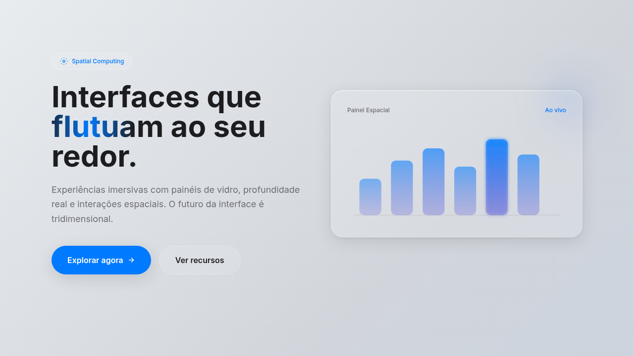
- **Hero layout:** Split-screen (text left, visual right).
- **Feature sections:** Zig-zag alternating text+image rows. No 3-equal-columns.
- **Mobile collapse:** All multi-column layouts collapse below 768px. No horizontal overflow.
- **z-index contract:** base (0) / sticky-nav (100) / overlay (200) / modal (300) / toast (500).


## Elevation & Depth

Morphing elements (SVG/CSS), fluid animations (400-600ms curves), dynamic blur (backdrop-filter), color transitions

- **Physics:** Spring — stiffness 120, damping 20. Confident, weighted transitions.
- **Entry animations:** Fade + translate-Y (16px → 0) over 480ms ease-out. Staggered cascades for lists: 100ms between items.
- **Hover states:** Scale(1.03) + shadow lift over 200ms.
- **Page transitions:** Fade + slide (300ms).
- **Performance:** Only transform and opacity animated. No layout-triggering properties.


## Shapes

Base corner radius: 12px. See rounded tokens in front matter for the full scale.


## Components

- **Primary Button:** Moderately rounded (0.75rem) shape. Accent color fill. Hover: 8% darken + subtle lift shadow. Active: -1px translate tactile press. Font weight 600. No outer glows.
- **Secondary / Ghost Button:** Outline variant. 1.5px border in muted color. Text in primary color. Hover: subtle background fill.
- **Cards:** Moderately rounded (0.75rem) corners. Surface background. Subtle shadow (0 2px 12px rgba(0,0,0,0.06)). 1px border stroke.
- **Inputs:** Label above input. 1px border stroke. Focus ring: 2px accent color offset 2px. Error text below in semantic red. No floating labels.
- **Navigation:** Primary surface background. Active item: accent color indicator. Font weight 500 when active.
- **Skeletons:** Shimmer animation matching component dimensions. No circular spinners.
- **Empty States:** Icon-based composition with descriptive text and action button.


## Do's and Don'ts

- No emojis in UI — use icon system only (Lucide, Heroicons)
- No pure black (#000000) — use off-black or charcoal variants
- No oversaturated accent colors (saturation cap: 80%)
- No 3-column equal-width feature layouts — use zig-zag or asymmetric grid
- No `h-screen` — use `min-h-[100dvh]`
- No AI copywriting clichés: "Elevate", "Seamless", "Unleash", "Next-Gen"
- No broken external image links — use picsum.photos or inline SVG
- No generic lorem ipsum in demos

- Do Morphing animations 400-600ms
- Do Chromatic aberration applied
- Do Dynamic blur active
- Do Iridescent gradients
- Do Smooth color transitions
- Do Premium feel achieved


## Use Case

Landing pages, SaaS
Technical Specs
CSS
animation: morphing SVG paths (400-600ms), backdrop-filter: blur + saturate, filter: hue-rotate + brightness, blend-mode: screen, background: iridescent gradient
Variables
--morph-duration: 400-600ms, --blur-amount: 15px, --chromatic-aberration: true, --iridescent: true, --blend-mode: screen, --smooth-transitions: true
Checklist
☐ Morphing animations 400-600ms, ☐ Chromatic aberration applied, ☐ Dynamic blur active, ☐ Iridescent gradients, ☐ Smooth color transitions, ☐ Premium feel achieved
Colors
Effects
Morphing elements (SVG/CSS), fluid animations (400-600ms curves), dynamic blur (backdrop-filter), color transitions
Light/Dark
✓ Full / ✓ Full
AI Prompt
Act as a Senior Frontend Engineer and Expert UI Designer.
Your task is to code a complete Landing Page on the first attempt.
- Landing Page Theme: <INSERT THEME>
- Sections to add: <INSERT SECTIONS>

Generate the final code immediately following these definitions:

## Style

- **Name:** Liquid Glass
- **Type:** Translucent, Fluid, Reflective, Modern
- **Keywords:** Flowing glass, morphing, smooth transitions, fluid effects, translucent, animated blur, iridescent, chromatic aberration
- **Era:** 2020s Modern
- **Light/Dark:** ✓ Full / ✓ Full

## Color Palette

- **Primary:** Vibrant iridescent (rainbow spectrum), translucent base with opacity shifts, gradient fluidity
- **Secondary:** Chromatic aberration (Red-Cyan), iridescent oil-spill, fluid gradient blends, holographic effects

## Visual Effects

Morphing elements (SVG/CSS), fluid animations (400-600ms curves), dynamic blur (backdrop-filter), color transitions

## AI Visual Direction

Create a premium liquid glass effect with morphing shapes, flowing animations, chromatic aberration, iridescent gradients, smooth 400-600ms transitions. Use SVG morphing for shape changes, dynamic blur, smooth color transitions creating a fluid, premium feel.

## CSS Technical

```css
animation: morphing SVG paths (400-600ms), backdrop-filter: blur + saturate, filter: hue-rotate + brightness, blend-mode: screen, background: iridescent gradient
```

## Design System Variables

```css
--morph-duration: 400-600ms, --blur-amount: 15px, --chromatic-aberration: true, --iridescent: true, --blend-mode: screen, --smooth-transitions: true
```

## Implementation Checklist

- ☐ Morphing animations 400-600ms
- ☐ Chromatic aberration applied
- ☐ Dynamic blur active
- ☐ Iridescent gradients
- ☐ Smooth color transitions
- ☐ Premium feel achieved

## Execution Rules

1. Strictly follow the defined visual style.
2. Use high-quality inline SVG icons (Heroicons or Lucide style) — NEVER use emojis as icons.
3. Add `cursor-pointer` and smooth `hover` states (transition-all) on all interactive elements.
4. Required Page Structure:
   - Navbar (Logo + Links + CTA)
   - Hero Section (Impactful Headline + Subtitle + 2 buttons + 3D/Abstract visual element via CSS)
   - Features (3 cards with icons)
   - Testimonials (3 cards)
   - Pricing (3 tiers, highlight the middle one)
   - Final CTA
   - Full Footer with social links, privacy policy, terms of use, contact and SEO links.
5. All text content must be in English.
6. The visual must be CLEARLY distinct — do not create a "default Bootstrap" design. Force the use of the provided design system variables.
7. Use `<style>` tags in the head for custom classes (especially for complex backdrop-filter effects and animations) that Tailwind CDN doesn't cover.
8. Full Responsiveness: Layout must adapt perfectly to Mobile, Tablet and Desktop (vertical stack on mobile).
9. Include basic SEO, Viewport and Open Graph meta tags in `<head>`.
10. Footer must contain: Copyright 2026, Secondary navigation links and Social media icons.
11. Make the creative decisions needed to deliver the complete, functional result now.
Related
Last synced: 4/1/2026